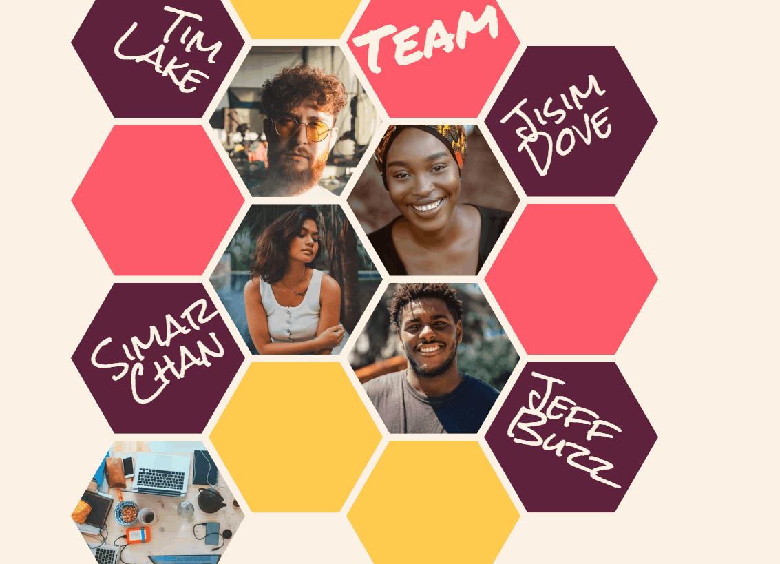
HTML+CSS+JS实现 ❤️ 团队人物图片蜂巢布局❤️
Posted java李阳勇
tags:
篇首语:本文由小常识网(cha138.com)小编为大家整理,主要介绍了HTML+CSS+JS实现 ❤️ 团队人物图片蜂巢布局❤️相关的知识,希望对你有一定的参考价值。
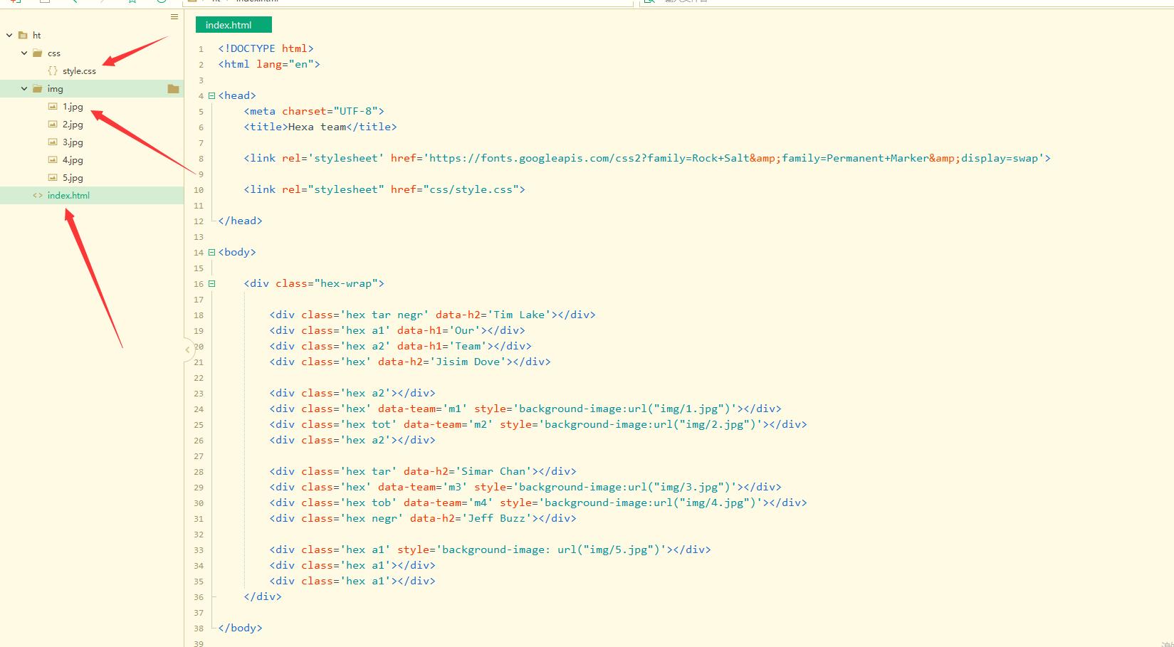
代码目录:
主要代码实现:
css样式:
html,
body {
    height: 100%;
    margin: auto;
    --wrp: 800px;
    width: var(--wrp);
}

body {
    background: center/1.6% #f5f5f5 url('data:image/svg+xml,%3Csvg xmlns="http://www.w3.org/2000/svg" width="28" height="49" viewBox="0 0 28 49"%3E%3Cg fill-rule="evenodd"%3E%3Cg id="hexagons" fill="%23e5e5e5" fill-opacity="0.4" fill-rule="evenodd"%3E%3Cpath d="M13.99 9.25l13 7.5v15l-13 7.5L1 31.75v-15l12.99-7.5zM3 17.9v12.7l10.99 6.34 11-6.35V17.9l-11-6.34L3 17.9zM0 15l12.98-7.5V0h-2v6.35L0 12.69v2.3zm0 18.5L12.98 41v8h-2v-6.85L0 35.81v-2.3zM15 0v7.5L27.99 15H28v-2.31h-.01L17 6.35V0h-2zm0 49v-8l12.99-7.5H28v2.31h-.01L17 42.15V49h-2z"/%3E%3C/g%3E%3C/g%3E%3C/svg%3E');
    background: #faf2e8;
}

body,
.hex-wrap {
    display: flex;
    flex-wrap: wrap;
    align-items: center;
    justify-content: center;
    align-content: center;
}

.hex-wrap {
    --r: 0.24935;
    --r-1: calc(1 / calc(1 - var(--r)));
    --g: 5px;
    --w: calc(var(--r-1) * var(--wrp) / 4 - 2 * var(--r-1) * var(--g));
    margin: 0 -1px;
    justify-content: flex-start;
}

.hex {
    clip-path: polygon(25% 0%, 75% 0%, 100% 50%, 75% 100%, 25% 100%, 0% 50%);
    background: center/cover #482245;
    color: #faf2e8;
    width: var(--w);
    height: calc(0.8658 * var(--w));
    margin: var(--g) calc(var(--r) / -2 * var(--w) + var(--g));
    position: relative;
}

.hex:nth-of-type(4n) {
    transform: translateY(calc(50% + var(--g)));
}

.hex:nth-of-type(4n+2) {
    transform: translateY(calc(-50% - var(--g)));
}

.hex[data-h1]:before {
    content: attr(data-h1);
    font: calc(var(--w) / 3) "Permanent Marker", sans-serif;
    position: absolute;
    width: 70%;
    text-align: left;
    top: 43%;
    left: 50%;
    transform: translate(-61%, -50%) rotate(-25deg);
}

.hex:before {
    position: absolute;
    width: 88%;
    text-align: inherit;
    top: 47%;
    left: 50%;
    transform: translate(-50%, -50%);
}

.hex[data-h1]:before {
    content: attr(data-h1);
    font: calc(var(--w) / 3) "Permanent Marker", sans-serif;
}

.hex[data-h1]:before {
    content: attr(data-h1);
    font: calc(var(--w) / 3) "Permanent Marker", sans-serif;
    transform: translate(-65%, -43%) rotate(-16deg);
}

.hex[data-h2]:before {
    width: 70%;
    content: attr(data-h2);
    font: calc(var(--w) / 5)/1 "Rock Salt", sans-serif;
    transform: translate(-49%, -50%) rotate(-29deg);
}

.hex.negr[data-h2]:before {
    transform: translate(-49%, -50%) rotate(31deg);
}

.hex[data-team] {
    transition: transform 0.5s;
}

.hex[data-team]:hover {
    z-index: 9;
    transform: scale(2);
}

.tot {
    transform-origin: 50% 0;
}

.tob {
    transform-origin: 50% 100;
}

.tar {
    text-align: right;
}

.tal {
    text-align: left;
}

.a1 {
    background: #ffcb59;
}

.a2 {
    background: #ff5b8c;
}

.pr {
    background: #482245;
}

.a1t {
    color: #ffcb59;
}

.a2t {
    color: #ff5b8c;
}

.prt {
    color: #482245;
}
html :
<!DOCTYPE html>
<html lang="en">
<head>
<meta charset="UTF-8">
<title>Hexa team</title>
<link rel='stylesheet' href='https://fonts.googleapis.com/css2?family=Rock+Salt&family=Permanent+Marker&display=swap'>
<link rel="stylesheet" href="css/style.css">
</head>
<body>
<div class="hex-wrap">
<div class='hex tar negr' data-h2='Tim Lake'></div>
<div class='hex a1' data-h1='Our'></div>
<div class='hex a2' data-h1='Team'></div>
<div class='hex' data-h2='Jisim Dove'></div>
<div class='hex a2'></div>
<div class='hex' data-team='m1' style='background-image:url("img/1.jpg")'></div>
<div class='hex tot' data-team='m2' style='background-image:url("img/2.jpg")'></div>
<div class='hex a2'></div>
<div class='hex tar' data-h2='Simar Chan'></div>
<div class='hex' data-team='m3' style='background-image:url("img/3.jpg")'></div>
<div class='hex tob' data-team='m4' style='background-image:url("img/4.jpg")'></div>
<div class='hex negr' data-h2='Jeff Buzz'></div>
<div class='hex a1' style='background-image: url("img/5.jpg")'></div>
<div class='hex a1'></div>
<div class='hex a1'></div>
</div>
</body>
</html>js文件在上面截图可以看到 需要引进来。
精彩推荐更新中:
HTML5大作业实战100套
打卡 文章 更新 36 / 100天
大家可以点赞、收藏、关注、评论我啦 、需要完整文件随时联系我或交流哟~!

以上是关于HTML+CSS+JS实现 ❤️ 团队人物图片蜂巢布局❤️的主要内容,如果未能解决你的问题,请参考以下文章