Matplot pyplot绘制单图,多子图不同样式详解,这一篇就够了
Posted 程序媛一枚~
tags:
篇首语:本文由小常识网(cha138.com)小编为大家整理,主要介绍了Matplot pyplot绘制单图,多子图不同样式详解,这一篇就够了相关的知识,希望对你有一定的参考价值。
Matplot pyplot绘制单图,多子图不同样式详解,这一篇就够了
matplotlib.pyplot 是使 matplotlib 像 MATLAB 一样工作的函数集合。这篇博客将介绍
- 单图单线
- 单图多线不同样式(红色圆圈、蓝色实线、绿色三角等)
- 使用关键字字符串绘图(data 可指定依赖值为:numpy.recarray 或 pandas.DataFrame)
- 使用分类变量绘图(绘制条形图、散点图、折线图)
- 多子表多轴及共享轴
- 多子表(水平堆叠、垂直堆叠、水平垂直堆叠、水平垂直堆叠共享轴、水平垂直堆叠去掉子图中间的冗余xy标签及间隙、极坐标风格轴示例);
-
plt.set_title(‘simple plot’, loc = ‘left’)
设置表示标题,默认位于中间,也可位于left靠左,right靠右 -
t = plt.xlabel(‘Smarts’, fontsize=14, color=‘red’)
表示设置x标签的文本,字体大小,颜色 -
plt.plot([1, 2, 3, 4])
如果提供的单个列表或数组,matplot假定提供的是y的值;x默认跟y个数一致,但从0开始,表示x:[0,1,2,3] -
plt.plot([1, 2, 3, 4], [1, 4, 9, 16])
表示x:[1,2,3,4],y:[1,4,9,16] -
plt.plot([1, 2, 3, 4], [1, 4, 9, 16], ‘ro’)
表示x:[1,2,3,4],y:[1,4,9,16],然后指定线的颜色和样式(ro:红色圆圈,b-:蓝色实线等) -
plt.axis([0, 6, 0, 20])
plt.axix[xmin, xmax, ymin, ymax] 表示x轴的刻度范围[0,6], y轴的刻度范围[0,20] -
plt.bar(names, values) # 条形图
-
plt.scatter(names, values) # 散点图
-
plt.plot(names, values) # 折线图
-
fig, ax = plt.subplots(2, sharex=True, sharey=True) 可创建多表,并指定共享x,y轴,然后ax[0],ax[1]绘制data
-
fig, (ax1, ax2) = plt.subplots(2, sharex=True, sharey=True) 可创建多表,并指定共享x,y轴
-
fig, (ax1, ax2) = plt.subplots(2, sharex=True, sharey=True) 可创建多表,垂直堆叠表 2行1列
-
fig, (ax1, ax2) = plt.subplots(1, 2, sharex=True, sharey=True) 可创建多表,水平堆叠表 1行2列
-
fig, (ax1, ax2) = plt.subplots(2, 2, sharex=True, sharey=True,hspace=0,wspace=0) 可创建多表,水平垂直堆叠表 2行2列,共享x,y轴,并去除子图宽度和高度之间的缝隙
共享x,y轴表示共享x,y轴的刻度及值域;
- plt.text(60, .025, r’
μ
=
100
,
σ
=
15
\\mu=100,\\ \\sigma=15
μ=100, σ=15’)
表示在60,0.025处进行文本( μ = 100 , σ = 15 \\mu=100,\\ \\sigma=15 μ=100, σ=15)的标注
1. 单图单线
# 单图单线
import matplotlib.pyplot as plt
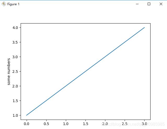
# 如果提供单个列表或数组,matplotlib 会假定它是一个 y 值序列,并自动为您生成 x 值。
# 由于 python 范围从 0 开始,默认的 x 向量与 y 具有相同的长度,但从 0 开始。因此 x 数据是 [0, 1, 2, 3]
plt.plot([1, 2, 3, 4])
plt.ylabel('some numbers')
plt.show()
plt.plot([1, 2, 3, 4], [1, 4, 9, 16])
plt.show()
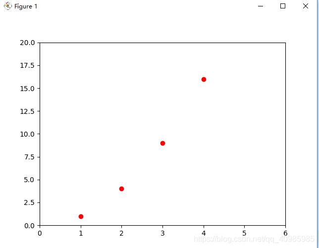
# 对于每对 x, y 参数,都有一个可选的第三个参数,它是指示绘图颜色和线型的格式字符串。
# 格式字符串的字母和符号来自 MATLAB,将颜色字符串与线型字符串连接起来。默认格式字符串是“b-”,这是一条蓝色实线。'ro'红色圆圈
plt.plot([1, 2, 3, 4], [1, 4, 9, 16], 'ro')
plt.axis([0, 6, 0, 20]) # 刻度轴的范围,x:0~6,y:0~20
plt.show()
2. 单图多线不同样式(红色圆圈、蓝色实线、绿色三角等)
- ’b-‘:蓝色实线
- ‘ro’:红色圆圈
- ‘r–’:红色破折号
- ‘bs’:蓝色方形
- ‘g^’:绿色三角
mark标记:
‘.’ point marker
‘,’ pixel marker
‘o’ circle marker
‘v’ triangle_down marker
‘^’ triangle_up marker
‘<’ triangle_left marker
‘>’ triangle_right marker
‘1’ tri_down marker
‘2’ tri_up marker
‘3’ tri_left marker
‘4’ tri_right marker
‘8’ octagon marker
‘s’ square marker
‘p’ pentagon marker
‘P’ plus (filled) marker
‘*’ star marker
‘h’ hexagon1 marker
‘H’ hexagon2 marker
‘+’ plus marker
‘x’ x marker
‘X’ x (filled) marker
‘D’ diamond marker
‘d’ thin_diamond marker
‘|’ vline marker
‘_’ hline marker
- 支持的颜色:
‘b’ blue 蓝色
‘g’ green 绿色
‘r’ red 红色
‘c’ cyan 兰青色
‘m’ magenta 紫色
‘y’ yellow 黄色
‘k’ black 黑色
‘w’ white 白色
- 支持的点的样式:
‘-’ solid line style 实线
‘–’ dashed line style 虚线
‘-.’ dash-dot line style 点划线
‘:’ dotted line style 虚线
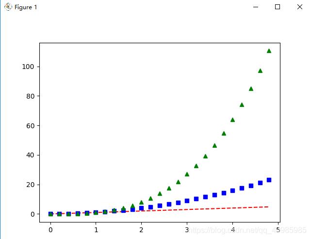
import matplotlib.pyplot as plt

import numpy as np

# 以 200 毫秒的间隔均匀采样时间
t = np.arange(0., 5., 0.2)

# 'r--':红色破折号,  'bs':蓝色方形 ,'g^':绿色三角
plt.plot(t, t, 'r--', t, t ** 2, 'bs', t, t ** 3, 'g^')
plt.show()
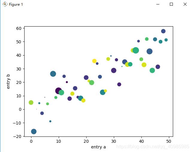
3. 使用关键字字符串绘图(data 可指定依赖值为:numpy.recarray 或 pandas.DataFrame)
import matplotlib.pyplot as plt

import numpy as np

# 使用关键字字符串绘图(data 可指定依赖值为:numpy.recarray 或 pandas.DataFrame)
data = {'a': np.arange(50),  # 1个参数,表示[0,1,2...,50]
        'c': np.random.randint(0, 50, 50),  # 表示产生50个随机数[0,50)
        'd': np.random.randn(50)}  # 返回呈标准正态分布的值(可能正,可能负)
data['b'] = data['a'] + 10 * np.random.randn(50)
data['d'] = np.abs(data['d']) * 100

print(np.arange(50))
print(np.random.randint(0, 50, 50))
print(np.random.randn(50))
print(data['b'])
print(data['d'])

plt.scatter('a', 'b', c='c', s='d', data=data)
plt.xlabel('entry a')
plt.ylabel('entry b')
plt.show()
4. 使用分类变量绘图(绘制条形图、散点图、折线图)
- plt.bar(names, values) # 条形图
- plt.scatter(names, values) # 散点图
- plt.plot(names, values) # 折线图
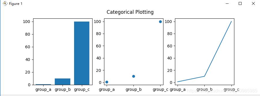
import matplotlib.pyplot as plt

import numpy as np

# 用分类变量绘图
names = ['group_a', 'group_b', 'group_c']
values = [1, 10, 100]

plt.figure(figsize=(9, 3))

plt.subplot(131)
plt.bar(names, values)  # 条形图
plt.subplot(132)
plt.scatter(names, values)  # 散点图
plt.subplot(133)
plt.plot(names, values)  # 折线图
plt.suptitle('Categorical Plotting')
plt.show()

# 控制线条属性:线条有许多可以设置的属性:线宽、虚线样式、抗锯齿等;
lines = plt.plot(10, 20, 30, 100)
# use keyword args
plt.setp(lines, color='r', linewidth=2.0)
# or MATLAB style string value pairs
plt.setp(lines, 'color', 'r', 'linewidth', 2.0)
line, = plt.plot(np.arange(50), np.arange(50) + 10, '-')
plt.show()
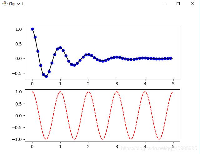
5. 多子表多轴及共享轴
多子表多轴,先用点再用线连接,效果图如下:
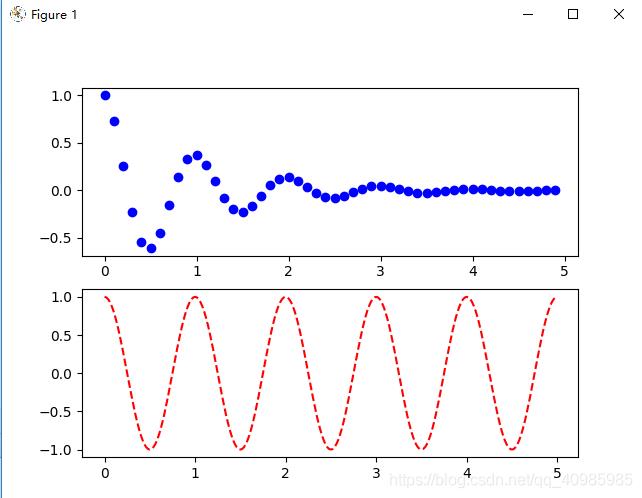
 多子表多轴,绘制点效果图如下:
import matplotlib.pyplot as plt
import numpy as np


# 多表和多轴
def f(t):
    return np.exp(-t) * np.cos(2 * np.pi * t)


t1 = np.arange(0.0, 5.0, 0.1)
t2 = np.arange(0.0, 5.0, 0.02)

plt.figure()
plt.subplot(211)  # 2行1列共俩个子表,中间的2,1,1同211
plt.plot(t1, f(t1), 'bo', t2, f(t2), 'k')  # 绘制蓝色圆圈(t1,f(t1)),然后用黑色线连接值

plt.subplot(212)
plt.plot(t2, np.cos(2 * np.pi * t2), 'r--')
plt.show()

# 图1去掉t2,f(t2)并没有把结果进行连线
plt.figure()
plt.subplot(211)  # 2行1列共俩个子表,中间的2,1,1同211
plt.plot(t1, f(t1), 'bo')

plt.subplot(212)
plt.plot(t2, np.cos(2 * np.pi * t2), 'r--')
plt.show()
多子表共享y轴,效果图如下:
fig, (ax1, ax2) = plt.subplots(2, sharey=True) 共享y轴

# 多子表共享轴
import numpy as np
import matplotlib.pyplot as plt

# 构建绘图数据
x1 = np.linspace(0.0, 5.0)
x2 = np.linspace(0.0, 2.0)
y1 = np.cos(2 * np.pi * x1) * np.exp(-x1)
y2 = np.cos(2 * np.pi * x2)

# 绘制俩个子图,共享y轴
fig, (ax1, ax2) = plt.subplots(2, sharey=True)

ax1.plot(x1, y1, 'ko-')
ax1.set(title='A tale of 2 subplots', ylabel='Damped oscillation')

ax2.plot(x2, y2, 'r.-')
ax2.set(xlabel='time (s)', ylabel='Undamped')

plt.show()
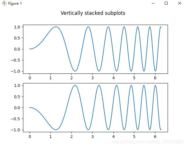
6. 多子表
6.1 多子表垂直堆叠
6.2 多子表水平堆叠
6.3 多子表垂直水平堆叠
隐藏顶部2子图的x标签,和右侧2子图的y标签,效果图如下:
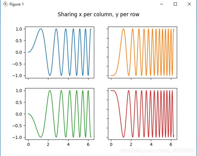
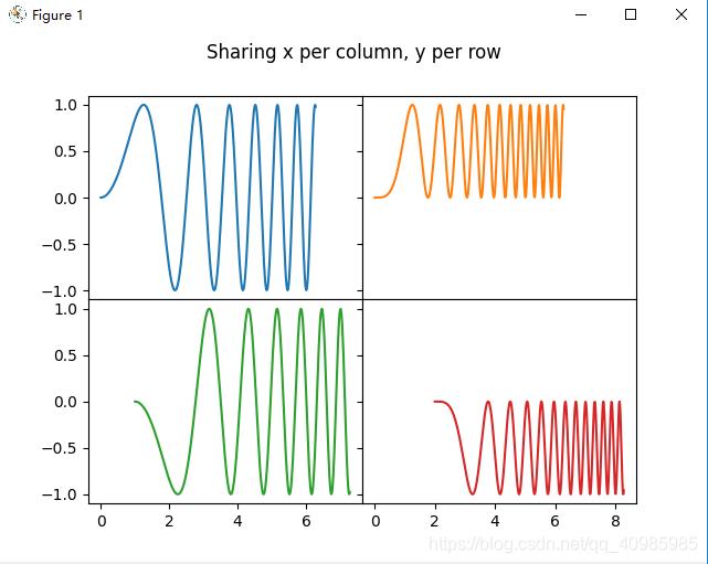
同上图,共享x列,y行的坐标轴~
6.4 多子表共享轴(去除垂直、水平堆叠子表之间宽度和高度之间的缝隙)
共享x轴并对齐,效果图如下:

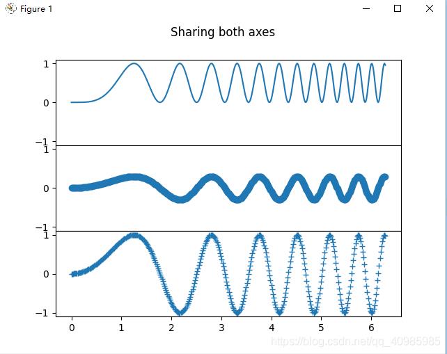
共享x,y轴效果如下图:
共享x,y轴表示共享其值域及刻度;
对于共享轴的子图,一组刻度标签就足够了。内部轴的刻度标签由 sharex 和 sharey 自动删除。子图之间仍然有一个未使用的空白空间;
要精确控制子图的定位,可以使用fig.add_gridspec(hspace=0) 减少垂直子图之间的高度。fig.add_gridspec(wspace=0) 减少水平子图之间的高度。
共享x,y轴,并删除多个子表之间高度的缝隙,效果如下图:
共享x,y轴,并删除多个子表冗余xy标签,及子图之间宽度、高度的缝隙,效果如下图:
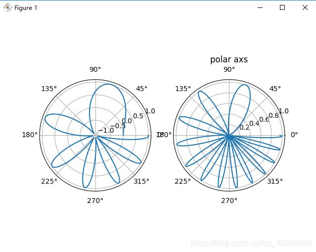
6.5 多子表极坐标风格轴
6.6 多子表源码
# 多子表示例:水平堆叠、垂直堆叠、水平垂直堆叠、水平垂直堆叠共享轴、水平垂直堆叠去掉子图中间的冗余xy标签及间隙;
import matplotlib.pyplot as plt
import numpy as np
# 样例数据
x = np.linspace(0, 2 * np.pi, 400)
y = np.sin(x ** 2)
def single_plot():
fig, ax = plt.subplots()
ax.plot(x, y)
ax.set_title('A single plot')
plt.show()
def stacking_plots_one_direction():
# pyplot.subplots 的前两个可选参数定义子图网格的行数和列数。
# 当仅在一个方向上堆叠时,返回的轴是一个一维 numpy 数组,其中包含创建的轴列表。
fig, axs = plt.subplots(2)
fig.suptitle('Vertically stacked subplots')
axs[0].plot(x, y)
axs[1].plot(x, -y)
plt.show()
# 当只创建几个 Axes,可将它们立即解压缩到每个 Axes 的专用变量会很方便
fig, (ax1, ax2) = plt.subplots(2)
fig.suptitle('Vertically stacked subplots')
ax1.plot(x, y)
ax2.plot(x, -y)
plt.show()
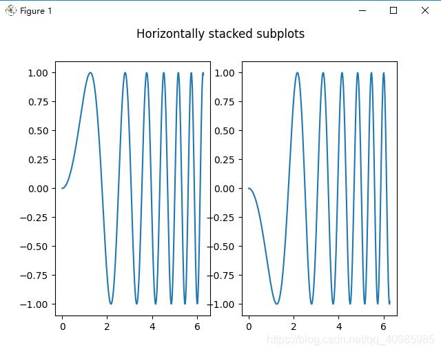
# 水平方向堆叠子图
fig, (ax1, ax2) = plt.subplots(1, 2)
fig.suptitle('Horizontally stacked subplots')
ax1.plot(x, y)
ax2.plot(x, -y)
plt.show()
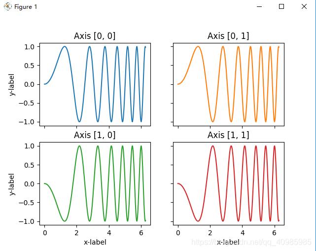
def stacking_plots_two_directions():
# 在两个方向上堆叠子图时,返回的 axs 是一个 2D NumPy 数组。表示俩行俩列的表
fig, axs = plt.subplots(2, 2)
axs[0, 0].plot(x, y)
axs[0, 0].set_title('Axis [0, 0]')
axs[0, 1].plot(x, y, 'tab:orange')
axs[0, 1].set_title('Axis [0, 1]')
axs[1, 0].plot(x, -y, 'tab:green')
axs[1, 0].set_title('Axis [1, 0]')
axs[1, 1].plot(x, -y, 'tab:red')
axs[1, 1].set_title('Axis [1, 1]')
for ax in axs.flat:
ax.set(xlabel='x-label', ylabel='y-label')
# 隐藏顶部2子图的x标签,和右侧2子图的y标签
for ax in axs.flat:
ax.label_outer()
plt.show()
# 也可以在 2D 中使用元组解包将所有子图分配给专用变量
fig, ((ax1, ax2), (ax3, ax4)) = plt.subplots(2, 2)
fig.suptitle('Sharing x per column, y per row')
ax1.plot(x, y)
ax2.plot(x, y ** 2, 'tab:orange')
ax3.plot(x, -y, 'tab:green')
ax4.plot(x, -y ** 2, 'tab:red')
for ax in fig.get_axes():
ax.label_outer()
plt.show()
def sharing_axs():
fig, (ax1, ax2) = plt.subplots(2)
fig.suptitle('Axes values are scaled individually by default')
ax1.plot(x, y)
ax2.plot(x + 1, -y)
plt.show()
# 共享x轴,对齐x轴
fig, (ax1, ax2) = plt.subplots(2, sharex=True)
fig.suptitle('Aligning x-axis using sharex')
ax1.plot(x, y)
ax2.plot(x + 1, -y)
plt.show()
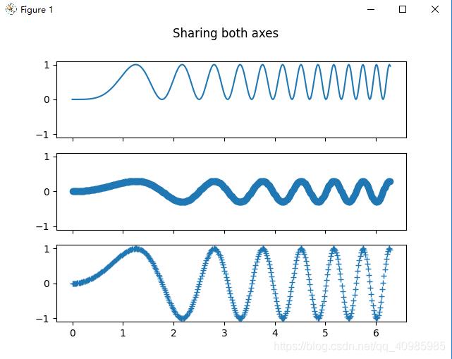
# 共享x,y轴
fig, axs = plt.subplots(3, sharex=True, sharey=True)
fig.suptitle('Sharing both axes')
axs[0].plot(x, y ** 2)
axs[1].plot(x, 0.3 * y, 'o')
axs[2].plot(x, y, '+')
plt.show()
# 对于共享轴的子图,一组刻度标签就足够了。内部轴的刻度标签由 sharex 和 sharey 自动删除。子图之间仍然有一个未使用的空白空间;
# 要精确控制子图的定位,可以使用 Figure.add_gridspec 显式创建一个 GridSpec,然后调用其子图方法。例如可以使用 add_gridspec(hspace=0) 减少垂直子图之间的高度。
fig = plt.figure()
gs = fig.add_gridspec(3, hspace=0)
axs = gs.subplots(sharex=True, sharey=True)
fig.suptitle('Sharing both axes')
axs[0].plot(x, y ** 2)
axs[1].plot(x, 0.3 * y, 'o')
axs[2].plot(x, y, '+')
# 隐藏除了底部x标签及刻度外,其他子图的x标签及刻度
# label_outer 是一种从不在网格边缘的子图中删除标签和刻度的方便方法。
for ax in axs