Css3旋转位移缩放倾斜动画
Posted 月疯
tags:
篇首语:本文由小常识网(cha138.com)小编为大家整理,主要介绍了Css3旋转位移缩放倾斜动画相关的知识,希望对你有一定的参考价值。
rotate:旋转
skew:倾斜
sacle:缩放
translate:位移

<!DOCTYPE html>
<html>
	<head>
		<meta charset="utf-8">
		<title></title>
		<style type="text/css">
			*{
				margin: 0;
				padding: 0;
			}
			section{
				width: 600px;
				height: 300px;
				background: pink;
				margin: 100px auto;
			}
			div{
				width: 100px;
				height: 30px;
				background: blue;
				/* 第一个左右,第二个上下 */
				transform: translate(200px,0);
				transition: 1s;
			}
			section:hover div{
				/* transform: translate(400px,200px); */
				transform: translateY(400px);
				/* transform: translateX(200px); */
			}
		</style>
	</head>
	<body>
		<section>
			<div>

			</div>
		</section>
	</body>
</html>
<!DOCTYPE html>
<html>
<head>
<meta charset="utf-8">
<title></title>
<style type="text/css">
*{
margin: 0;
padding: 0;
}
section{
width: 300px;
height: 300px;
border: 5px solid red;
margin: 100px auto;
overflow: hidden;
}
section img{
width: 100%;
height: 100%;
transition: 1s;
}
section:hover img{
transform: scale(0.8);
}
</style>
</head>
<body>
<section>
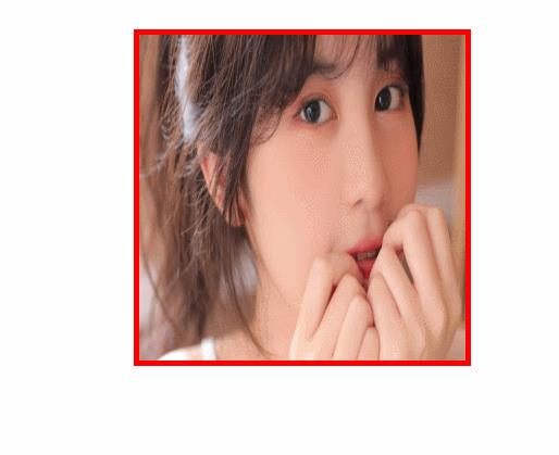
<img src="img/2.jpg" >
</section>
</body>
</html>

<!DOCTYPE html>
<html>
	<head>
		<meta charset="utf-8">
		<title></title>
		<style type="text/css">
			*{
				margin: 0;
				padding: 0;
			}
			section{
				width: 600px;
				height: 300px;
				background: pink;
				margin: 100px auto;
			}
			div{
				width: 100px;
				height: 30px;
				background: blue;
				transition: 1s;
			}
			section:hover div{
				transform: rotate(60deg);
			}
		</style>
	</head>
	<body>
		<section>
			<div>

			</div>
		</section>
	</body>
</html>
<!DOCTYPE html>
<html>
	<head>
		<meta charset="utf-8">
		<title></title>
		<style type="text/css">
			*{
				margin: 0;
				padding: 0;
			}
			section{
				width: 600px;
				height: 300px;
				background: pink;
				margin: 100px auto;
			}
			div{
				width: 100px;
				height: 30px;
				background: blue;
				transition: 1s;
			}
			section:hover div{
				transform: skew(30deg);
			}
		</style>
	</head>
	<body>
		<section>
			<div>

			</div>
		</section>
	</body>
</html>
以上是关于Css3旋转位移缩放倾斜动画的主要内容,如果未能解决你的问题,请参考以下文章