python画统计图
Posted 小肚腩的世界
tags:
篇首语:本文由小常识网(cha138.com)小编为大家整理,主要介绍了python画统计图相关的知识,希望对你有一定的参考价值。
python画统计图
目录
python有一个画图的库matplotlib,非常方便我们日常使用或者写论文做插图等等。我们不需要考虑样式的问题,输入数据就可以轻轻松松把图画出来。你用Excel我也没意见。
matplotlib: Visualization with Python
Matplotlib 是一个综合性的库,用于在 Python 中创建静态、动画和交互式可视化。Matplotlib 使简单的事情变得容易,使困难的事情成为可能。基于matplotlib的基础开发的绘图接口还有seaborn、HoloViews、ggplot,以及一个投影和映射工具包(Cartopy)。
入门
安装
# 第一种
python -m pip install -U pip
python -m pip install -U matplotlib
# 第二种
conda install matplotlib
# linux
sudo apt-get install python3-matplotlib
使用
import matplotlib.pyplot as plt
Matplotlib都是在Figure这个概念上面进行画图,每个Figure都可以包含一个或多个坐标
fig, ax = plt.subplots()  # Create a figure containing a single axes.
ax.plot([1, 2, 3, 4], [1, 4, 2, 3])  # Plot some data on the axes.
图的组成部分

Figure组成:主要刻度、次要刻度、坐标轴、坐标轴标签、刻度标签、标记、网格、图例等等
Figure
在整个图片Figure,包括了子类Axes\\。(不要太担心画布,这是至关重要的,因为它是实际进行绘图以获取绘图的对象,但作为用户,它或多或少对您不可见)。一个数字可以包含任意数量的Axes,但通常至少有一个。
fig = plt.figure()	# an empty figure with no Axes
fig, ax = plt.subplots()	# a figure with a single Axes
fig, axs = plt.subplots(2, 2)	# a figure with a 2x2 grid of Axes
Axes 和 Axis
Axes看成“绘画”区域,包含两个或者三个Axis对象,Axis负责设置图形限制并生成刻度(轴上的标记)和刻度标签(标记刻度的字符串)。
注:还没明白 Artist对象概念的重要性。
输入
所有的输入都期望numpy.array或numpy.ma.masked_array作为输入。
风格:面向对象接口和pyplot接口
显式:
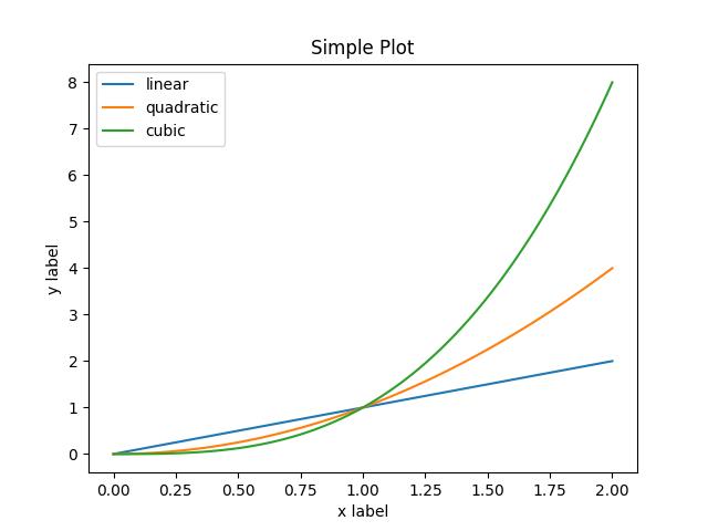
x = np.linspace(0, 2, 100)

# Note that even in the OO-style, we use `.pyplot.figure` to create the figure.
fig, ax = plt.subplots()  # Create a figure and an axes.
ax.plot(x, x, label=\'linear\')  # Plot some data on the axes.
ax.plot(x, x**2, label=\'quadratic\')  # Plot more data on the axes...
ax.plot(x, x**3, label=\'cubic\')  # ... and some more.
ax.set_xlabel(\'x label\')  # Add an x-label to the axes.
ax.set_ylabel(\'y label\')  # Add a y-label to the axes.
ax.set_title("Simple Plot")  # Add a title to the axes.
ax.legend()  # Add a legend.
隐式:
x = np.linspace(0, 2, 100)

plt.plot(x, x, label=\'linear\')  # Plot some data on the (implicit) axes.
plt.plot(x, x**2, label=\'quadratic\')  # etc.
plt.plot(x, x**3, label=\'cubic\')
plt.xlabel(\'x label\')
plt.ylabel(\'y label\')
plt.title("Simple Plot")
plt.legend()
示例
| 方法 | 作用 |
|---|---|
| plot() | 线图 |
| subplot() | 创建多个图即多个子图 |
| imshow() | 显示图像 |
| pcolormesh() | 可以对二维数组进行彩色表示,即使水平维度的间距不均匀。contour()函数是表示相同数据的另一种方式: |
| hist() | 直方图 |
matplotlib.path模块 |
添加任意路径 |
| mplot3d 工具包 | 三维绘图 |
| streamplot() | 矢量场的流线图 |
| bar() | 条形图 |
| pie() | 饼图 |
| table() | 表,未知 |
| scatter() | 散点图 |
| 子图设计 |
以上是关于python画统计图的主要内容,如果未能解决你的问题,请参考以下文章