利用echarts创建有质感的立体大数据统计柱状图
Posted 前端分享交流
tags:
篇首语:本文由小常识网(cha138.com)小编为大家整理,主要介绍了利用echarts创建有质感的立体大数据统计柱状图相关的知识,希望对你有一定的参考价值。
首先要使用echarts需要引入百度最新的JS库,echarts.js
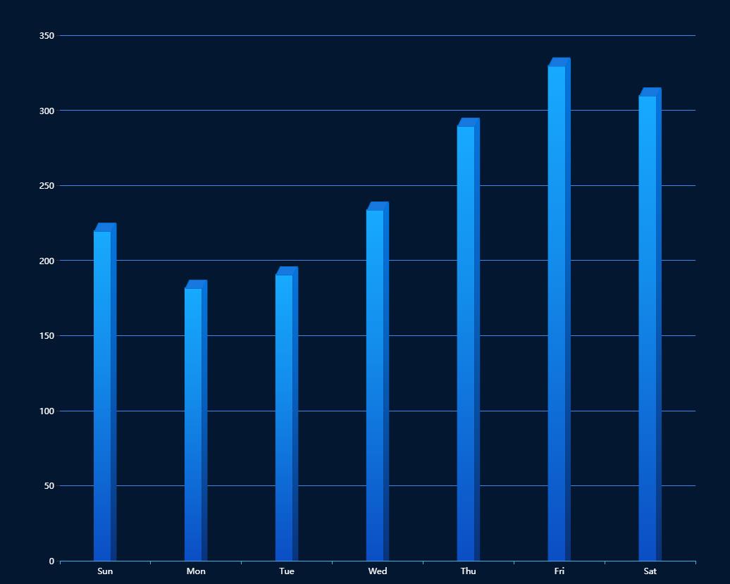
立体柱状图效果
实例分享
const data = [220, 182, 191, 234, 290, 330, 310]
const sideData = data.map(item => item + 4.5)

option = {

    backgroundColor: "#041730",
    tooltip: {
        trigger: \'axis\',
        formatter: "{b} : {c}",
        axisPointer: { // 坐标轴指示器,坐标轴触发有效
            type: \'shadow\' // 默认为直线,可选为:\'line\' | \'shadow\'
        }
    },
    xAxis: {
        data: [\'Sun\', \'Mon\', \'Tue\', \'Wed\', \'Thu\', \'Fri\', \'Sat\'],
        //坐标轴
        axisLine: {
            lineStyle: {
                color: \'#3eb2e8\'
            }
        },
        //坐标值标注
        axisLabel: {
            show: true,
            textStyle: {
                color: \'#fff\',
            }
        }
    },
    yAxis: {
        //坐标轴
        axisLine: {
            show: false
        },
        //坐标值标注
        axisLabel: {
            show: true,
            textStyle: {
                color: \'#fff\',
            }
        },
        //分格线
        splitLine: {
            lineStyle: {
                color: \'#4784e8\'
            }
        }
    },
    series: [{
        name: \'a\',
        tooltip: {
            show: false
        },
        type: \'bar\',
        barWidth: 24.5,
        itemStyle: {
            normal: {
                color: new echarts.graphic.LinearGradient(0, 1, 0, 0, [{
                    offset: 0,
                    color: "#0B4EC3" // 0% 处的颜色
                }, {
                    offset: 0.6,
                    color: "#138CEB" // 60% 处的颜色
                }, {
                    offset: 1,
                    color: "#17AAFE" // 100% 处的颜色
                }], false)
            }
        },
        data: data,
        barGap: 0
    }, {
        type: \'bar\',
        barWidth: 8,
        itemStyle: {
            normal: {
                color: new echarts.graphic.LinearGradient(0, 1, 0, 0, [{
                    offset: 0,
                    color: "#09337C" // 0% 处的颜色
                }, {
                    offset: 0.6,
                    color: "#0761C0" // 60% 处的颜色
                }, {
                    offset: 1,
                    color: "#0575DE" // 100% 处的颜色
                }], false)
            }
        },
        barGap: 0,
        data: sideData
    }, {
        name: \'b\',
        tooltip: {
            show: false
        },
        type: \'pictorialBar\',
        itemStyle: {
            borderWidth: 1,
            borderColor: \'#0571D5\',
            color: \'#1779E0\'
        },
        symbol: \'path://M 0,0 l 120,0 l -30,60 l -120,0 z\',
        symbolSize: [\'30\', \'12\'],
        symbolOffset: [\'0\', \'-11\'],
        //symbolRotate: -5,
        symbolPosition: \'end\',
        data: data,
        z: 3
    }]
};
以上是关于利用echarts创建有质感的立体大数据统计柱状图的主要内容,如果未能解决你的问题,请参考以下文章