小白R语言数据可视化进阶练习一
Posted R语言中文社区
tags:
篇首语:本文由小常识网(cha138.com)小编为大家整理,主要介绍了小白R语言数据可视化进阶练习一相关的知识,希望对你有一定的参考价值。
知乎ID:
https://zhuanlan.zhihu.com/c_135409797
00
布局参数
先介绍一个布局参数:
#par(mfrow=c(a,b)) #表示在PLOTS区域显示a行b列张图 par(mfrow=c(3,1)) x <- rnorm(100) y <- rnorm(100) plot(x, y, xlim=c(-5,5), ylim=c(-5,5)) boxplot(x, y, xlim=c(-5,5), ylim=c(-5,5)) hist(x)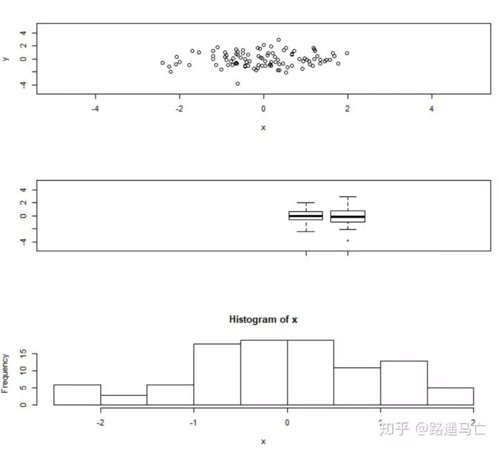
01
VIOLIN PLOT(小提琴图)
下面进入正题,第一个要讲解的是VIOLIN PLOT,中文名为小提琴图。
它用于可视化数值型变量,与箱线图十分类似,但加入了密度分布这个属性,更能够显示数据的数据的数字特征。
# Library library(ggplot2) # mtcars data head(mtcars) # First type of color ggplot(mtcars, aes(factor(cyl), mpg)) + geom_violin(aes(fill = cyl)) # Second type ggplot(mtcars, aes(factor(cyl), mpg)) + geom_violin(aes(fill = factor(cyl)))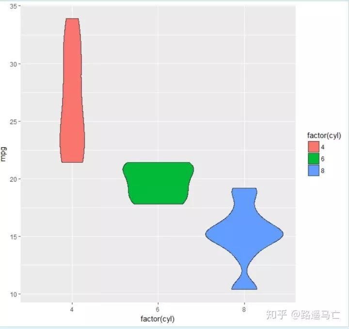
02
DENSITY PLOT(核密度图)
第二个分享的是DENSITY PLOT,中文名为核密度图,与直方图类似,但是可以在图中反映多组数据的分布情况:
# For the weatherAUS dataset. library(rattle) # To generate a density plot. library(ggplot2) , cities <- c("Canberra", "Darwin", "Melbourne", "Sydney") ds <- subset(weatherAUS, Location %in% cities & ! is.na(Temp3pm)) #subset函数和select函数类似,%in%表示是否包含 p <- ggplot(ds, aes(Temp3pm, colour=Location, fill=Location)) #color表示线的颜色,fill表示区域填充色,可以用具体的颜色参数,也可以用x变量,让系统自动生成颜色 p <- p + geom_density(alpha=0.55) #alpha表示透明度 p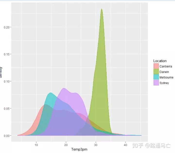
# plot 1: Density of price for each type of cut of the diamond: ggplot(data=diamonds,aes(x=price, group=cut, fill=cut)) + geom_density(adjust=1.5) #adjust起到了调节曲线拟合程度的一个作用,默认参数为1 # plot 2: 归一化后的叠加图: ggplot(data=diamonds,aes(x=price, group=cut, fill=cut)) + geom_density(adjust=1.5, position="fill")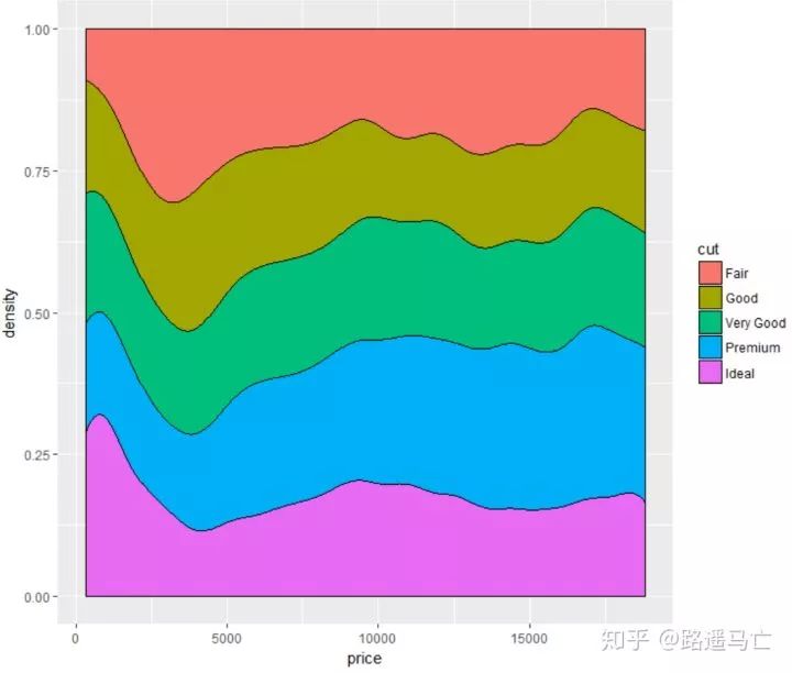
# plot 3 ggplot(diamonds, aes(x=depth, y=..density..)) + geom_density(aes(fill=cut), position="stack") + xlim(50,75) + theme(legend.position="none")#去掉图例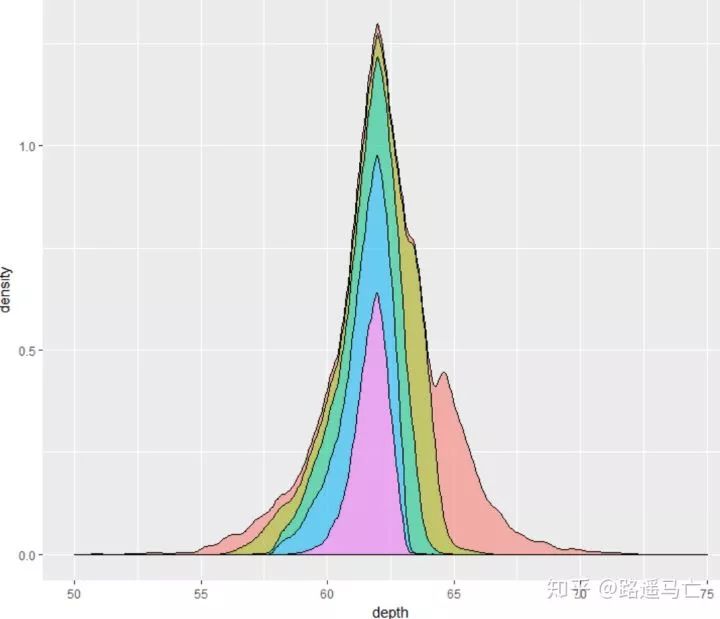
03
geom_boxplot()
第三个跟大家分享的是箱线图,geom_boxplot(),可以清晰地表现数据的极大值和极小值以及中位数:
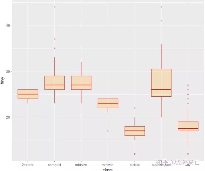
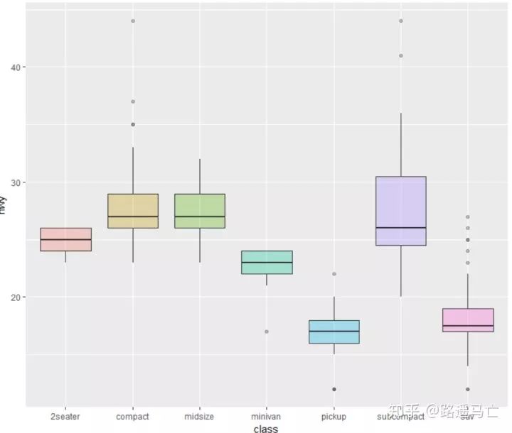
library(ggplot2) head(mtcars) # A really basic boxplot. ggplot(mtcars, aes(x=as.factor(cyl), y=mpg)) + geom_boxplot(fill="slateblue", alpha=0.2) + xlab("cyl")+ ylab("mpg") # Set a unique color with fill, colour, and alpha ggplot(mpg, aes(x=class, y=hwy)) + geom_boxplot(color="red", fill="orange", alpha=0.2) # Set a different color for each group ggplot(mpg, aes(x=class, y=hwy, fill=class)) + geom_boxplot(alpha=0.3) + theme(legend.position="none")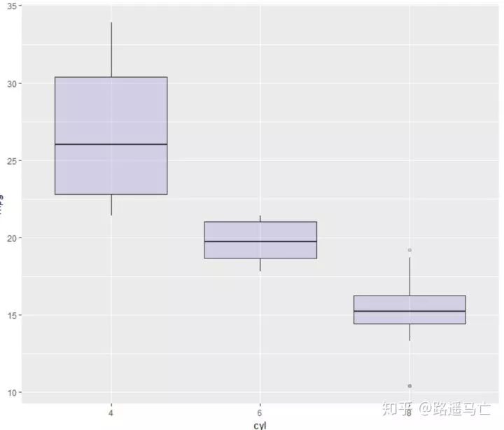
#配合scale_fill_brewer()使用,方便调颜色 library(RColorBrewer) display.brewer.all()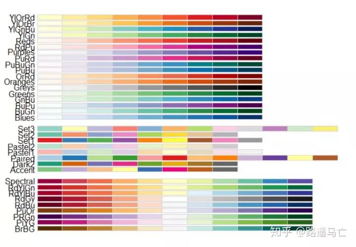
ggplot(mpg, aes(x=class, y=hwy, fill=class)) + geom_boxplot(alpha=0.3) + theme(legend.position="none") + scale_fill_brewer(palette="BuPu")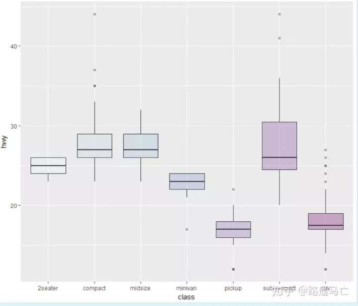
ggplot(mpg, aes(x=class, y=hwy, fill=class)) + geom_boxplot(alpha=0.3) + theme(legend.position="none") + scale_fill_brewer(palette="Dark2")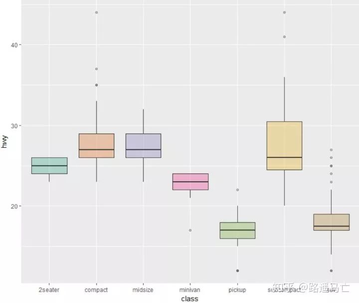
如果你想单独强调某一组数据或者某几组数据:
# Create a new column, telling if you want to highlight or not mpg$type=factor(ifelse(mpg$class=="subcompact","Highlighted","Normal")) # control appearance of groups 1 and 2 ggplot(mpg, aes(x=factor(class), y=hwy, fill=type, alpha=type)) + geom_boxplot() + #手动设置透明度,取决于你赋值给fill的变量个数 scale_alpha_manual(values=c(0.1,1)) + #手动设置颜色,取决与你赋值给fill的变量个数 scale_fill_manual(values=c("forestgreen","red"))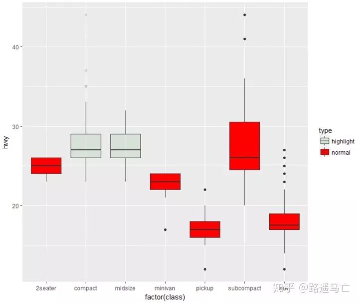
有时候我们也需要通过调整一些参数,使一些极端值更加清晰地展现出来:
ggplot(mpg, aes(x=class, y=hwy)) + geom_boxplot( # custom boxes color="blue", fill="blue", alpha=0.2, # Notch? notch=TRUE, notchwidth = 0.8, # custom outliers outlier.colour="red", outlier.fill="red", outlier.size=3 )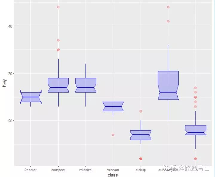
04
构造词云
第四个分享的是如何用R语言构造词云:
library(wordcloud2) wordcloud2(demoFreq,size=0.8,color=rep_len(c("blue","yellow"),nrow(demoFreq)),backgroundColor = "pink",shape="star")
词的角度也可以更改:
#minRontatin与maxRontatin:字体旋转角度范围的最小值以及最大值,选定后,字体会在该范围内随机旋转; #rotationRation:字体旋转比例,如设定为1,则全部词语都会发生旋转; wordcloud2(demoFreq,size=0.8,color=rep_len(c("blue","yellow"),nrow(demoFreq)),backgroundColor = "pink",minRotation = -pi/6, maxRotation = -pi/6, = 1) 以上只是简单的讲解下词云构造,关于更详细的可以看这篇:
05
直方图
第五个讲讲直方图的画法,只需要输入一个数值型变量:
library(ggplot2) data<-data.frame(rnorm(1000)) ggplot(data,aes(data))+ geom_histogram(aes(fill=..count..),binwidth = 0.1) #..count..表示根据计数表示颜色变化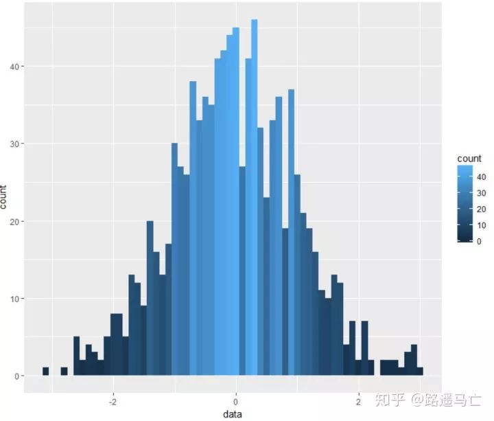
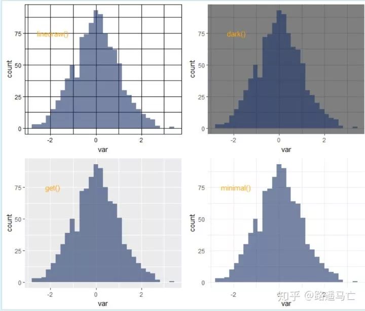
我们也可以自己设置不同的主题的背景:
# library library(ggplot2) # create data set.seed(123) var=rnorm(1000) # Without theme plot1 <- qplot(var , fill=I(rgb(0.1,0.2,0.4,0.6)) ) # With themes plot2 = plot1+theme_bw()+annotate("text", x = -1.9, y = 75, label = "bw()" , col="orange" , size=4) plot3 = plot1+theme_classic()+annotate("text", x = -1.9, y = 75, label = "classic()" , col="orange" , size=4) plot4 = plot1+theme_gray()+annotate("text", x = -1.9, y = 75, label = "gray()" , col="orange" , size=4) plot5 = plot1+theme_linedraw()+annotate("text", x = -1.9, y = 75, label = "linedraw()" , col="orange" , size=4) plot6 = plot1+theme_dark()+annotate("text", x = -1.9, y = 75, label = "dark()" , col="orange" , size=4) plot7 = plot1+theme_get()+annotate("text", x = -1.9, y = 75, label = "get()" , col="orange" , size=4) plot8 = plot1+theme_minimal()+annotate("text", x = -1.9, y = 75, label = "minimal()" , col="orange" , size=4) #annotate 做注释作用 # Arrange and display the plots into a 2x1 grid grid.arrange(plot1,plot2,plot3,plot4, ncol=2) grid.arrange(plot5,plot6,plot7,plot8, ncol=2)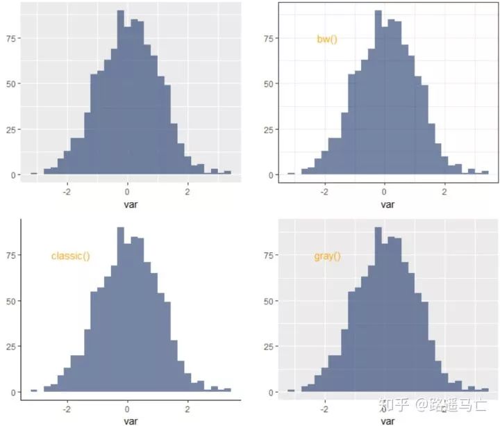
06
散点图
第六个讲讲一个非常简单实用的图——散点图。
先看看最简单的,不加任何修饰的画法:
# library library(ggplot2) # The iris dataset is proposed by R head(iris) # basic scatterplot ggplot(iris, aes(x=Sepal.Length, y=Sepal.Width)) + geom_point()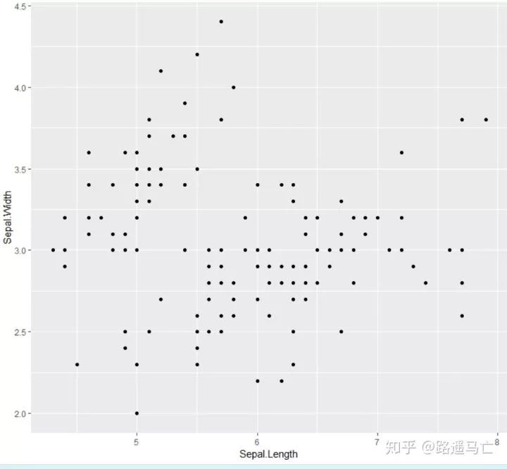
# use options! #注意stroke表示散点外线的粗细 ggplot(iris, aes(x=Sepal.Length, y=Sepal.Width)) + geom_point( color="red", fill="blue", shape=21, alpha=0.5, size=6, stroke = 2 )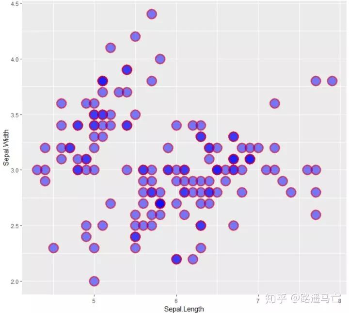
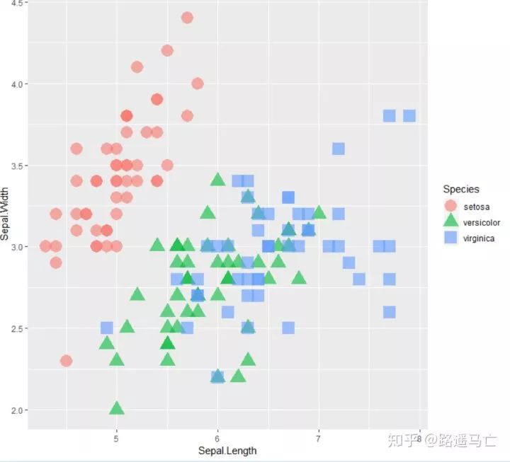
#用shape和fill参数,把不同类别的length和width区分开来。 ggplot(iris, aes(x=Sepal.Length, y=Sepal.Width, color=Species, shape=Species)) + geom_point(size=6, alpha=0.6)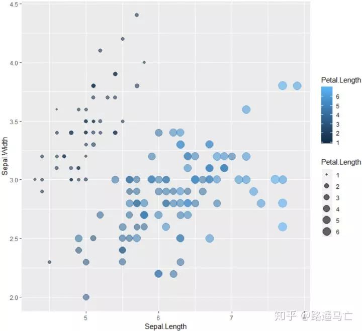
#此处并不能理解为什么color又负责填充色了,fill加了之后反而没有用。先死记吧。 ggplot(iris, aes(x=Sepal.Length, y=Sepal.Width, color=Petal.Length, size=Petal.Length)) + geom_point(alpha=0.6)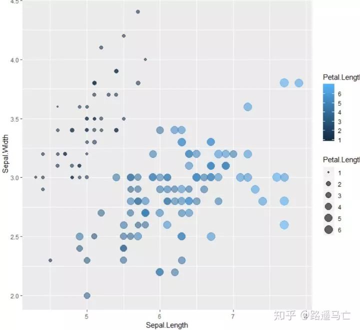
也可以通过一些函数给散点添加标签:
data=head(mtcars, 30) #nudge_x,nudge_y分别表示标签距离散点距离,check_overlap表示标签出现覆盖,是否去掉被覆盖的那个标签。 # 1/ add text with geom_text, use nudge to nudge the text ggplot(data, aes(x=wt, y=mpg)) + geom_point() + geom_text(label=rownames(data), nudge_x = 0.25, nudge_y = 0.25, check_overlap = T)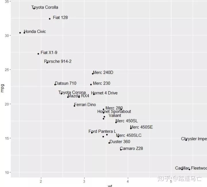
ggplot(data, aes(x=wt, y=mpg)) + geom_point() + geom_label(label=rownames(data), nudge_x = 0.25, nudge_y = 0.2) # 3/ custom geom_label like any other geom. ggplot(data, aes(x=wt, y=mpg, fill=cyl)) + geom_label(label=rownames(data),color="white", size=5)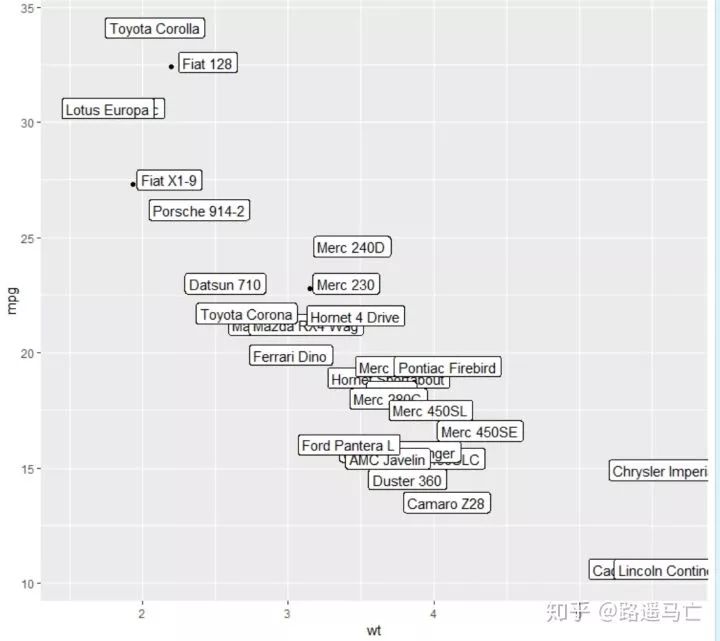
散点图是两个变量的值沿着两个轴绘制的图,所得到的点的模式揭示了存在的任何相关性。你可以很容易地在X轴和Y轴上添加rug,来说明点的分布:
ggplot(data=iris, aes(x=Sepal.Length, Petal.Length)) + geom_point() + geom_rug(col="skyblue",alpha=0.1, size=1.5)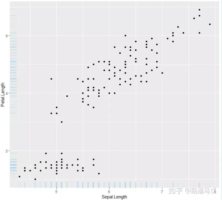
当然,也可以通过增加折线图,直方图,箱线图来表示数据分布情况:
# library library(ggplot2) library(ggExtra) library(gridExtra) # The mtcars dataset is proposed in R head(mtcars) # classic plot : p=ggplot(mtcars, aes(x=wt, y=mpg, color=cyl, size=cyl)) + geom_point() + theme(legend.position="none") # with marginal histogram a=ggMarginal(p, type="histogram") # marginal density b=ggMarginal(p, type="density") # marginal boxplot c=ggMarginal(p, type="boxplot") grid.arrange(p,a,b,c,ncol=2)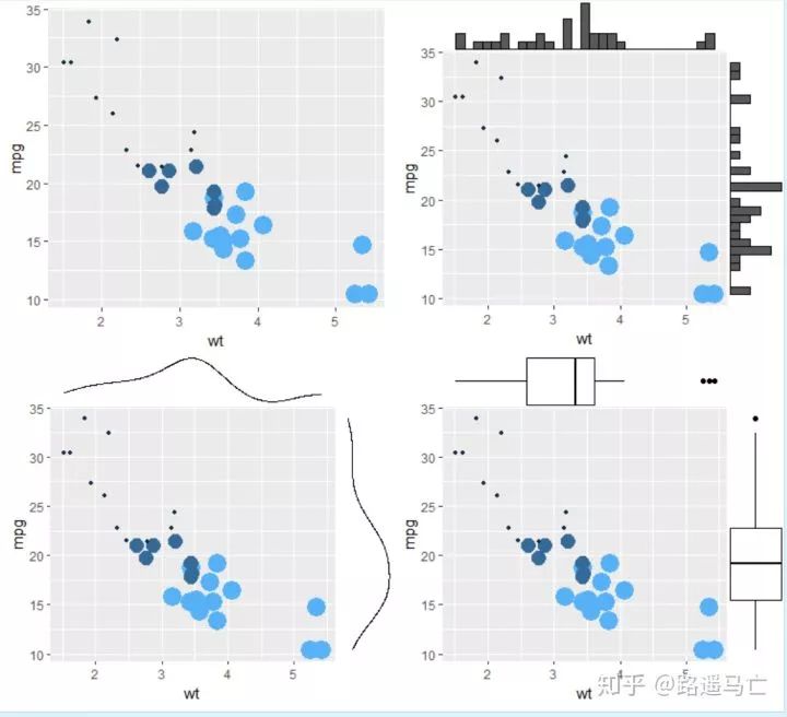
最后讲讲线性拟合:
library(ggployt2) data<-data.frame(rep(c("a","b"),50),my_x=1:100+rnorm(100,sd=9),my_y=1:100+rnorm(100,sd=16)) ggplot(data,aes(my_x,my_y)+geom(shape=1) ggplot(data,aes(my_x,my_y)+geom(shape=1)+geom_smooth(method=lm,color="red",se=T)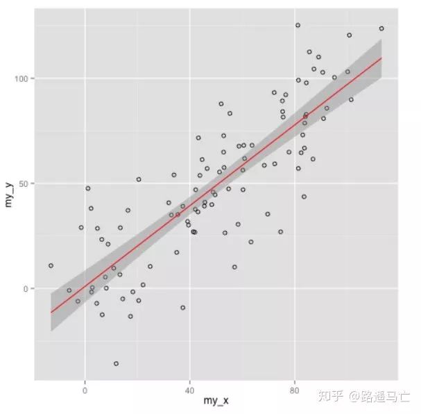
07
热力图
最后分享一下热力图的画法:
# Lattice package require(lattice) #The lattice package provides a dataset named volcano. It's a square matrix looking like that : head(volcano) # The use of levelplot is really easy then : levelplot(volcano) #注意输入数据为矩阵,行列表示坐标,数值表示显色深浅。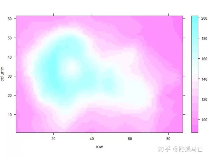
## Example data x <- seq(1,10, length.out=20) y <- seq(1,10, length.out=20) data <- expand.grid(X=x, Y=y)#expnad.grid 用于生成表格式的数据框,对应每个y,都会把所有的x都重复一遍 data$Z <- runif(400, 0, 5) # Levelplot with ggplot2 library(ggplot2) ggplot(data, aes(X, Y, z= Z)) + geom_tile(aes(fill = Z)) + theme_bw() # To change the color of the gradation : ggplot(data, aes(X, Y, z= Z)) + geom_tile(aes(fill = Z)) + theme_bw() + scale_fill_gradient(low="white", high="red") #自定义颜色深浅的种类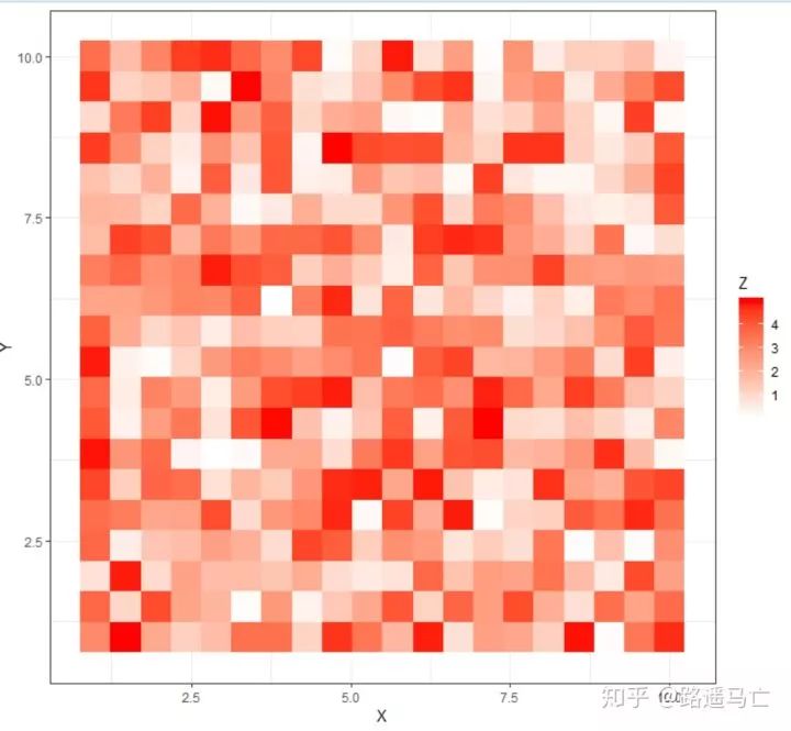
- END -
小编语:
本篇是根据作者在知乎分享的R语言数据可视化周计划的内容整理而来。最后祝大家圣诞节快乐!

回复 爬虫 爬虫三大案例实战
回复 Python 1小时破冰入门回复 数据挖掘 R语言入门及数据挖掘
回复 人工智能 三个月入门人工智能
回复 数据分析师 数据分析师成长之路
回复 机器学习 机器学习的商业应用
回复 数据科学 数据科学实战
回复 常用算法 常用数据挖掘算法
以上是关于小白R语言数据可视化进阶练习一的主要内容,如果未能解决你的问题,请参考以下文章