R语言基本功:绘制带边际图的散点图
Posted 刘老师医学统计
tags:
篇首语:本文由小常识网(cha138.com)小编为大家整理,主要介绍了R语言基本功:绘制带边际图的散点图相关的知识,希望对你有一定的参考价值。
这张图可以使用ggpubr包的ggscatterhist()函数绘制。
目 录
1. 加载数据集
2. 绘制图形
2.1 绘制简单图形
2.2 边际图为直方图
2.3 添加参考线
2.4 添加回归线
2.5 向模型添加系数
3. 复杂边际图
4. ggscatterhist()函数
1. 加载数据集
首先安装需要的包和加载数据集。
install.packages("ggpubr") # 安装包library(ggpubr) # 加载包data(iris) # 加载数据集View(iris) # 预览数据集
2. 绘制图形
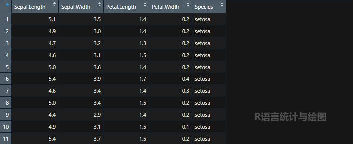
2.1 绘制简单图形
带边际密度图的散点图。
plots <- ggscatterhist(iris, x = "Sepal.Length", y = "Sepal.Width", color = "#00AFBB", margin.params = list(fill = "#00AFBB"))
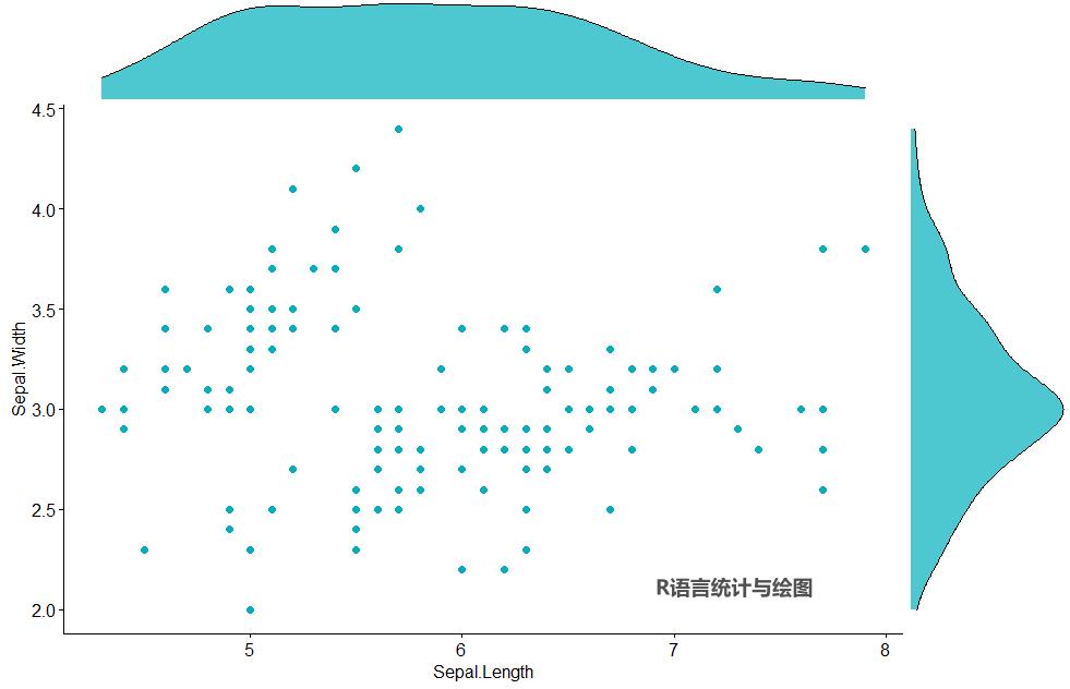
2.2 边际图为直方图
将边际图修改为直方图。
plots <- ggscatterhist(iris, x = "Sepal.Length", y = "Sepal.Width", color = "#00AFBB", margin.plot = "histogram", margin.params = list(fill = "#00AFBB"))

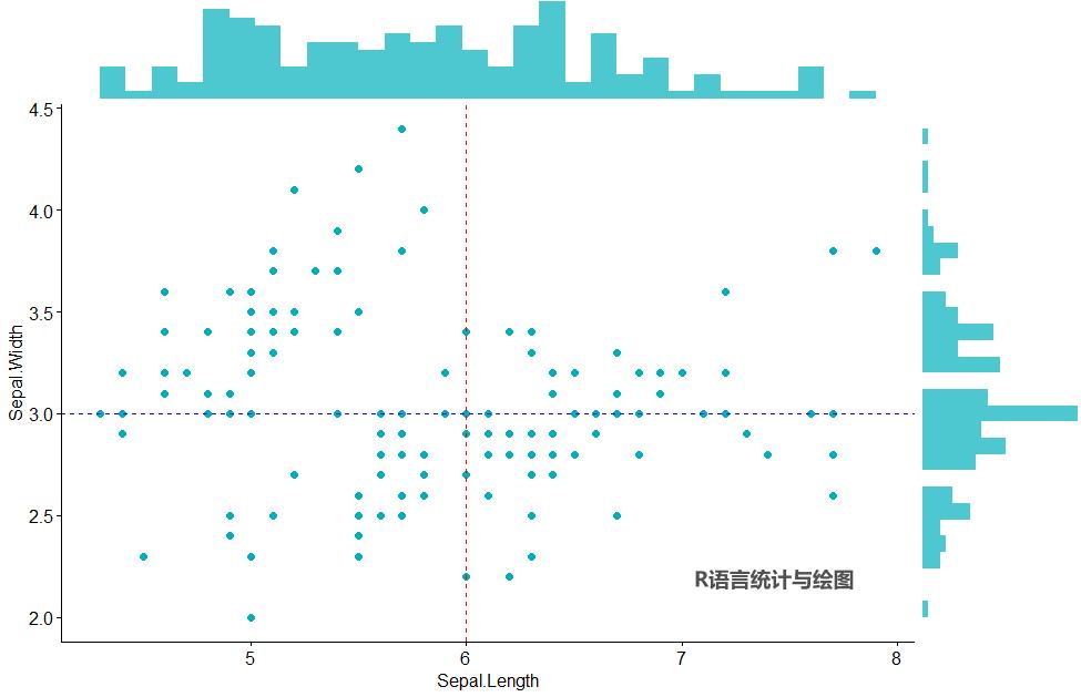
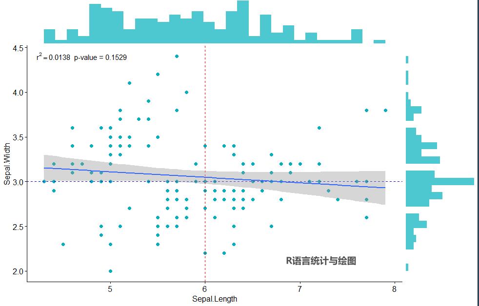
2.3 添加参考线
plots$sp <- plots$sp + # sp为散点图主图 geom_hline(yintercept = 3, linetype = "dashed", color = "blue") + geom_vline(xintercept = 6, linetype = "dashed", color = "red")plots
2.4 添加回归线
运行stat_smooth() 函数并设定method=lm即可向散点图中添加线性回归拟合线,调用lm()函数对数据拟合线性模型。
plots$sp <- plots$sp + stat_smooth(method=lm)plots
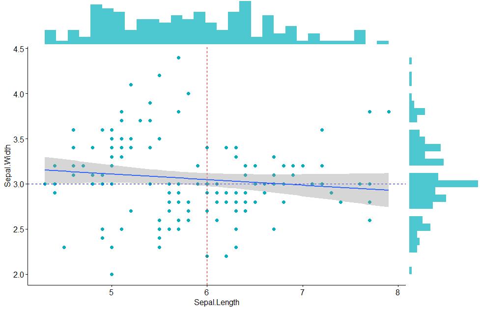
默认情况下,stat_smooth()函数会为回归拟合线添加95%的置信域,置信域对应的置信水平可通过设置level参数来进行调整。设定参数se=FALSE时,系统将不会对回归拟合线添加置信域。
2.5 向模型添加系数
先建立线性模型,计算出模型系数,再把系数以文本形式添加到图形中。
model <- lm(Sepal.Length ~ Sepal.Width, iris)summary(model)
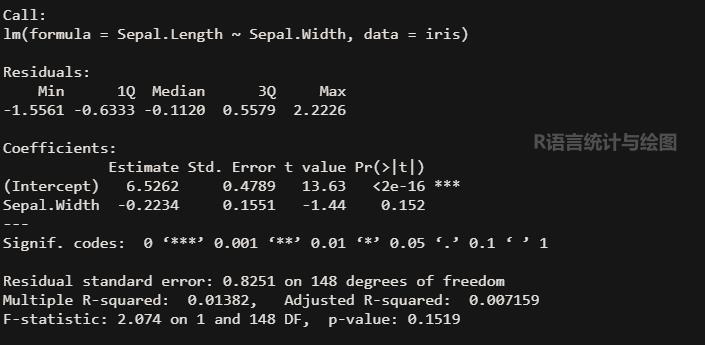
上面的结果表明模型的r2值是0.0138,p-value为0.1519。
调用annotate()函数向其手动添加文本。
plots$sp <- plots$sp + annotate("text", x=4.7, y=4.4, parse=TRUE, label="r^2 == 0.0138 * ' p-value = 0.1529'")plots
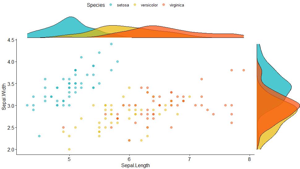
3. 复杂边际图
ggscatterhist( iris, x = "Sepal.Length", y = "Sepal.Width", color = "Species", size = 2.5, alpha = 0.5, palette = c("#00AFBB", "#E7B800", "#FC4E07"), margin.params = list(fill = "Species", color = "black", size = 0.2))
ggscatterhist( iris, x = "Sepal.Length", y = "Sepal.Width", color = "Species", size = 3, alpha = 0.6, palette = c("#00AFBB", "#E7B800", "#FC4E07"), margin.plot = "histogram", ggtheme = theme_bw())
4. ggscatterhist()函数
ggscatterhist(data, x, y, group = NULL, color = "black", fill = NA, palette = NULL, shape = 19, size = 2, linetype = "solid", bins = 30, margin.plot = c("density", "histogram", "boxplot"), margin.params = list(), margin.ggtheme = theme_void(), margin.space = FALSE, main.plot.size = 2, margin.plot.size = 1, title = NULL, xlab = NULL, ylab = NULL, legend = "top", ggtheme = theme_pubr(), print = TRUE, ...)
data x, y group color、fill palette shape size linetype bins margin.plot margin.params margin.ggtheme margin.space main.plot.size margin.plot.size title xlab、ylab legend ggtheme print
参考资料
-
R数据可视化手册; -
ggscatterhist()函数帮助文件。
热烈欢迎读者朋友们转发、点赞、点在看~~~
以上是关于R语言基本功:绘制带边际图的散点图的主要内容,如果未能解决你的问题,请参考以下文章