巧用 CSS 实现酷炫的充电动画
Posted 前端开发
tags:
篇首语:本文由小常识网(cha138.com)小编为大家整理,主要介绍了巧用 CSS 实现酷炫的充电动画相关的知识,希望对你有一定的参考价值。
来自:掘金,作者:chokcoco 链接:https://juejin.im/post/5e00240ee51d45583c1cc9a7
画个电池
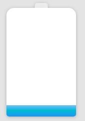
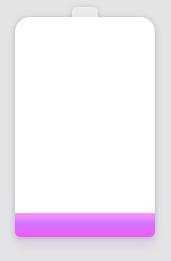
增加阴影及颜色的变化
知识点
    <divclass="container">


    <divclass="battery"></div>


    </div>
    html,


    body {


     width: 100%;


     height: 100%;


     display: flex;


     background: #e4e4e4;


    }


    .container {


     position: relative;


     width: 140px;


     margin: auto;


    }


    .battery {


     height: 220px;


     box-sizing: border-box;


     border-radius: 15px15px5px5px;


     filter: drop-shadow(01px3px rgba(0,0,0,0.22));


     background: #fff;


     z-index: 1;


    &::before {


     content: "";


     position: absolute;


     width: 26px;


     height: 10px;


     left: 50%;


     top: 0;


     transform: translate(-50%, -10px);


     border-radius: 5px5px00;


     background: rgba(240, 240, 240, .88);


    }


    &::after {


     content: "";


     position: absolute;


     left: 0;


     right: 0;


     bottom: 0;


     top: 90%;


     background: linear-gradient(to bottom, #7abcff 0%, #00BCD4 44%, #2196F3 100%);


     border-radius: 0px0px5px5px;


     box-shadow: 014px28px rgba(33, 150, 243, 0), 010px10px rgba(9, 188, 215, 0.08);


     animation: charging 6s linear infinite;


     filter: hue-rotate(90deg);


    }


    }


    @keyframes charging {


    50% {


     box-shadow: 014px28px rgba(0, 150, 136, 0.83), 0px4px10px rgba(9, 188, 215, 0.4);


    }


    95% {


     top: 5%;


     filter: hue-rotate(0deg);


     border-radius: 005px5px;


     box-shadow: 014px28px rgba(4, 188, 213, .2), 010px10px rgba(9, 188, 215, 0.08);


    }


    100% {


     top: 0%;


     filter: hue-rotate(0deg);


     border-radius: 15px15px5px5px;


     box-shadow: 014px28px rgba(4, 188, 213, 0), 010px10px rgba(9, 188, 215, 0.4);


    }


    }
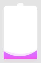
添加波浪
知识点
    <divclass="container">


    <divclass="header"></div>


    <divclass="battery">


    </div>


    <divclass="battery-copy">


    <divclass="g-wave"></div>


    <divclass="g-wave"></div>


    <divclass="g-wave"></div>


    </div>


    </div>
    html,


    body {


     width: 100%;


     height: 100%;


     display: flex;


     background: #e4e4e4;


    }


    .container {


     position: relative;


     width: 140px;


     margin: auto;


    }


    .header {


     position: absolute;


     width: 26px;


     height: 10px;


     left: 50%;


     top: 0;


     transform: translate(-50%, -10px);


     border-radius: 5px5px00;


     background: rgba(255, 255, 255, .88);


    }


    .battery-copy {


     position: absolute;


     top: 0;


     left: 0;


     height: 220px;


     width: 140px;


     border-radius: 15px15px5px5px;


     overflow: hidden;


    }


    .battery {


     position: relative;


     height: 220px;


     box-sizing: border-box;


     border-radius: 15px15px5px5px;


     box-shadow: 005px2px rgba(255, 255, 255, 0.22);


     background: #fff;


     z-index: 1;


    &::after {


     content: "";


     position: absolute;


     left: 0;


     right: 0;


     bottom: 0;


     top: 80%;


     background: linear-gradient(to bottom, #7abcff 0%, #00BCD4 44%, #2196F3 100%);


     border-radius: 0px0px5px5px;


     box-shadow: 014px28px rgba(33, 150, 243, 0), 010px10px rgba(9, 188, 215, 0.08);


     animation: charging 10s linear infinite;


     filter: hue-rotate(90deg);


    }


    }


    .g-wave {


     position: absolute;


     width: 300px;


     height: 300px;


     background: rgba(255, 255, 255, .8);


     border-radius: 45% 47% 44% 42%;


     bottom: 25px;


     left: 50%;


     transform: translate(-50%, 0);


     z-index: 1;


     animation: move 10s linear infinite;


    }


    .g-wave:nth-child(2) {


     border-radius: 38% 46% 43% 47%;


     transform: translate(-50%, 0) rotate(-135deg);


    }


    .g-wave:nth-child(3) {


     border-radius: 42% 46% 37% 40%;


     transform: translate(-50%, 0) rotate(135deg);


    }


    @keyframes charging {


    50% {


     box-shadow: 014px28px rgba(0, 150, 136, 0.83), 0px4px10px rgba(9, 188, 215, 0.4);


    }


    95% {


     top: 5%;


     filter: hue-rotate(0deg);


     border-radius: 005px5px;


     box-shadow: 014px28px rgba(4, 188, 213, .2), 010px10px rgba(9, 188, 215, 0.08);


    }


    100% {


     top: 0%;


     filter: hue-rotate(0deg);


     border-radius: 15px15px5px5px;


     box-shadow: 014px28px rgba(4, 188, 213, 0), 010px10px rgba(9, 188, 215, 0.4);


    }


    }


    @keyframes move {


    100% {


     transform: translate(-50%, -160px) rotate(720deg);


    }


    }
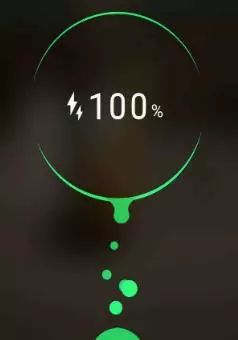
使用强大的 CSS 滤镜实现安卓充电动画效果
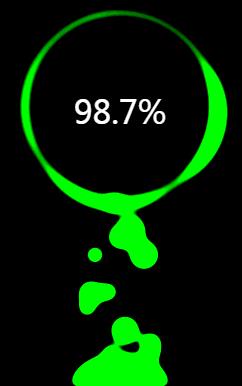
    <divclass="g-container">


    <divclass="g-number">98.7%</div>


    <divclass="g-contrast">


    <divclass="g-circle"></div>


    <ulclass="g-bubbles">


    <li></li>


    <li></li>


    <li></li>


    <li></li>


    <li></li>


    <li></li>


    <li></li>


    <li></li>


    <li></li>


    <li></li>


    <li></li>


    <li></li>


    <li></li>


    <li></li>


    <li></li>


    </ul>


    </div>


    </div>
    html,


    body {


     width: 100%;


     height: 100%;


     display: flex;


     background: #000;


     overflow: hidden;


    }


    .g-number {


     position: absolute;


     width: 300px;


     top: 27%;


     text-align: center;


     font-size: 32px;


     z-index: 10;


     color: #fff;


    }


    .g-container {


     position: relative;


     width: 300px;


     height: 400px;


     margin: auto;


    }


    .g-contrast {


     filter: contrast(15) hue-rotate(0);


     width: 300px;


     height: 400px;


     background-color: #000;


     overflow: hidden;


     animation: hueRotate 10s infinite linear;


    }


    .g-circle {


     position: relative;


     width: 300px;


     height: 300px;


     box-sizing: border-box;


     filter: blur(8px);


    &::after {


     content: "";


     position: absolute;


     top: 40%;


     left: 50%;


     transform: translate(-50%, -50%) rotate(0);


     width: 200px;


     height: 200px;


     background-color: #00ff6f;


     border-radius: 42% 38% 62% 49% / 45%;


     animation: rotate 10s infinite linear;


    }


    &::before {


     content: "";


     position: absolute;


     width: 176px;


     height: 176px;


     top: 40%;


     left: 50%;


     transform: translate(-50%, -50%);


     border-radius: 50%;


     background-color: #000;


     z-index: 10;


    }


    }


    .g-bubbles {


     position: absolute;


     left: 50%;


     bottom: 0;


     width: 100px;


     height: 40px;


     transform: translate(-50%, 0);


     border-radius: 100px100px00;


     background-color: #00ff6f;


     filter: blur(5px);


    }


    li {


     position: absolute;


     border-radius: 50%;


     background: #00ff6f;


    }


    @for $i from0 through 15{


     li:nth-child(#{$i}) {


     $width: 15+ random(15) + px;


     left: 15+ random(70) + px;


     top: 50%;


     transform: translate(-50%, -50%);


     width: $width;


     height: $width;


     animation: moveToTop #{random(6) + 3}s ease-in-out -#{random(5000)/1000}s infinite;


    }


    }


    @keyframes rotate {


    50% {


     border-radius: 45% / 42% 38% 58% 49%;


    }


    100% {


     transform: translate(-50%, -50%) rotate(720deg);


    }


    }


    @keyframes moveToTop {


    90% {


     opacity: 1;


    }


    100% {


     opacity: .1;


     transform: translate(-50%, -180px);


    }


    }


    @keyframes hueRotate {


    100% {


     filter: contrast(15) hue-rotate(360deg);


    }


    }
知识点
-
filter: blur():给图像设置高斯模糊效果。 -
filter: contrast():调整图像的对比度。
-
【第1568期】CSS 火焰 -
你所不知道的 CSS 滤镜技巧与细节
颜色的变换
    html,


    body {


     width: 100%;


     height: 100%;


     display: flex;


     background: #000;


     overflow: hidden;


    }


    .g-number {


     position: absolute;


     width: 300px;


     top: 27%;


     text-align: center;


     font-size: 32px;


     z-index: 10;


     color: #fff;


    }


    .g-container {


     position: relative;


     width: 300px;


     height: 400px;


     margin: auto;


    }


    .g-contrast {


     filter: contrast(15) hue-rotate(0);


     width: 300px;


     height: 400px;


     background-color: #000;


     overflow: hidden;


     animation: hueRotate 10s infinite linear;


    }


    .g-circle {


     position: relative;


     width: 300px;


     height: 300px;


     box-sizing: border-box;


     filter: blur(8px);


    &::after {


     content: "";


     position: absolute;


     top: 40%;


     left: 50%;


     transform: translate(-50%, -50%) rotate(0);


     width: 200px;


     height: 200px;


     background-color: #00ff6f;


     border-radius: 42% 38% 62% 49% / 45%;


     animation: rotate 10s infinite linear;


    }


    &::before {


     content: "";


     position: absolute;


     width: 176px;


     height: 176px;


     top: 40%;


     left: 50%;


     transform: translate(-50%, -50%);


     border-radius: 50%;


     background-color: #000;


     z-index: 10;


    }


    }


    .g-bubbles {


     position: absolute;


     left: 50%;


     bottom: 0;


     width: 100px;


     height: 40px;


     transform: translate(-50%, 0);


     border-radius: 100px100px00;


     background-color: #00ff6f;


     filter: blur(5px);


    }


    li {


     position: absolute;


     border-radius: 50%;


     background: #00ff6f;


    }


    @for $i from0 through 15{


     li:nth-child(#{$i}) {


     $width: 15+ random(15) + px;


     left: 15+ random(70) + px;


     top: 50%;


     transform: translate(-50%, -50%);


     width: $width;


     height: $width;


     animation: moveToTop #{random(6) + 3}s ease-in-out -#{random(5000)/1000}s infinite;


    }


    }


    @keyframes rotate {


    50% {


     border-radius: 45% / 42% 38% 58% 49%;


    }


    100% {


     transform: translate(-50%, -50%) rotate(720deg);


    }


    }


    @keyframes moveToTop {


    90% {


     opacity: 1;


    }


    100% {


     opacity: .1;


     transform: translate(-50%, -180px);


    }


    }


    @keyframes hueRotate {


    100% {


     filter: contrast(15) hue-rotate(360deg);


    }


    }
容易忽视的点
最后
●编号1119,输入编号直达本文
●输入m获取文章目录
Web开发
以上是关于巧用 CSS 实现酷炫的充电动画的主要内容,如果未能解决你的问题,请参考以下文章