纯CSS3实现的酷炫笑脸猫动画
Posted 蓝桥杯
tags:
篇首语:本文由小常识网(cha138.com)小编为大家整理,主要介绍了纯CSS3实现的酷炫笑脸猫动画相关的知识,希望对你有一定的参考价值。
之前在网上看到一些用纯CSS3实现的酷炫效果,以为实现起来比较困难,于是想看看具体是怎么实现的。
一、笑脸猫动画
实现效果:https://wj704.github.io/css3-demo/catLaugh.html
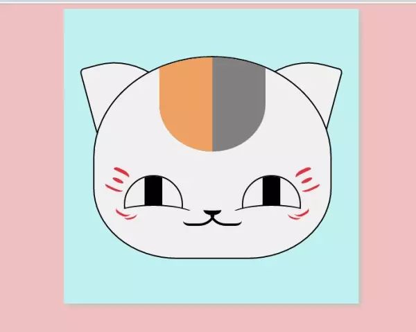
这个实现起来确实比较麻烦,很多地方需要花时间,有耐心地调整。
1.先看下页面结构:
<body> <div class="container"> <!-- 脸 --> <div class="face"> <!-- 头发 --> <div class="hair"> <div></div> </div> <!-- 眼睛 --> <div class="eye-wrap"> <div class="eye left"> <div class="eye-circle"> <div class="eye-core"></div> </div> <div class="eye-bottom"></div> <div class="eye-red"></div> </div> <div class="eye right"> <div class="eye-circle"> <div class="eye-core"></div> </div> <div class="eye-bottom"></div> <div class="eye-red"></div> </div> </div> <!-- 鼻子 --> <div class="nose"> </div> <!-- 嘴巴 --> <div class="mouth-wrap"> <!-- <div class="mouth-top"></div> --> <div class="mouth left"></div> <div class="mouth right"></div> </div> <!-- 胡子 --> <div class="mustache-wrap"> <div class="mustache left"> <div></div> <div></div> <div></div> <div></div> <div></div> </div> <div class="mustache right"> <div></div> <div></div> <div></div> <div></div> <div></div> </div> </div> </div> <!-- 耳朵 --> <div class="ear-wrap"> <div class="ear left"> </div> <div class="ear right"> </div> </div> </div></body>2.再看css部分
1.先看脸部face:
.face { /* top: 100px; */ left: 50%; top: 50%; position: absolute; width: 400px; height: 340px; margin-left: -200px; margin-top: -170px; border-radius: 50% 50% 35% 35%; border: 2px solid #000; z-index: 10; background: #f3f3f3; overflow: hidden;}主要是要画出椭圆形,width和height设置的值要注意,脸比较宽。然后关键就是border-radius的设置了:
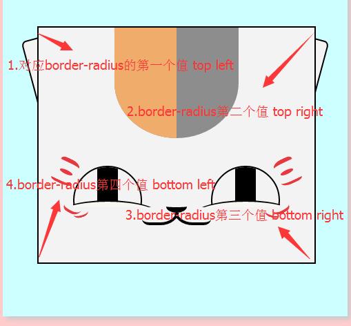
border-radius全部设置为0时,就是一个长方形,然后把它的四个角对应的设置下,就可以出现我们想要的效果。
2.接下来看耳朵的设置:
耳朵看起来其实也是一个椭圆,通过设置border-radius,调出想要的效果。不过需要被遮住一部分,所以在HTML结构中,我把它放在face的外面了。
/* 耳朵 */.ear-wrap { position: absolute; width: 400px; top: 100px; left: 50%; margin-left: -200px;}.ear { width: 160px; height: 200px; position: absolute; top: -22px; left: 0; border: 2px solid #000; background: #f3f3f3; transform: rotate(-15deg); -ms-transform: rotate(-15deg); -moz-transform: rotate(-15deg); -webkit-transform: rotate(-15deg); -o-transform: rotate(-15deg); border-radius: 4% 80% 0% 50%; transition: all 1s;}.ear-wrap .right { left: auto; right: 0; border-radius: 80% 4% 50% 0%; transform: rotate(15deg); -ms-transform: rotate(15deg); -moz-transform: rotate(15deg); -webkit-transform: rotate(15deg); -o-transform: rotate(15deg);}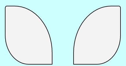
这是竖起来的耳朵,通过 transform:rotate(15deg); 旋转一点,耳朵就塌下来了。
3.然后是头发:
有了上述的实践,知道头发也好弄了,还是椭圆
/* 头发 */.hair { position: absolute; width: 180px; height: 160px; left: 50%; margin-left: -90px; background: #8d8d8d; overflow: hidden; border-radius: 0 0 50% 50%;}.hair div { width: 90px; height: 160px; background: #f0ac6b;}另外一个颜色,只需要在里面加一个子div,然后给不同的颜色就ok。
4.再来看眼睛:
眼睛比较复杂,拆分四个小部件,眼眶,眼珠,下眼线,眼红(笑起来露出的表情),对应的效果设置为:
/* 眼睛 */.eye-wrap { position: absolute; width: 300px; height: 60px; top: 200px; left: 50%; margin-left: -150px; overflow: hidden;}.eye-wrap .eye { height: 100px; width: 100px; position: absolute;}.eye-wrap .eye-circle { width: 100px; height: 100px; border: 2px solid #000; overflow: hidden; position: absolute; border-radius: 50%; box-sizing: border-box;}.eye-wrap .eye-core { height: 100px; width: 30px; /* margin: 0 auto; */ background: #000; position: absolute; left: 50%; margin-left: -15px; transition: all 1s;}.eye-wrap .eye-bottom { height: 50px; width: 160px; border-radius: 50%; position: absolute; /* background: #000; */ margin-top: 50px; border-top: 2px solid #000; left: -30px; background: #f6f7f2; transition: all 1s;}.eye-wrap .right { left: auto; right: 0px;}.eye-red { position: absolute; height: 28px; width: 70px; background: red; top: 34px; /*top: 64px;*/ left: 18px; border-radius: 50% 50% 50% 50%; background-image: -moz-radial-gradient( 50% 50%, rgba(253,214,240,0.8) 0%, rgba(253,224,244,0.8) 66%, rgba(253,234,247,0.8) 100%); background-image: -webkit-radial-gradient( 50% 50%, rgba(253,214,240,0.8) 0%, rgba(253,224,244,0.8) 66%, rgba(253,234,247,0.8) 100%); background-image: -ms-radial-gradient( 50% 50%, rgba(253,214,240,0.8) 0%, rgba(253,224,244,0.8) 66%, rgba(253,234,247,0.8) 100%); opacity: 0.0; /* transition: all 1.5s; */ transition: all 0.1s ease-in 0.2s;}注意左右两只眼睛效果大致是一样,只是位置不一样,这是我们只需要设置右边的 right: 0px; 就可以(因为设置了position: absolute)
5.鼻子:
/* 鼻子 */.nose { width: 30px; height: 10px; /* background: #000; */ border-bottom: 8px solid #000; border-radius: 0% 0% 50% 50%; top: 250px; left: 50%; margin-left: -15px; position: absolute;}这里特别注意,height:10px; border-bottom: 8px solid #000;的设置,我本来想只用height:10px;然后设置border-radius,可是效果却长这样:
 没有半圆的效果,是高度设置不够?变成18px,这货长这样
也不对,所以就加上border-bottom
6.嘴巴:
/* 嘴巴 */.mouth-wrap { position: absolute; top: 268px; width: 100px; left: 50%; margin-left: -50px; height: 20px; overflow: hidden;}.mouth { width: 50px; height: 40px; border-bottom: 4px solid #000; border-right: 4px solid #000; border-radius: 0% 40% 50% 20%; margin-top: -26px; position: absolute; left: 0; transition: all 1s;}.mouth-wrap .right { border-bottom: 4px solid #000; border-right: none; border-left: 4px solid #000; border-radius: 40% 0% 20% 50%; position: absolute; left: auto; right: 0;}算是比较简单,设置border-bottom,border-left或border-right就可以。嘴巴上翘的效果是改变其border-radius值
7.两边的胡子:
/* 胡子 */.mustache-wrap { height: 80px; width: 380px; position: absolute; top: 190px; z-index: 20; left: 50%; margin-left: -190px;}.mustache > div:first-child { width: 30px; height: 10px; border-top: 6px #E53941 solid; border-radius: 30% 50% 20% 50%; transform: rotate(25deg); -ms-transform: rotate(25deg); -moz-transform: rotate(25deg); -webkit-transform: rotate(25deg); -o-transform: rotate(25deg); margin-left: 20px;}.mustache > div:nth-child(2) { width: 20px; height: 6px; background-color: #E53941; border-radius: 50% 50% 50% 50%; transform: rotate(25deg); -ms-transform: rotate(25deg); -moz-transform: rotate(25deg); -webkit-transform: rotate(25deg); -o-transform: rotate(25deg); margin-left: 20px;}.mustache > div:nth-child(3) { /*margin-top:10px;*/ width: 32px; height: 10px; border-bottom: 4px #E53941 solid; border-radius: 30% 0% 50% 30%; transform: rotate(25deg); -ms-transform: rotate(25deg); -moz-transform: rotate(25deg); -webkit-transform: rotate(25deg); -o-transform: rotate(25deg); margin-left: 8px;}.mustache > div:nth-child(4) { margin-top: 20px; width: 26px; height: 20px; border-bottom: 4px #E53941 solid; border-radius: 30% 0% 50% 30%; transform: rotate(30deg); -ms-transform: rotate(30deg); -moz-transform: rotate(30deg); -webkit-transform: rotate(30deg); -o-transform: rotate(30deg); margin-left: 28px;}.mustache > div:last-child { width: 22px; height: 10px; border-bottom: 3px #E53941 solid; border-radius: 0% 0% 50% 50%; transform: rotate(-15deg); -ms-transform: rotate(-15deg); -moz-transform: rotate(-15deg); -webkit-transform: rotate(-15deg); -o-transform: rotate(-15deg); margin-left: 40px; margin-top: -8px;}/*右边胡子*/.mustache-wrap .right { transform: rotateY(180deg); -webkit-transform: rotateY(180deg); /* Safari 和 Chrome */ -moz-transform: rotateY(180deg); /* Firefox */ margin-top: -85px;}虽然比较麻烦,不过也算是简单的图形,只需要把height,width,border-top,border-radius,transform: rotate这些值设置恰当就好。
8.鼠标hover样式:
/*鼠标hover样式*/.container:hover .ear-wrap > div:first-child { /* left: -10px; */ transform: rotate(0deg); -ms-transform: rotate(0deg); -moz-transform: rotate(0deg); -webkit-transform: rotate(0deg); -o-transform: rotate(0deg); border-radius: 4% 80% 0% 60%; transition: all 1s; /*transition: transform 1s,left 1s;*/}.container:hover .ear-wrap > div:last-child { /* right: -10px; */ transform: rotate(0deg); -ms-transform: rotate(0deg); -moz-transform: rotate(0deg); -webkit-transform: rotate(0deg); -o-transform: rotate(0deg); border-radius: 80% 4% 60% 0%; transition: all 1s; /*transition: transform 1s,right 1s;*/}.container:hover .eye-bottom { margin-top: 30px; transition: all 1s;}.container:hover .eye-red { opacity: 1; transition: all 2.5s;}.container:hover .mouth { border-radius: 50%; transition: all 1s;}.container:hover .eye-core { width: 40px; margin-left: -20px; transition: all 1s;}耳朵,嘴巴,眼睛等地方需要修改transform,border-radius,width等值的属性。
https://github.com/wj704/wj704.github.io/blob/master/css3-demo/catLaugh.html
以上是关于纯CSS3实现的酷炫笑脸猫动画的主要内容,如果未能解决你的问题,请参考以下文章