纯css3制作旋转太极图案
Posted 瑾谦
tags:
篇首语:本文由小常识网(cha138.com)小编为大家整理,主要介绍了纯css3制作旋转太极图案相关的知识,希望对你有一定的参考价值。
我们现在最后制作出的效果如何。
我们先分析应该如何制作这样一个太极图案。首先外面是一个大圆。
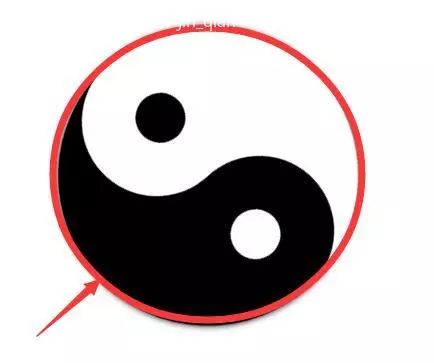
其次我们观察太极图案的内部应该如何实现。
我们可以使用两个长方形进行填充。然后给大圆添加overflow:hidden;就能得到两个半圆,一半是黑色一半为白色。
最后就是分别在两个长方形的盒子两端添加圆形。这个太极图案就成功。
html代码
(向上滑动查看内容)
<div class="wrap">
<div class="taici">
<div class="white">
<div class="mr mr1"></div>
</div>
<div class="black">
<div class="mr mr2"></div>
</div>
</div>
</div>
css代码
(向上滑动查看内容)
body,div{margin:0;padding:0;}
.taici{
position:relative;
width:300px;
height:300px;
margin:50px auto;
border-radius:50%;
overflow:hidden;
box-shadow:0 0 10px 0;
animation:whirl 6s linear infinite;
}
@keyframes whirl{
100%{
transform:rotate(360deg);
}
}
.white{
position:absolute;
right:0;
width:50%;
height:300px;
}
.white:after{
position:absolute;
top:0;
right:75px;
height:150px;
width:150px;
border-radius:50%;
content:"";
background-color:#fff;
z-index:4;
}
.black{
position:absolute;
left:0;
width:50%;
height:300px;
background-color:#000;
}
.black:after{
position:absolute;
bottom:0;
left:75px;
height:150px;
width:150px;
border-radius:50%;
content:"";
background-color:#000;
}
.mr{
position:absolute;
width:50px;
height:50px;
border-radius:50%;
z-index:9;
}
.mr1{
top:50px;
right:120px;
background-color:#000;
}
.mr2{
bottom:50px;
left:120px;
background-color:#fff;
}
以上是关于纯css3制作旋转太极图案的主要内容,如果未能解决你的问题,请参考以下文章