Python----一次懵懵懂懂的机器学习之旅
Posted cC sust
tags:
篇首语:本文由小常识网(cha138.com)小编为大家整理,主要介绍了Python----一次懵懵懂懂的机器学习之旅相关的知识,希望对你有一定的参考价值。
数据采集
数据背景:
国外某电信运营商为挽留用户流失,对比分析目前已/未流失用户的相关信息,通过机器学习了解流失用户的特征,分析流失的原因,并预测用户是否会流失从而制定相关的挽回计划。
2. 数据信息分析:
特征名称 |
特征代表的信息 |
特征存储的格式 |
State |
用户所居住的州 |
英文字符 |
Account Length |
用户的账户长度 |
数字 |
Area Code |
用户所在地区的编号 |
数字 |
Phone |
数字 |
|
Int'l Plan |
是否加入Int'l计划 |
YES/NO |
VMail Plan |
是否加入Vmail计划 |
YES/NO |
VMail Message |
邮件数量 |
数字 |
Day Mins |
用户日间通话时长 |
数字 |
Day Calls |
用户日间通话次数 |
数字 |
Day Charge |
用户日间通话总费用 |
数字 |
Eve Mins |
用户晚间通话时长 |
数字 |
Eve Calls |
用户晚间通话次数 |
数字 |
Eve Charge |
用户晚间通话总费用 |
数字 |
Night Mins |
用户夜间通话时长 |
数字 |
Night Calls |
用户夜间通话次数 |
数字 |
Night Charge |
用户夜间通话总费用 |
数字 |
Intl Mins |
用户上网时长 |
数字 |
Intl Calls |
用户网络通话次数 |
数字 |
Intl Charge |
用户网络消费总费用 |
数字 |
CustServ Calls |
用户客服沟通次数 |
数字 |
Churn? |
用户是否流失 |
YES/NO |
具体详细数据详细见附件:churn.csv
数据预处理
#读取数据churn_df = pd.read_csv('C://Users/lx223/Desktop/Python/机器学习——用户流失预警/churn.csv')     #读取Excel数据文件col_names = churn_df.columns.tolist()

print("Column names:")      #打印特征名字print(col_names)

to_show = col_names[:6] + col_names[-6:]   #显示前和后6条记录,查看print("
Sample data:")

print(churn_df[to_show].head(6))
通过python对Excel进行读取操作,然后打印出所有特征的名字及前后各6条数据信息记录,人为对比本地的Excel文件,观察数据没有差别,正确读取。
Columnnames:
['State','Account Length', 'Area Code', 'Phone', "Int'l Plan", 'VMail Plan','VMail Message', 'Day Mins', 'Day Calls', 'Day Charge', 'Eve Mins', 'EveCalls', 'Eve Charge', 'Night Mins', 'Night Calls', 'Night Charge', 'Intl Mins','Intl Calls', 'Intl Charge', 'CustServ Calls', 'Churn?']
Sampledata:
State Account Length Area Code ... Intl Charge CustServ Calls Churn?
0 KS 128 415 ... 2.70 1 False.
1 OH 107 415 ... 3.70 1 False.
2 NJ 137 415 ... 3.29 0 False.
3 OH 84 408 ... 1.78 2 False.
4 OK 75 415 ... 2.73 3 False.
5 AL 118 510 ... 1.70 0 False.
[6rows x 12 columns]
#特征值转换/

yes_no_cols = ["Int'l Plan","VMail Plan"]

churn_feat_space[yes_no_cols] = churn_feat_space[yes_no_cols] == 'yes'  #数值转换,将是否参加计划转化为1/0


features = churn_feat_space.columns

X = churn_feat_space.values.astype(np.float)  #将表格转换为矩阵
数据中,是否参加Int'l Plan /VMail Plan计划和用户是否流失三个特征的存储类型为YES/NO,将对应的特征值转化为1/0,便于对数据的处理,最后将表格数据转换为矩阵便于科学计算。
3.数据标准化处理

#数据标准化处理scaler = StandardScaler()  #调用库,对数据进行标准化处理X = scaler.fit_transform(X)


print("Feature space holds %d observations and %d features" % X.shape)

print("Unique target labels:", np.unique(y))

print(X[0])  #打印标准化处理后的第一行数据,都压缩到某一固定的区间范围,消除权重的影响print(len(y[y == 0]))   #有多少个0就是有多少个丢失的用户
对应存储类型为数字的特征的取值范围各不相同,机器学习并不知道具体时间什么特征,只会从数值上计算,对应的数值计算单位不同也会影响计算,所以需要对数据进行初始化处理,本次调用StandardScaler库进行标准化处理,将数值指定到一个具体的范围,消除权重带来的影响。
Feature space holds 3333 observations and 17 features
Unique target labels: [0 1]
[ 0.67648946 -0.32758048 1.6170861 1.23488274 1.56676695 0.47664315
1.56703625 -0.07060962-0.05594035 -0.07042665 0.86674322-0.46549436
0.86602851 -0.08500823-0.60119509 -0.0856905 -0.42793202]
2850
成功将数据压缩到[-0.5,1.6]这个区间,一共3333个用户中丢失的用户达到2850,出现数据不均衡现象。
数据可视化分析
查看用户流失比例
# 查看流失客户占比#画饼图:churnvalue=churn_df["Churn?"].value_counts()

labels=churn_df["Churn?"].value_counts().index


plt.rcParams["figure.figsize"]=(6,6)

plt.pie(churnvalue,labels=labels,colors=["whitesmoke","yellow"], explode=(0.1,0),autopct='%1.1f%%', shadow=True)

plt.title("Proportions of Customer Churn")

plt.show()
调用matplotlib.pyplot库根据数据画出饼状图,查看流失用户所占比例(灰色部分)达到85.5%
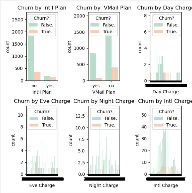
2.Int'l Plan /VMail Plan /Day Charge /EveCharge /Night Charge /Intl Charge对流失率的影响
#统计图判断  Int'l Plan  VMail Plan  Day Charge  Eve Charge   Night Charge   Intl Charge对流客户流失率的影响plt.subplot(231)

Intl_Plan=sns.countplot(x="Int'l Plan",hue="Churn?",data=churn_df,palette="Pastel2") # palette参数表示设置颜色,这里设置为主题色Pastel2

plt.xlabel("Int'l Plan")

plt.title("Churn by Int'l Plan")


plt.subplot(232)

VMail_Plan=sns.countplot(x="VMail Plan",hue="Churn?",data=churn_df,palette="Pastel2")

plt.xlabel("VMail Plan")

plt.title("Churn by VMail Plan")


plt.subplot(233)

Day_Charge=sns.countplot(x="Day Charge",hue="Churn?",data=churn_df,palette="Pastel2")

plt.xlabel("Day Charge")

plt.title("Churn by Day Charge")


plt.subplot(234)

Eve_Charge=sns.countplot(x="Eve Charge",hue="Churn?",data=churn_df,palette="Pastel2")

plt.xlabel("Eve Charge")

plt.title("Churn by Eve Charge")


plt.subplot(235)

Night_Charge=sns.countplot(x="Night Charge",hue="Churn?",data=churn_df,palette="Pastel2")

plt.xlabel("Night Charge")

plt.title("Churn by Night Charge")


plt.subplot(236)

Intl_Charge=sns.countplot(x="Intl Charge",hue="Churn?",data=churn_df,palette="Pastel2")

plt.xlabel("Intl Charge")

plt.title("Churn by Intl Charge")
plt.show() #显示数据
通过调用seaborn库,根据数据画出统计图,观察各个特征对用户是否流失的影响,可以看出,在参与Int'l Plan中流失占比明显比不参与Int'l Plan更高,相反,在参与VMail Plan中流失占比明显比不参与VMail Plan更低,在所有数据中Day/Eve Charge各阶段消费水平流失的人数基本持平,但Night/Intl Charge中等消费比两端的流失人数高出了几倍。
构建学习模型
1.选择机器学习算法
#不确定用哪一个分类器,写成函数的形式,进行交叉验证def run_cv(X, y, clf_class, **kwargs):  #X是得到的特征数据,y表示用户是否丢失,clf_class表示分类器,**kwargs制定分类器的参数

   # Construct a kfolds object

   kf = KFold(len(y), n_splits=5, shuffle=True)    #切割为几份来做交叉验证

   y_pred = y.copy()

   # Iterate through folds

   fortrain_index, test_index in kf.split(X):     #对每一份进行训练

        X_train, X_test = X[train_index], X[test_index]

        y_train = y[train_index]

       # Initialize a classifier with key word arguments

        clf = clf_class(**kwargs)   #添加分类器

        clf.fit(X_train, y_train)   #训练分类器

        y_pred[test_index] = clf.predict(X_test)    #进行预测

   return y_pred
调用机器学习算法(SVC,RF,KNN)的库,写成一个函数的形式,将算法写进参数中,学习时直接调用函数即可
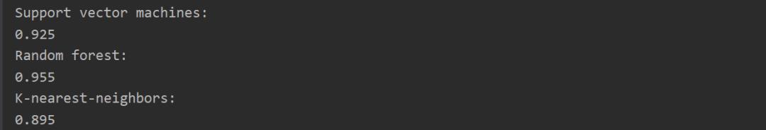
2. 计算精度
#计算精度def accuracy(y_true, y_pred):

   # NumPy interprets True and False as 1. and 0.

   return np.mean(y_true == y_pred)


print("Support vector machines:")   #SVM结果print("%.3f" % accuracy(y, run_cv(X, y, SVC)))

print("Random forest:")      #RF结果print("%.3f" % accuracy(y, run_cv(X, y, RF)))

print("K-nearest-neighbors:")       #KNN结果print("%.3f" % accuracy(y, run_cv(X, y, KNN)))
分别计算出三种学习结果的精度
3.衡量指标

#衡量指标,光看精度这个量是不行的,召回率#关心内容:分类器错的情况下,当分类器预测用户不会流失,但用户实际流失时,影响大#用户流失的概率def run_prob_cv(X, y, clf_class, **kwargs):

    kf = KFold(len(y), n_splits=5, shuffle=True)

    y_prob = np.zeros((len(y), 2))

   fortrain_index, test_index in kf.split(X):

        X_train, X_test = X[train_index], X[test_index]

        y_train = y[train_index]

        clf = clf_class(**kwargs)

        clf.fit(X_train, y_train)

       # Predict probabilities, not classes

        y_prob[test_index] = clf.predict_proba(X_test)  #把值转化为概率值

   return y_prob
计算出TP,FP,FN,TN并画出MAP图,比较两者的召回率和准确率,期望召回率和准确率都是越高越好,最后看通过比较两者的面积得到效果优势。结合TP/FP,和MAP图两个衡量指标权威衡量。
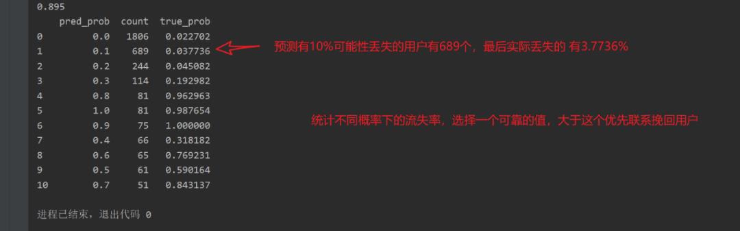
4.预测结果
# Number of times a predicted probability is assigned to an observation

counts = pd.value_counts(pred_churn)

# print counts

# calculate true probabilities

true_prob = {}

for prob in counts.index:

    true_prob[prob] = np.mean(is_churn[pred_churn == prob])

    true_prob = pd.Series(true_prob)

# pandas-fu

counts = pd.concat([counts, true_prob], axis=1).reset_index()

counts.columns = ['pred_prob','count','true_prob']

print(counts)
得到预测结果,按阶段预测用户丢失的概率和数量,再给出最后实际的用户流失率。同级不同概率下的用户流失率,选择一个可靠地值,当预测概率大于这个值时优先选择挽回该用户。
分析结果
通过上述分析,我们可以大致得到容易流失的用户特征:
1.参与Int'l Plan计划与未参与VMail Plan计划用户更容易流失。
2. Day/Eve Charge对用户的流失没有直接的影响。
3. Night/Intl Charge处于中等消费的用户更容易流失。
4.当预测概率达到60%之后,用户真实流失的概率逐渐上升。
针对上述分析结果,可有针对性的对此提出建议:
应该积极推荐用户参与VMail Plan计划,同时针对参与Int'l Plan计划的用户给予相应的福利来保留客户。对Night/Intl Charge(晚间消费/上网消费)做出适当的资费调整,对于预测概率达到60%之后的用户优先进行挽留活动。
遇到的问题
1.as_matrix()将Excel的数据从DataFrame的形式转换成数组一遍后续的科学计算,但是目前.as_matrix()这个方法已经淘汰了,应该改为
x = datas.iloc[:,:].values
2. TypeError: __init__() got anunexpected keyword argument 'n_folds'
导入了错误的KFold包
fromsklearn.cross_validation import KFold 已经淘汰,需要改为fromsklearn.model_selection import KFold
使用错误的参数
kf = KFold(titanic.shape[0], n_folds=3, random_state=1)由于sklearn的更新,Kfold的参数已经更改, n_folds更改为n_splits,前文代码更改为kf = KFold(n_splits=3, shuffle=False, random_state=1),如果不更改,会发生报错TypeError: __init__() got multiplevalues for argument 'n_splits'
除此之外,for train, test in kf:同时更改为for train, test in kf.split(titanic[predictions]): 此时相当于用predictions来进行折叠交叉划分。
3.polt画图一直没有显示出来,最后发现忘记加plot.show()语句显示图像了。
以上是关于Python----一次懵懵懂懂的机器学习之旅的主要内容,如果未能解决你的问题,请参考以下文章