静态页面3-移动端苏宁首页
Posted JackySei
tags:
篇首语:本文由小常识网(cha138.com)小编为大家整理,主要介绍了静态页面3-移动端苏宁首页相关的知识,希望对你有一定的参考价值。
为了更好的掌握各种布局和样式,模仿着写了几个移动端的首页。
分别采用了不同的布局方式。这个例子主要采用rem+less的适配方式。
有时间的话会继续优化。
需要注意的地方有:
1.合理用less。
2.知道通过rem怎么适配不同机型的原理。
3.了解em和rem的区别。
4.了解flexible.js 适配不同机型的原理。
5.了解一些插件的使用,如easyless和cssrem。
6.与前面两种布局的区别。
效果如图
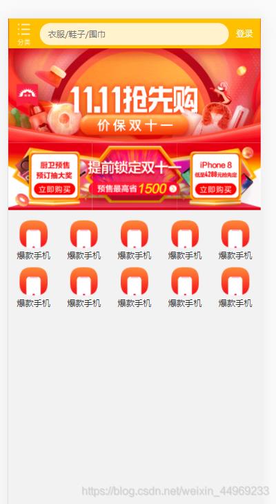
太多的东西和之前的两个页面一样。所以这个页面只实现了部分。
只要是学会如何用rem适配不同设备。
rem是根据html中font-size来设置大小的,所以只要根据不同机型设置不同的font-size,这样的比例相同,相同的rem值在不同的设备中因为font-size的不同会表示不同的大小,从而达到适配的效果。
因为可能会涉及到计算,没怎么用过less,这里采用less练练手。
先写好适配不同机型的common.less
// 设置常见的屏幕尺寸,修改html大小

html{
    font-size: 50px;
}
a{
    text-decoration: none;
}
@no:15;
@media screen and (min-width: 320px){
    html{
        font-size: (320px / @no);
    }
}

@media screen and (min-width: 360px){
    html{
        font-size: (360px / @no);
    }
}

@media screen and (min-width: 375px){
    html{
        font-size: (375px / @no);
    }
}
@media screen and (min-width: 400px){
    html{
        font-size: (400px / @no);
    }
}
@media screen and (min-width: 420px){
    html{
        font-size: (420px / @no);
    }
}

@media screen and (min-width: 480px){
    html{
        font-size: (480px / @no);
    }
}
@media screen and (min-width: 540px){
    html{
        font-size: (540px / @no);
    }
}
@media screen and (min-width: 720px){
    html{
        font-size: (720px / @no);
    }
}
@media screen and (min-width: 750px){
    html{
        font-size: (750px / @no);
    }
}
通过eazyless插件会把这个文件生成相应的css文件。
在为页面创建相应的less文件,把这个文件引入之后,在写入自己页面的东西即可。
<!DOCTYPE html>
<html lang="en">
<head>
    <meta charset="UTF-8">
    <meta http-equiv="X-UA-Compatible" content="IE=edge">
    <meta name="viewport" content="width=device-width, initial-scale=1.0">
    <link rel="stylesheet" href="css/normalize.css">
    <link rel="stylesheet" href="css/index1.css">
    <title>苏宁官网1</title>
</head>
<body>
    <!-- 顶部搜索框 -->
   <div class="search-content">
       <a class="classify"></a>
       <div class="search">
           <form action="#" class="">
                <input type="search" placeholder="衣服/鞋子/围巾">
           </form>
       </div>
       <a class="login">登录</a>
   </div>
   <!-- banner部分 -->
   <div class="banner">
       <img src="upload/banner.gif" alt="">
   </div>

   <!-- 广告部分 -->
   <div class="ad">
       <a href="#">
        <img src="upload/ad1.gif" alt="">
       </a>
       <a href="#">
           <img src="upload/ad2.gif" alt="">
       </a>
       <a href="#">
           <img src="upload/ad3.gif" alt="">
       </a>
   </div>
   <!-- nav 部分 -->
   <nav>
       <a href="#">
           <img src="upload/nav1.png" alt="">
           <span>爆款手机</span>
       </a>
       <a href="#">
        <img src="upload/nav1.png" alt="">
        <span>爆款手机</span>
    </a>       <a href="#">
        <img src="upload/nav1.png" alt="">
        <span>爆款手机</span>
    </a>
    <a href="#">
        <img src="upload/nav1.png" alt="">
        <span>爆款手机</span>
    </a>
    <a href="#">
        <img src="upload/nav1.png" alt="">
        <span>爆款手机</span>
    </a>
    <a href="#">
        <img src="upload/nav1.png" alt="">
        <span>爆款手机</span>
    </a>
    <a href="#">
        <img src="upload/nav1.png" alt="">
        <span>爆款手机</span>
    </a>
    <a href="#">
        <img src="upload/nav1.png" alt="">
        <span>爆款手机</span>
    </a>
    <a href="#">
        <img src="upload/nav1.png" alt="">
        <span>爆款手机</span>
    </a>
    <a href="#">
        <img src="upload/nav1.png" alt="">
        <span>爆款手机</span>
    </a>
   </nav>
</body>
</html>
index1.less
@import "common";

body{
    min-width: 320px;
    width: 15rem;
    margin: 0 auto;
    line-height: 1.5;
    font-family: Arial, Helvetica;
    background-color: #f2f2f2;
}
@baseFont:50;
// 搜索框
.search-content{
    display: flex;
    position: fixed;
    top: 0;
    left: 50%;
    transform: translateX(-50%);
    width: 15rem;
    height: (88rem / @baseFont);
    background-color: #FFc001;
    .classify{
        width: (44rem / @baseFont);
        height: (70rem / @baseFont);
        background: pink;
        margin: (11rem / @baseFont) (25rem / @baseFont) (7rem / @baseFont) (24rem / @baseFont);
        background: url(../images/classify.png) no-repeat;
        background-size: (44rem / @baseFont) (70rem / @baseFont);
    }
    .search{
        flex: 1;
        input{
            width: 100%;
            height: (66rem / @baseFont);
            border-radius: (33rem / @baseFont);
            background-color: #FFF2cc;
            border:0;
            outline: none;
            padding-left: (25rem / @baseFont);
            font-size: (25rem / @baseFont);
            margin-top: (12rem / @baseFont);
        }
    }
    .login{
        width: (75rem / @baseFont);
        height: (70rem / @baseFont);
        margin: (10rem / @baseFont);
        font-size: (25rem / @baseFont);
        text-align: center;
        line-height: (70rem / @baseFont);
        color: #fff;
    }
}

.banner{
    width: (750rem / @baseFont);
    height: (368rem / @baseFont);
    img{
        width: 100%;
        height: 100%;
    }
}

.ad{
    display: flex;
    a{
        flex: 1;
        img{
            width: 100%;
        }
    }
}

nav{
    width: (750rem / @baseFont);
    a{
        float: left;
        width: (150rem / @baseFont);
        height: (140rem / @baseFont);
        text-align: center;
        img{
            display: block;
            width: (82rem / @baseFont);
            height: (82rem / @baseFont);
            margin: (10rem / @baseFont) auto (5rem / @baseFont);
        }
        span{
            display: block;
            color: #333;
            font-size: (25rem / @baseFont);
        }
    }
}
通过插件生成的css文件为
html {
  font-size: 50px;
}
a {
  text-decoration: none;
}
@media screen and (min-width: 320px) {
  html {
    font-size: 21.33333333px;
  }
}
@media screen and (min-width: 360px) {
  html {
    font-size: 24px;
  }
}
@media screen and (min-width: 375px) {
  html {
    font-size: 25px;
  }
}
@media screen and (min-width: 400px) {
  html {
    font-size: 26.66666667px;
  }
}
@media screen and (min-width: 420px) {
  html {
    font-size: 28px;
  }
}
@media screen and (min-width: 480px) {
  html {
    font-size: 32px;
  }
}
@media screen and (min-width: 540px) {
  html {
    font-size: 36px;
  }
}
@media screen and (min-width: 720px) {
  html {
    font-size: 48px;
  }
}
@media screen and (min-width: 750px) {
  html {
    font-size: 50px;
  }
}
body {
  min-width: 320px;
  width: 15rem;
  margin: 0 auto;
  line-height: 1.5;
  font-family: Arial, Helvetica;
  background-color: #f2f2f2;
}
.search-content {
  display: flex;
  position: fixed;
  top: 0;
  left: 50%;
  transform: translateX(-50%);
  width: 15rem;
  height: 1.76rem;
  background-color: #FFc001;
}
.search-content .classify {
  width: 0.88rem;
  height: 1.4rem;
  background: pink;
  margin: 0.22rem 0.5rem 0.14rem 0.48rem;
  background: url(../images/classify.png) no-repeat;
  background-size: 0.88rem 1.4rem;
}
.search-content .search {
  flex: 1;
}
.search-content .search input {
  width: 100%;
  height: 1.32rem;
  border-radius: 0.66rem;
  background-color: #FFF2cc;
  border: 0;
  outline: none;
  padding-left: 0.5rem;
  font-size: 0.5rem;
  margin-top: 0.24rem;
}
.search-content .login {
  width: 1.5rem;
  height: 1.4rem;
  margin: 0.2rem;
  font-size: 0.5rem;
  text-align: center;
  line-height: 1.4rem;
  color: #fff;
}
.banner {
  width: 15rem;
  height: 7.36rem;
}
.banner img {
  width: 100%;
  height: 100%以上是关于静态页面3-移动端苏宁首页的主要内容,如果未能解决你的问题,请参考以下文章