鸿蒙开发(12)---Checkbox组件
Posted 一天一篇Python库
tags:
篇首语:本文由小常识网(cha138.com)小编为大家整理,主要介绍了鸿蒙开发(12)---Checkbox组件相关的知识,希望对你有一定的参考价值。
Checkbox组件
有单选操作,就有多选操作。在鸿蒙App的开发当中,我们一般使用Checkbox组件进行多项选择的操作。
本篇,将详细介绍Checkbox组件的使用规则。
基本使用规则
首先,我们来看看如何通过XML布局文件使用Checkbox组件。示例代码如下:
<Checkbox
    ohos:id="$+id:check_box"
    ohos:height="match_content"
    ohos:width="match_content"
    ohos:layout_alignment="center"
    ohos:top_margin="20vp"
    ohos:text="第一个checkbox"
    ohos:text_size="20fp" />
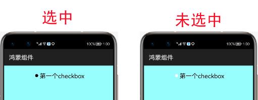
运行之后,我们会得到下图所示的选中与非选中图:
样式文件修改(check_element)
从上面的图片,我们可以发现,其选中与未选中的情况下,都是圆形。但我们在实际的App体验中,还看到了很多方形的选中框。
那么如何修改样式去实现这种呢?答案其实很简单,样式文件中也给我们提供了state-container属性用于判断状态。
我们只需要设置未选中状态与选中状态的样式,然后设置到state-container属性中,再将值赋值给check_element即可。
下面,我们先来创建选中状态的样式文件(checkbox_checked.xml):
<shape
    xmlns:ohos="http://schemas.huawei.com/res/ohos"
    ohos:shape="rectangle">
    <solid
        ohos:color="#FF0000"/>
</shape>
未选中状态的样式文件(checkbox_unchecked.xml):
<shape
    xmlns:ohos="http://schemas.huawei.com/res/ohos"
    ohos:shape="rectangle">
    <solid
        ohos:color="#FFFFFF"/>
</shape>
状态文件(checkbox_check_element):
<state-container
    xmlns:ohos="http://schemas.huawei.com/res/ohos">
    <item ohos:state="component_state_checked" ohos:element="$graphic:checkbox_checked"/>
    <item ohos:state="component_state_empty" ohos:element="$graphic:checkbox_unchecked"/>
</state-container>
给checkbox组件设置状态文件:
<Checkbox
    ohos:id="$+id:check_box"
    ohos:height="match_content"
    ohos:width="match_content"
    ohos:layout_alignment="center"
    ohos:check_element="$graphic:checkbox_check_element"
    ohos:top_margin="20vp"
    ohos:text="第一个checkbox"
    ohos:text_size="20fp" />
运行之后,效果如下:
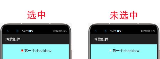
至于文字选中与未选中效果可以使用前文的text_color_on与text_color_off进行颜色的设置。
监听其状态
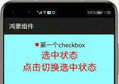
在实际的开发中,我们需要监听其选中的状态,然后进行特定的操作。那么如果监听其状态呢?示例代码如下:
public class MainAbilitySlice extends AbilitySlice{
    HiLogLabel label=new HiLogLabel(HiLog.LOG_APP, 0x00201, "TAG");
    private Checkbox checkbox;
    private Text text;
    private Button button;
    @Override
    public void onStart(Intent intent) {
        super.onStart(intent);
        super.setUIContent(ResourceTable.Layout_ability_main);
        this.checkbox=(Checkbox)findComponentById(ResourceTable.Id_check_box);
        this.text=(Text)findComponentById(ResourceTable.Id_test_text);
        this.button=(Button)findComponentById(ResourceTable.Id_test_button);
        this.text.setText("未选中状态");
        this.checkbox.setCheckedStateChangedListener(new AbsButton.CheckedStateChangedListener() {
            @Override
            public void onCheckedChanged(AbsButton absButton, boolean b) {
                if(b){
                    text.setText("选中状态");
                }else{
                    text.setText("未选中状态");
                }
            }
        });
        this.button.setClickedListener(new Component.ClickedListener() {
            @Override
            public void onClick(Component component) {
                checkbox.toggle();//反选择
            }
        });
    }
}
运行之后,效果如下图所示:
以上是关于鸿蒙开发(12)---Checkbox组件的主要内容,如果未能解决你的问题,请参考以下文章