FlexboxLayout使用(Google官方实现流式布局控件)
Posted Jason_Lee155
tags:
篇首语:本文由小常识网(cha138.com)小编为大家整理,主要介绍了FlexboxLayout使用(Google官方实现流式布局控件)相关的知识,希望对你有一定的参考价值。
一、FlexboxLayout是什么
FlexboxLayout是Google开源的一个强大的控件,直接继承ViewGroup,效果类似于加强版的LinearLayout,但与LinearLayout并无关联。
官方原话是:
FlexboxLayout is a library project which brings the similar capabilities of CSS Flexible Box Layout Module to android.
意思是:FlexBoxLayout是为Android带来了与 CSS Flexible Box Layout(CSS 弹性盒子)相似功能的库。
Github地址:https://github.com/google/flexbox-layout
二、如何使用FlexboxLayout
FlexBoxLayout有非常多的属性,下面一一验证各个属性的作用
引用依赖
dependencies {
    implementation 'com.google.android:flexbox:1.1.0'
}
如果还没用上AndroidX:
dependencies {
    implementation 'com.google.android:flexbox:1.0.0'
}
在布局中简单使用
<com.google.android.flexbox.FlexboxLayout
        android:layout_width="match_parent"
        android:layout_height="wrap_content"
        android:background="@color/colorPrimary"
        app:flexWrap="wrap">

        <TextView
            style="@style/TextStyle"
            android:text="推送和即时通讯"/>

        <TextView
            style="@style/TextStyle"
            android:text="蓝牙" />

        <TextView
            style="@style/TextStyle"
            android:text="程序员"/>

        <TextView
            style="@style/TextStyle"
            android:text="影视天堂" />

        <TextView
            style="@style/TextStyle"
            android:text="郭德纲" />

        <TextView
            style="@style/TextStyle"
            android:text="旅行——在路上" />

        <TextView
            style="@style/TextStyle"
            android:text="复仇者联盟4" />

    </com.google.android.flexbox.FlexboxLayout>
TextStyle如下:
 <style name="TextStyle">
        <item name="android:layout_margin">5dp</item>
        <item name="android:layout_width">wrap_content</item>
        <item name="android:layout_height">wrap_content</item>
        <item name="android:background">@drawable/shape_pink_border</item>
        <item name="android:ellipsize">end</item>
        <item name="android:maxLines">1</item>
        <item name="android:padding">8dp</item>
        <item name="android:textColor">@android:color/white</item>
    </style>
shape_pink_border文件:
<shape xmlns:android="http://schemas.android.com/apk/res/android">
    <corners android:radius="8dp"/>
    <stroke android:width="1dp" android:color="@android:color/holo_red_light"/>
</shape>
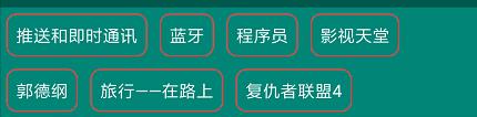
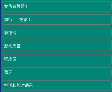
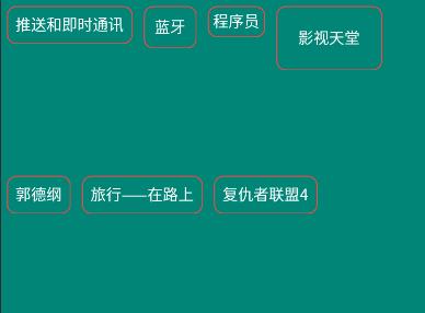
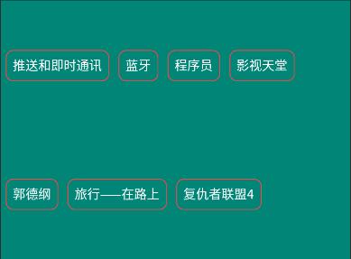
运行看一下效果:
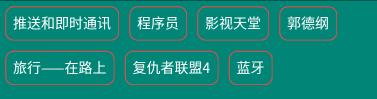
可以看到内容虽然出来了,但都挤在同一行了,这显然并不是我要的效果。
那么接下来就该FlexboxLayout属性们出来救场了:
三、FlexboxLayout属性介绍
FlexboxLayout直接属性
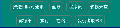
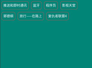
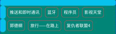
1. app:flexWrap=“nowrap”
简单来说,该属性表示是否换行和换行的方向。
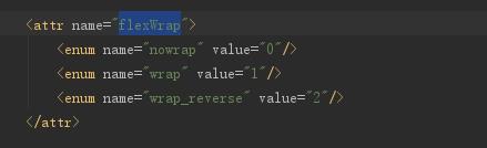
由上图可见,flexWrap属性一共有三个枚举值,分别是nowrap、wrap和wrap_reverse
nowrap:单行显示,不换行,默认就是这个属性。
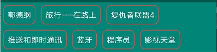
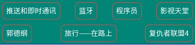
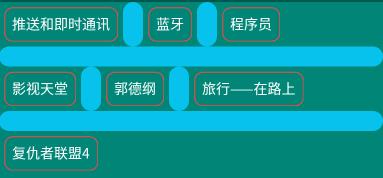
wrap:当内容超过一行时,自动换行。效果:
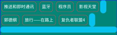
wrap_reverse:反向换行(下一行内容在当前行之上
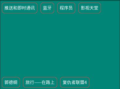
该属性表示主轴的方向,子元素的排列按照轴线方向依次添加。
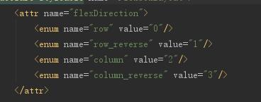
再看一下源码,可见flexDirection的枚举值有row和row_reverse,column和column_reverse
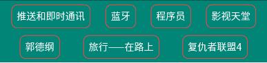
- row : 主轴方向按水平(行)方向排版,默认就是这个属性。效果:

- row_reverse : 主轴方向按水平(行)方向反向排版。效果:

由效果图可见,row是从左向右绘制,row_reverse是row的反向,也就是从右向左绘制啦。同理column也是一样。
- column : 主轴方向按竖直(列)方向排版。效果:

column_reverse : 主轴方向按竖直(列)方向反向排版(从下向上)。
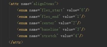
3. app:justifyContent=“flex_start”
关于这个属性,官方有一段说明:
<!-- Omitting flex-flow property since it's reflected in the parent flex container. Set the flexDirection and/or flexWrap to the parent flex container explicitly if you want to use the flex-flow similar way to the web. -->
作用是控制元素在主轴上的对齐方式,需要配合flexDirection或flexWrap属性来使用。

看一下源码,可见app:justifyContent属性有flex_start、flex_end、center、space_between、space_around和space_evenly6个枚举值。
下面把以上两个属性改为:
		app:flexWrap="wrap"
        app:flexDirection="row"
来看效果。
-
flex_start: 左对齐,默认值。
flex_end: 右对齐。

-
center:居中对齐。
-
space_between: 两端对齐
-
space_around: 分散对齐

-
space_evenly:子元素在一行内均匀分布空间
4. app:alignItems=“stretch”
该属性表示元素在每条轴线上的对齐方式。
注意:如果设置了
alignContent,且值不为stretch,那么该属性失效。
app:alignItems属性有flex_start、flex_end、center、baseline和stretch
下面把FlexBoxLayout指定一个高度,并为TextView添加不同的padding来看效果。
- stretch: 默认值,如果子元素未设置高度,则沾满父布局高度。

- flex_start :顶端对齐。
- flex_end :底端对齐。

- center : 居中对齐。

- baseline :按照第一个元素的基线对齐。

下面这张图片可以很直观的表达这个属性的作用。图片来源

5. app:alignContent=“stretch”
该属性表示每条轴线在整个布局中的对齐方式。

app:alignContent属性有flex_start、flex_end、center、space_between、space_around和stretch6个枚举值。
-
stretch:默认值,轴线占满整个父布局。
- flex_start:顶部对齐所有轴线。
- flex_end:底部对齐所有轴线。

- center:居中对齐所有轴线。

- space_between:两端对齐所有轴线。
- space_around:分散对齐所有轴线。
插一句嘴,轴线方向可以由flexDirection属性来指定,注意属性搭配,举一反三。
6. dividerDrawable (reference)
水平和竖直方向分割线。
7. dividerDrawableHorizontal / dividerDrawableVertical (reference)
水平/竖直方向分割线。
8. showDivider
显示水平和竖直方向分割线方式。
枚举值有:
- none
不显示。
- beginning
- middle
- end
9. showDividerHorizontal / showDividerVertical
显示水平/竖直方向分割线方式。
FlexboxLayout子元素属性
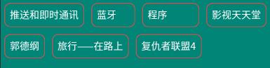
1. app:layout_order=“1”
指定子元素排序优先级,值越小越排在前面,默认值为1。设置值类型为float。
如图,蓝牙TextView元素在xml中排序为第二个,但给它的layout_order属性指定为2,蓝牙排名到最后一位了。
2. app:layout_flexGrow=“0”
分配同一轴线剩余控件所占权重,默认值为0,表示不参与分配。用法类似于LinearLayout的weight,不过weight分配的是整个父布局控件,而layout_flexGrow分配的是同一行/列的剩余空间。
举个例子:将蓝牙的layout_flexGrow设为1,程序的layout_flexGrow属性设为2
如图,蓝牙与程序都参与到了剩余空间分配,由于程序设置的权重为2,所以比蓝牙多分配了一倍的空间。
3. app:layout_flexShrink=“0”
子元素缩放比例,如果设置了换行(flexWrap=“wrap或wrap_reverse”)则该属性无效。
设置值类型为float,0表示不缩放,数值越大,缩放比例越大,默认为1,负值无效。
例子:推送和即时通讯设置为0(不缩放),旅行——在路上设置为2(双倍缩放)

4. app:layout_flexBasisPercent="-1"
官方解释:
	<!--
            The initial length in a percentage format relative to its parent. This is similar to the
            flex-basis property in the original CSS specification.
            (https://www.w3.org/TR/css-flexbox-1/#flex-basis-property)
            But unlike the flex-basis property, this attribute only accepts a value in fraction
            (percentage), whereas flex-basis property accepts width values such as 1em, 10px and
            the 'content' string.
            But specifying initial fixed width values can be done by specifying width values in
            layout_width (or layout_height, varies depending on the flexDirection). Also the same
            effect can be done by specifying "wrap_content" in layout_width (or layout_height) if
            developers want to achieve the same effect as 'content'.
            Thus, this attribute only accepts fraction values, which can't be done through
            layout_width (or layout_height) for simplicity.
        -->
表示子元素长度是其父布局长度的百分比,设置了元素的layout_flexBasisPercent将覆盖子元素原本长度,默认值为-1。要注意的是,只有具体设置了父布局的长度才能生效。
设置的值为百分数,例如50%。
例子:将第一个元素宽度设置为父布局的50%(app:layout_flexBasisPercent="50%")。

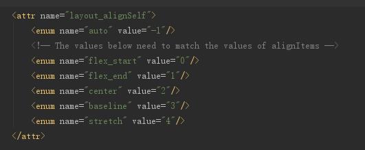
5. app:layout_alignSelf=“auto”
所用与alignItems属性一样,不同点是alignItems设置的是所有元素,而layout_alignSelf作用于单个元素。
需要注意的一点是,若父布局设置了alignContent,并且枚举值不为stretch,则改属性失效。
layout_alignSelf的枚举值有auto,flex_start,flex_end,center,baseline和stretch,作用与alignItems属性相同。
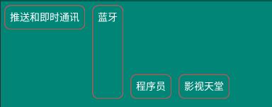
例子:将推送和即时通讯设置为flex_start,蓝牙的layout_alignSelf设置为stretch。效果:
6.app:layout_wrapBefore=“false”
强制换行,默认为false。
若为子元素设置了layout_wrapBefore属性为false,那么这个子元素将重新另起一行。
例:为蓝牙设置layout_wrapBefore属性为true

7. layout_minWidth / layout_minHeight
限制 FlexboxLayout的子元素(宽或高)不会小于最小值,无论layout_flexShrink属性为多少,子元素不会被缩小到小于设置的这个最小值。
8. layout_maxWidth / layout_maxHeight
限制 FlexboxLayout的子元素(宽或高)不会大于最小值,无论layout_flexGrow属性为多少,子元素不会被放大到大于于设置的这个最小值。
小结
FlexBoxLayout的常用属性就这么多了,灵活运用这些属性的搭配可以达到非常灵活的效果。
四、与RecyclerView配合使用
官方不仅提供了FlexboxLayout布局,还提供了FlexboxLayoutManager来与RecyclerView配合使用。
The second one is FlexboxLayoutManager that can be used within RecyclerView.
虽然RecyclerView之前也有StaggeredGridLayoutManager来提供瀑布流效果,但还是要指定行/列数、相比之下,FlexboxLayoutManager更加灵活,且应用场景也不尽相同。
下面将RecyclerView的layoutManager设置成FlexboxLayoutManager
先看一下效果:

白色背景为设置了FlexboxLayoutManager的RecyclerView,绿色背景为FlexboxLayout,可见FlexboxLayoutManagery与FlexboxLayout可以达到相同的效果。
主要代码:
		val flexboxLayoutManager = FlexboxLayoutManager(this)
        flexboxLayoutManager.flexWrap = FlexWrap.WRAP
        flexboxLayoutManager.flexDirection = FlexDirection.ROW
        flexboxLayoutManager.justifyContent = JustifyContent.FLEX_START
        flexboxLayoutManager.alignItems = AlignItems.FLEX_START
		//flexboxLayoutManager.alignContent = AlignContent.FLEX_START

        val adapter = FlexAdapter()
        initData(adapter)
        rv_flex.layoutManager = flexboxLayoutManager
        rv_flex.adapter = adapter
注意:flexboxLayoutManager.alignContent,
FlexboxLayoutManager不支持alignContent 属性
看一下setAlignContent的源码:
	@Override
    public void setAlignContent(@AlignContent int alignContent) {
        throw new UnsupportedOperationException("Setting the alignContent in the "
                + "FlexboxLayoutManager is not supported. Use FlexboxLayout "
                + "if you need to use this attribute.");
    }
可见,FlexboxLayoutManager不支持alignContent 属性,如果强行设置则会报出以下异常。
Caused by: java.lang.UnsupportedOperationException: Setting the alignContent in the FlexboxLayoutManager is not supported. Use FlexboxLayout if you need to use this attribute.
那么FlexboxLayoutManager和FlexboxLayout还有哪些使用的不同呢?官方这张表给出了很好地说明。
| Attribute / Feature | FlexboxLayout | FlexboxLayoutManager (RecyclerView) |
|---|---|---|
| flexDirection |  | |
| flexWrap | | |
| justifyContent | | |
| alignItems | | |
| alignContent | | - |
| layout_order | | - |
| layout_flexGrow | | |
| layout_flexShrink | | |
| layout_alignSelf | | |
| layout_(min/max)Width | | |
| layout_(min/max)Height | | |
| layout_wrapBefore | | |
| Divider | | |
| View recycling | - | |
| Scrolling | - |
|
五、实践
这样的流失布局,如果在项目中碰到,貌似只能自定义View,或者寻求别人写好的库了。
但有了FlexboxLayout之后可以完美解决。
以上是关于FlexboxLayout使用(Google官方实现流式布局控件)的主要内容,如果未能解决你的问题,请参考以下文章