6分钟实现CSS炫光倒影按钮
Posted 北极光之夜。
tags:
篇首语:本文由小常识网(cha138.com)小编为大家整理,主要介绍了6分钟实现CSS炫光倒影按钮相关的知识,希望对你有一定的参考价值。
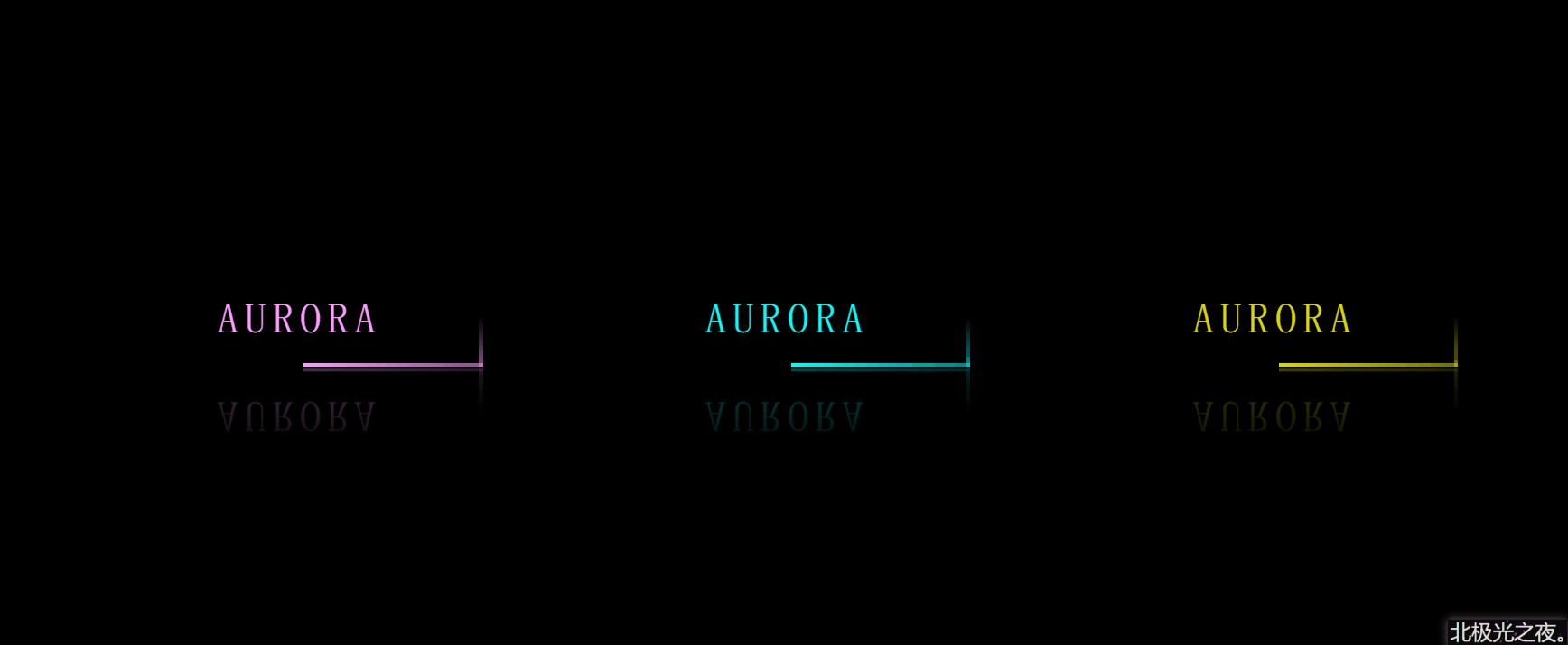
话不多,先看效果:
回归老本行,继续分享简单有趣的CSS创意特效,放松放松心情~
实现过程(完整源码在最后):
1 老样子,定义基本样式:
   *{
             margin: 0;
            padding: 0;
            box-sizing: border-box;
            font-family: 'fangsong';
        }
        body{
            height: 100vh;
            display: flex;
            align-items: center;
            justify-content: center;
            background-color: rgb(0, 0, 0);
        }
font-family: ‘fangsong’; 仿宋字体。
display: flex;
align-items: center;
justify-content: center; flex布局,让按钮在屏幕居中。
2.定义基本标签:
        <a href="#" class="item item1">
            aurora
            <span></span>
            <span></span>
            <span></span>
            <span></span>
        </a>
        <a href="#" class="item item2">
            aurora
            <span></span>
            <span></span>
            <span></span>
            <span></span>
        </a>
        <a href="#" class="item item3">
            aurora
            <span></span>
            <span></span>
            <span></span>
            <span></span>
        </a>
3个a标签就对应3个按钮,每个按钮里4个span就是环绕按钮的4条边。
且都有个公共的选择器 .item 和 只属于自己的选择器。
3.定义每个按钮的基本样式:
 .item{
            position: relative;
            margin: 50px;
            width: 300px;
            height: 80px;
            text-align: center;
            line-height: 80px;
            text-transform: uppercase;
            text-decoration: none;
            font-size: 35px;
            letter-spacing: 5px;
            color: aqua;
            overflow: hidden;
            -webkit-box-reflect: below 1px linear-gradient( transparent,rgba(6, 133, 133,0.3));
        }
text-align: center;文字对齐方式。
line-height: 80px; 字行高。
text-transform: uppercase; 字母为大写。
text-decoration: none; 去掉a标签默认下划线。
letter-spacing: 5px; 每个字符间的距离。
overflow: hidden;溢出隐藏。
-webkit-box-reflect: below 1px linear-gradient( transparent,rgba(6, 133, 133,0.3)); 这个属性能实现倒影效果。
4. 鼠标经过按钮样式改变:
 .item:hover{
            background-color: aqua;
            box-shadow:0 0 5px aqua,
            0 0 75px aqua,
            0 0 155px aqua;
            color: black;
        }
box-shadow:0 0 5px aqua,
0 0 75px aqua,
0 0 155px aqua; 阴影,写多行可以叠加更亮。
5.设置环绕按钮的4根线上面那条的样式:
.item span:nth-of-type(1){
            position: absolute;
            left: -100%;
            width: 100%;
            height: 3px;
            background-image: linear-gradient(to left,aqua ,transparent);
            animation: shang 1s linear infinite;
        }
        @keyframes shang{
            0%{
                left:-100%;
            }
            50%,100%{
                left:100%;
            }
        }
position: absolute;
left: -100%; 定位在对应位置。
background-image: linear-gradient(to left,aqua ,transparent); 线性渐变颜色。
animation: shang 1s linear infinite; 动画属性,让它动起来。
5.以此类推,设置环绕按钮的其它3根样式:
  .item span:nth-of-type(2){
            position: absolute;
            top: -100%;
            right: 0;
            width: 3px;
            height: 100%;
            background-image: linear-gradient(to top,aqua ,transparent);
            animation: you 1s linear infinite;
            animation-delay: 0.25s;
        }
        @keyframes you{
            0%{
                top:-100%;
            }
            50%,100%{
                top:100%;
            }
        }
        .item span:nth-of-type(3){
            position: absolute;
            right: -100%;
            bottom: 0;
            width: 100%;
            height: 3px;
            background-image: linear-gradient(to right,aqua ,transparent);
            animation: xia 1s linear infinite;
            animation-delay: 0.5s;
        }
        @keyframes xia{
            0%{
                right:-100%;
            }
            50%,100%{
                right:100%;
            }
        }
        .item span:nth-of-type(4){
            position: absolute;
            bottom: -100%;
            left: 0;
            width: 3px;
            height: 100%;
            background-image: linear-gradient(to bottom,aqua ,transparent);
            animation: zuo 1s linear infinite;
            animation-delay: 0.75s;
        }
        @keyframes zuo{
            0%{
                bottom:-100%;
            }
            50%,100%{
                bottom:100%;
            }
        }
animation-delay: 0.75s; 动画延迟执行。每条线对应延迟一段时间,形成时间差,形成环绕效果。
6.给第一,第三个按钮设置其它颜色:
 .item1{
            filter: hue-rotate(100deg);
        }
        .item3{
            filter: hue-rotate(250deg);
        }
filter: hue-rotate(100deg); 用色相旋转,这样不管背景还是阴影颜色都变了。
完整代码:
<!DOCTYPE html>
<html lang="zh-CN">
<head>
    <meta charset="UTF-8">
    <meta http-equiv="X-UA-Compatible" content="IE=edge">
    <meta name="viewport" content="width=device-width, initial-scale=1.0">
    <title>Document</title>
    <style>
        *{
            margin: 0;
            padding: 0;
            box-sizing: border-box;
            font-family: 'fangsong';
        }
        body{
            height: 100vh;
            display: flex;
            align-items: center;
            justify-content: center;
            background-color: rgb(0, 0, 0);
        }
        .item{
            position: relative;
            margin: 50px;
            width: 300px;
            height: 80px;
            text-align: center;
            line-height: 80px;
            text-transform: uppercase;
            text-decoration: none;
            font-size: 35px;
            letter-spacing: 5px;
            color: aqua;
            overflow: hidden;
            -webkit-box-reflect: below 1px linear-gradient( transparent,rgba(6, 133, 133,0.3));
        }
        .item:hover{
            background-color: aqua;
            box-shadow:0 0 5px aqua,
            0 0 75px aqua,
            0 0 155px aqua;
            color: black;
        }
        .item span:nth-of-type(1){
            position: absolute;
            left: -100%;
            width: 100%;
            height: 3px;
            background-image: linear-gradient(to left,aqua ,transparent);
            animation: shang 1s linear infinite;
        }
        @keyframes shang{
            0%{
                left:-100%;
            }
            50%,100%{
                left:100%;
            }
        }
        .item span:nth-of-type(2){
            position: absolute;
            top: -100%;
            right: 0;
            width: 3px;
            height: 100%;
            background-image: linear-gradient(to top,aqua ,transparent);
            animation: you 1s linear infinite;
            animation-delay: 0.25s;
        }
        @keyframes you{
            0%{
                top:-100%;
            }
            50%,100%{
                top:100%;
            }
        }
        .item span:nth-of-type(3){
            position: absolute;
            right: -100%;
            bottom: 0;
            width: 100%;
            height: 3px;
            background-image: linear-gradient(to right,aqua ,transparent);
            animation: xia 1s linear infinite;
            animation-delay: 0.5s;
        }
        @keyframes xia{
            0%{
                right:-100%;
            }
            50%,100%{
                right:100%;
            }
        }
        .item span:nth-of-type(4){
            position: absolute;
            bottom: -100%;
            left: 0;
            width: 3px;
            height: 100%;
            background-image: linear-gradient(to bottom,aqua ,transparent);
            animation: zuo 1s linear infinite;
            animation-delay: 0.75s;
        }
        @keyframes zuo{
            0%{
                bottom:-100%;
            }
            50%,100%{
                bottom:100%;
            }
        }
        .item1{
            filter: hue-rotate(100deg);
        }
        .item3{
            filter: hue-rotate(250deg);
        }
    </style>
</head>
<body>

        <a href="#" class="item item1">
            aurora
            <span></span>
            <span></span>
            <span></span>
            <span></span>
        </a>
        <a href="#" class="item item2">
            aurora
            <span></span>
            <span></span>
            <span></span>
            <span></span>
        </a>
        <a href="#" class="item item3">
            aurora
            <span></span>
            <span></span>
            <span></span>
            <span></span>
        </a>

</body>
</html>
总结:

其它文章:
文字烟雾效果 html+css+js
环绕倒影加载特效 html+css
气泡浮动背景特效 html+css
简约时钟特效 html+css+js
赛博朋克风格按钮 html+css
仿网易云官网轮播图 html+css+js
水波加载动画 html+css
导航栏滚动渐变效果 html+css+js
书本翻页 html+css
3D立体相册 html+css
霓虹灯绘画板效果 html+css+js
记一些css属性总结(一)
Sass总结笔记
…等等
进我主页看更多~
以上是关于6分钟实现CSS炫光倒影按钮的主要内容,如果未能解决你的问题,请参考以下文章