六Flutter自定义Tabbar
Posted 飞翔的熊blabla
tags:
篇首语:本文由小常识网(cha138.com)小编为大家整理,主要介绍了六Flutter自定义Tabbar相关的知识,希望对你有一定的参考价值。
转自于:https://www.jianshu.com/p/22034838ae45
目录
一、效果展示
二、底部Tabbar
三、顶部Tabbar
一、效果展示
底部Tabbar切换和顶部Tabbar切换在工作中使用频率都比较高,Flutter很人性化,这些组件都提供好了,我们只需要了解一下如何使用就好了。下面是我用宝贵的周末时间做的一个Demo,请看效果。有什么好的建议,可以在下面留言交流一下,共同学习共同进步。
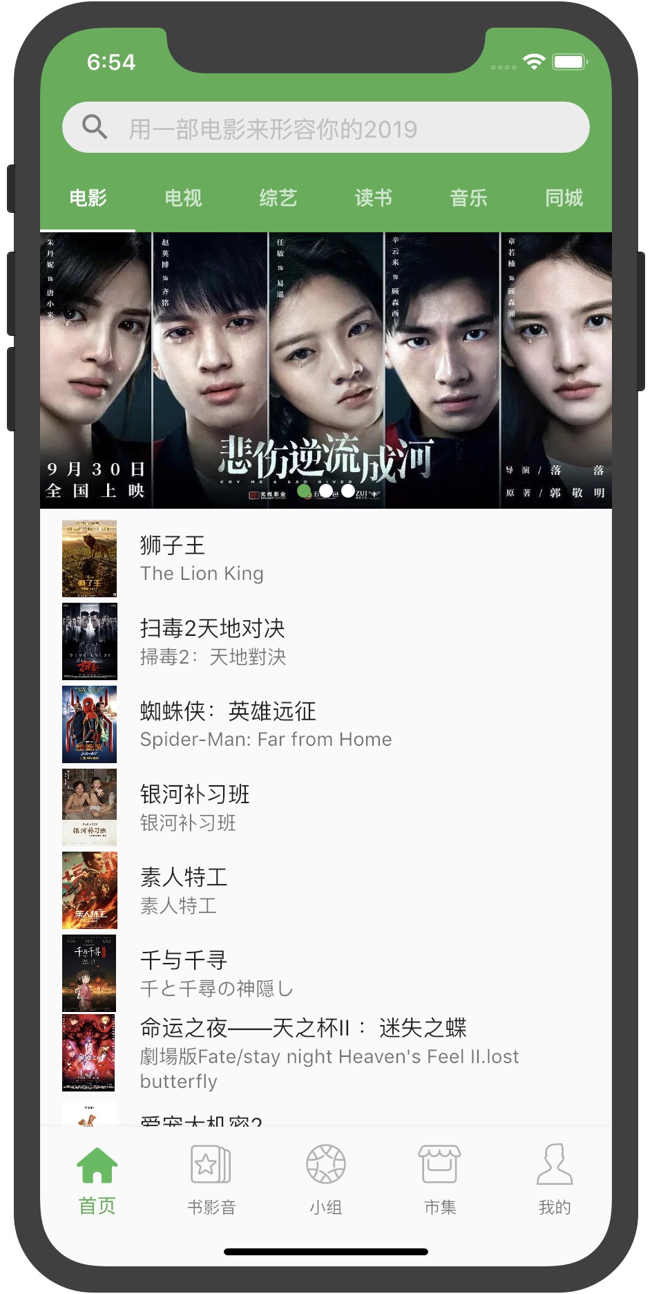
Tabbar.jpg
二、底部Tabbar
重新build方法会返回一个Scaffold组件,在这个组件下面添加底部导航属性bottomNavigationBar,onTap事件实现点击底部导航栏页面之间的切换和状态改变。因为界面有变化,所以这里使用的是动态组件StatefulWidget。
@override
  Widget build(BuildContext context) {
    return Scaffold(
      backgroundColor: Color.fromRGBO(244, 245, 245, 1.0),
      bottomNavigationBar: BottomNavigationBar(
        type:BottomNavigationBarType.fixed,
        currentIndex: currentIndex,
        items:_bottomTabs,
        onTap: (index){
          setState(() {
           currentIndex = index;
           currentPage = _tabs[currentIndex];
          });
        },
       fixedColor: Colors.green,
      ),
      body:currentPage
    );
  }
_bottomTabs是定义的底部Tabbar的List<BottomNavigationBarItem>,包含了Tabbar的每个item。item有默认icon和选择的activeIcon,这里使用的都是加载的本地图片,加载本地图片需要以下配置。
1、以当前Demo为例,建立一个assets文件夹images,下面建2.0x和3.0x两个文件夹,用来放2倍图和3倍图,另外直接在images文件夹下放一倍图。

本地图片配置1.jpg
2、需要在pubspec.yaml文件中声明每张图片。
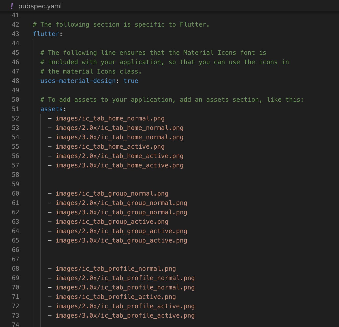
本地图片配置2.jpg
3、Tabbar每个item的icon和activeIcon加载本地图。
final List<BottomNavigationBarItem> _bottomTabs = [
    BottomNavigationBarItem(
      icon:Image.asset("images/ic_tab_home_normal.png",fit: BoxFit.cover,width: 40,height: 40,),
      activeIcon:Image.asset("images/ic_tab_home_active.png",fit: BoxFit.cover,width: 40,height: 40,),
      title:Text('首页')
    ),
    BottomNavigationBarItem(
      icon:Image.asset("images/ic_tab_subject_normal.png",fit: BoxFit.cover,width: 40,height: 40,),
      activeIcon:Image.asset("images/ic_tab_subject_active.png",fit: BoxFit.cover,width: 40,height: 40,),
      title:Text('书影音')
    ),
    BottomNavigationBarItem(
      icon:Image.asset("images/ic_tab_group_normal.png",fit: BoxFit.cover,width: 40,height: 40,),
      activeIcon:Image.asset("images/ic_tab_group_active.png",fit: BoxFit.cover,width: 40,height: 40,),
      title:Text('小组')
    ),
     BottomNavigationBarItem(
      icon:Image.asset("images/ic_tab_shiji_normal.png",fit: BoxFit.cover,width: 40,height: 40,),
      activeIcon:Image.asset("images/ic_tab_shiji_active.png",fit: BoxFit.cover,width: 40,height: 40,),
      title:Text('市集')
    ),
     BottomNavigationBarItem(
      icon:Image.asset("images/ic_tab_profile_normal.png",fit: BoxFit.cover,width: 40,height: 40,),
      activeIcon: Image.asset("images/ic_tab_profile_active.png",fit: BoxFit.cover,width: 40,height: 40,),
      title:Text('我的')
    )
  ];
_tabs是Tabbar所以页面的集合。
final List _tabs = [
    TopBarPage(),
    AudioBook(),
    Team(),
    Fair(),
    Mine()
  ];
初次加载页面重新initState初始化currentPage完成整个页面的渲染。
 @override
  void initState() {
    super.initState();
    currentPage=_tabs[currentIndex];
  }
切换Tabbar实现onTap刷新状态并更改currentPage渲染页面,就这样一个漂亮的底部Tabbar就完成了,很简单吧!
三、顶部Tabbar
顶部Tabbar相对于底部Tabbar简单一些,顶部Tabbar切换时不需要手动改变状态,所以这里使用StatelessWidget。顶部Tabbar使用DefaultTabController组件,声明切换item的个数length属性,并保证与tabs和TabBarView的个数一致,否则会报错。
AppBar组件下的Title也是一个组件,这里添加一个自定义的搜索组件SearchTextFieldWidget,这里就不过多介绍了。
@override
  Widget build(BuildContext context) {
    return DefaultTabController(
      length: 6,
      child: Scaffold(
        appBar: AppBar(
          title: SearchTextFieldWidget(
              hintText: "用一部电影来形容你的2019",
              onSubmitted: (searchContent) {

              },
            ),
         backgroundColor: Colors.green,
          bottom: TabBar(
            indicatorColor: Colors.white,
            tabs: <Widget>[
              Tab(
                text: "电影",
              ),
              Tab(
                text: "电视",
              ),
               Tab(
                text: "综艺",
              ),
               Tab(
                text: "读书",
              ),
              Tab(
                text: "音乐",
              ),
              Tab(
                text: "同城",
              )
            ],
          ),
        ),
        body: TabBarView(
          children: <Widget>[Home(), Home(), Home(), Home(), Home(), Home()],
        ),
      ),
    );
  }
作者:星星编程
链接:https://www.jianshu.com/p/22034838ae45
来源:简书
著作权归作者所有。商业转载请联系作者获得授权,非商业转载请注明出处。
以上是关于六Flutter自定义Tabbar的主要内容,如果未能解决你的问题,请参考以下文章