用三角形创建一个三角形原理
Posted 暑假过期le
tags:
篇首语:本文由小常识网(cha138.com)小编为大家整理,主要介绍了用三角形创建一个三角形原理相关的知识,希望对你有一定的参考价值。
用纯CSS创建一个三角形的原理
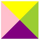
一.原理
采用均分原理,把盒子分为4等份,4等份都是边框
实现效果
1.必须是块元素,设置边框
<!DOCTYPE html>
<html lang="en">
<head>
    <meta charset="UTF-8">
    <meta name="viewport" content="width=device-width, initial-scale=1.0">
    <title>Document</title>
    <style>
        .square
            width: 150px;
            height: 150px;
            border-top: 60px solid yellow;
            border-right: 60px solid yellowgreen;
            border-left: 60px solid pink;
            border-bottom: 60px solid purple;

    </style>
</head>
<body>
    <div class="square"></div>
</body>
</html>

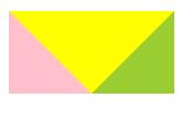
2.把宽和高都设置为0
<!DOCTYPE html>
<html lang="en">
<head>
    <meta charset="UTF-8">
    <meta name="viewport" content="width=device-width, initial-scale=1.0">
    <title>Document</title>
    <style>
        .square
            width: 0px;
            height: 0px;
            border-top: 60px solid yellow;
            border-right: 60px solid yellowgreen;
            border-left: 60px solid pink;
            border-bottom: 60px solid purple;

    </style>
</head>
<body>
    <div class="square"></div>
</body>
</html>
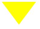
3.把border-bottom去掉
<!DOCTYPE html>
<html lang="en">
<head>
    <meta charset="UTF-8">
    <meta name="viewport" content="width=device-width, initial-scale=1.0">
    <title>Document</title>
    <style>
        .square
            width: 0px;
            height: 0px;
            border-top: 60px solid yellow;
            border-right: 60px solid yellowgreen;
            border-left: 60px solid pink;

    </style>
</head>
<body>
    <div class="square"></div>
</body>
</html>
把左右边框设置为透明(transparent)
<!DOCTYPE html>
<html lang="en">
<head>
    <meta charset="UTF-8">
    <meta name="viewport" content="width=device-width, initial-scale=1.0">
    <title>Document</title>
    <style>
        .square
            width: 0px;
            height: 0px;
            border-top: 60px solid yellow;
            border-right: 60px solid transparent;
            border-left: 60px solid transparent;

    </style>
</head>
<body>
    <div class="square"></div>
</body>
</html>
以上是关于用三角形创建一个三角形原理的主要内容,如果未能解决你的问题,请参考以下文章