css 视觉格式化模型 (visual formatting model )
Posted 耳东蜗牛
tags:
篇首语:本文由小常识网(cha138.com)小编为大家整理,主要介绍了css 视觉格式化模型 (visual formatting model )相关的知识,希望对你有一定的参考价值。
为什么需要了解视觉格式化模型?
解释一些css效果,下面的两个问题?
- 下面child1:一般为了水平居中会在水平方向上设置auto,这里在垂直方向上设置auto,会导致垂直居中的效果呢?
- 下面两种方式一种是基于position,一种基于margin。可以观察chorme浏览器检查元素的不同
水平垂直居中
<html lang="en">
  <head>
    <meta charset="UTF-8">
    <title>Document</title>
    <style>
      html,
      body
        margin:0;
        height: 100%;


      .parent
        position: relative;
        height: 100%;
        background-color: #f3f3f3;


      .child
        position: absolute;
        margin: auto;
        width: 200px;
        height: 200px;
        background-color: #61C1E8;
        top: calc(50% - 100px);
        left: calc(50% - 100px);


      .child1
        position: absolute;
        top: 0;
        bottom: 0;
        left: 0;
        right: 0;
        margin: auto;
        width: 200px;
        height: 200px;
        background-color: red;

    </style>
  </head>

  <body>
    <div class="parent">
      <div>text</div>
      <div class="child"></div>
      <div class="child1"></div>
    </div>
  </body>
</html>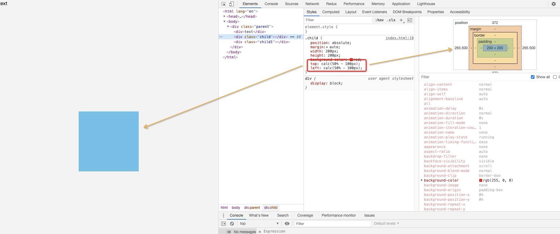

视觉格式化模型是什么?
定义
视觉格式化模型 的全称是 Visual formatting model,它被用来描述用户代理(比如浏览器)在图形媒体下如何处理文档树。
在 视觉格式化模型 中,每个文档树的元素会根据框模型产生零到多个框(boxes)
https://www.w3.org/TR/CSS22/visuren.html
- box dimensions and type.
- positioning scheme (normal flow, float, and absolute positioning).
- relationships between elements in the document tree.
- external information (e.g., viewport size, intrinsic dimensions of images, etc.).
- 盒模型的尺寸和类型
- 定位方案【正常文档流,浮动和绝对定位】
- 文档树内部元素之间的关系
- 外部信息(视口大小,图片的固有尺寸等)
名词解释
元素块
css假设每个元素都会生成Box,成为元素框。
替换 / 非替换元素
在 CSS 中,可替换元素(replaced element)的展现效果不是由 CSS 来控制的。这些元素是一种外部对象,它们外观的渲染,是独立于 CSS 的。
简单来说,它们的内容不受当前文档的样式的影响。CSS 可以影响可替换元素的位置,但不会影响到可替换元素自身的内容。某些可替换元素,例如 <iframe> 元素,可能具有自己的样式表,但它们不会继承父文档的样式。
典型的可替换元素有:
- <iframe>
- <video>
- <embed>
- <img>
有些元素仅在特定情况下被作为可替换元素处理,例如:
- <option>
- <audio>
- <canvas>
- <object>
- <applet>
HTML 规范也说了 <input> 元素可替换,因为 "image" 类型的 <input> 元素就像<img>一样被替换。但是其他形式的控制元素,包括其他类型的 <input> 元素,被明确地列为非可替换元素(non-replaced elements)。该规范用术语小挂件(Widgets)来描述它们默认的限定平台的渲染行为。
视口(viewport)
连续媒体的用户代理一般会给用户提供一个视口(屏幕上的一个窗口或者视图区域),用户通过它来查阅文档。视口尺寸变化(见初始包含块)时,用户代理可能会改变文档的布局
当视口比渲染文档的画布区域小时,用户代理应该提供一种滚动机制。一个画布最多对应一个视口,但用户代理可能会渲染到多个画布上(即提供同一文档的不同视图)
包含块
https://www.w3.org/TR/CSS22/visuren.html#containing-block
In CSS 2.2, many box positions and sizes are calculated with respect to the edges of a rectangular box called a containing block. In general, generated boxes act as containing blocks for descendant boxes; we say that a box "establishes" the containing block for its descendants. The phrase "a box's containing block" means "the containing block in which the box lives," not the one it generates.
Each box is given a position with respect to its containing block, but it is not confined by this containing block; it may overflow.
在css2.2,许多盒子的定位和大小都是参展叫做包含块的盒子边缘计算而来。通常来说:生成的框将会充当后代元素的包含块,我们称这个盒子为后代建立了包含块。这个短语“a box's containing block”意思是包含当前元素的包含块,而不是当前元素创建的包含块。
理解:包含块指的是元素的布局上下文。
包含块的定义
https://www.w3.org/TR/CSS22/visudet.html#containing-block-details
Definition of "containing block"
The position and size of an element's box(es) are sometimes calculated relative to a certain rectangle, called the containing block of the element. The containing block of an element is defined as follows:
- The containing block in which the root element lives is a rectangle called the initial containing block. For continuous media, it has the dimensions of the viewport and is anchored at the canvas origin; it is the page area for paged media. The 'direction' property of the initial containing block is the same as for the root element.
- For other elements, if the element's position is 'relative' or 'static', the containing block is formed by the content edge of the nearest ancestor box that is a block container or which establishes a formatting context.
- If the element has 'position: fixed', the containing block is established by the viewport in the case of continuous media or the page area in the case of paged media.
- If the element has 'position: absolute', the containing block is established by the nearest ancestor with a 'position' of 'absolute', 'relative' or 'fixed', in the following way:
- In the case that the ancestor is an inline element, the containing block is the bounding box around the padding boxes of the first and the last inline boxes generated for that element. In CSS 2.2, if the inline element is split across multiple lines, the containing block is undefined.
- Otherwise, the containing block is formed by the padding edge of the ancestor.
If there is no such ancestor, the containing block is the initial containing block.
- 根元素所在的包含块称之为初始包含块。
- 如果元素的position属性值为releative或者static。包含块则是最近的块级盒子或者建立格式上下文的祖先元素。
- 如果元素的position属性值为fixed。连续媒体,包含块为视口。多页媒体,包含块为页面区域。
- 如果元素的position属性值为absolute。则包含块由具有position属性值为 'absolute', 'relative' or 'fixed'的最近祖先元素建立。
-
- 如果祖先元素为内联元素,则包含块是当前内联元素创建的第一个内联元素和最后一个内联元素填充框周围的边界框
- 其他情况下,包含块为祖先的填充边缘组成。
- 如果没有上述的父元素,则包含块为初始包含块。
我们给4.a举个例子:
<html lang="en">
  <head>
    <meta charset="UTF-8">
    <title>Document</title>
    <style>
      html,
      body
        margin:0;
        height: 100%;


      .parent
        position: relative;
        height: 100%;
        background-color: #f3f3f3;


      .child


      .child1
        position: absolute;
        bottom: 10px;
        right: 0px;
        background-color: #61C1E8;


      .child2
        display: inline-block;
        width: 200px;
        height: 200px;
    </style>

  </head>

  <body>
    <div>
      <span class="parent">
        <span class="child">1111111</span>
        <span class="child1">2222</span>
        <span class="child2">333333333333333333333333333333333333333333333333333333333333333</span>
      </span>
    </div>
  </body>
</html>
生成盒
CSS视觉格式化模型的一部分工作是从文档元素生成盒.生成的盒拥有不同类型,并对视觉格式化模型的处理产生影响。生成盒的类型取决于CSS属性display
块级元素和块级盒
一般情况下一个块级元素产生一个块级盒(block-level box),称为主块级盒(principal block-level box),主块级盒用来包含后代盒(descendant boxes)以及后代盒中的内容。主块级盒可以参与任何定位方案(positioning scheme)。
块级元素在源文档中格式化为可见的块。display的属性值为block,list-item, table的元素是块级元素。
块级元素(Block-level elements)
- 当元素的CSS属性display为block,list-item或table时,它就是块级元素
- 块级元素视觉上呈现为块,竖直排列
块级盒(block-level box)
- 块级盒用于描述他与父元素和兄弟元素之间的表现
- 块级盒参与块格式化上下文(block formatting context)
- 每个块级元素至少生成一个块级盒,称为主要块级盒(principal block-level box).一些元素,比如<li>,生成额外的盒赖放置项目符号,不过多数元素只生成一个主要块级盒
- 主要块级盒将包含后代元素生成的盒以及生成的内容
- 主要块级盒是可以使用定位方案(position scheme)的盒
note:
有些块级元素除了产生主块级盒,也可能产生额外的盒(additional boxes),比如display属性值为“list-item”的元素产生的额外的盒用来包含项目符号(可以用list-style-position属性设置额外的盒是放在主块级盒内还是外)
<html lang="en">
  <head>
    <meta charset="UTF-8">
    <title>Document</title>
    <style>
      ul[list-style-position="inside"]
        background: yellow;
        list-style-position: inside;


      ul[list-style-position="outside"]
        background: yellow;
        list-style-position: outside;

    </style>

  </head>

  <body>
    <ul list-style-position="inside">
      <li>rod</li>
      <li>augmentum</li>
    </ul>
    <ul list-style-position="outside">
      <li>rod</li>
      <li>augmentum</li>
    </ul>
  </body>
</html>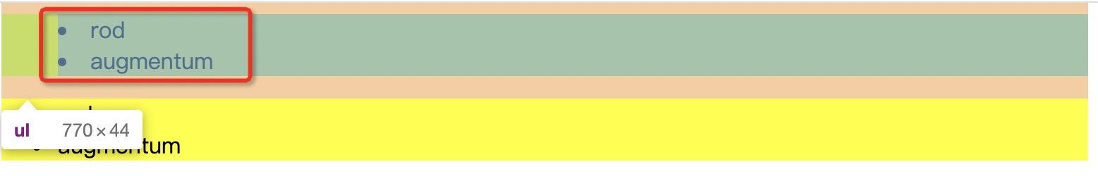

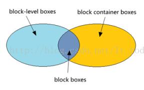
块容器盒
除了表格盒和可替换元素盒外,一个块级盒也可以是一个块容器盒,块容器盒有两个功能(只能同时具备一种功能)
- 只用来包含其他块级盒
- 创建一个行内格式化上下文(inline formating context),行内格式化上下文只用来包含行内集盒。
不是所有的块容器盒都是块级盒。不可替换行内块(non-replaced inline blocks)和不可替换表单元格(non-replaced table cells)是块容器盒,但不是块级盒。如果一个块级盒同时又是一个块容器盒,那么我们可以叫这个块级盒为块盒(block boxes)。
- 块容器盒描述跟它后代之间的影响
- 一个块级盒也可能是块容器盒
- 块容器盒(block container box)只包含其它块级盒,或生成一个行内格式化上下文(inline formatting context),由此只包含行内盒
- 有些块级盒,比如表格,可替换元素不是块容器盒.相反,一些块容器盒.比如非替换行内块及非替换表格单元格,不是块级盒
- 同是块容器盒的块级盒称为块盒(block boxes)

块级盒,块容器盒 块盒 例子
<html lang="en">
  <head>
    <meta charset="UTF-8">
    <title>Document</title>
    <style>
      .block-level-box
        display: block;


      .block_container_box
        display: inline-block;
        width: 100px;
        height: 100px;
        background-color: yellowgreen;


      .block_box
        width: 100px;
        height: 100px;
        background-color: yellow;

    </style>

  </head>

  <body>
    <img class="block-level-box" src="https://gimg2.baidu.com/image_search/src=http%3A%2F%2Ffile02.16sucai.com%2Fd%2Ffile%2F2015%2F0107%2F1daf01ab3e6dc38c15efa15c4a6f7a40.jpg&refer=http%3A%2F%2Ffile02.16sucai.com&app=2002&size=f9999,10000&q=a80&n=0&g=0n&fmt=jpeg?sec=1619604060&t=58546a123e31a1c096d02cbc1ee72c4a" />
    <div class="block_container_box">

    </div>

    <div class="block_box">

    </div>
  </body>
</html>
理解:
- 其实大部分块级盒都是块容器盒
- 如果非要拆开来看,块级盒指的是对外表现形式。块容器盒是对内表现形式。
- 因为可替换元素的内部内容展示不是由css控制的,所以可替换元素对内表现形式不是块级容器盒。然后我们将其对外展现形式,通过display设置成块级盒。则是独立的块级盒而不是块级容器盒。
- 不可替换元素基本上都是块级容器盒子。但是为了独立的块级容器盒,而不是块级盒,则需要将不可替换元素的display设置成非块级盒。
行内元素和行内盒
行内级元素是那些在源文档中不形成新的内容块,而分布在行中的元素(例如段落里的强调文本,行内图片等)。display属性的值为“inline”、“inline-table”、“inline-block”的元素是行内级元素。
行内级元素产生行内级盒(inline-level boxes),行内级盒参与行内格式化上下文(inline formatting context)的布局。
行内盒(inline box)是一种行内级盒,他的内容参与他包含的行内格化式上下文的布局。display值为“inline”的不可替换元素产生行内盒。
不是行内盒的行内级盒(such as replaced inline-level elements, inline-block elements, and inline-table elements)叫做原子行内(级)盒(atomic inline-level boxes)。原子行内盒作为一个不可拆分的整体参与行内格式上下文的布局(不能拆分为多个盒跨行显示)。
总览
行内级元素(inline-level elements)
- 当元素的CSS属性display为inline,inline-block或inline-table时,称它为行内级元素
- 视觉上它将内容与其它行内级元素排列为多行.典型的如段落内容,有文本(可以有多种格式譬如着重),或图片,都是行内级元素
行内级盒(inline-level boxes)
- 行内级元素生成行内级盒
- 参与行内格式化上下文(inline formatting context)
- 行内级盒分为行内盒和原子行内级盒
行内盒(inline boxes)
- 参与生成行内格式化上下文的行内级盒称为行内盒
- 所有display:inline的非替换元素生成的盒是行内盒
原子行内级盒(atomic inline-level boxes)
- 作为不透明盒子参与生成行内格式化上下文的行内级盒称为原子行内级盒
- 这些盒由可替换行内元素,或display值为inline-block或inline-table的元素生成,不能拆分成多个盒
例子
<html lang="en">
  <head>
    <meta charset="UTF-8">
    <title>Document</title>
    <style>
      .inline_boxes


      .atomic_inline_level_boxes
        display: inline-block;
        width: 100px;
        height: 100px;
        background-color: yellowgreen;


    </style>

  </head>

  <body>
    <span class="inline_boxes">123</span>
    <span class="atomic_inline_level_boxes">456</span>
  </body>
</html>
理解
- 行内级元素都是行内级盒
- 都会参与参与行内格式化上下文(inline formatting context)
- 通过区分参与的方式不同分为行内盒(inline boxes)和原子行内级盒(atomic inline-level boxes)
- 可替换元素内部展示由内容决定,inline-block,inline-table对内为block元素。宽度为元素的盒子模型决定。这几种情况下,参与行内上下文的方式为 一个整体进行。称之为 原子行内级盒。
匿名块盒
在某些情况下进行视觉格式化时,需要添加一些增补性的盒子,这些盒子不能用CSS选择符选中,因此称为匿名盒子(anonymous boxes)。
CSS选择器不能作用于匿名盒子(anonymous boxes),所以它不能被样式表赋予样式。也就是说,此时所有可继承的 CSS 属性值都为 inherit ,而所有不可继承的 CSS 属性值都为 initial。
第一种
块包含盒子可能只包含行内级盒子,也可能只包含块级盒子,但通常的文档都会同时包含两者,在这种情况下,就会在相邻的行内级盒子外创建匿名块盒子。
<html lang="en">
  <head>
    <meta charset="UTF-8">
    <title>Document</title>
    <style>
    </style>
  </head>

  <body>
    <div>Some inline text <p>followed by a paragraph</p> followed by more inline text.</div>
  </body>
</html>
第二种
一个行内盒子中包含一或多个块盒子。此时,包含块盒子的盒子会拆分为两个行内盒子【行内盒子同时会被一个匿名块级盒子包含】,分别位于块盒子的前面和后面。
<html lang="en">
  <head>
    <meta charset="UTF-8">
    <title>Document</title>
    <style>
    </style>
  </head>

  <body>
    <span>Some inline text <p>followed by a paragraph</p> followed by more inline text.</span>
  </body>
</html>
其他类型盒子
行盒子
行盒子由行内格式化上下文创建,用来显示一行文本。在块盒子内部,行盒子总是从块盒子的一边延伸到另一边(译注:即占据整个块盒子的宽度)。当有浮动元素时,行盒子会从向左浮动的元素的右边缘延伸到向右浮动的元素的左边缘。
行盒子更多是以技术性目的而存在的,Web开发者通常不需要关心。
Run-in盒子
Run-in 盒子通过 display:run-in 来定义,它可以是块盒子,也可以是行内盒子,这取决于紧随其后的盒子的类型。Run-in 盒子可以用来在可能的情况下将标题嵌入文章的第一个段落中。
注意:Run-in 盒子已经在CSS 2.1的标准中移除了,但可能会在CSS 3中作为一个实验性的内容再次加入。因此最好不要将其用于正式项目。
定位规则
一旦生成了盒子以后,CSS引擎就需要定位它们以完成布局。下面是定位盒子时所使用的规则:
- 普通流:按照次序依次定位每个盒子
- 浮动:将盒子从普通流中单独拎出来,将其放到外层盒子的某一边
- 绝对定位:按照绝对位置来定位盒子,其位置根据盒子的包含元素所建立的绝对坐标系来计算,因此绝对定位元素有可能会覆盖其他元素
普通流
在普通流中,盒子会依次放置。在块格式化上下文中,盒子在垂直方向依次排列;而在行内格式化上下文中,盒子则水平排列。当CSS的 position 属性为 static 或 relative,并且 float 为 none 时,其布局方式为普通流。
浮动 [后续详细文章]
在浮动定位中,浮动盒子会浮动到当前行的开始或尾部位置。这会导致普通流中的文本及其他内容会“流”到浮动盒子的边缘处,除非元素通过 clear 清除了前面的浮动。
一个盒子的 float 值不为 none,并且其 position 为 static 或 relative 时,该盒子为浮动定位。如果将 float 设置为 left,浮动盒子会定位到当前行盒子的开始位置(左侧),如果设置为 right,浮动盒子会定位到当前行盒子的尾部位置(右侧)。不管是左浮动还是右浮动,行盒子都会伸缩以适应浮动盒子的大小。
绝对定位 [后续详细文章]
在绝对定位中,盒子会完全从当前流中移除,并且不会再与其有任何联系(译注:此处仅指定位和位置计算,而绝对定位的元素在文档树中仍然与其他元素有父子或兄弟等关系),其位置会使用 top、bottom、left 和 right 相对其包含块进行计算。
如果元素的 position 为 absolute 或 fixed,该元素为绝对定位。
对固定位置的元素来说,其包含块为整个视口,该元素相对视口进行绝对定位,因此滚动时元素的位置并不会改变。
解决开头的问题
盒子偏移量:top,right,bottom,left
https://www.w3.org/TR/CSS22/visuren.html#position-props
An element is said to be positioned if its 'position' property has a value other than 'static'. Positioned elements generate positioned boxes, laid out according to four properties:
This property specifies how far an absolutely positioned box's top margin edge is offset below the top edge of the box's containing block. intial value: auto
翻译:
- 如果有一个元素的position属性值不是static,则认为当前元素已定位。定位元素生成定位框,根据四个属性值进行定位。
- 四个属性值的距离是 定位框的上边距 距离 当前盒子的包含块边的长度。
- 初始值为auto。
display,position,和float之间的关系
https://www.w3.org/TR/CSS22/visuren.html#dis-pos-flo
The three properties that affect box generation and layout — 'display', 'position', and 'float' — interact as follows:
- If 'display' has the value 'none', then 'position' and 'float' do not apply. In this case, the element generates no box.
- Otherwise, if 'position' has the value 'absolute' or 'fixed', the box is absolutely positioned, the computed value of 'float' is 'none', and display is set according to the table below. The position of the box will be determined by the 'top', 'right', 'bottom' and 'left' properties and the box's containing block.
- Otherwise, if 'float' has a value other than 'none', the box is floated and 'display' is set according to the table below.
- Otherwise, if the element is the root element, 'display' is set according to the table below, except that it is undefined in CSS 2.2 whether a specified value of 'list-item' becomes a computed value of 'block' or 'list-item'.
- Otherwise, the remaining 'display' property values apply as specified.
- 如果’display’值为’none’,同时不设置’position’和’float’,那么该元素不生成框。
- 否则,如果’positon’值为’absolute’或’fixed’,即框为绝对定位,’float’的计算值为’none’,并且’display’根据下表设置。那么该框的位置由’top’,’right’,’bottom’,’left’和框的包含块决定。
- 否则,如果’float’的值不为’none’,那么该框会浮动,’display’根据下表设置。
- 否则,如果该元素为根元素,’display’根据下表设置。
- 否则,剩余的’display’属性值与指定值相同。
| Specified value | Computed value |
| inline-table | table |
| inline, table-row-group, table-column, table-column-group, table-header-group, table-footer-group, table-row, table-cell, table-caption, inline-block | block |
| others | same as specified |
绝对定位,非替换元素
https://www.w3.org/TR/CSS22/visudet.html#abs-non-replaced-height
// 对于绝对定位的元素,使用的垂直尺寸值必须满足以下约束:
For absolutely positioned elements, the used values of the vertical dimensions must satisfy this constraint:
// 计算公式
'top' + 'margin-top' + 'border-top-width' + 'padding-top' + 'height' + 'padding-bottom' + 'border-bottom-width' + 'margin-bottom' + 'bottom' = height of containing block
// 如果top,height,bottom三个值都是auto。则那么’top’值为元素的静态位置。
If all three of 'top', 'height', and 'bottom' are auto, set 'top' to the static position and apply rule number three below.
// 如果这三个值都不是auto,margin-top和margin-bottom都是auto,则将这两个值设置为相等,然后计算上面的方程式
If none of the three are 'auto': If both 'margin-top' and 'margin-bottom' are 'auto', solve the equation under the extra constraint that the two margins get equal values.
// 如果margin-top或者margin-bottom其中一个为auto,则带入上面的方程式计算
If one of 'margin-top' or 'margin-bottom' is 'auto', solve the equation for that value.
If the values are over-constrained, ignore the value for 'bottom' and solve for that value.
解释一开始的问题:
当前盒子的包含块为父元素高度:100%,我的电脑为910px。
      .child
        position: absolute;
        margin: auto;
        width: 200px;
        height: 200px;
        background-color: #61C1E8;
        top: calc(50% - 100px);
        left: calc(50% - 100px);
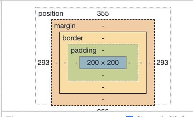
计算方式:top + bottom + width = 50% + 50% - 100px - 100px + 200px = 100%
      .child1
        position: absolute;
        top: 0;
        bottom: 0;
        left: 0;
        right: 0;
        margin: auto;
        width: 200px;
        height: 200px;
        background-color: red;
根据上面提示的:
// 如果这三个值都不是auto,margin-top和margin-bottom都是auto,则将这两个值设置为相等,然后计算上面的方程式
If none of the three are 'auto': If both 'margin-top' and 'margin-bottom' are 'auto', solve the equation under the extra constraint that the two margins get equal values.

top + bottom + width = 0 + 0 + 200 + margin-top + margin-bootom = 910px

然后二者取相等的值:margin-top + margin-bootom = 710px

margin-top = margin-bootom = 355px
说明display,position,和float之间的关系的用处
我们将上面代码的display设置为inline-block没有任何影响,因为上面表格当中,inline-block会当前block计算
以上是关于css 视觉格式化模型 (visual formatting model )的主要内容,如果未能解决你的问题,请参考以下文章