前端基础学习CSS过渡与动画
Posted 三笠·阿卡曼
tags:
篇首语:本文由小常识网(cha138.com)小编为大家整理,主要介绍了前端基础学习CSS过渡与动画相关的知识,希望对你有一定的参考价值。
transition过渡
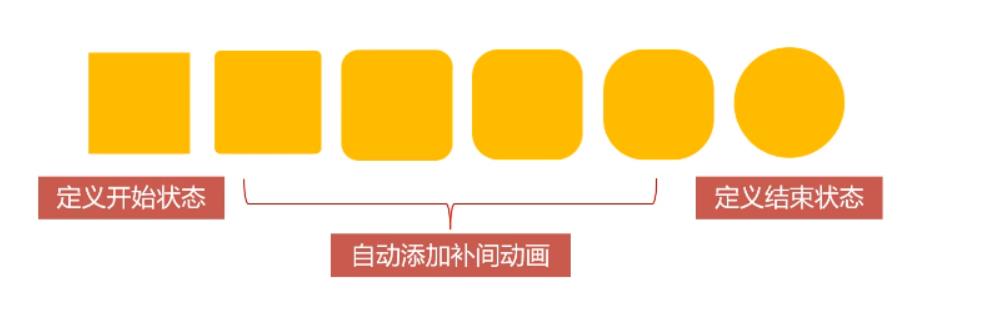
transition过渡属性是CSS3浓墨重彩的特性,过渡可以为一个元素在不同样式之间变化自动添加“补间动画”;
- 兼容性良好,动画更细腻,内存开销小;
过渡的基本使用
transition属性基本使用
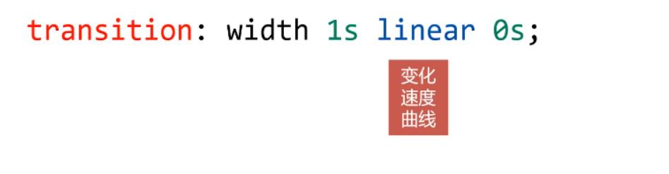
transition有四个要素
transition: width 1s linear 0s;

哪些属性可以参与过渡
- 所有数值类型的属性,都可以参与过渡,比如
width、height、left、top、border-radius; - 背景颜色和文字颜色可以被过渡;
- 所有变形(包括2D和3D)都能被过渡;
all
- 如果要所有的属性都参与过渡,可以写all;
transition: all 1s linear 0s;
过渡的四个小属性
| 属性 | 意义 |
|---|---|
| transition-property | 那些属性要过渡 |
| transition-duration | 动画时间 |
| transition-timing-function | 动画变化曲线(缓动效果) |
| transition-delay | 延迟时间 |
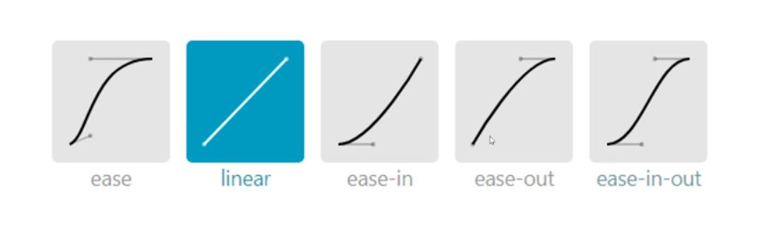
过渡的缓动效果
缓动参数
- transition的第三个参数就是缓动参数,也是变化速度曲线;
transition: width 1s linear 0s;
<!DOCTYPE html>
<html lang="en">
  <head>
    <meta charset="UTF-8" />
    <meta http-equiv="X-UA-Compatible" content="IE=edge" />
    <meta name="viewport" content="width=device-width, initial-scale=1.0" />
    <title>过渡的缓动效果</title>

    <style>

      *
        margin: 0;
        padding: 0;


      div
        margin-bottom: 10px;


      .box1
        border: 1px solid #000;


      .box1 p
        width: 60px;
        height: 60px;
        background-color: orange;
        margin-bottom: 10px;
        position: relative;
        left: 0;
        transition: left 5s linear 0s;


      .box1 p:nth-child(2)
        transition-timing-function: ease;

      .box1 p:nth-child(3)
        transition-timing-function: ease-in;

      .box1 p:nth-child(4)
        transition-timing-function: ease-out;

      .box1 p:nth-child(5)
        transition-timing-function: ease-in-out;

      .box1 p:nth-child(6)


      .box1:hover p
        left: 1000px;


    </style>
  </head>
  <body>
    <div class="box1">
      <p></p>
      <p></p>
      <p></p>
      <p></p>
      <p></p>
      <p></p>
    </div>
  </body>
</html>
贝塞尔曲线
- 网站
https://cubic-bezier.com/可以生成贝塞尔曲线,可以自定义动画缓动参数
过渡效果实战课
动画
动画的定义和调用
动画的定义
- 可以用
@keyframes来定义动画,keyframes表示“关键帧”,在项目上线前,要补上@-webkit-这样的私有前缀;
@keyframes r
	from
		transform: rotate(0);


	to
		transform: rotate(360deg);
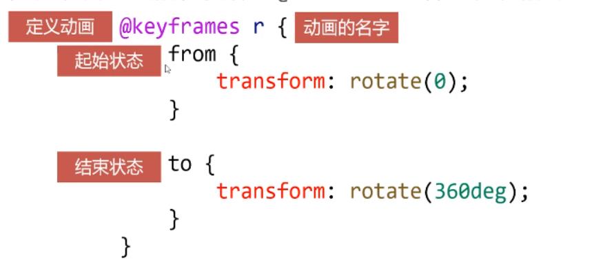
中间状态由CSS3自动补全
动画的调用
- 定义动画之后,就可以使用
animation属性来调用动画;
animation: r 1s linear 0s;

动画的执行次数
- 第五个参数就是动画的执行次数
animation: r 1s linear 0s 3;
- 如果永远想执行的话可以写
infinite;
alternate和forwards
- 如果想让动画的第2、4、6…(偶数次)自动逆向执行,那么要加上alternate参数即可
animation: movelr 2s linear 0s infinite alternate;
- 如果想让动画停止在最后结束状态,那么要加上forwars
animation: changeToCircle 1s linear 0s forwards;
多关键帧动画
@keyframes changeColor
        0%
          background-color: red;

        20%
          background-color: yellow;

        40%
          background-color: blue;

        60%
          background-color: green;

        80%
          background-color: purple;

        100%
          background-color: orange;
动画效果实战课
制作一个发光的灯泡
<!DOCTYPE html>
<html lang="en">
<head>
  <meta charset="UTF-8">
  <meta http-equiv="X-UA-Compatible" content="IE=edge">
  <meta name="viewport" content="width=device-width, initial-scale=1.0">
  <title>Document</title>

  <style>

    *
      margin: 0;
      padding: 0;


    .dengpao
      position: absolute;
      top: 300px;
      left: 300px;


    .guang
      position: absolute;
      top: 235px;
      left: 222px;
      //设置动画时间,无限循环+正反
      animation: ss 1s ease 0s infinite alternate;

	//定义动画
    @keyframes ss
      from
        opacity: 1;


      to
        opacity: 0;


  </style>
</head>
<body>

  <img class="dengpao" src="../images/transition/dengpao.png" />
  <img class="guang" src="../images/transition/guang.png" />

</body>
</html>
效果:

不会截GIF;
以上是关于前端基础学习CSS过渡与动画的主要内容,如果未能解决你的问题,请参考以下文章