React Native 安卓开发----第三方框架的引用之React-native-Swiper框架实现欢迎页第五篇
Posted 先知丨先觉
tags:
篇首语:本文由小常识网(cha138.com)小编为大家整理,主要介绍了React Native 安卓开发----第三方框架的引用之React-native-Swiper框架实现欢迎页第五篇相关的知识,希望对你有一定的参考价值。
#前言
今天要介绍的是React-native-Swiper这个RN开源框架,如果你不想用第三方的你也可以自己用viewPagerandroid去实现,这里先不做介绍了,很简单。
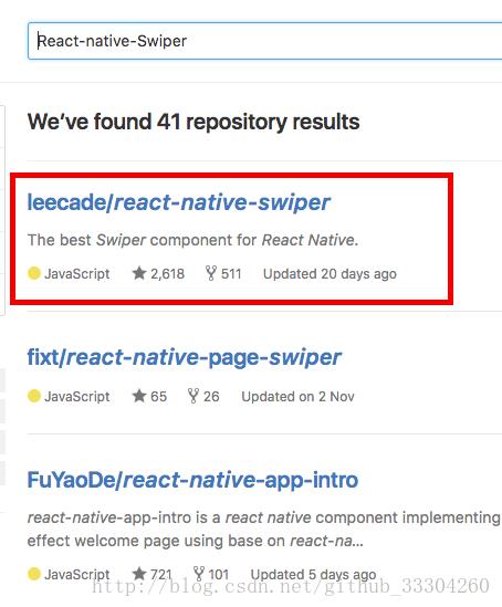
想要了解React-native-Swiper源码的童鞋可以在github直接搜索React-native-Swiper。
对于安卓同学来说应该都用过ViewPagerIndicator 做引导页或者导航栏,这里就不多说了,今天要讲的React-native-Swiper也是一款非常叼的开源框架,接下来然我们一起来看一看。
#引入依赖和模块
####1.首先进入到工程目录根目录下面 即:package.json所在的目录。
(package.json里面有工程信息及所有依赖,相当于安卓的gradle,然后我们所依赖的那些库在node-modules里面,就相当于安卓之前的libs文件夹)
####2.通过npm安装模块
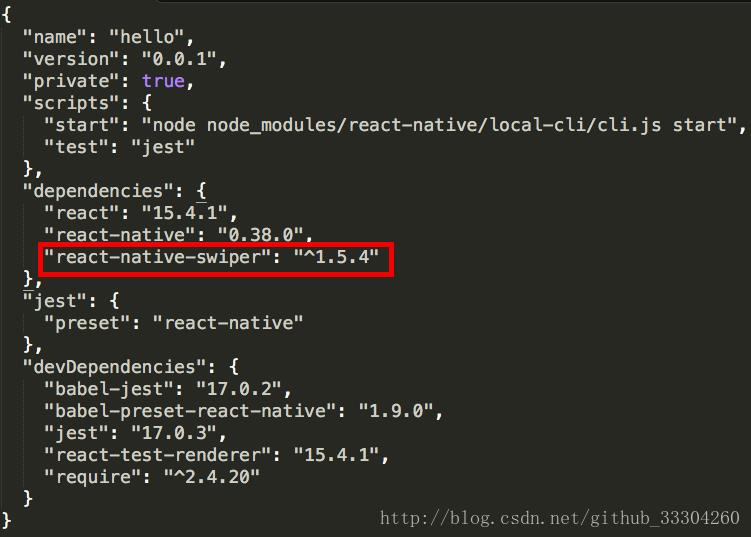
npm i react-native-swiper --save
成功后会有如下显示:

这个意思就是安装这个模块到node-modules,同时配置到package.json里面去。
– save的作用就是配置package.json。
如下:会在package.json依赖里面多了一个react_native-swiper:"^1.5.4"
同时让我们观察一下node-modules文件夹:

多了react-native-swiper文件
####3.几个常用命令便于管理工程
查看模块:npm view react-native-swiper
删除模块:npm rm react-native-swiper --save (这个添加save会在删除的同时去除package.json中的依赖)
查看帮助命令:npm help 命令 (例如npm help -i查看i的使用)
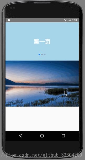
#使用效果
先来看一下效果:
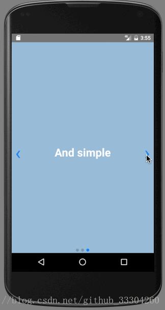
下面是代码:可以直接自己coyp自己体验一下,切记AppRegistry.registerComponent('hello', () => hello);需要自己改一下
import React,  Component  from 'react';
import
    AppRegistry,
    StyleSheet,
    Text,
    Image,
    TouchableOpacity,
    ViewPagerAndroid,
    Navigator,
    View
     from 'react-native';

import Swiper from 'react-native-swiper';

class hello extends Component
  render()
    return (
      <Swiper style=styles.wrapper showsButtons=true>
        <View style=styles.slide1>
          <Text style=styles.text>Hello Swiper</Text>
        </View>
        <View style=styles.slide2>
          <Text style=styles.text>Beautiful</Text>
        </View>
        <View style=styles.slide3>
          <Text style=styles.text>And simple</Text>
        </View>
      </Swiper>
    );


const styles = StyleSheet.create(
  wrapper:
  ,
  slide1:
    flex: 1,
    justifyContent: 'center',
    alignItems: 'center',
    backgroundColor: '#9DD6EB',
  ,
  slide2:
    flex: 1,
    justifyContent: 'center',
    alignItems: 'center',
    backgroundColor: '#97CAE5',
  ,
  slide3:
    flex: 1,
    justifyContent: 'center',
    alignItems: 'center',
    backgroundColor: '#92BBD9',
  ,
  text:
    color: '#fff',
    fontSize: 30,
    fontWeight: 'bold',

);


AppRegistry.registerComponent('hello', () => hello);
#详细属性
接下来让我们好好探索一下这个框架的基本属性:
###基本属性
| Prop | Default | Type | Description |
|---|---|---|---|
| horizontal | true | boolean | 为false提示小圆点在侧面 |
| loop | true | boolean | 设置为false以禁用连续循环模式 |
| index | 0 | int | 默认显示第几页 |
| showsButtons | false | int | 设置为true显示button |
| autoplay | false | boolean | 设置为true将启用自动播放模式。 |
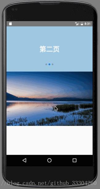
下面演示一下下面这些样式的效果 我设置默认选择第二页,显示button,小圆点在最下面,禁用无限循环。
<Swiper style=styles.wrapper showsButtons=true horizontal=true loop=false index=1>
        <View style=styles.slide1>
          <Text style=styles.text>我是第一页</Text>
        </View>
        <View style=styles.slide2>
          <Text style=styles.text>我是第二页</Text>
        </View>
        <View style=styles.slide3>
          <Text style=styles.text>我是第三页</Text>
        </View>
      </Swiper>
显示效果如下:
###自定义基本样式
| Prop | Default | Type | Description |
|---|---|---|---|
| width | -/- | number | 默认flex:1 |
| height | -/- | number | 默认flex:1 |
| style | … | style | 请参阅源中的默认样式。 |
| loadMinimal | false | boolean | 只加载当前索引幻灯片 |
| loadMinimalSize | 1 | number | 请参阅loadMinimal |
| loadMinimalLoader | 《ActivityIndicator/》 | element | 在未加载幻灯片时显示自定义加载程序 |
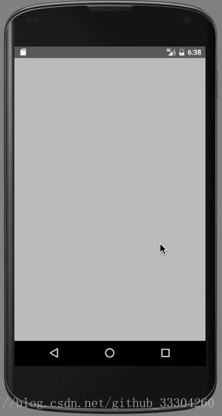
接来下体验下一下效果
设置宽高为200,200,loadMinimal为true加载当前索引幻灯片。
<Swiper style=styles.wrapper
              showsButtons=true
              horizontal=true
              loop=false
              index=1
              loadMinimal=true>
效果图:
可以看出宽高都有了变化 而且只加载了一个
视图,其他的都是空白的
当我们把loadMinimal设置为true同时,loadMinimalSize设置为3这时候就回复正常了,让我们看一下效果:
<Swiper style=styles.wrapper
              showsButtons=true
              horizontal=true
              loop=false
              index=1

              loadMinimal=true
              loadMinimalSize=3

             >

###Pagination分页
| Prop | Default | Type | Description |
|---|---|---|---|
| showsPagination | true | boolean | 设置为true可使分页可见 |
| paginationStyle | … | style | 自定义样式将与默认样式合并 |
| renderPagination | -/- | function | 通过三个参数(index, total, context)确定如何渲染 |
| dot | 《View style=backgroundColor:‘rgba(0,0,0,.2)’, width: 8, height: 8,borderRadius: 4, marginLeft: 3, marginRight: 3, marginTop: 3, marginBottom: 3, /》 | element | 允许自定义点元素 |
| activeDot | 《View style=backgroundColor: ‘#007aff’, width: 8, height: 8, borderRadius: 4, marginLeft: 3, marginRight: 3, marginTop: 3, marginBottom: 3, /》 | element | 允许自定义active-dot元素 |
接下来让我们看一个分页的demo:
先看一下效果:
/**
 * Sample React Native App
 * https://github.com/facebook/react-native
 */

import React,  Component  from 'react';
import
    AppRegistry,
    StyleSheet,
    Text,
    Image,
    TouchableOpacity,
    ViewPagerAndroid,
    Navigator,
    View,
    Dimensions
     from 'react-native';

import Swiper from 'react-native-swiper';

const  width  = Dimensions.get('window')

class hello extends Component
  render()
    return (
      <View>
        <Swiper style=styles.wrapper height=200 horizontal=true autoplay=true>
          <View style=styles.slide1>
            <Text style=styles.text>第一页</Text>
          </View>
          <View style=styles.slide2>
            <Text style=styles.text>第二页</Text>
          </View>
          <View style=styles.slide3>
            <Text style=styles.text>第三页</Text>
          </View>
        </Swiper>

        <Swiper style=styles.wrapper height=240
          dot=<View style=backgroundColor: 'rgba(0,0,0,.2)', width: 5, height: 5, borderRadius: 4, marginLeft: 3, marginRight: 3, marginTop: 3, marginBottom: 3 />
          activeDot=<View style=backgroundColor: '#000', width: 8, height: 8, borderRadius: 4, marginLeft: 3, marginRight: 3, marginTop: 3, marginBottom: 3 />
          paginationStyle=
            bottom: -23, left: null, right: 10
           loop>
          <View style=styles.slide title=<Text numberOfLines=1>Aussie tourist dies at Bali hotel</Text>>
            <Image resizeMode='stretch' style=styles.image source=require('./imgs/1.jpg') />
          </View>
          <View style=styles.slide title=<Text numberOfLines=1>Big lie behind Nine’s new show</Text>>
            <Image resizeMode='stretch' style=styles.image source=require('./imgs/2.jpg') />
          </View>
          <View style=styles.slide title=<Text numberOfLines=1>Why Stone split from Garfield</Text>>
            <Image resizeMode='stretch' style=styles.image source=require('./imgs/3.jpg') />
          </View>
          <View style=styles.slide title=<Text numberOfLines=1>Learn from Kim K to land that job</Text>>
            <Image resizeMode='stretch' style=styles.image source=require('./imgs/4.jpg') />
          </View>
        </Swiper>
      </View>
    );


const styles = StyleSheet.create(
  wrapper:
  ,

  slide:
    flex: 1,
    justifyContent: 'center',
    backgroundColor: 'transparent'
  ,

  slide1:
    flex: 1,
    justifyContent: 'center',
    alignItems: 'center',
    backgroundColor: '#9DD6EB'
  ,

  slide2:
    flex: 1,
    justifyContent: 'center',
    alignItems: 'center',
    backgroundColor: '#97CAE5'
  ,

  slide3:
    flex: 1,
    justifyContent: 'center',
    alignItems: 'center',
    backgroundColor: '#92BBD9'
  ,

  text:
    color: '#fff',
    fontSize: 30,
    fontWeight: 'bold'
  ,

  image:
    width,
    flex: 1

);
AppRegistry.registerComponent('hello', () => hello);
###Autoplay自动换图
| Prop | Default | Type | Description |
|---|---|---|---|
| autoplay | true | boolean | 设置为true将启用自动播放模式 |
| autoplayTimeout | 2.5 | number | 延迟时间(秒 |
| autoplayDirection | true | boolean | 循环方向控制 |
还以上个例子讲解 这里设置 autoplayDirection为false ;autoplayTimeout为1;
效果如图:
代码如下:
<Swiper style=styles.wrapper height=200 horizontal=true autoplay=true autoplayTimeout=1 autoplayDirection=false>
###Control buttons自定义按钮
| Prop | Default | Type | Description |
|---|---|---|---|
| showsButtons | true | boolean | 设置为true将启用自动播放模式 |
| buttonWrapperStyle | backgroundColor: ‘transparent’, flexDirection: ‘row’, position: ‘absolute’, top: 0, left: 0, flex: 1, paddingHorizontal: 10, paddingVertical: 10, justifyContent: ‘space-between’, alignItems: ‘center’ | style | 自定义样式 |
| nextButton | 《Text style=styles.buttonText>›</Text》 | element | 容许自定next按钮 |
| prevButton | 《Text style=styles.buttonText>›</Text》 | element | 容许自定prev按钮 |
在上一个demo的基础上进行衍生demo:
先看效果图:
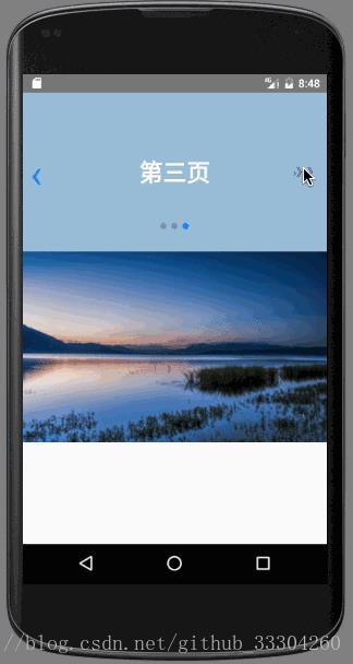
再看样式代码:
<Swiper style=styles.wrapper height=200 horizontal=true autoplay=true autoplayTimeout=1 autoplayDirection=false showsButtons=truenextButton=<Text style=styles.buttonText>》》</Text>>
扫码关注公众号“伟大程序猿的诞生“,更多干货新鲜文章等着你~

公众号回复“资料获取”,获取更多干货哦~
有问题添加本人微信号“fenghuokeji996” 或扫描博客导航栏本人二维码
以上是关于React Native 安卓开发----第三方框架的引用之React-native-Swiper框架实现欢迎页第五篇的主要内容,如果未能解决你的问题,请参考以下文章
react-native中textInput在androidTV上的焦点处理(坑篇)
安卓转战React-Native之签名打包成Apk并极速多渠道打包