flex为1的时候,子元素限制一行时内容撑出父布局解决方案
Posted 隔壁小王66
tags:
篇首语:本文由小常识网(cha138.com)小编为大家整理,主要介绍了flex为1的时候,子元素限制一行时内容撑出父布局解决方案相关的知识,希望对你有一定的参考价值。
今天遇到一个问题,就是flex布局,左边宽度不定,右边填满剩余空间时,右边元素子元素内容会撑出父布局,遂记录之。
html:
<div class="container">
  <div class="left">
    宽度自适应
  </div>
  <div class="right">
    <div class="content">
      子元素
    </div>
   </div>
</div>
1:左边宽度不定/固定,右边填充剩余空间,用flex:1
css:
.container
  background:#f00;
  width:200px;
  height:100px;
  display:flex;

.left
  width:60px;
  flex:0 0 auto;
  background:#ff0;
  height:100px;


.right
  background:#f0f;
  flex:1 1 auto;
效果1(宽度固定):
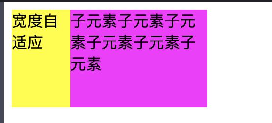
效果2(宽度不定)
2:左边宽度不定/固定,右边填充剩余空间,右边子元素一行时撑出父元素
html:
<div class="container">
  <div class="left">
    宽度自适应
  </div>
  <div class="right">
    <div class="content">
      子元素子元素子元素子元素子元素子元素
    </div>
   </div>
</div>
css:
.container
  background:#f00;
  width:200px;
  height:100px;
  display:flex;

.left
  flex:0 0 auto;
  background:#ff0;
  height:100px;


.right
  background:#f0f;
  flex:1 1 auto;


.content
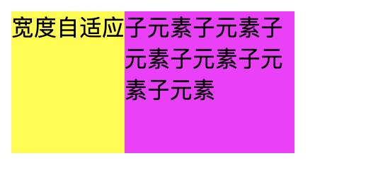
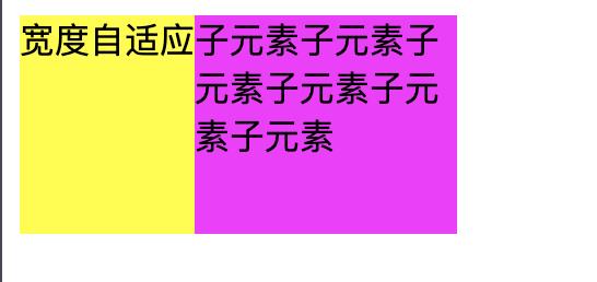
子元素多行展示效果
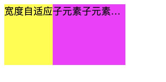
如果子元素一行呢?
css:
.container
  background:#f00;
  width:200px;
  height:100px;
  display:flex;

.left
  flex:0 0 auto;
  background:#ff0;
  height:100px;


.right
  background:#f0f;
  flex:1 1 auto;


.content
  overflow: hidden;
  white-space: nowrap;
  text-overflow: ellipsis;
效果:
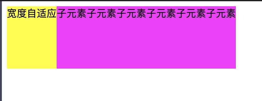
发现子布局把父布局撑出来了
解决方案:
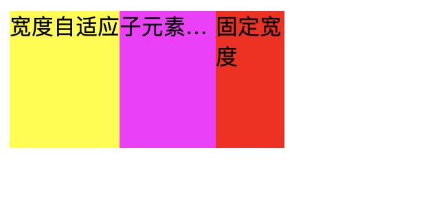
1、在子元素的父元素上加 overflow:hidden;
2、在子元素的父元素上加 width:0px;
效果
如果子元素在嵌套子元素
html
<div class="container">
  <div class="left">
    宽度自适应
  </div>
  <div class="right">
    <div class="content">
      子元素子元素子元素子元素子元素子元素
    </div>
    <div class="content-right">

    </div>
   </div>
</div>
css
.container
  background:#f00;
  width:200px;
  height:100px;
  display:flex;

.left
  flex:0 0 auto;
  background:#ff0;
  height:100px;


.right
  background:#f0f;
  flex:1 1 auto;
  display:flex;
  width:0px;
  overflow:hidden;


.content
  overflow: hidden;
  white-space: nowrap;
  text-overflow: ellipsis;
  flex:1 1 auto;


.content-right
  flex:0 0 auto;
  background:#f00;
  width:50px;
效果
以上是关于flex为1的时候,子元素限制一行时内容撑出父布局解决方案的主要内容,如果未能解决你的问题,请参考以下文章