Bootstrap4 JS插件(多种框)
Posted Sun_先生
tags:
篇首语:本文由小常识网(cha138.com)小编为大家整理,主要介绍了Bootstrap4 JS插件(多种框)相关的知识,希望对你有一定的参考价值。
下拉框
根据官网提示:要使用需要导入popper.js,popper.js包含在了 bootstrap.bundle.js中,我导入了bootstrap.bundle.js但是仍然提示我没有popper.js。
所以我决定下载一个popper.js,安装过程请参考这篇:https://www.cnblogs.com/py-peng/p/12758395.html
基本实例

Button标签
<div class="dropdown">
  <button class="btn btn-secondary dropdown-toggle" type="button" id="dropdownMenuButton" data-toggle="dropdown" aria-haspopup="true" aria-expanded="false">
    Dropdown button
  </button>
  <div class="dropdown-menu" aria-labelledby="dropdownMenuButton">
    <a class="dropdown-item" href="#">Action</a>
    <a class="dropdown-item" href="#">Another action</a>
    <a class="dropdown-item" href="#">Something else here</a>
  </div>
</div>
a标签
<div class="dropdown">
  <a class="btn btn-secondary dropdown-toggle" href="#" role="button" id="dropdownMenuLink" data-toggle="dropdown" aria-haspopup="true" aria-expanded="false">
    Dropdown link
  </a>

  <div class="dropdown-menu" aria-labelledby="dropdownMenuLink">
    <a class="dropdown-item" href="#">Action</a>
    <a class="dropdown-item" href="#">Another action</a>
    <a class="dropdown-item" href="#">Something else here</a>
  </div>
</div>
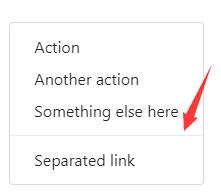
拆分按钮
Similarly, create split button dropdowns with virtually the same markup as single button dropdowns, but with the addition of .dropdown-toggle-split for proper spacing around the dropdown caret.
<!-- Example split danger button -->
<div class="btn-group">
  <button type="button" class="btn btn-primary">Action</button>
  <button type="button" class="btn btn-primary dropdown-toggle dropdown-toggle-split" data-toggle="dropdown" aria-haspopup="true" aria-expanded="false">
    <span class="sr-only">Toggle Dropdown</span>
  </button>
  <div class="dropdown-menu">
    <a class="dropdown-item" href="#">Action</a>
    <a class="dropdown-item" href="#">Another action</a>
    <a class="dropdown-item" href="#">Something else here</a>
    <div class="dropdown-divider"></div>
    <a class="dropdown-item" href="#">Separated link</a>
  </div>
</div>
尺寸选择
Button dropdowns work with buttons of all sizes, including default and split dropdown buttons.
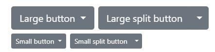
<!-- Large button groups (default and split) -->
<div class="btn-group">
  <button class="btn btn-secondary btn-lg dropdown-toggle" type="button" data-toggle="dropdown" aria-haspopup="true" aria-expanded="false">
    Large button
  </button>
  <div class="dropdown-menu">
    ...
  </div>
</div>
<div class="btn-group">
  <button class="btn btn-secondary btn-lg" type="button">
    Large split button
  </button>
  <button type="button" class="btn btn-lg btn-secondary dropdown-toggle dropdown-toggle-split" data-toggle="dropdown" aria-haspopup="true" aria-expanded="false">
    <span class="sr-only">Toggle Dropdown</span>
  </button>
  <div class="dropdown-menu">
    ...
  </div>
</div>

<!-- Small button groups (default and split) -->
<div class="btn-group">
  <button class="btn btn-secondary btn-sm dropdown-toggle" type="button" data-toggle="dropdown" aria-haspopup="true" aria-expanded="false">
    Small button
  </button>
  <div class="dropdown-menu">
    ...
  </div>
</div>
<div class="btn-group">
  <button class="btn btn-secondary btn-sm" type="button">
    Small split button
  </button>
  <button type="button" class="btn btn-sm btn-secondary dropdown-toggle dropdown-toggle-split" data-toggle="dropdown" aria-haspopup="true" aria-expanded="false">
    <span class="sr-only">Toggle Dropdown</span>
  </button>
  <div class="dropdown-menu">
    ...
  </div>
</div>
方向选择
dropup,dropdown,dropleft,dropright 上、下、左、右
替换的就像下面这样,和打开方向。

添加样式
添加active
Add .active to items in the dropdown to style them as active.
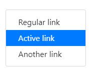
<div class="dropdown-menu">
  <a class="dropdown-item" href="#">Regular link</a>
  <a class="dropdown-item active" href="#">Active link</a>
  <a class="dropdown-item" href="#">Another link</a>
</div>
添加Disabled
Add .disabled to items in the dropdown to style them as disabled.
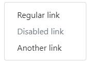
<div class="dropdown-menu">
  <a class="dropdown-item" href="#">Regular link</a>
  <a class="dropdown-item disabled" href="#" tabindex="-1" aria-disabled="true">Disabled link</a>
  <a class="dropdown-item" href="#">Another link</a>
</div>
菜单对齐
默认情况下,下拉菜单从左到右,你也可以指定从右到左。
Add .dropdown-menu-right to a .dropdown-menu
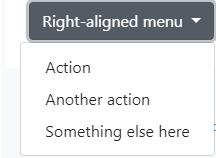
<div class="btn-group">
  <button type="button" class="btn btn-secondary dropdown-toggle" data-toggle="dropdown" aria-haspopup="true" aria-expanded="false">
    Right-aligned menu
  </button>
  <div class="dropdown-menu dropdown-menu-right">
    <button class="dropdown-item" type="button">Action</button>
    <button class="dropdown-item" type="button">Another action</button>
    <button class="dropdown-item" type="button">Something else here</button>
  </div>
</div>
菜单内容
header
Add a header to label sections of actions in any dropdown menu.
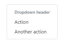
<div class="dropdown-menu">
  <h6 class="dropdown-header">Dropdown header</h6>
  <a class="dropdown-item" href="#">Action</a>
  <a class="dropdown-item" href="#">Another action</a>
</div>
Dividers
Separate groups of related menu items with a divider.
Text
Place any freeform text within a dropdown menu with text and use spacing utilities. Note that you’ll likely need additional sizing styles to constrain the menu width.
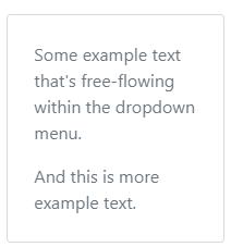
<div class="dropdown-menu p-4 text-muted" style="max-width: 200px;">
  <p>
    Some example text that\'s free-flowing within the dropdown menu.
  </p>
  <p class="mb-0">
    And this is more example text.
  </p>
</div>
Forms
Put a form within a dropdown menu, or make it into a dropdown menu, and use margin or padding utilities to give it the negative space you require.
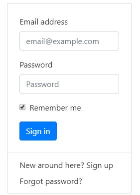
<div class="dropdown-menu">
  <form class="px-4 py-3">
    <div class="form-group">
      <label for="exampleDropdownFormEmail1">Email address</label>
      <input type="email" class="form-control" id="exampleDropdownFormEmail1" placeholder="email@example.com">
    </div>
    <div class="form-group">
      <label for="exampleDropdownFormPassword1">Password</label>
      <input type="password" class="form-control" id="exampleDropdownFormPassword1" placeholder="Password">
    </div>
    <div class="form-group">
      <div class="form-check">
        <input type="checkbox" class="form-check-input" id="dropdownCheck">
        <label class="form-check-label" for="dropdownCheck">
          Remember me
        </label>
      </div>
    </div>
    <button type="submit" class="btn btn-primary">Sign in</button>
  </form>
  <div class="dropdown-divider"></div>
  <a class="dropdown-item" href="#">New around here? Sign up</a>
  <a class="dropdown-item" href="#">Forgot password?</a>
</div>
使用
data属性
Add data-toggle="dropdown" to a link or button to toggle a dropdown.
<div class="dropdown">
  <button id="dLabel" type="button" data-toggle="dropdown" aria-haspopup="true" aria-expanded="false">
    Dropdown trigger
  </button>
  <div class="dropdown-menu" aria-labelledby="dLabel">
    ...
  </div>
</div>
js属性
$(\'.dropdown-toggle\').dropdown()
data-toggle="dropdown" still required
Regardless of whether you call your dropdown via javascript or instead use the data-api, data-toggle="dropdown" is always required to be present on the dropdown’s trigger element.
参数
Options can be passed via data attributes or JavaScript. For data attributes, append the option name to data-, as in data-offset="".
| Name | Type | Default | Description |
|---|---|---|---|
| offset | number | string | function | 0 |
Offset of the dropdown relative to its target. When a function is used to determine the offset, it is called with an object containing the offset data as its first argument. The function must return an object with the same structure. The triggering element DOM node is passed as the second argument. For more information refer to Popper.js\'s offset docs. |
| flip | boolean | true | Allow Dropdown to flip in case of an overlapping on the reference element. For more information refer to Popper.js\'s flip docs. |
| boundary | string | element | \'scrollParent\' | Overflow constraint boundary of the dropdown menu. Accepts the values of \'viewport\', \'window\', \'scrollParent\', or an htmlElement reference (JavaScript only). For more information refer to Popper.js\'s preventOverflow docs. |
| reference | string | element | \'toggle\' | Reference element of the dropdown menu. Accepts the values of \'toggle\', \'parent\', or an HTMLElement reference. For more information refer to Popper.js\'s referenceObject docs. |
| display | string | \'dynamic\' | By default, we use Popper.js for dynamic positioning. Disable this with static. |
| popperConfig | null | object | null | To change Bootstrap\'s default Popper.js config, see Popper.js\'s configuration |
Note when boundary is set to any value other than \'scrollParent\', the style position: static is applied to the .dropdown container.
方法
| Method | Description |
|---|---|
$().dropdown(\'toggle\') |
Toggles the dropdown menu of a given navbar or tabbed navigation. |
$().dropdown(\'show\') |
Shows the dropdown menu of a given navbar or tabbed navigation. |
$().dropdown(\'hide\') |
Hides the dropdown menu of a given navbar or tabbed navigation. |
$().dropdown(\'update\') |
Updates the position of an element’s dropdown. |
$().dropdown(\'dispose\') |
Destroys an element’s dropdown. |
事件
All dropdown events are fired at the .dropdown-menu’s parent element and have a relatedTarget property, whose value is the toggling anchor element. hide.bs.dropdown and hidden.bs.dropdown events have a clickEvent property (only when the original event type is click) that contains an Event Object for the click event.
| Event | Description |
|---|---|
show.bs.dropdown |
This event fires immediately when the show instance method is called. |
shown.bs.dropdown |
This event is fired when the dropdown has been made visible to the user (will wait for CSS transitions, to complete). |
hide.bs.dropdown |
This event is fired immediately when the hide instance method has been called. |
hidden.bs.dropdown |
This event is fired when the dropdown has finished being hidden from the user (will wait for CSS transitions, to complete). |
$(\'#myDropdown\').on(\'show.bs.dropdown\', function () {
  // do something...
})
警告框
基本实例
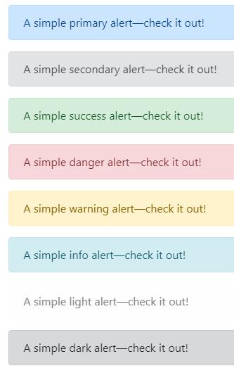
<div class="alert alert-primary" role="alert">
  A simple primary alert—check it out!
</div>
<div class="alert alert-secondary" role="alert">
  A simple secondary alert—check it out!
</div>
<div class="alert alert-success" role="alert">
  A simple success alert—check it out!
</div>
<div class="alert alert-danger" role="alert">
  A simple danger alert—check it out!
</div>
<div class="alert alert-warning" role="alert">
  A simple warning alert—check it out!
</div>
<div class="alert alert-info" role="alert">
  A simple info alert—check it out!
</div>
<div class="alert alert-light" role="alert">
  A simple light alert—check it out!
</div>
<div class="alert alert-dark" role="alert">
  A simple dark alert—check it out!
</div>
附加内容
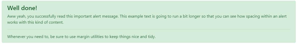
<div class="alert alert-success" role="alert">
  <h4 class="alert-heading">Well done!</h4>
  <p>Aww yeah, you successfully read this important alert message. This example text is going to run a bit longer so that you can see how spacing within an alert works with this kind of content.</p>
  <hr>
  <p class="mb-0">Whenever you need to, be sure to use margin utilities to keep things nice and tidy.</p>
</div>
Dismissing

<div class="alert alert-warning alert-dismissible fade show" role="alert"> <strong>Holy guacamole!</strong> You should check in on some of those fields below. <button type="button" class="close" data-dismiss="alert" aria-label="Close"> <span aria-hidden="true">×</span> </button> </div>
使用
js属性
$(\'.alert\').alert()
Note that closing an alert will remove it from the DOM.
方法
| Method | Description |
|---|---|
$().alert() |
Makes an alert listen for click events on descendant elements which have the data-dismiss="alert" attribute. (Not necessary when using the data-api’s auto-initialization.) |
$().alert(\'close\') |
Closes an alert by removing it from the DOM. If the .fade and .show classes are present on the element, the alert will fade out before it is removed. |
$().alert(\'dispose\') |
Destroys an element’s alert. |
$(\'.alert\').alert(\'close\')
事件
| Event | Description |
|---|---|
close.bs.alert |
This event fires immediately when the close instance method is called. |
closed.bs.alert以上是关于Bootstrap4 JS插件(多种框)的主要内容,如果未能解决你的问题,请参考以下文章
|