Flutter TextField UI 实例 —— 新手礼包
Posted IAM17前端
tags:
篇首语:本文由小常识网(cha138.com)小编为大家整理,主要介绍了Flutter TextField UI 实例 —— 新手礼包相关的知识,希望对你有一定的参考价值。

大家好,我是17。
新手礼包一共 3 篇文章,每篇都是描述尽量详细,实例讲解,包会!
本篇介绍了 TextField UI 的常见写法,从TextField的尺寸,border,icon,文本到光标,无所不包!
TextField 的尺寸
默认情况下,TextField 的宽度尽量大,高度包含所有内容并加上 padding。TextField 可以通过 constraints 定义自己的尺寸。
下面的代码规定了 TextField 最大宽度为 200。
TextField(
       decoration: InputDecoration(
          constraints: BoxConstraints(maxWidth: 200),
 ));
让 TextFiled 在高度上也尽量大,设置 expands: true,同时还必须设置 maxLines,minLines 为 null。
TextField(
      maxLines: null,
      minLines: null,
      expands: true,
    );
需要注意在高度上的约束必须是有限的,否则报错。
Column(
      children: [
          TextField(expands: true,)
      ],
    );
这个例子执行会报错。解决办法看下面的代码:
Column(
   children: [
     SizedBox(
         height: 200,
         child: TextField(
           expands: true,
           maxLines: null,
           minLines: null,
         )),
     TextField(
       decoration:
           InputDecoration(constraints: BoxConstraints(maxHeight: 200)),
       expands: true,
       maxLines: null,
       minLines: null,
     ),
     Expanded(
         child: TextField(
       expands: true,
       maxLines: null,
       minLines: null,
     ))
   ],
 );
Column 中有三个 TextField,一个用 SizedBox 包起来,一个用 InputDecoration 自带的 constraints 限定,一个用 Expanded 包起来,都是可以的,都可以让 TextField 在高度上的约束是有限的。
除了 SizedBox,很多 widget 都有修改约束的能力,比如 Container,ConstrainedBox 等。
Expanded 的解释可以看这篇 Flutter 弹性布局的基石: Flex 和 Flexible。
默认展示
第一个示例给出全部代码,贴到 main.dart 就能运行。后面的只给出 TextField 相关。
import 'package:flutter/material.dart';
void main() => runApp(const MyApp());
class MyApp extends StatelessWidget
const MyApp(super.key);
Widget build(BuildContext context)
return MaterialApp(
home: Scaffold(
body: Center(child: SizedBox(width: 300, child: MyWidget()))));
class MyWidget extends StatefulWidget
const MyWidget(super.key);
State<MyWidget> createState() => _MyWidgetState();
class _MyWidgetState extends State<MyWidget>
var controller = TextEditingController(text: "IAM17");
void dispose()
controller.dispose();
super.dispose();
Widget build(BuildContext context)
return Column(
mainAxisSize: MainAxisSize.min,
children: [
TextField(),
SizedBox(
height: 20,
),
TextField(),
],
);
没加 Const 关键字,因为反复修改的时候可能得一会删,一会加。发布代码的时候还是应该加上的。
controller 后面会用到
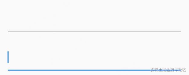
用两个 TextField 是为了方便查看 Focus 的效果。上面的为 正常状态的 TextField,下面的为 focus 状态的 TextField。默认配置正常状态下的 TextField 是一条灰线,有焦点的时候变成蓝色。接下来,我们把他变成想要的样子。
去掉下面的横线
TextField(
    decoration: InputDecoration(
        border: InputBorder.none,
    ),
),
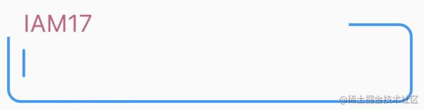
下面的横线其实就是 border,去掉后,现在只剩下一个光标了。想怎样装扮可以用其它 widget,比如可以用 Container 包起来,自定义 border,也可以用 Row 包起来,加各种图标。这是一个方案,如果你对 TextField 不熟悉,可以这样做来快速完成任务,但实际上,TextField 直接就可以完成大多数装扮,还是用优先用 TextField 自带的装扮为好,因为这样可以少写很多代码。
实际上,在设置 border: InputBorder.none后还是有 padding 的。为了彻底消除 decoration 的影响,可以把它设置为 null。
TextField(
     decoration: null,
);
加边框

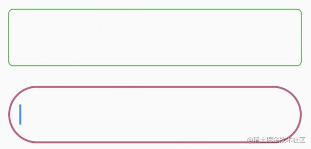
TextField(
      decoration: InputDecoration(
        border: OutlineInputBorder(
            gapPadding: 4,
            borderSide: BorderSide(
                color: Colors.green, width: 2, style: BorderStyle.solid),
            borderRadius: BorderRadius.circular(10)),
      ),
    )
我们给 TextField 加上了宽度为 2,圆角为 10 的边框。
- width 是用来定义边框的宽度的,可以用小数,比如
1.5 - style 是线框的样式,目前只有一种可选,就是
BorderStyle.solid - color 是线框的颜色
- borderRadius 可以定线框的圆角。
- gapPadding 定义 labelText 左右的 Padding。
前面几个都好理解,gapPadding 我再放一个图就明白了。
gapPadding:4 修改为 100 看下效果。
gapPadding 是作用于 LabelText 的,为 LabelText 的左右添加空白。虽然在视觉上好像是只给右边加了空白,其实左边也加了,只是左边没那么长的线框可以减,看起来好像是少了一小段,其实左边的上边框已经完全减掉了。
label 也可以拆开写,效果是一样的。
 labelText:  'IAM17',
 labelStyle: TextStyle(color:Color(0xFFC45F84),fontSize: 24),
可能你会想到,要用虚线边框怎么办,需要自定义 decration,本文就不展开说了。
如果你已经运行了示例代码,会发现 width,color 没有生效?确实是没有生效,线框的颜色还是默认的灰色,宽度还是 1。
定义线框的颜色和宽度
定义线框的宽度和颜色不能用 border。InputDecoration 按状态还为我们准备了五种 border,下面示范的是最常用的两种,正常状态下的 enabledBorder,和 focus 状态下的 focusedBorder。
TextField(
       decoration: InputDecoration(
         enabledBorder: OutlineInputBorder(
           borderRadius: BorderRadius.circular(5),
           borderSide: BorderSide(
             color: Colors.green,
             width: 1.0,
           ),
         ),
         focusedBorder: OutlineInputBorder(
           borderRadius: BorderRadius.circular(30),
           borderSide: BorderSide(
             color: Color(0xFFC45F84),
             width: 2.0,
           ),
         ),
       ),
     )
第三种是 disabledBorder,看效果需要 enabled: false 禁用 TextField。禁用后会展示灰色 border,无法 focus。

TextField(
    decoration: InputDecoration(
      enabled: false,
      disabledBorder: OutlineInputBorder(
        borderRadius: BorderRadius.circular(5),
        borderSide: BorderSide(
          color: Colors.grey,
          width: 1.0,
        ),
      ),
    ),
);
第四种第五种是 error 相关,errorBorder 与 focusedErrorBorder。 给 errorText 赋值,就会触发 TextField 的错误状态。
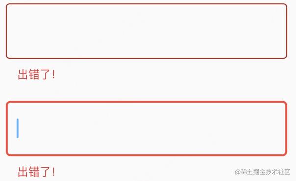
 TextField(
     decoration: InputDecoration(
       errorBorder: OutlineInputBorder(
         borderSide: BorderSide(
           color: Color.fromARGB(255, 157, 23, 13),
           width: 1.0,
         ),
       ),
       errorText: '出错了!',
       focusedErrorBorder: OutlineInputBorder(
         borderRadius: BorderRadius.circular(5),
         borderSide: BorderSide(
           color: Colors.red,
           width: 2.0,
         ),
       ),
     ),
   )
文本样式,背景色
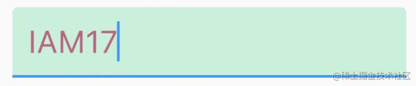
 TextField(
      controller: controller,
      style: TextStyle(color: Color(0xFFC45F84), fontSize: 24),
      decoration: InputDecoration(
          filled: true, fillColor: Color.fromARGB(255, 192, 241, 218)));
controller 在最开始的代码中已经给出来了var controller = TextEditingController(text: "IAM17"); 现在我们用 controller 显示初始文本。
filled 默认为 false,fillColor 无效,要设置背景色,需要设置 filled: true,然后再设置 fillColor。
正文文本的样式用 style。可以用 textAlign 控制文本的摆放。我们可以把文本摆放在中间。
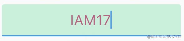
TextField(
        textAlign: TextAlign.center,
        controller: controller,
        style: TextStyle(color: Color(0xFFC45F84), fontSize: 24),
        decoration: InputDecoration(
            filled: true, fillColor: Color.fromARGB(255, 192, 241, 218)))
  ]));
除了可以摆放在中间,还可以摆在末尾,一共有 5 个值可选,具体可以查看 TextAlign
不够生动?用 icon 和 text 来装扮吧!
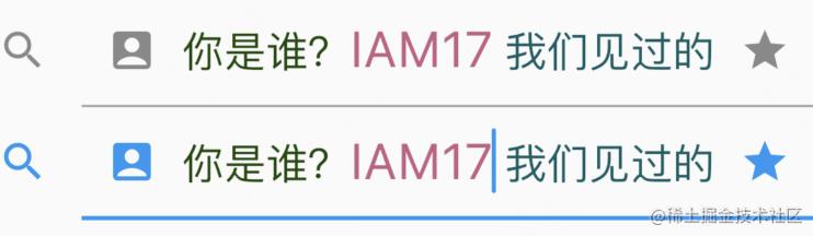
 TextField(
       controller: controller,
       style: TextStyle(color: Color(0xFFC45F84), fontSize: 24),
       decoration: InputDecoration(
         icon: Icon(Icons.search),
         prefixIcon: Icon(Icons.account_box),
         prefix: Text('你是谁?',
             style: TextStyle(
                 color: Color.fromARGB(255, 25, 73, 6), fontSize: 20)),
         suffixIcon: Icon(Icons.star),
         suffix: Text('我们见过的',
             style: TextStyle(
                 color: Color.fromARGB(255, 14, 92, 99), fontSize: 20)),
       ))
内容有点多,把最外面的 Container 的宽度放大到 400。
一共有五个位置用来装饰。最前面的是 icon,在 border 的外面。接下来是 prefixIcon,然后是正文,最后是 suffix 和 subffixIcon。
这个五个位置虽然从名字上来看是 Icon 和 Text,但实际上只要是 Widget 都可以!但最好是用 Icon,Text,因为如果用其它 Widget,可能享受不到 Theme 的福利了。
prefix,suffix 也可以用两个字段替代。
prefixText: '你是谁?',
prefixStyle: TextStyle( color: Color.fromARGB(255, 25, 73, 6), fontSize: 20),
suffixText: '我们见过的',
suffixStyle: TextStyle( color: Color.fromARGB(255, 14, 92, 99), fontSize: 20),
扩写和缩写只能采用一种,同时存在会报错!
自定义 Icon 的颜色
当前 Icon 的 color 都是默认的,如何修改 Icon 的颜色呢?可能你第一时间想到这样修改:
icon: Icon(Icons.search,color:Colors.green),
你一定很高兴,it work! 现在 TextField 的正常状态和 foucs 状态的颜色都是 green。那么,如果想让 TextField 的 focus 状态的 icon 颜色是红色,怎么办?
思考中…
好像很棘手,其实 Flutter 已经为我们设计好了如何修改 Icon 的颜色,用 Theme!
首先定义一个 MaterialStateColor。
class IconColor extends MaterialStateColor
const IconColor() : super(_defaultColor);
//绿色
static const int _defaultColor = 0xff00ff00;
//红色
static const int _focusColor = 0xffff0000;
Color resolve(Set<MaterialState> states)
if (states.contains(MaterialState.focused))
return const Color(_focusColor);
return const Color(_defaultColor);
然后加入到 Theme 中,我们需要修改一下之前的代码。
MaterialApp(
   theme: ThemeData(
      inputDecorationTheme: InputDecorationTheme(
         iconColor: IconColor()
       ),),
   home: Scaffold(
       body: Center(child: SizedBox(width: 400, child: MyWidget()))));
查看效果默认的时候 icon 是绿色的,focus 的时候是红色的。

如果你觉得定义一个类太麻烦,也可以用 resolveWith 方法
MaterialApp(
    theme: ThemeData(
      inputDecorationTheme: InputDecorationTheme(iconColor:
          MaterialStateColor.resolveWith((Set<MaterialState> states)
        if (states.contains(MaterialState.focused))
          return Colors.red;

        return Colors.green;
      )),
    ),
    home: Scaffold(
        body: Center(child: SizedBox(width: 300, child: MyWidget()))));
前面说的 border, 也可以通过 Theme 设置。这样就不用每个 TextField 都定一遍了!
inputDecorationTheme: InputDecorationTheme(
         enabledBorder: OutlineInputBorder(borderSide: BorderSide(color: Colors.green)),
         focusedBorder: OutlineInputBorder(borderSide: BorderSide(color: Colors.red))
 )
inputDecorationTheme 可以设置很多内容。Theme 相当于是 css 中的样式表。Theme 如果写在 MaterialApp 中,就相当于是全局样式表了,写在其它地方相当于局部样式表。子级的 Theme 的优先级大于父级的 Theme。写在 Widget 里的相当于 Style,优先级最高。
isDense
上面是默认 isDense:false 的效果,下面是 isDense:true 的效果,就是icon变小了一些。

InputDecoration(
     isDense: true,
     icon: Icon(Icons.search),
     prefixIcon: Icon(Icons.account_box),
     prefix: Text('你是谁?',
         style: TextStyle(
             color: Color.fromARGB(255, 25, 73, 6), fontSize: 20)),
     suffixIcon: Icon(Icons.star),
     suffix: Text('我们见过的',
         style: TextStyle(
             color: Color.fromARGB(255, 14, 92, 99), fontSize: 20)),
   );
hint text 与 helper text
灰色的是 hintText,和 html 中 placeholder 差不多。绿色的是 helper Text,显示在左下角。

TextField(
   decoration: InputDecoration(
     hintText: 'IAM17',
     hintStyle: TextStyle(color: Colors.black54),
     hintMaxLines: 1,
     helperText: '我们见过的',
     helperStyle: TextStyle(color: Color.fromARGB(255, 52, 116, 7)),
     helperMaxLines: 1,
   ))
已经包含 hint text 与 helper text 的所有属性了,比较好理解,就不再解释了。要注意的一点是:focus 对这两个 text 的样式没有影响。error 状态 hint text 没有变化,helper text 被 errorText 取代。
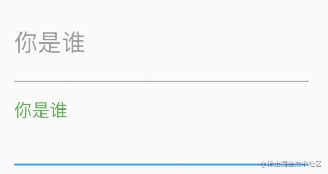
label text
同时有 label text 和 hint text 的时候,正常状态下会优先显示 labelText。在 focus 状态下,labelText 缩小到左上角,hint text 显示出来。

label text 远没有这么简单,除 labelText,labelStyle,还有几个属性需要了解。
floatingLabelStyle 定义 focus 状态下 label 显示在左上角的样式。正常状态下 label text 的颜色用 labelStyle 设置为灰色,浮到左上角后可以用 floatingLabelStyle 设置为绿色。
TextField(
    decoration: InputDecoration(
      labelText: '你是谁',
      labelStyle: TextStyle(color: Colors.grey),
      floatingLabelStyle: TextStyle(color: Colors.green),
    ))
)
floatingLabelAlignment 可以让左上角的 label 显示在中间。(只有 start 和 center 两个选项)

TextField(
   decoration: InputDecoration(
     labelText: '你是谁',
     labelStyle: TextStyle(color: Color.fromARGB(255, 194, 52, 101)),
     floatingLabelStyle: TextStyle(color: Colors.blue),
     floatingLabelAlignment: FloatingLabelAlignment.center
   ));
floatingLabelBehavior 控制 label 的行为,有三个选项
FloatingLabelBehavior.auto默认。正常状态覆盖 hint,focus 状态上浮。FloatingLabelBehavior.always正常状态 和 focus 状态 都上浮。hint 正常显示。FloatingLabelBehavior.never正常状态覆盖 hint,focus 状态不上浮。这时就和 hint 并不多了,唯一不同的是 focus 的时候 hint 不消失,label 消失。
padding
默认情况下,在正文的四周是有 padding 的。

contentPadding: EdgeInsets.zero 可以去掉左右的 padding。
NavigationScreenProvider:
class NavigationScreenProvider extends ChangeNotifier
  final AuthProvider auth;
  NavigationScreenProvider(required this.auth);

  int _currentIndex = 0;
  List<int> _authRequiredScreens = [2, 3, 4];
  Map<String, dynamic> _data = ;

  int get currentIndex
    final currentIndex = _currentIndex;
    return currentIndex;


  Map<String, dynamic> get data
    return ..._data;


  changePageIndex(int index, [Function? callback])
    if (!_authRequiredScreens.contains(index) || auth.isAuthenticated)
      _currentIndex = index;
      notifyListeners();
     else
      callback != null ? callback() : null;

    if (index == 0) clearData();


  visitSearchPage(String term)
    _data =
      "search_term": term,
    ;
    changePageIndex(1);


  clearData()
    _data = ;
登录屏幕:
class LoginScreen extends StatefulWidget
  const LoginScreen(Key? key) : super(key: key);

  static String routeName = "/login";

  @override
  _LoginScreenState createState() => _LoginScreenState();


class _LoginScreenState extends State<LoginScreen>
  bool _hidePassword = true;

  FocusNode _phoneFocusNode = FocusNode();
  FocusNode _passwordFocusNode = FocusNode();

  final _phoneController = TextEditingController();
  final _passwordController = TextEditingController();

  @override
  void didChangeDependencies()
    // _phoneFocusNode.addListener(()
    //   setState(() );
    // );
    // _passwordFocusNode.addListener(()
    //   setState(() );
    // );
    super.didChangeDependencies();


  @override
  void dispose()
    _phoneFocusNode.dispose();
    _passwordFocusNode.dispose();
    _phoneController.dispose();
    _passwordController.dispose();
    super.dispose();


  @override
  Widget build(BuildContext context)
    return SafeArea(
      child: Scaffold(
        body: Padding(
          padding: const EdgeInsets.all(defaultPadding),
          child: Form(
            child: Column(
              mainAxisAlignment: MainAxisAlignment.center,
              children: [
                LocaleText(
                  "log_in",
                  style: TextStyle(
                    fontSize: 25,
                    color: normalOrange,
                    fontWeight: FontWeight.w700,
                  ),
                ),
                SizedBox(
                  height: 60,
                ),
                TextFormField(
                  focusNode: _phoneFocusNode,
                  controller: _phoneController,
                  inputFormatters: [
                    MaskTextInputFormatter(mask: "+998 ## ### ## ##")
                  ],
                  decoration: InputDecoration(
                    border: InputStyles.inputBorder(),
                    focusedBorder: InputStyles.focusBorder(),
                    prefixIcon: Icon(
                      Icons.phone_outlined,
                    ),
                    hintText: Locales.string(context, "phone_number_hint"),
                  ),
                  keyboardType: TextInputType.number,
                  onFieldSubmitted: (value)
                    FocusScope.of(context).requestFocus(_passwordFocusNode);
                  ,
                ),
                SizedBox(
                  height: 20,
                ),
                TextField(
                  focusNode: _passwordFocusNode,
                  controller: _passwordController,
                  decoration: InputDecoration(
                    border: InputStyles.inputBorder(),
                    focusedBorder: InputStyles.focusBorder(),
                    prefixIcon: Icon(
                      Icons.lock,
                    ),
                    hintText: Locales.string(context, "password_hint"),
                    suffixIcon: IconButton(
                      icon: Icon(
                        Icons.remove_red_eye,
                      ),
                      onPressed: ()
                        setState(()
                          _hidePassword = !_hidePassword;
                        );
                      ,
                    ),
                  ),
                  obscureText: _hidePassword,
                ),
                SizedBox(
                  height: 20,
                ),
                TextLinkButton(
                    Locales.string(context, "forgot_password?"), () ),
                SizedBox(
                  height: 32,
                ),
                FluidBigButton(Locales.string(context, "log_in"), onPress: ()
                  String phone = _phoneController.text.replaceAll(" ", "");
                  String password = _passwordController.text;
                  Provider.of<AuthProvider>(context, listen: false)
                      .login(phone, password)
                      .then((value)
                    if (value.containsKey("status") && !value["status"])
                      print("You cannot log in!");

                    Navigator.of(context).pushNamedAndRemoveUntil(
                        NavigationalAppScreen.routeName, (route) => false);
                  );
                ),
                SizedBox(
                  height: 24,
                ),
                Wrap(
                  children: [
                    LocaleText(
                      "no_profile?",
                      style: TextStyle(fontSize: 16),
                    ),
                    SizedBox(width: 10),
                    TextLinkButton(Locales.string(context, "register"), ()
                      Navigator.of(context)
                          .pushReplacementNamed(RegisterScreen.routeName);
                    ),
                  ],
                )
              ],
            ),
          ),
        ),
      ),
    );
【问题讨论】:
请修剪您的代码,以便更容易找到您的问题。请按照以下指南创建minimal reproducible example。 【参考方案1】:在您的 NavigationalAppScreen 中,您将以下代码作为底部导航的一部分:
onTap: (index)
    if (index != 1)
      Provider.of<NavigationScreenProvider>(context, listen: false)
          .clearData();

    Provider.of<NavigationScreenProvider>(context, listen: false)
        .changePageIndex(index, ()
      Navigator.push(
        context,
        MaterialPageRoute(builder: (context) => LoginScreen()),
      );
    );
  ,
这将在每次调用onTap 函数时推送LoginScreen,因此您看到的行为是正确的。不知道你的代码,也许你可以做你的“我登录了吗?”在onTap 中进行测试,并且只有当结果是false 时,您才会推送LoginScreen
【讨论】:
这也不起作用。在我的应用程序的其他部分,即使我不检查身份验证用户,也会出现此问题。以上是关于Flutter TextField UI 实例 —— 新手礼包的主要内容,如果未能解决你的问题,请参考以下文章