前端甘特图组件开发
Posted PorkCanteen
tags:
篇首语:本文由小常识网(cha138.com)小编为大家整理,主要介绍了前端甘特图组件开发相关的知识,希望对你有一定的参考价值。
背景
- 工作中需要在网页上实现甘特图,以展示进度数据。通过网上调研相关项目,找到一款 dhtmlx-gantt 组件,在低程度上满足项目需求,但在部分定制功能(如时间轴自定义、编辑弹窗样式风格等)并不能完全满足项目需求。此外,使用此类开源项目,若遇到功能无法满足需求时,解决起来较为麻烦,基本只有在需求上进行妥协。
- 个人在工作后暂时没有开发过相对复杂且功能较为完整的组件,开发甘特图组件既可以满足工作需要、方便开发人员,也可以加深自己对前端技术的理解。
基于以上原因,开始着手开发一款甘特图组件 m-gantt,第一版首先以完成项目需求为目标,实现项目需要的功能,尽可能将配置项进行提取。后续将继续完善拓展应有功能,实现可配置化。
开发准备
其他说明
- 本甘特图组件目前仅支持 Angular 开发
- 除 Angular 框架外,本组件无其他依赖包
- 甘特图基于svg绘画,不依赖其他工具,可塑性强,且相较于使用标签加定位的布局方式,该方法代码量较少且逻辑清晰
- 样式使用less语法
开发内容概述
基本思路
- 布局
布局需要实现如下几项功能
① 主要分为左右两个部分,每个部分分上部固定区域和下部垂直滚动区域
② 左右部分的下部区域需要同时滚动
③ 右部需要横向滚动
④(可选)左侧部分支持缩放 - 表格区域
① 基本为常规表格,将表头固定在上部,表体放在下部
② 点击行数据可使进度图横向滚动到该项任务所在起始位置 - 时间轴区域
① 分多层,默认分为 年-月层、日层、自定义层
② 使用svg语法进行绘制 - 进度图区域
① 使用svg语法绘制
② 进度图根据实际数据实时渲染
③ 鼠标移动到单个任务进度条上显示数据详情
布局
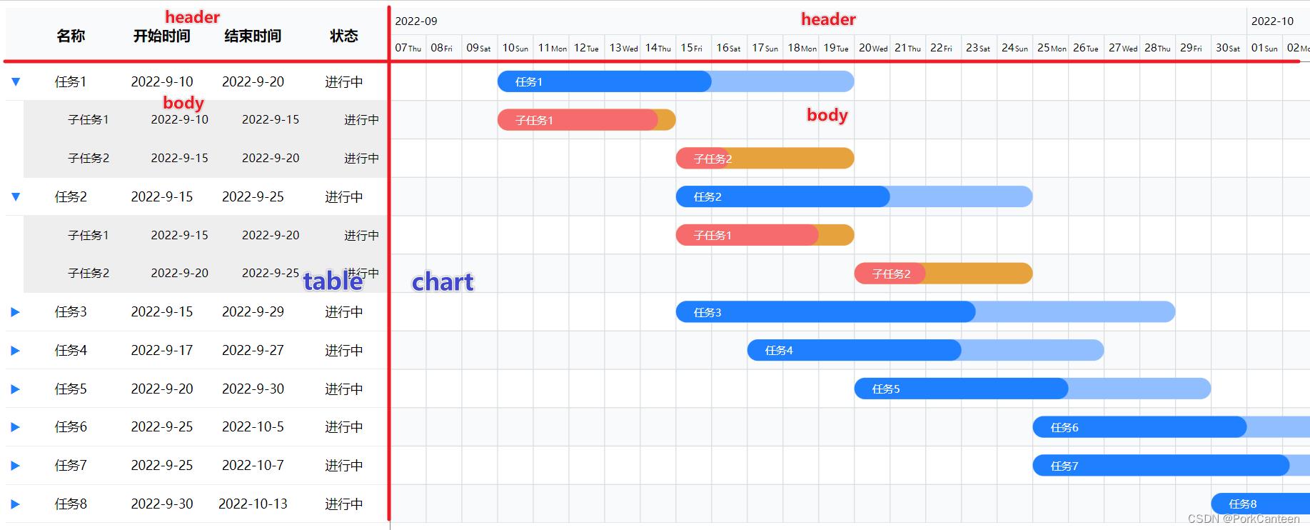
① 主要分为左右两个部分,每个部分分上部固定区域(吸顶)和下部垂直滚动区域
② 左右部分的下部区域需要同时滚动(共用滚动条)
③ 右部需要横向滚动
<div class="gantt-table" #table>
  <div class="header"></div>
  <div class="body"></div>
</div>
<div class="gantt-chart" #chart>
  <div class="header"></div>
  <div class="body"></div>
</div>
.gantt-container
  height: 800px;
  display: flex; // 使用flex布局
  overflow: hidden;
  .gantt-table, .gantt-chart
    .header
      position: sticky;
      height: @headHeight;
      top: 0;

    .body
      height: 900px;


  // 左侧表格
  .gantt-table
    position: relative;
    overflow-x: hidden;
    overflow-y: scroll;

  // 隐藏左侧滚动条
  .gantt-table::-webkit-scrollbar
    width: 0;

  // 右侧进度图
  .gantt-chart
    overflow-x: scroll;
    flex: 1;
  @ViewChild('table') table: any;
  @ViewChild('chart') chart: any;
  public scrollLock =
    isTableScroll: false,
    isChartScroll: false

  ngAfterViewInit(): void
    // 监听左侧表格
    this.table.nativeElement.addEventListener('scroll', this.scrollChart);
    // 监听右侧表格
    this.chart.nativeElement.addEventListener('scroll', this.scrollTable);

  private scrollChart = (e: any) =>
    // 当右侧进度图没有滚动时,使之随表格滚动
    if (!this.scrollLock.isChartScroll)
      this.scrollLock.isTableScroll = true;
      this.chart.nativeElement.scroll(
        top: e.target?.scrollTop
      )

    this.scrollLock.isTableScroll = false;

  private scrollTable = (e: any) =>
    // 当左侧表格没有滚动时,使之随进度图滚动
    if (!this.scrollLock.isTableScroll)
      this.scrollLock.isChartScroll = true;
      this.table.nativeElement.scroll(
        top: e.target?.scrollTop
      )

    this.scrollLock.isChartScroll = false;


  ngOnDestroy(): void
    this.table.nativeElement.removeEventListener('scroll', this.scrollChart);
    this.chart.nativeElement.removeEventListener('scroll', this.scrollTable);
SVG
本甘特图使用svg语法绘制,主要用到以下几种常用标签
- react 矩形标签
- x: 左侧距离
- y: 顶部距离
- width: 宽度
- height: 高度
- rx: x轴半径
- rx: y轴半径
- path 路径标签(eg: M 100 0 V 100)
- M: move to 传入目标点的坐标 x y
- H: horizontal lineto 平行线
- V: vertical lineto 垂直线
- line 线标签
- x1 y1: 第一个点的坐标
- x2 y2: 第二个点的坐标
- text 文本标签
- g 组合标签
- 添加到g上的变化会应用到其子元素
更加详细的SVG图知识可以参考另一篇文章【svg学习】
时间轴

① 计算时间轴的长度
② 构造时间数组
③ 通过位置绘制时间轴
// 时间轴
public dateConfig: any =
  startDate: new Date('2077-12-31'),
  endDate: new Date('1999-1-1'),
  total: 0, // 总天数
  svgWidth: 0, // 整体宽度
  svgHeight: 60, // 时间轴高度
  dateList: [], // 日轴
  monthList: [] // 月轴

// 配置时间轴数据
private setGanttData(): void
  // 遍历任务数据 获取最大/最小值
  this.ganttConfig.data.forEach((task: any) =>
    const  startDate, endDate  = task;
    if (startDate && new Date(startDate) < this.dateConfig.startDate)
      this.dateConfig.startDate = new Date(startDate)

    if (endDate && new Date(endDate) > this.dateConfig.endDate)
      this.dateConfig.endDate = new Date(endDate);

  )
  // 前后加N天保证显示效果
  this.dateConfig.endDate = new Date(this.dateConfig.endDate.getTime() + 3 * 24 * 60 * 60 * 1000);
  this.dateConfig.startDate = new Date(this.dateConfig.startDate.getTime() - 3 * 24 * 60 * 60 * 1000);
  this.dateConfig.total = (this.dateConfig.endDate.getTime() - this.dateConfig.startDate.getTime()) / (24 * 60 * 60 * 1000);
  // 计算总宽度
  this.dateConfig.svgWidth = this.dateConfig.total * this.squareWidth;
  // 时间轴
  // 日
  const week = ['Mon', 'Tue', 'Wed', 'Thu', 'Fri', 'Sat', 'Sun'];
  for (let i = 0; i < this.dateConfig.total; i++)
    this.dateConfig.dateList.push(
      text: this.datePipe.transform(new Date(this.dateConfig.startDate.getTime() + i * 24 * 60 * 60 * 1000), 'dd'),
      day: week[new Date(this.dateConfig.startDate.getTime() + i * 24 * 60 * 60 * 1000).getDay()],
      month: this.datePipe.transform(new Date(this.dateConfig.startDate.getTime() + i * 24 * 60 * 60 * 1000), 'yyyy-MM'),
    )

  // 月
  const monthMap = new Map();
  this.dateConfig.dateList.forEach((date: any) =>
    const month = date.month;
    if (monthMap.has(month))
      monthMap.set(month, monthMap.get(month) + 1)
     else
      monthMap.set(month, 1)

  )
  let lengthBefore: number = 0;
  monthMap.forEach((value, key) =>
    this.dateConfig.monthList.push(
      text: key,
      left: lengthBefore
    )
    lengthBefore += value;
  )
<!-- 时间轴 -->
<div class="header" [style.width]="dateConfig.svgWidth + 'px'">
  <!-- 月数据 -->
  <svg [attr.width]="dateConfig.svgWidth" [attr.height]="timeLineHeight">
    <g class="date" *ngFor="let month of dateConfig.monthList; let i = index;">
      <!-- 文字 -->
      <text [attr.x]="month.left * squareWidth + 5" [attr.y]="timeLineHeight / 2 + 4"
        style="font-size: 12px;">month.text</text>
      <!-- 时间轴边框 -->
      <path [attr.d]="'M ' + month.left * squareWidth + ' 0 V 30'" stroke="#d9dde0"></path>
      <line x1="0" y1="30" [attr.x2]="dateConfig.svgWidth" y2="30" stroke="#d9dde0" />
    </g>
  </svg>
  <!-- 日数据 -->
  <svg [attr.width]="dateConfig.svgWidth" [attr.height]="timeLineHeight">
    <g class="date" *ngFor="let date of dateConfig.dateList; let i = index;">
      <text [attr.x]="i * squareWidth + 5" [attr.y]="timeLineHeight / 2 + 4"
        style="font-size: 12px;">date.text</text>
      <text [attr.x]="i * squareWidth + 20" [attr.y]="timeLineHeight / 2 + 4"
        style="font-size: 8px;">date.day</text>
      <path [attr.d]="'M ' + i * squareWidth + ' 0 V 30'" stroke="#d9dde0"></path>
    </g>
  </svg>
</div>
进度图
- 背景绘制
① 用 react 绘制格子
② 用 line 绘制横线
③ 用 path 绘制竖线
// 数据
public ganttConfig: any =
  columns: columns,
  data: data,
  chartData: []

// 数据预处理
private preprocessData(data: Array<any>): Array<any>
  data.forEach(row =>
    const startDay = (new Date(row.startDate).getTime() - this.dateConfig.startDate.getTime()) / (24 * 60 * 60 * 1000);
    row.startDay = startDay;
  )
  return data;
<div class="body">
  <svg [attr.width]="dateConfig.svgWidth" [attr.height]="ganttConfig.chartData.length * lineHeight">
    <rect *ngFor="let row of ganttConfig.chartData; let i = index;" x="0" [attr.y]="lineHeight * i"
      [attr.width]="dateConfig.svgWidth" [attr.heigth]="lineHeight" [attr.fill]="i % 2 === 0 ? '#fff' : '#f9fafb'">
    </rect>
    <path *ngFor="let date of dateConfig.dateList; let i = index;"
      [attr.d]="'M ' + i * squareWidth + ' 0 V ' + ganttConfig.chartData.length * lineHeight" stoke="#d9dde0">
    </path>
    <line *ngFor="let row of ganttConfig.chartData; let i = index;" x1="0" [attr.y1]="lineHeight * i + lineHeight"
      [attr.x2]="dateConfig.svgWidth" [attr.y2]="lineHeight * i + lineHeight" stroke="#d9dde0" />
    <!-- 进度图 -->
  </svg>
</div>
- 进度图 bar 绘制

① 用 rect 绘制每项任务的总计划 bar
② 用 rect 绘制每项任务的已完成 bar
③ 用 text 填充文字
<g class="bar" *ngFor="let row of ganttConfig.chartData; let i = index;" (mouseenter)="showDetail(row, true)"
  (mouseleave)="showDetail(row)">
  <!-- 全部 -->
  <rect [id]="'bar_' + i" [attr.x]="row.startDay * squareWidth"
    [attr.y]="i * lineHeight + (lineHeight - barHeight) / 2" [attr.width]="row.duration * squareWidth"
    [attr.height]="barHeight" [attr.rx]="barHeight / 2" [attr.ry]="barHeight / 2"
    [attr.fill]="row.parentId ? subBarColor : barColor"></rect>
  <!-- 进度 -->
  <rect [attr.x]="row.startDay * squareWidth" [attr.y]="i * lineHeight + (lineHeight - barHeight) / 2"
    [attr.width]="(row.duration * squareWidth) * row.progress" [attr.height]="barHeight"
    [attr.rx]="barHeight / 2" [attr.ry]="barHeight / 2"
    [attr.fill]="row.parentId ? subProgressBarColor : progressBarColor">
  </rect>
  <text [attr.x]="row.startDay * squareWidth + 20" [attr.y]="(i + 0.5) * lineHeight + 5"
    [attr.fill]="barFontColor" style="font-size: 12px;">row.name</text>
</g>
点击滚动
点击任务滚动到任务开始位置
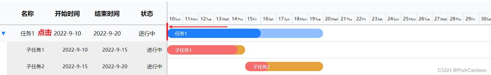
// 点击任务自动滚动
public scrollToBar(row: any): void
const targetBar = document.querySelector(`#bar_$this.ganttConfig.chartData.indexOf(row)`)项目中需要用到甘特图组件,之前的图表一直基于 EChart 开发,但 EChart 本身没有甘特图组件,需要自行封装
经过一番鏖战,终于完成了...

我在工程中参考 v-chart 封装了一套图表组件,所以这里只介绍甘特图组件的实现,图表的初始化、数据更新、自适应等不在这里介绍
一、约定数据格式
EChart 本身没有甘特图,但可以通过 EChart 提供的“自定义”方法 type: ‘custom‘ 开发
const option = {
series: [{
type: ‘custom‘,
renderItem: (params, api) => {
// do sth
},
data,
}]
}
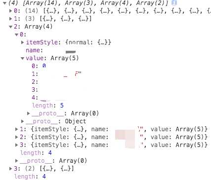
这里的 data 就是数据集,它是一个二维数组,主要需要两个参数:
name: 名称,可以在 legend 和 tooltip 中展示
value:参数集合,自定义的图表时需要的参数都可以放到这个数组里
如果需要其它的配置,也可以按照 ECharts 的 series 结构添加别的字段
我自定义的数据结构是这样的:
{
name,
itemStyle: {
normal: {
color: color || defaultColor,
},
},
// value 为约定写法,依序为“类目对应的索引”、“状态类型”、“状态名称”、“开始时间”、“结束时间”
value: [
index,
type,
name,
new Date(start).getTime(),
new Date(end || Date.now()).getTime(),
],
}
注意:series.data 中的元素需要根据状态划分,不能根据类目(Y轴)划分,这样才能保证图例 legend 的正常显示
最终的 data 结构如图:
自定义的核心是 renderItem 函数,这个函数的本质就是:将 data 中的参数 value 处理之后,映射到对应的坐标轴上,具体处理参数的逻辑完全自定义
甘特图就需要计算出各个数据块的高度和宽度,然后映射到对应的类目轴(Y轴)和时间轴(X轴)上
由于甘特图会用到时间轴(X轴),所以定义的 value 中需要开始时间和结束时间的时间戳
为了区分该数据属于类目轴(Y轴)的哪一条类目,还需要对应类目的索引 index
如果还有其它的需要,比如自定义 tooltip,还可以在 value 中添加其它的参数
但一定要约定好参数的顺序,因为 renderItem 函数是根据 value 的索引去取对应的参数
二、处理数据 Series
// 处理数据
function getGantSeries(args) {
const { innerRows, columns } = args
const baseItem = {
type: ‘custom‘,
renderItem: (params, api) => renderGanttItem(params, api),
dimensions: columns,
};
return innerRows.map(row => {
return {
...baseItem,
name: row[0].name,
data: row,
};
});
}
当 type 指定为 ‘custom‘ 的时候,series 的元素可以添加 dimensions 字段,用来定义每个维度的信息
处理数据的核心是 renderItem 方法,该方法提供了 params 和 api 两个参数,最后需要返回对应的图形元素信息
const DIM_CATEGORY_INDEX = 0; // value 中类目标识的索引
const DIM_CATEGORY_NAME_INDEX = 1; // value 中对应元素类型的索引
const DIM_START_TIME_INDEX = 3; // value 中开始时间的索引
const DIM_END_TIME_INDEX = 4; // value 中结束时间的索引
const HEIGHT_RATIO = 0.6; // 甘特图矩形元素高度缩放比例
const CATEGORY_NAME_PADDING_WIDTH = 20; // 在甘特图矩形元素上展示文字时,左右 padding 的最小长度
/**
* 计算元素位置及宽高
* 如果元素超出了当前坐标系的包围盒,则剪裁这个元素
* 如果元素完全被剪掉,会返回 undefined
*/
function clipRectByRect(params, rect) {
return echarts.graphic.clipRectByRect(rect, {
x: params.coordSys.x,
y: params.coordSys.y,
width: params.coordSys.width,
height: params.coordSys.height,
});
}
// 渲染甘特图元素
function renderGanttItem(params, api, extra) {
const { isShowText, barMaxHeight, barHeight } = extra;
// 使用 api.value(index) 取出当前 dataItem 的维度
const categoryIndex = api.value(DIM_CATEGORY_INDEX);
// 使用 api.coord(...) 将数值在当前坐标系中转换成为屏幕上的点的像素值
const startPoint = api.coord([api.value(DIM_START_TIME_INDEX), categoryIndex]);
const endPoint = api.coord([api.value(DIM_END_TIME_INDEX), categoryIndex]);
// 使用 api.size(...) 取得坐标系上一段数值范围对应的长度
const baseHeight = Math.min(api.size([0, 1])[1], barMaxHeight);
const height = barHeight * HEIGHT_RATIO || baseHeight * HEIGHT_RATIO;
const width = endPoint[0] - startPoint[0];
const x = startPoint[0];
const y = startPoint[1] - height / 2;
// 处理类目名,用于在图形上展示
const categoryName = api.value(DIM_CATEGORY_NAME_INDEX) + ‘‘;
const categoryNameWidth = echarts.format.getTextRect(categoryName).width;
const text = width > categoryNameWidth + CATEGORY_NAME_PADDING_WIDTH ? categoryName : ‘‘;
const rectNormal = clipRectByRect(params, { x, y, width, height });
const rectText = clipRectByRect(params, { x, y, width, height });
return {
type: ‘group‘,
children: [
{
// 图形元素形状: ‘rect‘, circle‘, ‘sector‘, ‘polygon‘
type: ‘rect‘,
ignore: !rectNormal, // 是否忽略(忽略即不渲染)
shape: rectNormal,
// 映射 option 中 itemStyle 样式
style: api.style(),
},
{
// 在图形上展示类目名
type: ‘rect‘,
ignore: !isShowText || !rectText,
shape: rectText,
style: api.style({
fill: ‘transparent‘,
stroke: ‘transparent‘,
text: text,
textFill: ‘#fff‘,
}),
},
],
};
}
上面是我用的 renderItem 方法全貌,主要是使用 api 提供的工具函数计算出元素的视觉宽高
再使用 echarts 提供的 graphic.clipRectByRect 方法,结合参数 params 提供的坐标系信息,截取出元素的图形信息
三、自定义 tooltip
如果数据格式正确,到这里已经能渲染出甘特图了,但一个图表还需要其它的细节,比如 tooltip 的自定义
在 renderItem 中有一个字段 encode 可以用来自定义 tooltip,但只能定义展示的文字
具体的 tooltip 排版和图例颜色(特别是渐变色)无法通过 encode 实现自定义,最终还是得通过 formatter 函数
formatter: params => {
const { value = [], marker, name, color } = params;
const axis = this.columns; // 类目轴(Y轴)数据
// 删除空标题
let str = ‘‘;
isArray(axis[value[0]]) && axis[value[0]].map(item => {
item && (str += `${item}/`);
});
str = str.substr(0, str.length - 1);
// 颜色为对象时,为渐变颜色,需要手动拼接
let mark = marker;
if (isObject(color)) {
const { colorStops = [] } = color;
const endColor = colorStops[0] && colorStops[0].color;
const startColor = colorStops[1] && colorStops[1].color;
const colorStr = `background-image: linear-gradient(90deg, ${startColor}, ${endColor});`;
mark = `
<span style="
display:inline-block;
margin-right:5px;
border-radius:10px;
width:10px;
height:10px;
${colorStr}
"></span>`;
}
// 计算时长
const startTime = moment(value[3]);
const endTime = moment(value[4]);
let unit = ‘小时‘;
let duration = endTime.diff(startTime, ‘hours‘);
return `
<div>${str}</div>
<div>${mark}${name}: ${duration}${unit}</div>
<div>开始时间:${startTime.format(‘YYYY-MM-DD HH:mm‘)}</div>
<div>结束时间:${endTime.format(‘YYYY-MM-DD HH:mm‘)}</div>
`;
},
},
四、自动滚屏
如果甘特图的数据过多,堆在一屏展示就会显得很窄,这时候可以结合 dataZoom 实现滚屏
首先需要在组件中引入 dataZoom
import ‘echarts/lib/component/dataZoom‘;
// 配置项
const option = {
...,
dataZoom: {
type: ‘slider‘,
id: ‘insideY01‘,
yAxisIndex: 0,
zoomLock: true,
bottom: -10,
startValue: this.dataZoomStartVal,
endValue: this.dataZoomEndVal,
handleSize: 0,
borderColor: ‘transparent‘,
backgroundColor: ‘transparent‘,
fillerColor: ‘transparent‘,
showDetail: false,
},
{
type: ‘inside‘,
id: ‘insideY02‘,
yAxisIndex: 0,
startValue: this.dataZoomStartVal,
endValue: this.dataZoomEndVal,
zoomOnMouseWheel: false,
moveOnMouseMove: true,
moveOnMouseWheel: true,
}
}
然后需要设定甘特图每一行的高度 barHeight,同时获取甘特图组件的高度
通过这两个高度计算出每屏可以展示的甘特图数据的数量 pageSize
const GANT_ITEM_HEIGHT = 56;
const height = this.$refs.chartGantRef.$el.clientHeight;
this.pageSize = Math.floor(height / GANT_ITEM_HEIGHT);
// 设置 dataZoom 的起点
this.dataZoomStartVal = 0;
this.dataZoomEndVal = this.pageSize - 1;
然后通过定时器派发事件,修改 dataZoom 的 startValue 和 endValue,实现自动滚屏的效果
const Timer = null;
dataZoomAutoScoll() {
Timer = setInterval(() => {
const max = this.total - 1;
if (
this.dataZoomEndVal > max ||
this.dataZoomStartVal > max - this.pageSize
) {
this.dataZoomStartVal = 0;
this.dataZoomEndVal = this.pageSize - 1;
} else {
this.dataZoomStartVal += 1;
this.dataZoomEndVal += 1;
}
echarts.dispatchAction({
type: ‘dataZoom‘,
dataZoomIndex: 0,
startValue: this.dataZoomStartVal,
endValue: this.dataZoomEndVal
});
}, 2000);
},
以上是关于前端甘特图组件开发的主要内容,如果未能解决你的问题,请参考以下文章