纯css实现文字特效动画
Posted 水星记_
tags:
篇首语:本文由小常识网(cha138.com)小编为大家整理,主要介绍了纯css实现文字特效动画相关的知识,希望对你有一定的参考价值。
前言
现如今网页越来越趋近于动画,相信大家平时浏览网页或多或少都能看到一些动画效果,今天我们来做一些文字上面的动画效果,下面一起看看吧。
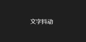
1. 文字抖动
实现效果
实现思路
其实主要就是通过 animation 添加动画属性,利用 keyframes 来描述动画的开始、过程和结束的状态,核心就是 animation + transform:rotate,话不多说,下面直接看代码。
完整源码
<template>
  <div class="parentBox">
    <div class="contantBox">文字抖动</div>
  </div>
</template>
<style lang="less" scoped>
.parentBox
  height: 100%;
  background: rgb(31, 31, 31);
  padding: 100px;
  @keyframes cartoon
    2%
      transform: translate(6px, -2px) rotate(3.5deg);


    4%
      transform: translate(5px, 8px) rotate(-0.5deg);


    6%
      transform: translate(6px, -3px) rotate(-2.5deg);


    8%
      transform: translate(4px, -2px) rotate(1.5deg);


    10%
      transform: translate(-6px, 8px) rotate(-1.5deg);


    12%
      transform: translate(-5px, 5px) rotate(1.5deg);


    14%
      transform: translate(4px, 10px) rotate(3.5deg);


    16%
      transform: translate(0px, 4px) rotate(1.5deg);


    18%
      transform: translate(-1px, -6px) rotate(-0.5deg);


    20%
      transform: translate(6px, -9px) rotate(2.5deg);


    22%
      transform: translate(1px, -5px) rotate(-1.5deg);


    24%
      transform: translate(-9px, 6px) rotate(-0.5deg);


    26%
      transform: translate(8px, -2px) rotate(-1.5deg);


    28%
      transform: translate(2px, -3px) rotate(-2.5deg);


    30%
      transform: translate(9px, -7px) rotate(-0.5deg);


    32%
      transform: translate(8px, -6px) rotate(-2.5deg);


    34%
      transform: translate(-5px, 1px) rotate(3.5deg);


    36%
      transform: translate(0px, -5px) rotate(2.5deg);


    38%
      transform: translate(2px, 7px) rotate(-1.5deg);


    40%
      transform: translate(6px, 3px) rotate(-1.5deg);


    42%
      transform: translate(1px, -5px) rotate(-1.5deg);


    44%
      transform: translate(10px, -4px) rotate(-0.5deg);


    46%
      transform: translate(-2px, 2px) rotate(3.5deg);


    48%
      transform: translate(3px, 4px) rotate(-0.5deg);


    50%
      transform: translate(8px, 1px) rotate(-1.5deg);


    52%
      transform: translate(7px, 4px) rotate(-1.5deg);


    54%
      transform: translate(10px, 8px) rotate(-1.5deg);


    56%
      transform: translate(-3px, 0px) rotate(-0.5deg);


    58%
      transform: translate(0px, -1px) rotate(1.5deg);


    60%
      transform: translate(6px, 9px) rotate(-1.5deg);


    62%
      transform: translate(-9px, 8px) rotate(0.5deg);


    64%
      transform: translate(-6px, 10px) rotate(0.5deg);


    66%
      transform: translate(7px, 0px) rotate(0.5deg);


    68%
      transform: translate(3px, 8px) rotate(-0.5deg);


    70%
      transform: translate(-2px, -9px) rotate(1.5deg);


    72%
      transform: translate(-6px, 2px) rotate(1.5deg);


    74%
      transform: translate(-2px, 10px) rotate(-1.5deg);


    76%
      transform: translate(2px, 8px) rotate(2.5deg);


    78%
      transform: translate(6px, -2px) rotate(-0.5deg);


    80%
      transform: translate(6px, 8px) rotate(0.5deg);


    82%
      transform: translate(10px, 9px) rotate(3.5deg);


    84%
      transform: translate(-3px, -1px) rotate(3.5deg);


    86%
      transform: translate(1px, 8px) rotate(-2.5deg);


    88%
      transform: translate(-5px, -9px) rotate(2.5deg);


    90%
      transform: translate(2px, 8px) rotate(0.5deg);


    92%
      transform: translate(0px, -1px) rotate(1.5deg);


    94%
      transform: translate(-8px, -1px) rotate(0.5deg);


    96%
      transform: translate(-3px, 8px) rotate(-1.5deg);


    98%
      transform: translate(4px, 8px) rotate(0.5deg);


    0%,
    100%
      transform: translate(0, 0) rotate(0);


  .contantBox
    color: #fff;
    animation: cartoon 5s infinite ease-in-out;


</style>
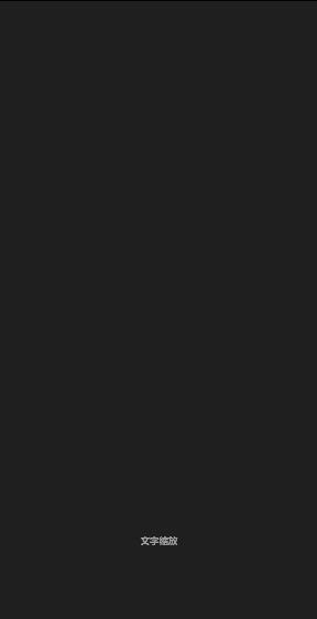
2. 文字缩放
实现效果
实现思路
实现的思路核心在于 scale3d 属性让其变形,配合 animation-timing-function 属性指定动画完成的周期实现该效果。
完整源码
<template>
  <div class="parentBox">
    <div class="contantBox">文字缩放</div>
  </div>
</template>
<style lang="less" scoped>
.parentBox
  height: 100%;
  background: rgb(31, 31, 31);
  padding: 100px;
  @keyframes zoomMeans
    40%
      opacity: 1;
      transform: scale3d(0.475, 0.475, 0.475) translate3d(0, -60px, 0);
      animation-timing-function: cubic-bezier(0.55, 0.055, 0.675, 0.19);


    to
      opacity: 0;
      transform: scale3d(0.1, 0.1, 0.1) translate3d(0, 2000px, 0);
      animation-timing-function: cubic-bezier(0.175, 0.885, 0.32, 1);


  .contantBox
    animation: 2s linear 0s infinite alternate zoomMeans;
    font-weight: bold;
    color: white;
    font-size: 20px;
    text-align: center;


</style>
3. 文字鼠标悬浮
实现效果

实现思路
上图的效果实现起来其实就非常的简单了,我们只需要通过 hover 事件在鼠标触摸文字时设置其样式和效果即可。
完整源码
<template>
  <div class="parentBox">
    <h1>hello word!(鼠标悬浮特效)</h1>
  </div>
</template>
<style lang="less" scoped>
.parentBox
  height: 100%;
  background: rgb(31, 31, 31);
  padding: 100px;
  h1
    display: inline-block;
    color: white;
    font-size: 56px;
    transition: 0.5s;
    cursor: pointer;


  h1:hover
    text-shadow: 0 1px 0 #ccc, 0 2px 0 #ccc, 0 3px 0 #ccc, 0 4px 0 #ccc,
      0 5px 0 #ccc, 0 6px 0 #ccc, 0 7px 0 #ccc, 0 8px 0 #ccc, 0 9px 0 #ccc,
      0 10px 0 #ccc, 0 11px 0 #ccc, 0 12px 0 #ccc,
      0 20px 30px rgba(0, 0, 0, 0.5);


</style>
当然你还可以如下图这样⤵

完整源码
<template>
  <div class="parentBox">
    <h1>hello word!(鼠标悬浮特效)</h1>
  </div>
</template>
<style lang="less" scoped>
.parentBox
  height: 100%;
  background: rgb(31, 31, 31);
  padding: 100px;
  h1
    display: inline-block;
    color: #fff;
    cursor: pointer;
    -webkit-box-reflect: below 0 -webkit-linear-gradient(transparent, transparent
          50%, rgba(255, 255, 255, 0.3));
    font: bold 50px/1.231 georgia, sans-serif;
    text-transform: uppercase;


</style>
持续更新中...
以上是关于纯css实现文字特效动画的主要内容,如果未能解决你的问题,请参考以下文章