Material Design控件使用
Posted 滕玉坤
tags:
篇首语:本文由小常识网(cha138.com)小编为大家整理,主要介绍了Material Design控件使用相关的知识,希望对你有一定的参考价值。
本篇接着之前的Material Design控件总结(一)往下学习support design包下其余控件,如果对Material Design不太熟悉的同学最好把第一篇看完再来看第二篇效果更好
本篇将介绍剩下的控件
- FloatingActionButton
- TabLayout
- Snackbar
- TextInputLayout
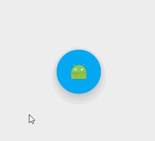
FloatingActionButton
作为MD风格最具争议的控件,本篇将先学习他的简单使用,然后再从日常app中FAB常见的两种样式入手进行介绍
FloatingActionButton是重写ImageView的,所以FloatingActionButton拥有ImageView的一切属性。
基本属性
| xml参数 | 含义 | 备注 |
|---|---|---|
| app:backgroundTint | FAB的背景颜色 | |
| app:rippleColor | FAB点击时的背景颜色 | |
| app:elevation | 默认状态下FAB的阴影大小 | 默认为6dp |
| app:pressedTranslationZ | 点击时候FAB的阴影大小 | 默认为12dp |
| app:fabSize | 设置FAB的大小 | 该属性有两个值,分别为normal和mini,对应的FAB大小分别为56dp和40dp。 |
| src | 设置FAB的图标 | Google建议符合Design设计的该图标大小为24dp |
| app:layout_anchor | 设置FAB的锚点 | 即以哪个控件为参照物设置位置 |
| app:layout_anchorGravity | 设置FAB相对锚点的位置 | 有 bottom、center、right、left、top等 |
有时候会出现点击效果不显示的情况,可以试试 加上 clickable = “true” 这个属性,应该是焦点未获取到导致的
简单使用
xml布局
<android.support.design.widget.FloatingActionButton
        android:id="@+id/fab"
        android:layout_width="wrap_content"
        android:layout_height="wrap_content"
        android:clickable="true"
        android:src="@mipmap/ic_launcher"
        app:backgroundTint="#03A9F4"
        app:elevation="12dp"
        app:pressedTranslationZ="24dp"
        app:rippleColor="#0288D1" />
- 1
- 2
- 3
- 4
- 5
- 6
- 7
- 8
- 9
- 10

- 1
- 2
- 3
- 4
- 5
- 6
- 7
- 8
- 9
- 10
至于点击事件跟普通控件并无差别这里不过多说明
接下来将实现二个比较常见的效果
1.随着appbar隐藏

这里是在Material Design控件总结(一)基础上实现的也就是利用了Fab app:layout_anchor锚点的属性将它与AppBarLayout关联,然后随着CollapsingToolbarLayout而隐藏,activity中并无其他代码
<?xml version="1.0" encoding="utf-8"?>
<android.support.design.widget.CoordinatorLayout xmlns:android="http://schemas.android.com/apk/res/android"
    xmlns:app="http://schemas.android.com/apk/res-auto"
    android:layout_width="match_parent"
    android:layout_height="match_parent">
    <android.support.design.widget.AppBarLayout
        android:id="@+id/appbar"
        android:layout_width="match_parent"
        android:layout_height="180dp"
        android:theme="@style/ThemeOverlay.AppCompat.Dark.ActionBar">

        <android.support.design.widget.CollapsingToolbarLayout
            android:id="@+id/collapsingToolbarLayout"
            android:layout_width="match_parent"
            android:layout_height="match_parent"
            app:contentScrim="?attr/colorPrimary"
            app:layout_scrollFlags="scroll|exitUntilCollapsed">

            <ImageView
                android:layout_width="match_parent"
                android:layout_height="match_parent"
                android:background="@drawable/bg"
                app:layout_collapseMode="parallax"
                app:layout_collapseParallaxMultiplier="0.6" />

            <android.support.v7.widget.Toolbar
                android:id="@+id/toolbar"
                android:layout_width="match_parent"
                android:layout_height="?attr/actionBarSize"
                app:layout_collapseMode="pin"
                app:popupTheme="@style/ThemeOverlay.AppCompat.Light"
                app:theme="@style/ThemeOverlay.AppCompat.Dark.ActionBar" />


        </android.support.design.widget.CollapsingToolbarLayout>

    </android.support.design.widget.AppBarLayout>


    <android.support.v7.widget.RecyclerView
        android:id="@+id/recyclerView"
        android:layout_width="match_parent"
        android:layout_height="match_parent"
        app:layout_behavior="@string/appbar_scrolling_view_behavior" />

    <android.support.design.widget.FloatingActionButton
        android:id="@+id/fab"
        android:layout_width="wrap_content"
        android:layout_height="wrap_content"
        android:clickable="true"
        android:src="@mipmap/ic_launcher"
        app:layout_anchor="@+id/appbar"
        app:layout_anchorGravity="right|bottom"
        android:layout_marginRight="10dp"
        android:layout_marginBottom="10dp"
        />

</android.support.design.widget.CoordinatorLayout>
- 1
- 2
- 3
- 4
- 5
- 6
- 7
- 8
- 9
- 10
- 11
- 12
- 13
- 14
- 15
- 16
- 17
- 18
- 19
- 20
- 21
- 22
- 23
- 24
- 25
- 26
- 27
- 28
- 29
- 30
- 31
- 32
- 33
- 34
- 35
- 36
- 37
- 38
- 39
- 40
- 41
- 42
- 43
- 44
- 45
- 46
- 47
- 48
- 49
- 50
- 51
- 52
- 53
- 54
- 55
- 56
- 57
- 58
- 1
- 2
- 3
- 4
- 5
- 6
- 7
- 8
- 9
- 10
- 11
- 12
- 13
- 14
- 15
- 16
- 17
- 18
- 19
- 20
- 21
- 22
- 23
- 24
- 25
- 26
- 27
- 28
- 29
- 30
- 31
- 32
- 33
- 34
- 35
- 36
- 37
- 38
- 39
- 40
- 41
- 42
- 43
- 44
- 45
- 46
- 47
- 48
- 49
- 50
- 51
- 52
- 53
- 54
- 55
- 56
- 57
- 58
2.随着Recyclerview滑动而隐藏

相对于上面在Fab加一个属性app:layout_behavior (至于这个是干嘛的这里先贴上一段介绍Behavior只有是CoordinatorLayout的直接子View才有意义。可以为任何View添加一个Behavior.Behavior是一系列回调。让你有机会以非侵入的为View添加动态的依赖布局,和处理父布局(CoordinatorLayout)滑动手势的机会。)后面有空再讲解
这里先上xml
<?xml version="1.0" encoding="utf-8"?>
<android.support.design.widget.CoordinatorLayout xmlns:android="http://schemas.android.com/apk/res/android"
    xmlns:app="http://schemas.android.com/apk/res-auto"
    android:layout_width="match_parent"
    android:layout_height="match_parent">
    <android.support.design.widget.AppBarLayout
        android:id="@+id/appbar"
        android:layout_width="match_parent"
        android:layout_height="180dp"
        android:theme="@style/ThemeOverlay.AppCompat.Dark.ActionBar">

        <android.support.design.widget.CollapsingToolbarLayout
            android:id="@+id/collapsingToolbarLayout"
            android:layout_width="match_parent"
            android:layout_height="match_parent"
            app:contentScrim="?attr/colorPrimary"
            app:layout_scrollFlags="scroll|exitUntilCollapsed">

            <ImageView
                android:layout_width="match_parent"
                android:layout_height="match_parent"
                android:background="@drawable/bg"
                app:layout_collapseMode="parallax"
                app:layout_collapseParallaxMultiplier="0.6" />

            <android.support.v7.widget.Toolbar
                android:id="@+id/toolbar"
                android:layout_width="match_parent"
                android:layout_height="?attr/actionBarSize"
                app:layout_collapseMode="pin"
                app:popupTheme="@style/ThemeOverlay.AppCompat.Light"
                app:theme="@style/ThemeOverlay.AppCompat.Dark.ActionBar" />


        </android.support.design.widget.CollapsingToolbarLayout>

    </android.support.design.widget.AppBarLayout>


    <android.support.v7.widget.RecyclerView
        android:id="@+id/recyclerView"
        android:layout_width="match_parent"
        android:layout_height="match_parent"
        app:layout_behavior="@string/appbar_scrolling_view_behavior" />

    <android.support.design.widget.FloatingActionButton
        android:id="@+id/fab"
        android:layout_width="wrap_content"
        android:layout_height="wrap_content"
        android:clickable="true"
        android:src="@mipmap/ic_launcher"
        app:layout_anchor="@+id/recyclerView"
        app:layout_anchorGravity="right|bottom"
        android:layout_marginRight="10dp"
        android:layout_marginBottom="10dp"
        app:layout_behavior="com.zly.www.supportdesign.floatactionbutton.ScrollAwareFABBehavior"
        />

</android.support.design.widget.CoordinatorLayout>
- 1
- 2
- 3
- 4
- 5
- 6
- 7
- 8
- 9
- 10
- 11
- 12
- 13
- 14
- 15
- 16
- 17
- 18
- 19
- 20
- 21
- 22
- 23
- 24
- 25
- 26
- 27
- 28
- 29
- 30
- 31
- 32
- 33
- 34
- 35
- 36
- 37
- 38
- 39
- 40
- 41
- 42
- 43
- 44
- 45
- 46
- 47
- 48
- 49
- 50
- 51
- 52
- 53
- 54
- 55
- 56
- 57
- 58
- 59
- 1
- 2
- 3
- 4
- 5
- 6
- 7
- 8
- 9
- 10
- 11
- 12
- 13
- 14
- 15
- 16
- 17
- 18
- 19
- 20
- 21
- 22
- 23
- 24
- 25
- 26
- 27
- 28
- 29
- 30
- 31
- 32
- 33
- 34
- 35
- 36
- 37
- 38
- 39
- 40
- 41
- 42
- 43
- 44
- 45
- 46
- 47
- 48
- 49
- 50
- 51
- 52
- 53
- 54
- 55
- 56
- 57
- 58
- 59
其中ScrollAwareFABBehavior是我们自定义的一个Behavior。
package com.zly.www.supportdesign.floatactionbutton;

import android.content.Context;
import android.os.Build;
import android.support.design.widget.CoordinatorLayout;
import android.support.design.widget.FloatingActionButton;
import android.support.v4.view.ViewCompat;
import android.support.v4.view.ViewPropertyAnimatorListener;
import android.support.v4.view.animation.FastOutSlowInInterpolator;
import android.util.AttributeSet;
import android.view.View;
import android.view.ViewGroup;
import android.view.animation.Interpolator;

public class ScrollAwareFABBehavior extends FloatingActionButton.Behavior
    private static final Interpolator INTERPOLATOR = new FastOutSlowInInterpolator();
    private boolean mIsAnimatingOut = false;

    public ScrollAwareFABBehavior(Context context, AttributeSet attrs)
        super();


    @Override
    public boolean onStartNestedScroll(final CoordinatorLayout coordinatorLayout, final FloatingActionButton child,
                                       final View directTargetChild, final View target, final int nestedScrollAxes)
        // Ensure we react to vertical scrolling
        return nestedScrollAxes == ViewCompat.SCROLL_AXIS_VERTICAL
                || super.onStartNestedScroll(coordinatorLayout, child, directTargetChild, target, nestedScrollAxes);


    @Override
    public void onNestedScroll(final CoordinatorLayout coordinatorLayout, final FloatingActionButton child,
                               final View target, final int dxConsumed, final int dyConsumed,
                               final int dxUnconsumed, final int dyUnconsumed)
        super.onNestedScroll(coordinatorLayout, child, target, dxConsumed, dyConsumed, dxUnconsumed, dyUnconsumed);
        if (dyConsumed > 0 && !this.mIsAnimatingOut && child.getVisibility() == View.VISIBLE)
            // User scrolled down and the FAB is currently visible -> hide the FAB
            animateOut(child);
         else if (dyConsumed < 0 && child.getVisibility() != View.VISIBLE)
            // User scrolled up and the FAB is currently not visible -> show the FAB
            animateIn(child);


    // Same animation that FloatingActionButton.Behavior uses to hide the FAB when the AppBarLayout exits
    private void animateOut(final FloatingActionButton button)
        if (Build.VERSION.SDK_INT >= 14)
            ViewCompat.animate(button).translationY(button.getHeight() + getMarginBottom(button)).setInterpolator(INTERPOLATOR).withLayer()
                    .setListener(new ViewPropertyAnimatorListener()
                        public void onAnimationStart(View view)
                            ScrollAwareFABBehavior.this.mIsAnimatingOut = true;


                        public void onAnimationCancel(View view)
                            ScrollAwareFABBehavior.this.mIsAnimatingOut = false;


                        public void onAnimationEnd(View view)
                            ScrollAwareFABBehavior.this.mIsAnimatingOut = false;
                            view.setVisibility(View.GONE);

                    ).start();
         else


    // Same animation that FloatingActionButton.Behavior uses to show the FAB when the AppBarLayout enters
    private void animateIn(FloatingActionButton button)
        button.setVisibility(View.VISIBLE);
        if (Build.VERSION.SDK_INT >= 14)
            ViewCompat.animate(button).translationY(0)
                    .setInterpolator(INTERPOLATOR).withLayer().setListener(null)
                    .start();
         else


    private int getMarginBottom(View v)
        int marginBottom = 0;
        final ViewGroup.LayoutParams layoutParams = v.getLayoutParams();
        if (layoutParams instanceof ViewGroup.MarginLayoutParams)
            marginBottom = ((ViewGroup.MarginLayoutParams) layoutParams).bottomMargin;

        return marginBottom;
- 1
- 2
- 3
- 4
- 5
- 6
- 7
- 8
- 9
- 10
- 11
- 12
- 13
- 14
- 15
- 16
- 17
- 18
- 19
- 20
- 21
- 22
- 23
- 24
- 25
- 26
- 27
- 28
- 29
- 30
- 31
- 32
- 33
- 34
- 35
- 36
- 37
- 38
- 39
- 40
- 41
- 42
- 43
- 44
- 45
- 46
- 47
- 48
- 49
- 50
- 51
- 52
- 53
- 54
- 55
- 56
- 57
- 58
- 59
- 60
- 61
- 62
- 63
- 64
- 65
- 66
- 67
- 68
- 69
- 70
- 71
- 72
- 73
- 74
- 75
- 76
- 77
- 78
- 79
- 80
- 81
- 82
- 83
- 84
- 85
- 86
- 87
- 88
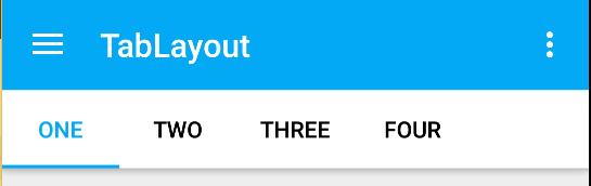
TabLayout
以前我们在应用viewpager的时候,经常会使用TabPageIndicator来与其配合达到tab选项卡效果。但是毕竟是第三方库用着总有点不放心,然而随着support design包的到来谷歌终于为我们带来了原生控件tablayout,从此选项卡效果不在需要第三方就可以实现
基本属性
| 属性 | 含义 |
|---|---|
| app:tabTextColor | Tab未被选中字体的颜色 |
| app:tabSelectedTextColor | tab被选中后,文字的颜色 |
| app:tabIndicatorColor | Tab指示器下标的颜色 |
使用也非常简单直接根据效果来看代码好了

xml布局
<?xml version="1.0" encoding="utf-8"?>
<android.support.design.widget.CoordinatorLayout xmlns:android="http://schemas.android.com/apk/res/android"
    xmlns:app="http://schemas.android.com/apk/res-auto"
    android:layout_width="match_parent"
    android:layout_height="match_parent">

    <android.support.design.widget.AppBarLayout
        android:id="@+id/appbar"
        android:layout_width="match_parent"
        android:layout_height="wrap_content"
        android:theme="@style/ThemeOverlay.AppCompat.Dark.ActionBar">

        <android.support.v7.widget.Toolbar
            android:id="@+id/toolbar"
            android:layout_width="match_parent"
            android:layout_height="?attr/actionBarSize"
            app:layout_scrollFlags="scroll|enterAlways"
            app:popupTheme="@style/ThemeOverlay.AppCompat.Light"
            app:theme="@style/ThemeOverlay.AppCompat.Dark.ActionBar" />

        <android.support.design.widget.TabLayout
            android:id="@+id/tabLayout"
            android:layout_width="match_parent"
            android:layout_height="wrap_content"
            android:background="#fff"
            app:tabTextColor="#000"
            app:tabSelectedTextColor="#03A9F4"
            />
    </android.support.design.widget.AppBarLayout>

    <android.support.v4.view.ViewPager
        android:id="@+id/viewPager"
        android:layout_width="match_parent"
        android:layout_height="match_parent"
        app:layout_behavior="@string/appbar_scrolling_view_behavior" />


</android.support.design.widget.CoordinatorLayout>
- 1
- 2
- 3
- 4
- 5
- 6
- 7
- 8
- 9
- 10
- 11
- 12
- 13
- 14
- 15
- 16
- 17
- 18
- 19
- 20
- 21
- 22
- 23
- 24
- 25
- 26
- 27
- 28
- 29
- 30
- 31
- 32
- 33
- 34
- 35
- 36
- 37
- 38
- 1
- 2
- 3
- 4
- 5
- 6
- 7
- 8
- 9
- 10
- 11
- 12
- 13
- 14
- 15
- 16
- 17
- 18
- 19
- 20
- 21
- 22
- 23
- 24
- 25
- 26
- 27
- 28
- 29
- 30
- 31
- 32
- 33
- 34
- 35
- 36
- 37
- 38
除了使用上面介绍的属性外,给viewpager加了一个app:layout_behavior=”@string/appbar_scrolling_view_behavior” 来实现当recyclerview下滑的时候隐藏toolbar,对这里不是太理解的小伙伴可以在看看第一篇中关于CoordinatorLayout的部分应该就可以理解
activity中代码
private Fragment[] fragments =
            new OneFragment(),
            new TwoFragment(),
            new ThreeFragment(),
            new FourFragment()
    ;

private String[] tabs =
        "one",
        "two",
        "three",
        "four"
;

ViewPager vp = (ViewPager) view.findViewById(R.id.viewPager);
TabLayout tabLayout = (TabLayout) view.findViewById(R.id.tabLayout);
vp.setAdapter(new MainPageAdapter(getFragmentManager(),fragments,tabs));
tabLayout.setupWithViewPager(vp);
- 1
- 2
- 3
- 4
- 5
- 6
- 7
- 8
- 9
- 10
- 11
- 12
- 13
- 14
- 15
- 16
- 17
- 18
- 1
- 2
- 3
- 4
- 5
- 6
- 7
- 8
- 9
- 10
- 11
- 12
- 13
- 14
- 15
- 16
- 17
- 18
TabLayout只需调用setupWithViewPager()与viewpager关联即可至于每个tab的title在viewpager的adapter中getPageTitle()设置即可
adapter代码
public class MainPageAdapter extends FragmentPagerAdapter

    private final Fragment[] fragments;
    private final String[] tabs;

    public MainPageAdapter(FragmentManager fm, Fragment[] fragments, String[] tabs)
        super(fm);
        this.fragments = fragments;
        this.tabs = tabs;


    @Override
    public Fragment getItem(int position)
        return fragments[position];


    @Override
    public int getCount()
        return fragments.length;


    @Override
    public CharSequence getPageTitle(int position)
        return tabs[position];
- 1
- 2
- 3
- 4
- 5
- 6
- 7
- 8
- 9
- 10
- 11
- 12
- 13
- 14
- 15
- 16
- 17
- 18
- 19
- 20
- 21
- 22
- 23
- 24
- 25
- 26
- 1
- 2
- 3
- 4
- 5
- 6
- 7
- 8
- 9
- 10
- 11
- 12
- 13
- 14
- 15
- 16
- 17
- 18
- 19
- 20
- 21
- 22
- 23
- 24
- 25
- 26
除了上面简单用法TabLayout常用的方法如下:
- 增加选项卡到 layout 中
- addTab(TabLayout.Tab tab, int position, boolean setSelected)
- addTab(TabLayout.Tab tab, boolean setSelected)
- addTab(TabLayout.Tab tab)
- 得到选项卡
- getTabAt(int index)
- 得到选项卡的总个数
- getTabCount()
- 得到 tab 的 Gravity
- getTabGravity()
- 得到 tab 的模式
- getTabMode()
- 得到 tab 中文本的颜色
- getTabTextColors()
- 新建个 tab
- newTab()
- 移除所有的 tab
- removeAllTabs()
- 移除指定的 tab
- removeTab(TabLayout.Tab tab)
- 移除指定位置的 tab
- removeTabAt(int position)
- 为每个 tab 增加选择监听器
- setOnTabSelectedListener(TabLayout.OnTabSelectedListener onTabSelectedListener)
- 设置滚动位置
- setScrollPosition(int position, float positionOffset, boolean updateSelectedText)
- 设置 Gravity
- setTabGravity(int gravity)
- 设置 Mode,有两种值:TabLayout.MODE_SCROLLABLE和TabLayout.MODE_FIXED
- setTabMode(int mode)
- 设置 tab 中文本的颜色
- setTabTextColors(ColorStateList textColor)
- 设置 tab 中文本的颜色 默认 选中
- setTabTextColors(int normalColor, int selectedColor)
- 设置 PagerAdapter
- setTabsFromPagerAdapter(PagerAdapter adapter)
- 和 ViewPager 联动
- setupWithViewPager(ViewPager viewPager)
这里解释下setTabMode(int mode)方法,直接看效果就明白了
tabLayout.setTabMode(TabLayout.MODE_FIXED);
TabLayout.MODE_FIXED->tablayout直接显示出所有title
tabLayout.setTabMode(TabLayout.MODE_SCROLLABLE);
TabLayout.MODE_SCROLLABLE->tablayout在当前屏幕下能显示多少就显示多少title显示不下的可以滑动tablayout查看
Snackbar
Snackbar使用的时候需要一个控件容器用来容纳Snackbar.官方推荐使用CoordinatorLayout,因为使用这个控件,可以保证Snackbar可以让用户通过向右滑动退出。并且Snackbar不会遮挡FAB的显示了,当Snackbar出现时FAB会自动上移。

使用跟Toast类似
Snackbar.make(collapsingToolbarLayout,"弹出了",Snackbar.LENGTH_SHORT).show();
- 1
- 1
除了这样之外Snackbar还可以支持一个按钮

Snackbar.make(collapsingToolbarLayout,"弹出了",Snackbar.LENGTH_SHORT)
        .setAction("你点我啊", new View.OnClickListener()
                    @Override
                    public void onClick(View v)
                        Snackbar.make(collapsingToolbarLayout,"轻点疼",Snackbar.LENGTH_SHORT).show();

                ).show();
- 1
- 2
- 3
- 4
- 5
- 6
- 7
- 1
- 2
- 3
- 4
- 5
- 6
- 7
action按钮颜色可以通过setActionTextColor()来设置,而弹出的message颜色很可惜没有提供方法设置
不过我们可以看下setActionTextColor()源码
@NonNull
    public Snackbar setActionTextColor(ColorStateList colors)
        final TextView tv = mView.getActionView();
        tv.setTextColor(colors);
        return this;
- 1
- 2
- 3
- 4
- 5
- 6
- 1
- 2
- 3
- 4
- 5
- 6
可以发现是给mView中的Action按钮的TextView设置颜色,经过继续查看发现mView为Snackbar内部类SnackbarLayout而该内部类的布局为design_layout_snackbar_include接下来看该布局文件
<?xml version="1.0" encoding="utf-8"?>
<!--
  ~ Copyright (C) 2015 The Android Open Source Project
  ~
  ~ Licensed under the Apache License, Version 2.0 (the "License");
  ~ you may not use this file except in compliance with the License.
  ~ You may obtain a copy of the License at
  ~
  ~      http://www.apache.org/licenses/LICENSE-2.0
  ~
  ~ Unless required by applicable law or agreed to in writing, software
  ~ distributed under the License is distributed on an "AS IS" BASIS,
  ~ WITHOUT WARRANTIES OR CONDITIONS OF ANY KIND, either express or implied.
  ~ See the License for the specific language governing permissions and
  ~ limitations under the License.
-->

<merge xmlns:android="http://schemas.android.com/apk/res/android">

    <TextView
            android:id="@+id/snackbar_text"
            android:layout_width="wrap_content"
            android:layout_height="wrap_content"
            android:layout_weight="1"
            android:paddingTop="@dimen/design_snackbar_padding_vertical"
            android:paddingBottom="@dimen/design_snackbar_padding_vertical"
            android:paddingLeft="@dimen/design_snackbar_padding_horizontal"
            android:paddingRight="@dimen/design_snackbar_padding_horizontal"
            android:textAppearance="@style/TextAppearance.Design.Snackbar.Message"
            android:maxLines="@integer/design_snackbar_text_max_lines"
            android:layout_gravity="center_vertical|left|start"
            android:ellipsize="end"
            android:textAlignment="viewStart"/>

    <Button
            android:id="@+id/snackbar_action"
            android:layout_width="wrap_content"
            android:layout_height="wrap_content"
            android:layout_marginLeft="@dimen/design_snackbar_extra_spacing_horizontal"
            android:layout_marginStart="@dimen/design_snackbar_extra_spacing_horizontal"
            android:layout_gravity="center_vertical|right|end"
            android:paddingTop="@dimen/design_snackbar_padding_vertical"
            android:paddingBottom="@dimen/design_snackbar_padding_vertical"
            android:paddingLeft="@dimen/design_snackbar_padding_horizontal"
            android:paddingRight="@dimen/design_snackbar_padding_horizontal"
            android:visibility="gone"
            android:textColor="?attr/colorAccent"
            style="?attr/borderlessButtonStyle"/>

</merge>
- 1
- 2
- 3
- 4
- 5
- 6
- 7
- 8
- 9
- 10
- 11
- 12
- 13
- 14
- 15
- 16
- 17
- 18
- 19
- 20
- 21
- 22
- 23
- 24
- 25
- 26
- 27
- 28
- 29
- 30
- 31
- 32
- 33
- 34
- 35
- 36
- 37
- 38
- 39
- 40
- 41
- 42
- 43
- 44
- 45
- 46
- 47
- 48
- 49
- 50
- 1
- 2
- 3
- 4
- 5
- 6
- 7
- 8
- 9
- 10
- 11
- 12
- 13
- 14
- 15
- 16
- 17
- 18
- 19
- 20
- 21
- 22
- 23
- 24
- 25
- 26
- 27
- 28
- 29
- 30
- 31
- 32
- 33
- 34
- 35
- 36
- 37
- 38
- 39
- 40
- 41
- 42
- 43
- 44
- 45
- 46
- 47
- 48
- 49
- 50
是不是有点恍然大悟,哦原来就是一个普通的布局,那接下来思路就非常清晰了拿到id为snackbar_text的TextView然后setTextColor,经过查找发现没有方法可以直接拿到该TextView,那我们就先拿到SnackbarLayout然后findviewbyid()
发现提供了getView()方法获取到SnackbarLayout
@NonNull
    public View getView()
        return mView;
- 1
- 2
- 3
- 4
- 1
- 2
- 3
- 4
那修改颜色就简单了直接附上代码
Snackbar snackbar = Snackbar.make(collapsingToolbarLayout, "弹出了", Snackbar.LENGTH_SHORT)
                .setAction("你点我啊", new View.OnClickListener()
                    @Override
                    public void onClick(View v)
                        Snackbar.make(collapsingToolbarLayout, "轻点疼", Snackbar.LENGTH_SHORT).show();

                );
        ((TextView)snackbar.getView().findViewById(R.id.snackbar_text)).setTextColor(0xff03A9F4);
        snackbar.show();
- 1
- 2
- 3
- 4
- 5
- 6
- 7
- 8
- 9
- 1
- 2
- 3
- 4
- 5
- 6
- 7
- 8
- 9

TextInputLayout
该控件是用于EditView输入框的,主要解决之前EditView在获得焦点编辑时hint属性提示语消失,这一点在一个页面有多个EditView输入框的时候不是很好,因为很有可能用户在输入多个EditView之后,不知道当前EditView需要输入什么内容。为了解决这一问题,TextInputLayout就此诞生了。
TextInputLayout控件和LinearLayout完全一样,它只是一个容器。跟ScrollView一样,TextInputLayout只接受一个子元素。子元素需要是一个EditText元素说,先上效果图:
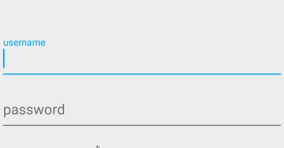
还真别说体验感上了一个档次,使用也非常简单接下来看xml代码
<?xml version="1.0" encoding="utf-8"?>
<LinearLayout xmlns:android="http://schemas.android.com/apk/res/android"
    android:layout_width="match_parent"
    android:layout_height="match_parent"
    android:gravity="center"
    android:orientation="vertical"
    >

    <android.support.design.widget.TextInputLayout
        android:id="@+id/usernameWrapper"
        android:layout_width="match_parent"
        android:layout_height="wrap_content">

        <EditText
            android:id="@+id/et_username"
            android:layout_width="match_parent"
            android:layout_height="wrap_content"
            android:hint="username"
            />

    </android.support.design.widget.TextInputLayout>


    <android.support.design.widget.TextInputLayout
        android:id="@+id/passwordWrapper"
        android:layout_width="match_parent"
        android:layout_height="wrap_content">

        <EditText
            android:id="@+id/et_pwd"
            android:layout_width="match_parent"
            android:layout_height="wrap_content"
            android:hint="password"
            />

    </android.support.design.widget.TextInputLayout>

</LinearLayout>
- 1
- 2
- 3
- 4
- 5
- 6
- 7
- 8
- 9
- 10
- 11
- 12
- 13
- 14
- 15
- 16
- 17
- 18
- 19
- 20
- 21
- 22
- 23
- 24
- 25
- 26
- 27
- 28
- 29
- 30
- 31
- 32
- 33
- 34
- 35
- 36
- 37
- 38
- 1
- 2
- 3
- 4
- 5
- 6
- 7
- 8
- 9
- 10
- 11
- 12
- 13
- 14
- 15
- 16
- 17
- 18
- 19
- 20
- 21
- 22
- 23
- 24
- 25
- 26
- 27
- 28
- 29
- 30
- 31
- 32
- 33
- 34
- 35
- 36
- 37
- 38
代码也可以看出TextInputLayout包裹着EditView。
为了达到以上效果,我们还需添加如下错误提示代码:
        final TextInputLayout usernameWrapper = (TextInputLayout) view.findViewById(R.id.usernameWrapper);
        EditText et_username = usernameWrapper.getEditText();

        et_username.addTextChangedListener(new TextWatcher()
            @Override
            public void beforeTextChanged(CharSequence s, int start, int count, int after)


            @Override
            public void onTextChanged(CharSequence s, int start, int before, int count)
                if(s.toString().length() > 3)
                    usernameWrapper.setError("用户名长度不能超过3个");
                else
                    usernameWrapper.setErrorEnabled(false);


            @Override
            public void afterTextChanged(Editable s)


        );
- 1
- 2
- 3
- 4
- 5
- 6
- 7
- 8
- 9
- 10
- 11
- 12
- 13
- 14
- 15
- 16
- 17
- 18
- 19
- 20
- 21
- 22
- 23
- 1
- 2
- 3
- 4
- 5
- 6
- 7
- 8
- 9
- 10
- 11
- 12
- 13
- 14
- 15
- 16
- 17
- 18
- 19
- 20
- 21
- 22
- 23
TextInputLayout 不仅能显示提示语,而且还能把错误信息显示在EditView之下。
TextInputLayout常用的方法有如下:
setHint():设置提示语。
getEditText():得到TextInputLayout中的EditView控件。
setErrorEnabled():设置是否可以显示错误信息。
setError():设置当用户输入错误时弹出的错误信息。
另外需要注意下
1.setErrorEnabled开启错误提醒功能。这直接影响到布局的大小,增加底部padding为错误标签让出空间。在setError设置错误消息之前开启这个功能意味着在显示错误的时候布局不会变化。
2.如果传入非null参数的setError,那么setErrorEnabled(true)将自动被调用。
3.TextInputLayout选中的颜色为主题中colorAccent属性
<item name="colorAccent">@color/colorAccent</item>
- 1
- 1
到此SupportDesign控件基本介绍完了.如有疑问欢迎讨论
以上是关于Material Design控件使用的主要内容,如果未能解决你的问题,请参考以下文章