Button简单学习和使用
Posted z啵唧啵唧
tags:
篇首语:本文由小常识网(cha138.com)小编为大家整理,主要介绍了Button简单学习和使用相关的知识,希望对你有一定的参考价值。
Button
声明和设置按钮的点击事件
    /**
     * 声明一个btn,用来Button的demo
     */
    private Button mBtnButton;

    @Override
    protected void onCreate(Bundle savedInstanceState)
        super.onCreate(savedInstanceState);
        //设置一个视图
        setContentView(R.layout.activity_main);
        //找到button
        mBtnButton.findViewById(R.id.btn_button);
        //给这个button设置一个点击事件
        mBtnButton.setOnClickListener(new View.OnClickListener()
            @Override
            public void onClick(View view)
                //跳转到Button演示界面

        );
文字大小、颜色
    <!--
    textSize 设置按钮字体的大小
    backgroundTint 设置按钮的背景颜色
    textColor 设置按钮字体的颜色
    -->
    <Button
        android:layout_width="match_parent"
        android:layout_height="40dp"
        android:id="@+id/btn_1"
        android:text="按钮1"
        android:textSize="20sp"
        android:textColor="#FFFFFF"
        android:backgroundTint="#FF0000"/>
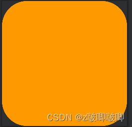
效果展示

自定义背景形状
<?xml version="1.0" encoding="utf-8"?>
<shape xmlns:android="http://schemas.android.com/apk/res/android"
    android:shape="rectangle">
    <!--画一个形状-->
    <solid
        android:color="#FF9900"/>
    <corners
        android:radius="100dp"/>

</shape>
<?xml version="1.0" encoding="utf-8"?>
<shape xmlns:android="http://schemas.android.com/apk/res/android"
    android:shape="rectangle">
    <!--画一个边框的形状-->
    <stroke
        android:width="1dp"
        android:color="#FF9900"/>
    <corners
        android:radius="100dp"/>

</shape>

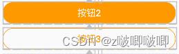
   <!--基于上面两种形状,将它们-->
   <Button
        android:id="@+id/btn_2"
        android:layout_width="match_parent"
        android:layout_height="wrap_content"
        android:layout_below="@id/btn_1"
        android:background="@drawable/bg_btn2"
        android:text="按钮2"
        android:textColor="#FFFFFF"
        android:textSize="20sp"
        android:layout_marginTop="10dp"/>

    <Button
        android:id="@+id/btn_3"
        android:layout_width="match_parent"
        android:layout_height="wrap_content"
        android:layout_below="@id/btn_2"
        android:layout_marginTop="10dp"
        android:background="@drawable/bg_btn3"
        android:text="按钮3"
        android:textColor="#FF9900"
        android:textSize="20sp" />
效果
自定义按压效果,点击事件
方法一:
 //方法一在按钮的点击事件当中通过Toast的makeText方法设置点击事件
 mBtn3.setOnClickListener(new View.OnClickListener()
     @Override
     public void onClick(View view)
         Toast.makeText(ButtonActivity.this, "btn3被点击了", Toast.LENGTH_SHORT).show();

 );
方法二:
//方法二,java代码配置xml文件进行配置
//定义一个方法,在方法当中调用Toast.makeText接口
public  void showToast(View view)
    Toast.makeText(this, "btn4被点击了", Toast.LENGTH_SHORT).show();
<!--
android:onClick 去调用我们上面定义的按压按钮的方法
-->
<Button
    android:layout_width="match_parent"
    android:layout_height="wrap_content"
    android:id="@+id/btn_4"
    android:text="按钮4"
    android:textSize="20sp"
    android:textColor="#FFFFFF"
    android:background="@drawable/bg_btn4"
    android:layout_below="@id/btn_3"
    android:layout_marginTop="10dp"
    android:onClick="showToast"/>
<!--
这个xml文件时用来定义按钮在按压和不按压的情况下的效果
-->

<?xml version="1.0" encoding="utf-8"?>
<selector xmlns:android="http://schemas.android.com/apk/res/android">
    <!--设置按钮被按压的时候的样式-->
    <item android:state_pressed="true">
        <shape>
            <solid android:color="#AA6600" />
            <corners android:radius="5dp" />
        </shape>
    </item>
    <!--设置不按压的时候的样子-->
    <item android:state_pressed="false">
        <shape>
            <solid android:color="#FF9900" />
            <corners android:radius="5dp" />
        </shape>
    </item>
</selector>
以上是关于Button简单学习和使用的主要内容,如果未能解决你的问题,请参考以下文章