echarts进阶配置
Posted Harris-H
tags:
篇首语:本文由小常识网(cha138.com)小编为大家整理,主要介绍了echarts进阶配置相关的知识,希望对你有一定的参考价值。
echarts进阶配置
1.配置
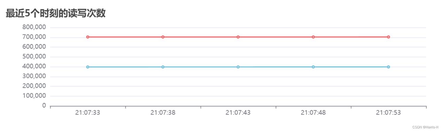
1.单option配置多个图表,并在一个图表绘制多条曲线
只需要在series设置多条数据线,然后其xAxisIndex、yAxisIndex对应同一个表即可。
            xAxisIndex: 3,
            yAxisIndex: 3,
            name: "读count",
            type: "line",
            radius: "55%",
            center: ["50%", "60%"],
            data: ans_2[3][0],
            emphasis:
              itemStyle:
                shadowBlur: 10,
                shadowOffsetX: 0,
                shadowColor: "rgba(0, 0, 0, 0.5)",
              ,
            ,
          ,

            xAxisIndex: 3,
            yAxisIndex: 3,
            name: "写count",
            type: "line",
            radius: "55%",
            center: ["50%", "60%"],
            data: ans_2[3][1],
            emphasis:
              itemStyle:
                shadowBlur: 10,
                shadowOffsetX: 0,
                shadowColor: "rgba(0, 0, 0, 0.5)",
              ,
            ,
          ,
比如上面的配置就是xAxisIndex=yAxisIndex=3。
2.格式化y轴数据
这里我采用的方法是预处理,事实上是option有对应的formatter接口,但是series 和x轴数据得对应这个问题有点折磨,也就是说series 应该也有对应得formatter 属性,估计就可以。
我这里 预处理是时间戳timestamp 转 日期。
    function myformatter(value, index)
      if (value)
        let date = new Date(value * 1000); // 时间戳为秒:10位数
        //let date = new Date(value)    // 时间戳为毫秒:13位数
        let year = date.getFullYear();
        let month =
          date.getMonth() + 1 < 10
            ? `0$date.getMonth() + 1`
            : date.getMonth() + 1;
        let day = date.getDate() < 10 ? `0$date.getDate()` : date.getDate();
        let hour =
          date.getHours() < 10 ? `0$date.getHours()` : date.getHours();
        let minute =
          date.getMinutes() < 10 ? `0$date.getMinutes()` : date.getMinutes();
        let second =
          date.getSeconds() < 10 ? `0$date.getSeconds()` : date.getSeconds();
        return `$hour:$minute:$second`;
        //return `$year-$month-$day $hour:$minute:$second`;
       else
        return "";
3.异步接收数据
引入onMounted钩子函数,然后再利用异步调用接口 接收数据,然后原生dom找到图表元素,定义option,然后setoption即可。
let obj = await getData(props.id);
var myChart = echarts.init(document.getElementById("chart")); //dom操作元素
let option = reactive(.......); //用到obj的数据
myChart.setOption(option); //设置option
4.一个option设置多个图,按照grid分布。
grid: [
           left: "10%", top: "3%", width: "90%", height: "15%" ,
           left: "10%", top: "25%", width: "90%", height: "15%" ,
           left: "10%", y: "47%", width: "90%", height: "15%" ,
           left: "10%", y: "69%", width: "90%", height: "15%" ,
        ],
上图就是4行一列的分布,let,top 是图距离容器左 和 上测的距离。width和height是图表的宽和高。
5.设置toolbox(工具箱)
toolbox:
            show: true,
            feature:
              // dataZoom: 	//缩放
              //   yAxisIndex: "none"
              // ,
              dataView: 	//数据视图
                title: "数据视图",
                lang: ["数据视图", "关闭", "刷新"],
                readOnly: false,
              ,
              // magicType: 	//图表类型转换
              //   type: ["line", "bar"]
              // ,
              // restore: ,
              saveAsImage: 	//保存图片
                title: "保存为图片",
              ,
            ,
          ,
注意option里要对应多个配置,则用数组的形式。
比如toolbox。
toolbox:[

            show: true,
            feature:
             .....
            ,
     ,

            show: true,
            feature:
             .....
            ,
     ,
]
6.legend分组设置到多个图
        legend: [
          //图例组件
          // orient: "vertical",
          // left: "left",

            data: ["cpu使用率"],
            right: "10%",
          ,

            top: "21%",
            data: ["mem使用率"],
            right: "10%",
          ,

            top: "43%",
            data: ["load使用率"],
            right: "10%",
          ,

            top: "65%",
            data: ["读Count/s", "写Count/s"],
            right: "10%",
          ,
        ],
7.折线图转化为面积图
在series 里添加areaStyle:
            xAxisIndex: 0,
            yAxisIndex: 0,
            name: "cpu使用率",
            type: "line",
            radius: "55%",
            center: ["50%", "60%"],
            data: ans_2[0],
            emphasis:
              itemStyle:
                shadowBlur: 10,
                shadowOffsetX: 0,
                shadowColor: "rgba(0, 0, 0, 0.5)",
              ,
            ,
            areaStyle: ,
          ,
8.y轴刻度格式化
yAxis:
            gridIndex: 0,
            minInterval: 1,
            type: "value",
            axisLabel:
              formatter: "value%",
            ,
          ,

完整配置
option = reactive(
//由grid控制各个图表,x,y为与左上角顶点的距离,控制各个图表的位置及大小
grid: [
left: "10%", top: "3%", width: "90%", height: "15%" ,
left: "10%", top: "25%", width: "90%", height: "15%" ,
left: "10%", y: "47%", width: "90%", height: "15%" ,
left: "10%", y: "69%", width: "90%", height: "15%" ,
],
title: [
text: "最近5个时刻的cpu使用率" ,
text: "最近5个时刻的mem使用率", top: "21%" ,
text: "最近5个时刻的load使用率", top: "43%" ,
text: "最近5个时刻的读写次数", top: "65%" ,
],
toolbox: [
show: true,
feature:
// dataZoom:
// yAxisIndex: "none"
// ,
dataView:
title: "数据视图",
lang: ["数据视图", "关闭", "刷新"],
readOnly: false,
,
// magicType:
// type: ["line", "bar"]
// ,
// restore: ,
saveAsImage:
title: "保存为图片",
,
,
,
show: true,
top: "21%",
feature:
// dataZoom:
// yAxisIndex: "none"
// ,
dataView:
title: "数据视图",
lang: ["数据视图", "关闭", "刷新"],
readOnly: false,
,
// magicType:
// type: ["line", "bar"]
// ,
// restore: ,
saveAsImage:
title: "保存为图片",
,
,
,
top: "43%",
show: true,
feature:
// dataZoom:
// yAxisIndex: "none"
// ,
dataView:
title: "数据视图",
lang: ["数据视图", "关闭", "刷新"],
readOnly: false,
,
// magicType:
// type: ["line", "bar"]
// ,
// restore: ,
saveAsImage:
title: "保存为图片",
,
,
,
top: "65%",
show: true,
feature:
// dataZoom:
// yAxisIndex: "none"
// ,
dataView:
title: "数据视图",
lang: ["数据视图", "关闭", "刷新"],
readOnly: false,
,
// magicType:
// type: ["line", "bar"]
// ,
// restore: ,
saveAsImage:
title: "保存为图片",
,
,
,
],
tooltip: [
//提示框配置
trigger: "axis",
//formatter: "a <br/>c",
axisPointer:
type: "cross",
,
,
],
legend: [
//图例组件
// orient: "vertical",
// left: "left",
data: ["cpu使用率"],
right: "10%",
,
top: "21%",
data: ["mem使用率"],
right: "10%",
,
top: "43%",
data: ["load使用率"],
right: "10%",
,
top: "65%",
data: ["读Count/s", "写Count/s"],
right: "10%",
,
],
xAxis: [
gridIndex: 0,
data: ans_1[0],
,
gridIndex: 1,
data: ans_1[1],
,
gridIndex: 2,
data: ans_1[2],
,
gridIndex: 3,
data: ans_1[3],
,
],
// xAxis:
// type: "category",
// data: obj.keys, //keys是x轴
// ,
yAxis: [
//minInterval控制最小间隔,不设置的话会有小数,同样由gridIndex绑定各个图表
gridIndex: 0, minInterval: 1, type: "value" ,
gridIndex: 1, minInterval: 1, type: "value" ,
gridIndex: 2, minInterval: 1, type: "value" ,
gridIndex: 3, minInterval: 1, type: "value" ,
],
series: [
//系列选择pie,进行相关数据配置
xAxisIndex: 0,
yAxisIndex: 0,
name: "cpu使用率",
type: "line",
radius: "55%",
center: ["50%", "60%"],
data: ans_2[0],
emphasis:
itemStyle:
shadowBlur以上是关于echarts进阶配置的主要内容,如果未能解决你的问题,请参考以下文章