WPF 基础控件之 Slider 样式
Posted dotNET跨平台
tags:
篇首语:本文由小常识网(cha138.com)小编为大家整理,主要介绍了WPF 基础控件之 Slider 样式相关的知识,希望对你有一定的参考价值。
其他基础控件
1.Window
2.Button
3.CheckBox
4.ComboBox
5.DataGrid
6.DatePicker
7.Expander
8.GroupBox
9.ListBox
10.ListView
11.Menu
12.PasswordBox
13.TextBox
14.RadioButton
15.ToggleButton
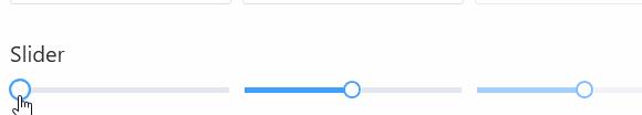
Slider 实现下面的效果
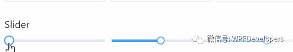
1)Slider来实现动画;
Grid嵌套Border并设置ScaleTransform,当鼠标移入MouseOver将ScaleTransform.ScaleX 与 ScaleTransform.ScaleY值To = 1.2放大;当
Orientation设置为Horizontal水平方向走SliderHorizontal;当
Orientation设置为Vertical垂直方向走SliderVertical;
<ResourceDictionary xmlns="http://schemas.microsoft.com/winfx/2006/xaml/presentation"
xmlns:x="http://schemas.microsoft.com/winfx/2006/xaml"
xmlns:sys="clr-namespace:System;assembly=mscorlib">
<ResourceDictionary.MergedDictionaries>
<ResourceDictionary Source="../Themes/Basic/ControlBasic.xaml"/>
<ResourceDictionary Source="../Themes/Basic/Animations.xaml"/>
</ResourceDictionary.MergedDictionaries>
<sys:Double x:Key="ThumbWidth">16</sys:Double>
<sys:Double x:Key="ThumbCornerRadius">8</sys:Double>
<sys:Double x:Key="RepeatButtonSize">5</sys:Double>
<ControlTemplate x:Key="SliderThumbHorizontalTop" TargetType="x:Type Thumb">
<Grid HorizontalAlignment="Center" UseLayoutRounding="True" VerticalAlignment="Center">
<Border BorderBrush="DynamicResource PrimaryPressedSolidColorBrush"
BorderThickness="2" Background="DynamicResource BackgroundSolidColorBrush"
SnapsToDevicePixels="True"
Height="StaticResource ThumbWidth" Width="StaticResource ThumbWidth" CornerRadius="8" Margin="-1,0,0,0"
Name="PART_Border" RenderTransformOrigin=".5,.5">
</Border>
</Grid>
<ControlTemplate.Triggers>
<Trigger Property="IsMouseOver" Value="True">
<Setter Property="RenderTransform" TargetName="PART_Border">
<Setter.Value>
<ScaleTransform ScaleX="1.2" ScaleY="1.2"/>
</Setter.Value>
</Setter>
</Trigger>
</ControlTemplate.Triggers>
</ControlTemplate>
<ControlTemplate x:Key="SliderThumbHorizontalBottom" TargetType="x:Type Thumb">
<Grid HorizontalAlignment="Center" UseLayoutRounding="True" VerticalAlignment="Center">
<Border BorderBrush="DynamicResource PrimaryNormalSolidColorBrush"
BorderThickness="2" Background="DynamicResource BackgroundSolidColorBrush"
SnapsToDevicePixels="True"
Height="StaticResource ThumbWidth" Width="StaticResource ThumbWidth" CornerRadius="8" Margin="-1,0,0,0"
Name="PART_Border" RenderTransformOrigin=".5,.5">
</Border>
</Grid>
<ControlTemplate.Triggers>
<Trigger Property="IsMouseOver" Value="True">
<Setter Property="RenderTransform" TargetName="PART_Border">
<Setter.Value>
<ScaleTransform ScaleX="1.2" ScaleY="1.2"/>
</Setter.Value>
</Setter>
</Trigger>
</ControlTemplate.Triggers>
</ControlTemplate>
<ControlTemplate x:Key="SliderThumbHorizontal" TargetType="x:Type Thumb">
<ControlTemplate.Resources>
<!--<Storyboard x:Key="ThumbMouseOut">
<DoubleAnimation Storyboard.TargetName="PART_Border"
Storyboard.TargetProperty="(UIElement.RenderTransform).(ScaleTransform.ScaleX)"
To="1" Duration="00:00:0.1"/>
<DoubleAnimation Storyboard.TargetName="PART_Border"
Storyboard.TargetProperty="(UIElement.RenderTransform).(ScaleTransform.ScaleY)"
To="1" Duration="00:00:0.1"/>
</Storyboard>-->
<Storyboard x:Key="ThumbMouseOver">
<DoubleAnimation Storyboard.TargetName="PART_Border"
Storyboard.TargetProperty="(UIElement.RenderTransform).(ScaleTransform.ScaleX)"
From="1"
To="1.2" Duration="00:00:0.1"/>
<DoubleAnimation Storyboard.TargetName="PART_Border"
Storyboard.TargetProperty="(UIElement.RenderTransform).(ScaleTransform.ScaleY)"
From="1"
To="1.2" Duration="00:00:0.1"/>
</Storyboard>
</ControlTemplate.Resources>
<Grid HorizontalAlignment="Center" UseLayoutRounding="True" VerticalAlignment="Center">
<Border BorderBrush="DynamicResource PrimaryNormalSolidColorBrush"
BorderThickness="2" Background="DynamicResource WindowForegroundColorBrush"
SnapsToDevicePixels="True"
Height="StaticResource ThumbWidth" Width="StaticResource ThumbWidth" CornerRadius="8" Margin="-1,0,0,0"
Name="PART_Border" RenderTransformOrigin=".5,.5">
<Border.RenderTransform>
<ScaleTransform/>
</Border.RenderTransform>
</Border>
</Grid>
<ControlTemplate.Triggers>
<Trigger Property="IsMouseOver" Value="True">
<Trigger.EnterActions>
<BeginStoryboard x:Name="BeginStoryboard" Storyboard="StaticResource ThumbMouseOver" />
</Trigger.EnterActions>
<Trigger.ExitActions>
<StopStoryboard BeginStoryboardName="BeginStoryboard"/>
<!--<BeginStoryboard Storyboard="StaticResource ThumbMouseOut" />-->
</Trigger.ExitActions>
</Trigger>
</ControlTemplate.Triggers>
</ControlTemplate>
<Style x:Key="RepeatButtonTransparent" TargetType="x:Type RepeatButton">
<Setter Property="OverridesDefaultStyle" Value="True"/>
<Setter Property="Background" Value="Transparent"/>
<Setter Property="Focusable" Value="False"/>
<Setter Property="IsTabStop" Value="False"/>
<Setter Property="Template">
<Setter.Value>
<ControlTemplate TargetType="x:Type RepeatButton">
<Rectangle Fill="TemplateBinding Background"
Height="TemplateBinding Height"
Width="TemplateBinding Width"/>
<!--<Border Background="TemplateBinding Background"
Height="TemplateBinding Height"
Width="TemplateBinding Width"
CornerRadius="4,4,0,0"/>-->
</ControlTemplate>
</Setter.Value>
</Setter>
</Style>
<ControlTemplate x:Key="SliderThumbHorizontalDefault" TargetType="x:Type Thumb">
<Grid HorizontalAlignment="Center" UseLayoutRounding="True" VerticalAlignment="Center">
<Border BorderBrush="DynamicResource PrimaryNormalSolidColorBrush"
BorderThickness="2" Background="DynamicResource BackgroundSolidColorBrush"
SnapsToDevicePixels="True"
Height="StaticResource ThumbWidth" Width="StaticResource ThumbWidth" CornerRadius="8" Margin="-1,0,0,0"
Name="PART_Border" RenderTransformOrigin=".5,.5">
</Border>
</Grid>
<ControlTemplate.Triggers>
<Trigger Property="IsMouseOver" Value="True">
<Setter Property="RenderTransform" TargetName="PART_Border">
<Setter.Value>
<ScaleTransform ScaleX="1.2" ScaleY="1.2"/>
</Setter.Value>
</Setter>
</Trigger>
</ControlTemplate.Triggers>
</ControlTemplate>
<ControlTemplate x:Key="SliderHorizontal" TargetType="x:Type Slider">
<Border x:Name="border"
BorderBrush="TemplateBinding BorderBrush"
BorderThickness="TemplateBinding BorderThickness"
Background="TemplateBinding Background"
SnapsToDevicePixels="True"
Padding="2">
<Grid>
<Grid.RowDefinitions>
<RowDefinition Height="Auto"/>
<RowDefinition Height="Auto" MinHeight="TemplateBinding MinHeight"/>
<RowDefinition Height="Auto"/>
</Grid.RowDefinitions>
<TickBar x:Name="TopTick" Fill="TemplateBinding Foreground" Height="4" Margin="0,0,0,2" Placement="Top" Grid.Row="0" Visibility="Collapsed"/>
<TickBar x:Name="BottomTick" Fill="TemplateBinding Foreground" Height="4" Margin="0,2,0,0" Placement="Bottom" Grid.Row="2" Visibility="Collapsed"/>
<Border x:Name="TrackBackground"
Height="6.0"
Margin="5,0"
Grid.Row="1"
VerticalAlignment="center">
<Canvas Margin="-6,-1">
<Rectangle x:Name="PART_SelectionRange"
Fill="DynamicResource x:Static SystemColors.HighlightBrushKey"
Height="4.0" Visibility="Hidden"/>
</Canvas>
</Border>
<Track x:Name="PART_Track" Grid.Row="1">
<Track.DecreaseRepeatButton>
<RepeatButton Command="x:Static Slider.DecreaseLarge"
Style="DynamicResource RepeatButtonTransparent"
Background="DynamicResource PrimaryNormalSolidColorBrush"
Height="StaticResource RepeatButtonSize"/>
</Track.DecreaseRepeatButton>
<Track.IncreaseRepeatButton>
<RepeatButton Command="x:Static Slider.IncreaseLarge"
Style="StaticResource RepeatButtonTransparent"
Background="DynamicResource LightSolidColorBrush"
Height="StaticResource RepeatButtonSize"/>
</Track.IncreaseRepeatButton>
<Track.Thumb>
<Thumb x:Name="Thumb" Focusable="False"
OverridesDefaultStyle="True"
Template="StaticResource SliderThumbHorizontal"
VerticalAlignment="Center"/>
</Track.Thumb>
</Track>
</Grid>
</Border>
<ControlTemplate.Triggers>
<Trigger Property="TickPlacement" Value="TopLeft">
<Setter Property="Visibility" TargetName="TopTick" Value="Visible"/>
<Setter Property="Template" TargetName="Thumb" Value="StaticResource SliderThumbHorizontal"/>
<Setter Property="Margin" TargetName="TrackBackground" Value="5,2,5,0"/>
</Trigger>
<Trigger Property="TickPlacement" Value="BottomRight">
<Setter Property="Visibility" TargetName="BottomTick" Value="Visible"/>
<Setter Property="Template" TargetName="Thumb" Value="StaticResource SliderThumbHorizontal"/>
<Setter Property="Margin" TargetName="TrackBackground" Value="5,0,5,2"/>
</Trigger>
<Trigger Property="TickPlacement" Value="Both">
<Setter Property="Visibility" TargetName="TopTick" Value="Visible"/>
<Setter Property="Visibility" TargetName="BottomTick" Value="Visible"/>
</Trigger>
<Trigger Property="IsSelectionRangeEnabled" Value="True">
<Setter Property="Visibility" TargetName="PART_SelectionRange" Value="Visible"/>
</Trigger>
<Trigger Property="IsKeyboardFocused" Value="True">
<Setter Property="Foreground" TargetName="Thumb" Value="DynamicResource PrimaryNormalSolidColorBrush"/>
</Trigger>
</ControlTemplate.Triggers>
</ControlTemplate>
<ControlTemplate x:Key="SliderThumbVerticalLeft" TargetType="x:Type Thumb">
<Grid HorizontalAlignment="Center" UseLayoutRounding="True" VerticalAlignment="Center">
<Border BorderBrush="DynamicResource PrimaryNormalSolidColorBrush"
BorderThickness="2" Background="DynamicResource BackgroundSolidColorBrush"
SnapsToDevicePixels="True" UseLayoutRounding="True"
Height="StaticResource ThumbWidth" Width="StaticResource ThumbWidth" CornerRadius="8"
Name="PART_Border" RenderTransformOrigin=".5,.5">
</Border>
</Grid>
<ControlTemplate.Triggers>
<Trigger Property="IsMouseOver" Value="True">
<Setter Property="RenderTransform" TargetName="PART_Border">
<Setter.Value>
<ScaleTransform ScaleX="1.2" ScaleY="1.2"/>
</Setter.Value>
</Setter>
</Trigger>
</ControlTemplate.Triggers>
</ControlTemplate>
<ControlTemplate x:Key="SliderThumbVerticalRight" TargetType="x:Type Thumb">
<Grid HorizontalAlignment="Center" UseLayoutRounding="True" VerticalAlignment="Center">
<Border BorderBrush="DynamicResource PrimaryNormalSolidColorBrush"
BorderThickness="2" Background="DynamicResource BackgroundSolidColorBrush"
SnapsToDevicePixels="True"
Height="StaticResource ThumbWidth" Width="StaticResource ThumbWidth" CornerRadius="8"
Name="PART_Border" RenderTransformOrigin=".5,.5">
</Border>
</Grid>
<ControlTemplate.Triggers>
<Trigger Property="IsMouseOver" Value="True">
<Setter Property="RenderTransform" TargetName="PART_Border">
<Setter.Value>
<ScaleTransform ScaleX="1.2" ScaleY="1.2"/>
</Setter.Value>
</Setter>
</Trigger>
</ControlTemplate.Triggers>
</ControlTemplate>
<ControlTemplate x:Key="SliderThumbVerticalDefault" TargetType="x:Type Thumb">
<Grid HorizontalAlignment="Center" UseLayoutRounding="True" VerticalAlignment="Center">
<Border BorderBrush="DynamicResource PrimaryNormalSolidColorBrush"
BorderThickness="2" Background="DynamicResource BackgroundSolidColorBrush"
SnapsToDevicePixels="True" UseLayoutRounding="True"
Height="StaticResource ThumbWidth" Width="StaticResource ThumbWidth" CornerRadius="8" Margin="0,0,0,-1"
Name="PART_Border" RenderTransformOrigin=".5,.5">
</Border>
</Grid>
<ControlTemplate.Triggers>
<Trigger Property="IsMouseOver" Value="True">
<Setter Property="RenderTransform" TargetName="PART_Border">
<Setter.Value>
<ScaleTransform ScaleX="1.2" ScaleY="1.2"/>
</Setter.Value>
</Setter>
</Trigger>
</ControlTemplate.Triggers>
</ControlTemplate>
<ControlTemplate x:Key="SliderThumbVertical" TargetType="x:Type Thumb">
<ControlTemplate.Resources>
<!--<Storyboard x:Key="ThumbMouseOut">
<DoubleAnimation Storyboard.TargetName="PART_Border"
Storyboard.TargetProperty="(UIElement.RenderTransform).(ScaleTransform.ScaleX)"
To="1" Duration="00:00:0.1"/>
<DoubleAnimation Storyboard.TargetName="PART_Border"
Storyboard.TargetProperty="(UIElement.RenderTransform).(ScaleTransform.ScaleY)"
To="1" Duration="00:00:0.1"/>
</Storyboard>-->
<Storyboard x:Key="ThumbMouseOver">
<DoubleAnimation Storyboard.TargetName="PART_Border"
Storyboard.TargetProperty="(UIElement.RenderTransform).(ScaleTransform.ScaleX)"
From="1"
To="1.2" Duration="00:00:0.1"/>
<DoubleAnimation Storyboard.TargetName="PART_Border"
Storyboard.TargetProperty="(UIElement.RenderTransform).(ScaleTransform.ScaleY)"
From="1"
To="1.2" Duration="00:00:0.1"/>
</Storyboard>
</ControlTemplate.Resources>
<Grid HorizontalAlignment="Center" UseLayoutRounding="True" VerticalAlignment="Center">
<Border BorderBrush="DynamicResource PrimaryNormalSolidColorBrush"
BorderThickness="2" Background="DynamicResource BackgroundSolidColorBrush"
SnapsToDevicePixels="True" UseLayoutRounding="True"
Height="StaticResource ThumbWidth" Width="StaticResource ThumbWidth" CornerRadius="8" Margin="0,0,0,-1"
Name="PART_Border" RenderTransformOrigin=".5,.5">
<Border.RenderTransform>
<ScaleTransform/>
</Border.RenderTransform>
</Border>
</Grid>
<ControlTemplate.Triggers>
<Trigger Property="IsMouseOver" Value="True">
<Trigger.EnterActions>
<BeginStoryboard x:Name="BeginStoryboard" Storyboard="StaticResource ThumbMouseOver" />
</Trigger.EnterActions>
<Trigger.ExitActions>
<StopStoryboard BeginStoryboardName="BeginStoryboard"/>
<!--<BeginStoryboard Storyboard="StaticResource ThumbMouseOut" />-->
</Trigger.ExitActions>
</Trigger>
</ControlTemplate.Triggers>
</ControlTemplate>
<ControlTemplate x:Key="SliderVertical" TargetType="x:Type Slider">
<Border x:Name="border"
BorderBrush="TemplateBinding BorderBrush"
BorderThickness="TemplateBinding BorderThickness"
Background="TemplateBinding Background"
SnapsToDevicePixels="True"
Padding="2">
<Grid>
<Grid.ColumnDefinitions>
<ColumnDefinition Width="Auto"/>
<ColumnDefinition MinWidth="TemplateBinding MinWidth" Width="Auto"/>
<ColumnDefinition Width="Auto"/>
</Grid.ColumnDefinitions>
<TickBar x:Name="TopTick" Grid.Column="0" Fill="TemplateBinding Foreground" Margin="0,0,2,0" Placement="Left" Visibility="Collapsed" Width="4"/>
<TickBar x:Name="BottomTick" Grid.Column="2" Fill="TemplateBinding Foreground" Margin="2,0,0,0" Placement="Right" Visibility="Collapsed" Width="4"/>
<Border x:Name="TrackBackground"
HorizontalAlignment="center"
Margin="0,5"
Width="6.0">
<Canvas Margin="-1,-6">
<Rectangle x:Name="PART_SelectionRange"
Fill="DynamicResource x:Static SystemColors.HighlightBrushKey"
Visibility="Hidden" Width="4.0"/>
</Canvas>
</Border>
<Track x:Name="PART_Track" Grid.Column="1">
<Track.DecreaseRepeatButton>
<RepeatButton Command="x:Static Slider.DecreaseLarge"
Style="StaticResource RepeatButtonTransparent"
Background="DynamicResource PrimaryNormalSolidColorBrush"
Width="StaticResource RepeatButtonSize"/>
</Track.DecreaseRepeatButton>
<Track.IncreaseRepeatButton>
<RepeatButton Command="x:Static Slider.IncreaseLarge"
Style="StaticResource RepeatButtonTransparent"
Background="DynamicResource LightSolidColorBrush"
Width="StaticResource RepeatButtonSize"/>
</Track.IncreaseRepeatButton>
<Track.Thumb>
<Thumb x:Name="Thumb" Focusable="False"
OverridesDefaultStyle="True"
Template="StaticResource SliderThumbVertical"
VerticalAlignment="Top"/>
</Track.Thumb>
</Track>
</Grid>
</Border>
<ControlTemplate.Triggers>
<Trigger Property="TickPlacement" Value="TopLeft">
<Setter Property="Visibility" TargetName="TopTick" Value="Visible"/>
<Setter Property="Template" TargetName="Thumb" Value="StaticResource SliderThumbVertical"/>
<Setter Property="Margin" TargetName="TrackBackground" Value="2,5,0,5"/>
</Trigger>
<Trigger Property="TickPlacement" Value="BottomRight">
<Setter Property="Visibility" TargetName="BottomTick" Value="Visible"/>
<Setter Property="Template" TargetName="Thumb" Value="StaticResource SliderThumbVertical"/>
<Setter Property="Margin" TargetName="TrackBackground" Value="0,5,2,5"/>
</Trigger>
<Trigger Property="TickPlacement" Value="Both">
<Setter Property="Visibility" TargetName="TopTick" Value="Visible"/>
<Setter Property="Visibility" TargetName="BottomTick" Value="Visible"/>
</Trigger>
<Trigger Property="IsSelectionRangeEnabled" Value="True">
<Setter Property="Visibility" TargetName="PART_SelectionRange" Value="Visible"/>
</Trigger>
</ControlTemplate.Triggers>
</ControlTemplate>
<Style TargetType="x:Type Slider" BasedOn="StaticResource ControlBasicStyle">
<Setter Property="Stylus.IsPressAndHoldEnabled" Value="False"/>
<Setter Property="Background" Value="Transparent"/>
<Setter Property="BorderBrush" Value="Transparent"/>
<Setter Property="Cursor" Value="Hand"/>
<Setter Property="Foreground" Value="DynamicResource PrimaryNormalSolidColorBrush"/>
<Setter Property="Template" Value="StaticResource SliderHorizontal"/>
<Style.Triggers>
<Trigger Property="Orientation" Value="Vertical">
<Setter Property="Template" Value="StaticResource SliderVertical"/>
</Trigger>
<!--<Trigger Property="IsEnabled" Value="False">
<Setter Property="Opacity" Value="StaticResource EnabledOpacity" />
</Trigger>-->
</Style.Triggers>
</Style>
</ResourceDictionary>2)Styles.Slider.xaml 代码如下;
<WrapPanel Margin="0,10">
           <Slider Width="200"/>
                    <Slider Width="200" Value="50" Maximum="100"  Margin="10,0"/>
                    <Slider Width="200" Value="50" Maximum="100" IsEnabled="False"/>
</WrapPanel>Nuget[1]Install-Package WPFDevelopers.Minimal
[2][3]
参考资料
[1]
Nuget: https://www.nuget.org/packages/WPFDevelopers.Minimal/
[2]GitHub: https://github.com/WPFDevelopersOrg
[3]Gitee: https://gitee.com/WPFDevelopersOrg
以上是关于WPF 基础控件之 Slider 样式的主要内容,如果未能解决你的问题,请参考以下文章