css基础 CSS 媒体类型CSS 属性 选择器CSS 表单CSS 计数器
Posted 知其黑、受其白
tags:
篇首语:本文由小常识网(cha138.com)小编为大家整理,主要介绍了css基础 CSS 媒体类型CSS 属性 选择器CSS 表单CSS 计数器相关的知识,希望对你有一定的参考价值。
阅读目录
CSS 媒体类型
媒体类型允许你指定文件将如何在不同媒体呈现。
该文件可以以不同的方式显示在屏幕上,在纸张上,或听觉浏览器等等。
媒体类型
某些 CSS 属性仅仅被设计为针对某些媒介。
比方说 voice-family 属性被设计为针对听觉用户终端。
其他一些属性可用于不同的媒体类型。例如,font-size 属性可用于屏幕和印刷媒体,但有不同的值。屏幕和纸上的文件不同,通常需要一个更大的字体,sans - serif 字体比较适合在屏幕上阅读,而 serif 字体更容易在纸上阅读。
@media 规则
@media 规则允许在相同样式表为不同媒体设置不同的样式。
在下面的例子告诉我们浏览器屏幕上显示一个14像素的 Verdana 字体样式。
但是如果页面打印,将是10个像素的 Times 字体。请注意,font-weight 在屏幕上和纸上设置为粗体:
@media screen

    p.test font-family:verdana,sans-serif;font-size:14px;

@media print

    p.test font-family:times,serif;font-size:10px;

@media screen,print

    p.test font-weight:bold;
你可以自己尝试看看 !
如果您使用的是 Mozilla / Firefox 或 IE5+打印此页,你会看到,Media Types将使用另一种比其他文本字体大小小点的字体显示。
其他媒体类型
注意:媒体类型名称不区分大小写。
| 媒体类型 | 描述 |
|---|---|
| all | 用于所有的媒体设备。 |
| aural | 用于语音和音频合成器。 |
| braille | 用于盲人用点字法触觉回馈设备。 |
| embossed | 用于分页的盲人用点字法打印机。 |
| handheld | 用于小的手持的设备。 |
| 用于打印机。 | |
| projection | 用于方案展示,比如幻灯片。 |
| screen | 用于电脑显示器。 |
| tty | 用于使用固定密度字母栅格的媒体,比如电传打字机和终端。 |
| tv | 用于电视机类型的设备。 |
CSS 属性 选择器
顾名思义,CSS 属性选择器就是指可以根据元素的属性以及属性值来选择元素。
具有特定属性的html元素样式,不仅仅是 class 和 id。
注意:IE7 和 IE8 需声明 !DOCTYPE 才支持属性选择器!
IE6 和更低的版本不支持属性选择器。
属性选择器
下面的例子是把包含标题(title)的所有元素变为蓝色:

<!DOCTYPE html>
<html>
<head>
    <meta charset="UTF-8">
    <title>图像</title>
    <style>
        [title]
                    color:blue;

    </style>
</head>
<body>

    <h1 title="Hello world">你好世界</h1>
    <a title="wgchen" >CSDN</a>

</body>
</html>
属性和值选择器
下面的实例改变了标题 title='wg' 元素的边框样式:

<!DOCTYPE html>
<html>
<head>
    <meta charset="UTF-8">
    <title>图像</title>
    <style>
        [title=wgchen]
                            border:5px solid green;

    </style>
</head>
<body>

    <a title="wgchen" >CSDN</a>

</body>
</html>
属性和值的选择器 – 多值
下面是包含指定值的 title 属性的元素样式的例子,使用 (~) 分隔属性和值:
<!DOCTYPE html>
<html>
<head>
<meta charset="UTF-8">
<title>图像</title>
<style>
[title~=hello]
color:blue;
</style>
</head>
<body>
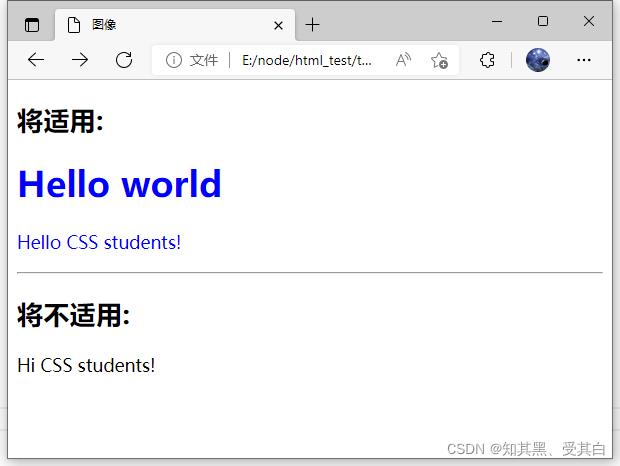
<h2>将适用:</h2>
<h1 title="hello world">Hello world</h1>
<p title="student hello">Hello CSS students!</p>
<hr>
<h2>将不适用:</h2>
<p title="student">Hi CSS students!</p>
</body>
</html>
下面是包含指定值的 lang 属性的元素样式的例子,使用 (|) 分隔属性和值:

表单样式
属性选择器样式无需使用 class 或 id 的形式:
input[type="text"]

    width:150px;
    display:block;
    margin-bottom:10px;
    background-color:yellow;

input[type="button"]

    width:120px;
    margin-left:35px;
    display:block;
CSS 表单
一个表单案例,我们使用 CSS 来渲染 HTML 的表单元素:

<!DOCTYPE html>
<html>
<head>
    <meta charset="UTF-8">
    <title>表单案例</title>
    <style>
        input[type=text],
        select
            width: 100%;
            padding: 12px 20px;
            margin: 8px 0;
            display: inline-block;
            border: 1px solid #ccc;
            border-radius: 4px;
            box-sizing: border-box;


        input[type=submit]
            width: 100%;
            background-color: #4CAF50;
            color: white;
            padding: 14px 20px;
            margin: 8px 0;
            border: none;
            border-radius: 4px;
            cursor: pointer;


        input[type=submit]:hover
            background-color: #45a049;


        div
            border-radius: 5px;
            background-color: #f2f2f2;
            padding: 20px;

    </style>
</head>
<body>

<h3>使用 CSS 来渲染 HTML 的表单元素</h3>

<div>
    <form action="/">
        <label for="fname">First Name</label>
        <input type="text" id="fname" name="firstname" placeholder="Your name..">

        <label for="lname">Last Name</label>
        <input type="text" id="lname" name="lastname" placeholder="Your last name..">

        <label for="country">Country</label>
        <select id="country" name="country">
            <option value="australia">Australia</option>
            <option value="canada">Canada</option>
            <option value="usa">USA</option>
        </select>

        <input type="submit" value="Submit">
    </form>
</div>

</body>
</html>
输入框(input) 样式
使用 width 属性来设置输入框的宽度:
input
  width: 100%;
以上实例中设置了所有 <input> 元素的宽度为 100%,如果你只想设置指定类型的输入框可以使用以下属性选择器:
    input[type=text] – 选取文本输入框
input[type=password] – 选择密码的输入框
  input[type=number] – 选择数字的输入框
输入框填充
使用 padding 属性可以在输入框中添加内边距。
input[type=text]
  width: 100%;
  padding: 12px 20px;
  margin: 8px 0;
  box-sizing: border-box;
注意我们设置了 box-sizing 属性为 border-box。
这样可以确保浏览器呈现出带有指定宽度和高度的输入框是把边框和内边距一起计算进去的。
输入框(input) 边框
使用 border 属性可以修改 input 边框的大小或颜色,使用 border-radius 属性可以给 input 添加圆角:
input[type=text]
  border: 2px solid red;
  border-radius: 4px;
如果你只想添加底部边框可以使用 border-bottom 属性:
input[type=text]
  border: none;
  border-bottom: 2px solid red;
输入框(input) 颜色
可以使用 background-color 属性来设置输入框的背景颜色,color 属性用于修改文本颜色:
input[type=text]
  background-color: #3CBC8D;
  color: white;
输入框(input) 聚焦
默认情况下,一些浏览器在输入框获取焦点时(点击输入框)会有一个蓝色轮廓。
我们可以设置 input 样式为 outline: none; 来忽略该效果。
使用 :focus 选择器可以设置输入框在获取焦点时的样式:
input[type=text]
  width: 100%;
  padding: 12px 20px;
  margin: 8px 0;
  box-sizing: border-box;
  border: 1px solid #555;
  outline: none;

input[type=text]:focus
  background-color: lightblue;
接下来这个实例,我们使用 :focus 选择器,在文本框获取焦点时,设置文本框当边框颜色为黑色。
注意,我们使用来 CSS transition 属性来设置边框当颜色 (在 0.5 秒内修改边框当颜色)。
input[type=text]
  width: 100%;
  padding: 12px 20px;
  margin: 8px 0;
  box-sizing: border-box;
  border: 3px solid #ccc;
  -webkit-transition: 0.5s;
  transition: 0.5s;
  outline: none;


input[type=text]:focus
  border: 3px solid #555;
输入框(input) 图标
如果你想在输入框中添加图标,可以使用 background-image 属性和用于定位的background-position 属性。
注意设置图标的左边距,让图标有一定的空间:
input[type=text]
  width: 100%;
  box-sizing: border-box;
  border: 2px solid #ccc;
  border-radius: 4px;
  font-size: 16px;
  background-color: white;
  background-image: url('search.png');
  background-position: 10px 10px;
  background-repeat: no-repeat;
  padding: 12px 20px 12px 40px;
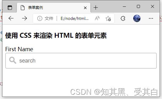
图标

<!DOCTYPE html>
<html>
<head>
    <meta charset="UTF-8">
    <title>表单案例</title>
    <style>
        input[type=text]
            width: 100%;
            box-sizing: border-box;
            border: 2px solid #ccc;
            border-radius: 4px;
            font-size: 16px;
            background-color: white;
            background-image: url('https://media.mybj123.com/wp-content/uploads/2021/06/1623303494-7bff7e55c76fb9f.png');
            background-position: 10px 10px;
            background-repeat: no-repeat;
            padding: 12px 20px 12px 40px;

    </style>
</head>
<body>

<h3>使用 CSS 来渲染 HTML 的表单元素</h3>

<div>
    <form action="/">
        <label for="fname">First Name</label>
        <input type="text" id="fname" name="firstname" placeholder="search">
    </form>
</div>

</body>
</html>
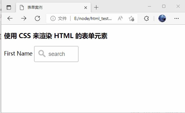
带动画的搜索框
以下实例使用了 CSS transition 属性,该属性设置了输入框在获取焦点时会向右延展。
<!DOCTYPE html>
<html>
<head>
    <meta charset="UTF-8">
    <title>表单案例</title>
    <style>
        input[type=text]
            width: 130px;
            box-sizing: border-box;
            border: 2px solid #ccc;
            border-radius: 4px;
            font-size: 16px;
            background-color: white;
            background-image: url('search.png');
            background-position: 10px 10px;
            background-repeat: no-repeat;
            padding: 12px 20px 12px 40px;
            -webkit-transition: width 0.4s ease-in-out;
            transition: width 0.4s ease-in-out;


        input[type=text]:focus
            width: 100%;

    </style>
</head>
<body>

<h3>使用 CSS 来渲染 HTML 的表单元素</h3>

<div>
    <form action="/">
        <label for="fname">First Name</label>
        <input type="text" id="fname" name="firstname" placeholder="search">
    </form>
</div>

</body>
</html>
关键代码:
input[type=text]
  -webkit-transition: width 0.4s ease-in-out;
  transition: width 0.4s ease-in-out;


input[type=text]:focus
  width: 100%;
文本框(textarea)样式
注意: 使用 resize 属性来禁用文本框可以重置大小的功能
(一般拖动右下角可以重置大小)。
textarea
  width: 100%;
  height: 150px;
  padding: 12px 20px;
  box-sizing: border-box;
  border: 2px solid #ccc;
  border-radius: 4px;
  background-color: #f8f8f8;
  font-size: 16px;
  resize: none;
下拉菜单(select)样式
select
  width: 100%;
  padding: 16px 20px;
  border: none;
  border-radius: 4px;
  background-color: #f1f1f1;
按钮样式
input[type=button], input[type=submit], input[type=reset]
  background-color: #4CAF50;
  border: none;
  color: white;
  padding: 16px 32px;
  text-decoration: none;
  margin: 4px 2px;
  cursor: pointer;


/* 提示: 使用 width: 100% 设置全宽按钮 */
响应式表单
响应式表单可以根据浏览器窗口的大小重新布局各个元素,我们可以通过重置浏览器窗口大小来查看效果:

<!DOCTYPE html>
<html>
<head>
    <meta charset="UTF-8">
    <title>表单案例</title>
    <s以上是关于css基础 CSS 媒体类型CSS 属性 选择器CSS 表单CSS 计数器的主要内容,如果未能解决你的问题,请参考以下文章