div 文字 css旋转问题
Posted
tags:
篇首语:本文由小常识网(cha138.com)小编为大家整理,主要介绍了div 文字 css旋转问题相关的知识,希望对你有一定的参考价值。
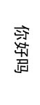
<div>你好吗</div>
显示成
不适用BasicImage 还没有没有什么办法?
必须支持ie8
做图不行的哦。 貌似没有其他办法了啊。
webkit核心浏览器使用和火狐浏览器使用transform可以做到旋转,IE要使用DXImage滤镜,代码如下:
transform:rotate(90deg);-ms-transform:rotate(90deg); /* Internet Explorer 9*/
-moz-transform:rotate(90deg); /* Firefox */
-webkit-transform:rotate(90deg); /* Safari 和 Chrome */
-o-transform:rotate(90deg); /* Opera */
filter: progid:DXImageTransform.Microsoft.BasicImage(rotation=1);
代码如下:
<html><head>
<title>Untitled</title>
<style>
.div1
width: 100px;
height: 30px;
transform:rotate(90deg);
-ms-transform:rotate(90deg); /* Internet Explorer 9*/
-moz-transform:rotate(90deg); /* Firefox */
-webkit-transform:rotate(90deg); /* Safari 和 Chrome */
-o-transform:rotate(90deg); /* Opera */
filter:progid:DXImageTransform.Microsoft.BasicImage(rotation=1);
border:1px solid #4EC83B;
</style>
</head>
<body>
</br>
</br>
</br>
<div class="div1">
我旋转了
</div>
</br>
</br>
</br>
<div style="-ms-writing-mode:tb-rl;border:1px solid #4EC83B;width: 30px;height: 100px;">
Hello World!
</div>
</body>
</html>
效果如下:
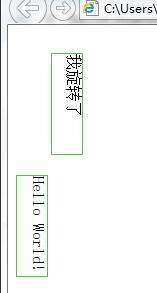
对于英文,IE还有一种方式,使用-ms-writing-mode,中文只能竖排,不能旋转,英文可以
-ms-writing-mode:tb-rl
<html>
<head>
<meta charset=UTF-8>
<title>YuGiOh</title>
<style type="text/css">
#div
position: absolute;
top: 50px;
left: 300px;
width: 300px;
height: 300px;
line-height: 300px;
text-align: center;
border: 1px solid black;
</style>
<script type="text/javascript" src="jquery-1.8.0.min.js"></script>
<script type="text/javascript">
var rotateHTML5 = function (limit)
var reg = /(rotate\\([\\-\\+]?((\\d+)(deg))\\))/i;
var wt = div.style['-webkit-transform'], wts = wt.match (reg);
var $2 = RegExp.$2;
console.log ($2);
div.style['-webkit-transform'] = wt.replace ($2, parseFloat (RegExp.$3) + limit + RegExp.$4);
var rotateIE = function (obj)
var d = !!obj.d ? obj.d : 1;
var r = d * Math.PI / 180;
costheta = Math.cos (r);
sintheta = Math.sin (r);
obj.style.filter = "progid:DXImageTransform.Microsoft.Matrix()";
var item = obj.filters.item (0);
var width = obj.clientWidth;
var height = obj.clientHeight;
item.DX = -width / 2 * costheta + height / 2 * sintheta + width / 2;
item.DY = -width / 2 * sintheta - height / 2 * costheta + height / 2;
item.M11 = costheta;
item.M12 = -sintheta;
item.M21 = sintheta;
item.M22 = costheta;
obj.timer = setTimeout (function ()
var dx = d + 1;
dx = dx > 360 ? 1 : dx;
obj.d = dx;
rotate (obj, dx);
, 30);
;
var start = function ()
if (!!div.interval)
clearInterval (div.interval);
delete div.interval;
else
div.interval = setInterval (function ()
/.*webkit.*/i.test (navigator.userAgent) ? rotateHTML5 (1) : rotateIE (div);
, 30);
</script>
</head>
<body>
<button onclick="start();">rotate</button>
<div id="div" style="border-radius: 90px; -webkit-transform: rotate(10deg);">ROTATE</div>
</body>
</html> 参考技术B divwidth:200px;
height:200px;
-moz-transform:rotate(90deg);
-webkit-transform:rotate(90deg);
-o-transform:rotate(90deg);
ie不支持哦 参考技术C -webkit-transform: rotate(90deg);/*Safari 4+,Google Chrome 1+ */
-moz-transform: rotate(90deg);/*Firefox 3.5+*/
filter: progid:DXImageTransform.Microsoft.BasicImage(rotation=1);/*ie*/
这个应该可以实现,试试吧。 参考技术D IE必须支持,不要妄下定论,IE滤镜是很强大的,简单的是各种90度转,复杂的可以任意角度。
<div style="height: 50px; width: 100px; margin-top:100px; background:#96d171;-webkit-transform: rotate(90deg);
-moz-transform: rotate(90deg);
filter: progid:DXImageTransform.Microsoft.BasicImage(rotation=1);">你好啊</div>
你自己试试,其中filter中rotation=1,这个1可以是0、1、2、3四个值分别是四个方向,有别的问题可以继续问本回答被提问者和网友采纳
使用CSS3旋转DIV
使用CSS3旋转DIV
参加某公司的前端工程师笔试,遇到以下问题。
请完成以下填空,使得id为loading的div每1秒转1圈并无限循环。
<html>
<head>
<style>
 #loading
   width:100px;
   height:100px;
   position:absolute;
   animation:circling__linear 0s __;

 @__circling
   from
     transform:__;

   to
     transform:__;


</style>
</head>
<body>
<div id="loading"></div>
</body>
</html>
我的实现方式:RotateDiv.html
<!DOCTYPE html>
<html>
<head>
  <meta charset="UTF-8">
  <title>旋转Div</title>
  <style>
  #loading
    width:400px;
    height:320px;
    background: url(gaoyuanyuan.png) no-repeat;
    position:absolute;
    animation:circling 1s linear 0s infinite;


  @keyframes circling
    from
      transform:rotate(0deg);

    to
      transform:rotate(360deg);


  </style>
</head>
<body>
<div id="loading"></div>
</body>
</html>
实现效果截图:

附录:
可以参考的其他资料:
1.纯HTML5+CSS3制作图片旋转:http://www.jb51.net/css/419466.html
-webkit-animation 是一个复合属性,定义如下:
-webkit-animation: name duration timing-function delay iteration_count direction;
name: 是 @-webkit-keyframes 中需要指定的方法,用来执行动画。
duration: 动画一个周期执行的时长。
timing-function: 动画执行的效果,可以是线性的,也可以是"快速进入慢速出来"等。
delay: 动画延时执行的时长。
iteration_count: 动画循环执行次数,如果是infinite,则无限执行。
direction: 动画执行方向。
@-webkit-keyframes 中的from和to 两个属性,就是指定动画执行的初始值和结束值。
-webkit-animation-play-state:paused; 暂停动画的执行。
效果截图:
代码:
    <!DOCTYPE html>
    <html lang="en">
    <head>
        <meta charset="UTF-8">
        <title>Document</title>
        <style type="text/css">
            #liu
                width:280px;
                height: 279px;
                background: url(shishi.png) no-repeat;
                border-radius:140px;
                -webkit-animation:run 6s linear 0s infinite;


            #liu:hover
                -webkit-animation-play-state:paused;


            @-webkit-keyframes run
                from
                    -webkit-transform:rotate(0deg);

                to
                    -webkit-transform:rotate(360deg);


        </style>
    </head>
    <body>
        <div id="liu"></div>
    </body>
    </html>
2.用CSS3让div立体3D的旋转:柯乐义:http://keleyi.com/a/bjad/s89uo4t1.htm
柯兄方案的效果截图:

3.CSS3实现旋转的太极图(二):只用1个DIV:http://www.cnblogs.com/huanlei/p/4031052.html
赵小磊的炫酷太极图,我重点推荐。
赵兄方案的效果截图:
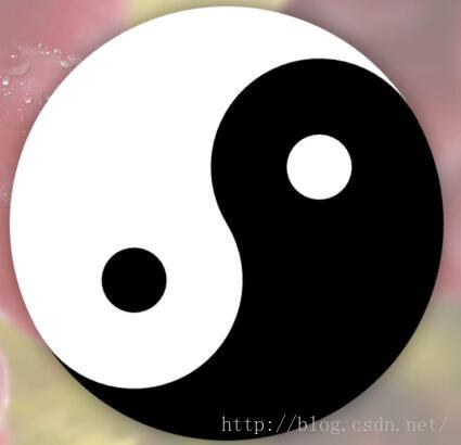
赵兄方案的代码:
<!doctype html>
<html>
<head>
<meta charset="utf-8">
<title>CSS3实现旋转的太极图(二):只用1个DIV</title>
<style>
/* 利用background-image实现左黑右白的圆,IE下测试不太理想 */
/* .box-taiji width:400px;height:400px;position:relative;margin:30px auto;border-radius:400px;box-shadow:0 0 30px rgba(0,0,0,.5);background-image:linear-gradient(left, #000 50%, #fff 50%);background-image:-webkit-linear-gradient(left, #000 50%, #fff 50%);background-image:-moz-linear-gradient(left, #000 50%, #fff 50%);
.box-taiji:before,
.box-taiji:after position:absolute;content:"";display:block;
.box-taiji:before width:200px;height:200px;top:0;left:100px;z-index:1;background-color:#fff;border-radius:50%;box-shadow:0 200px 0 #000;
.box-taiji:after width:60px;height:60px;top:70px;left:170px;z-index:2;background-color:#000;border-radius:50%;box-shadow:0 200px 0 #fff;
 */

.box-taiji width:0;height:400px;position:relative;margin:50px auto;border-left:200px solid #000;border-right:200px solid #fff;box-shadow:0 0 30px rgba(0,0,0,.5);border-radius:400px;animation:rotation 2.5s linear infinite;-webkit-animation:rotation 2.5s linear infinite;-moz-animation:rotation 2.5s linear infinite;
.box-taiji:before,
.box-taiji:after position:absolute;content:"";display:block;
.box-taiji:before width:200px;height:200px;top:0;left:-100px;z-index:1;background-color:#fff;border-radius:50%;box-shadow:0 200px 0 #000;
.box-taiji:after width:60px;height:60px;top:70px;left:-30px;z-index:2;background-color:#000;border-radius:50%;box-shadow:0 200px 0 #fff;
@keyframes rotation
    0% transform:rotate(0deg);
    100% transform:rotate(-360deg);

@-webkit-keyframes rotation
    0% -webkit-transform:rotate(0deg);
    100% -webkit-transform:rotate(-360deg);

@-moz-keyframes rotation
    0% -moz-transform:rotate(0deg);
    100% -moz-transform:rotate(-360deg);

</style>
</head>
<body>
<div class="box-taiji"></div>
</body>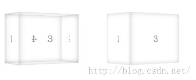
</html>4.旋转3D立方体
效果图:
<!DOCTYPE html>
<html>
<head>
<meta charset="utf-8" />
<style>
body
    -webkit-perspective: 800px;
    perspective: 800px;
    -webkit-perspective-origin: 50%;
    perspective-origin: 50%;

.cube
    display: inline-block;
    width: 100px;
    height: 100px;
    margin: 50px;
    -webkit-transform-style: preserve-3d;
    transform-style: preserve-3d;
    -webkit-animation: rotate 5s infinite;
    animation: rotate 5s infinite;

.cube > div
    position: absolute;
    width: 100%;
    height: 100%;
    box-shadow: inset 0 0 15px rgba(0, 0, 0, .2);
    background-color: rgba(255, 255, 255, .1);
    color: gray;
    font-size: 20px;
    line-height: 100px;
    text-align: center;

.front
    -webkit-transform: translatez(50px);
    transform: translatez(50px);

.back
    -webkit-transform: rotatey(180deg) translatez(50px);
    transform: rotatey(180deg) translatez(50px);

.right
    -webkit-transform: rotatey(90deg) translatez(50px);
    transform: rotatey(90deg) translatez(50px);

.left
    -webkit-transform: rotatey(-90deg) translatez(50px);
    transform: rotatey(-90deg) translatez(50px);

.top
    -webkit-transform: rotatex(90deg) translatez(50px);
    transform: rotatex(90deg) translatez(50px);

.bottom
    -webkit-transform: rotatex(-90deg) translatez(50px);
    transform: rotatex(-90deg) translatez(50px);

@-webkit-keyframes rotate
    from
        -webkit-transform: rotatey(0);

    to
        -webkit-transform: rotatey(360deg);


@keyframes rotate
    from
        transform: rotatey(0);

    to
        transform: rotatey(360deg);


.c1 > div
    -webkit-backface-visibility: visible;
    backface-visibility: visible;

.c2 > div
    -webkit-backface-visibility: hidden;
    backface-visibility: hidden;

</style>
</head>
<body>
<div class="cube c1">
    <div class="front">1</div>
    <div class="back">2</div>
    <div class="right">3</div>
    <div class="left">4</div>
    <div class="top">5</div>
    <div class="bottom">6</div>
</div>

<div class="cube c2">
    <div class="front">1</div>
    <div class="back">2</div>
    <div class="right">3</div>
    <div class="left">4</div>
    <div class="top">5</div>
    <div class="bottom">6</div>
</div>
</body>
</html>
每次挑战都是对自身的一次惊醒,发现不足时,要努力改正和提高。始终保持谦逊的态度对待学习,对待工作,对待生活。
CSS3 教程:http://www.w3school.com.cn/css3/index.asp
以上是关于div 文字 css旋转问题的主要内容,如果未能解决你的问题,请参考以下文章