CSS布局(圣杯布局双飞翼布局水平垂直居中)
Posted 小小白学计算机
tags:
篇首语:本文由小常识网(cha138.com)小编为大家整理,主要介绍了CSS布局(圣杯布局双飞翼布局水平垂直居中)相关的知识,希望对你有一定的参考价值。
一、圣杯布局

要求:三列布局;中间主体内容前置,且宽度自适应;两边内容定宽
好处:重要的内容放在文档流前面可以优先渲染
原理:利用相对定位、浮动、负边距布局,而不添加额外标签
<!DOCTYPE html>
<html lang="en">
<head>
    <meta charset="UTF-8">
    <title>Title</title>
    <style>
        *
            margin: 0;
            padding: 0;

        body
            min-width: 600px;


        header, footer
            width: 100%;
            height: 50px;
            line-height: 50px;
            background: papayawhip;
            text-align: center;

        .box
            padding: 0 200px;

        .clearfix::after
            content: '';
            display: block;
            clear: both;

        .main
            float: left;
            background: pink;
            width: 100%;
            height: 300px;

        .left
            float: left;
            width: 200px;
            height: 300px;
            background: skyblue;
            margin-left: -100%;
            position: relative;
            left: -200px;

        .right
            float: left;
            width: 200px;
            height: 300px;
            background: yellow;
            margin-left: -200px;
            position: relative;
            right: -200px;

    </style>
</head>
<body>
<header>圣杯布局</header>
<div class="box clearfix">
    <div class="main text">
        main
    </div>
    <div class="left text">
        left
    </div>
    <div class="right text">
        right
    </div>
</div>
<footer>footer</footer>
<script>
</script>

</body>
</html>
二、双飞翼布局
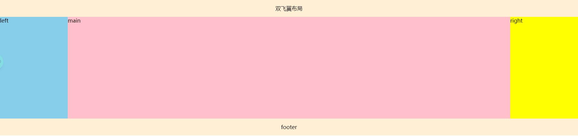
双飞翼布局:对圣杯布局(使用相对定位,对以后布局有局限性)的改进,消除相对定位布局
原理:主体元素上设置左右边距,预留两翼位置。左右两栏使用浮动和负边距归位,消除相对定位。
<!DOCTYPE html>
<html lang="en">
<head>
    <meta charset="UTF-8">
    <title>Title</title>
    <style>
        *
            margin: 0;
            padding: 0;


        body
            min-width: 600px;


        header, footer
            width: 100%;
            height: 50px;
            line-height: 50px;
            background: papayawhip;
            text-align: center;


        .box


        .clearfix::after
            content: '';
            display: block;
            clear: both;


        .main
            float: left;
            background: pink;
            width: 100%;
            height: 300px;


        .main-content
            margin-left: 200px;
            margin-right: 200px;
            height: 100%;


        .left
            float: left;
            width: 200px;
            height: 300px;
            background: skyblue;
            margin-left: -100%;


        .right
            float: left;
            width: 200px;
            height: 300px;
            background: yellow;
            margin-left: -200px;

    </style>
</head>
<body>
<header>双飞翼布局</header>
<div class="box clearfix">
    <div class="main text">
        <div class="main-content">
            main
        </div>
    </div>
    <div class="left text">
        left
    </div>
    <div class="right text">
        right
    </div>
</div>
<footer>footer</footer>
</body>
</html>
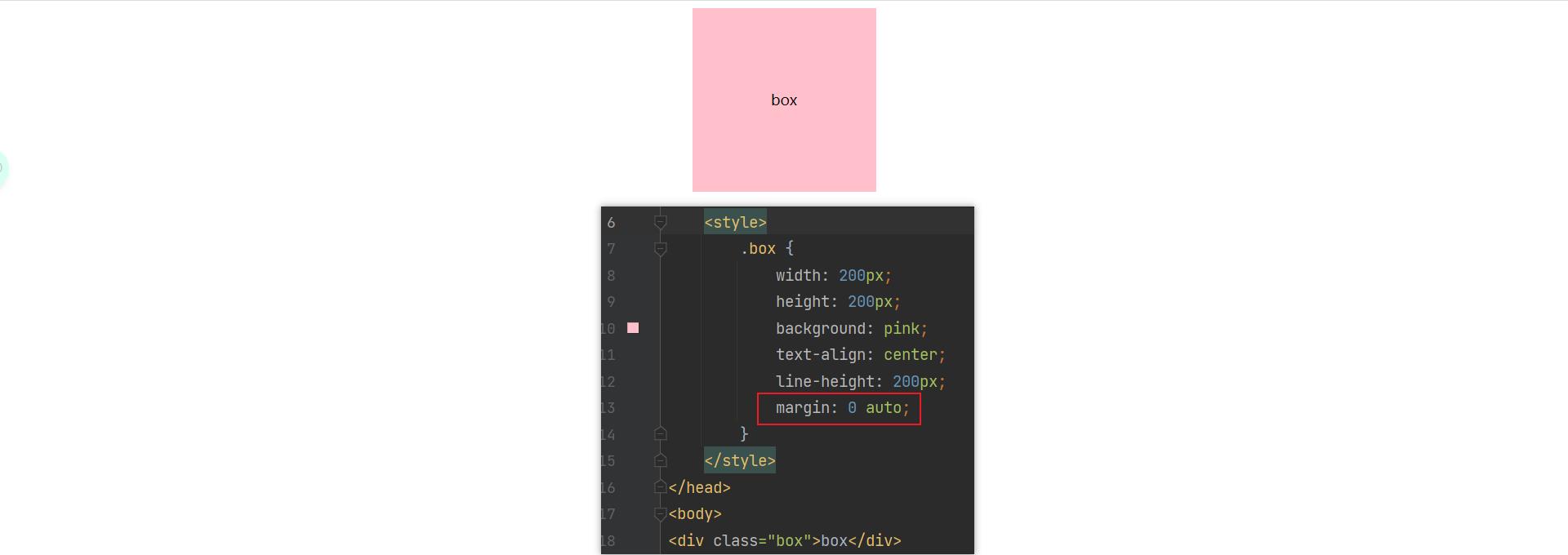
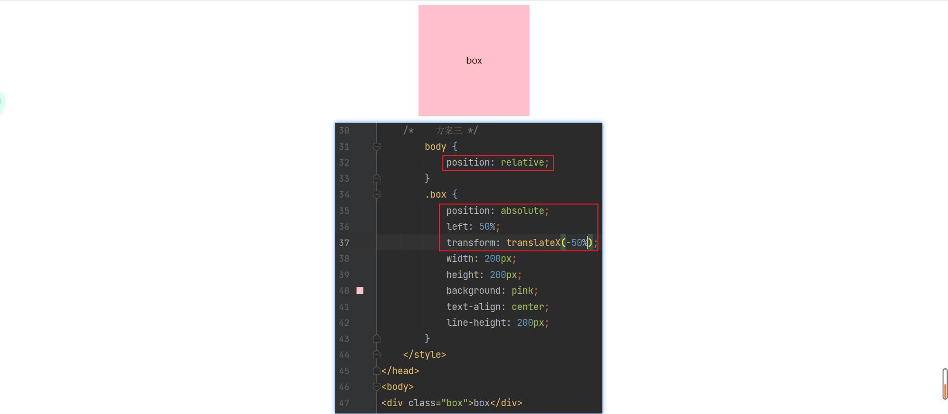
三、水平居中方案

四、垂直居中方案


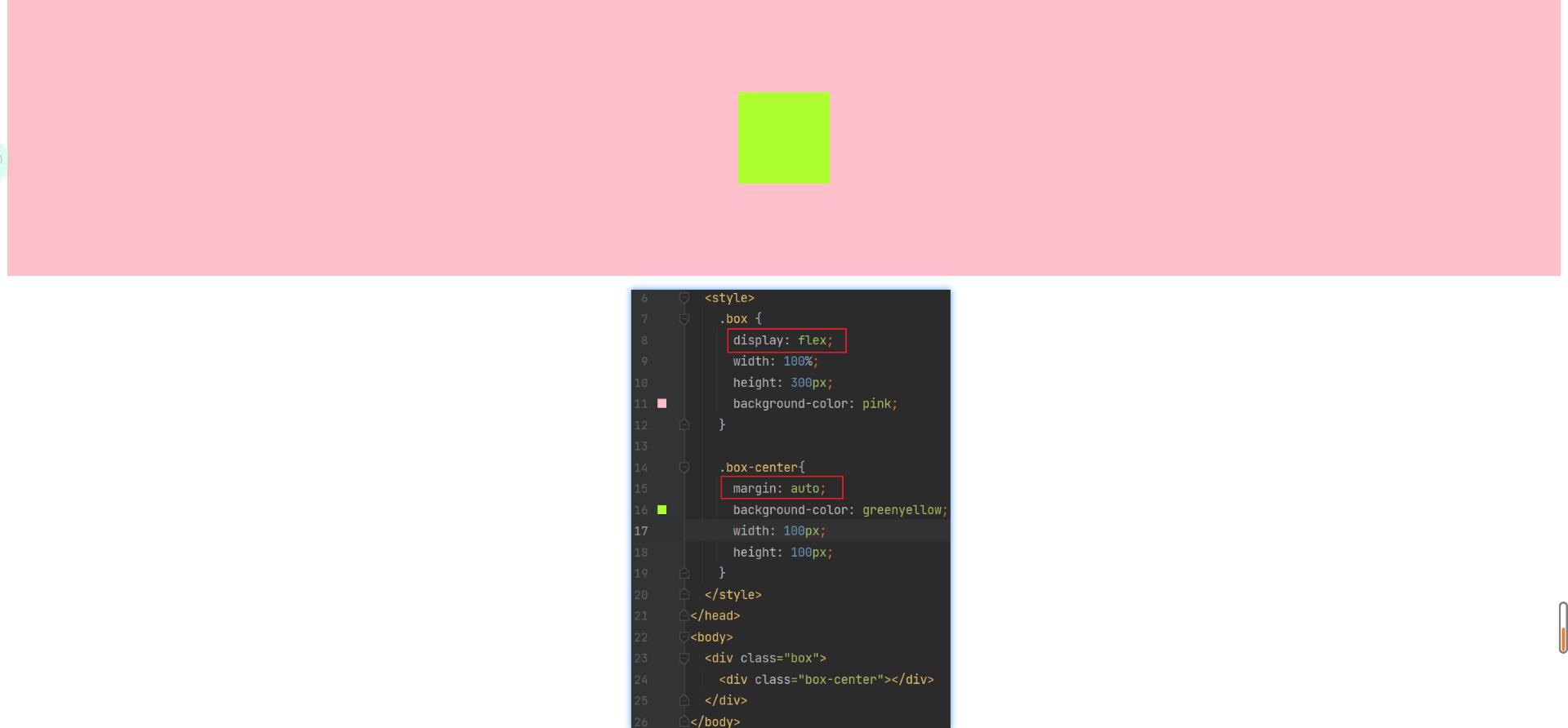
五、水平垂直居中


以上是关于CSS布局(圣杯布局双飞翼布局水平垂直居中)的主要内容,如果未能解决你的问题,请参考以下文章