CSS3&JavaScript 瀑布流
Posted 福州-司马懿
tags:
篇首语:本文由小常识网(cha138.com)小编为大家整理,主要介绍了CSS3&JavaScript 瀑布流相关的知识,希望对你有一定的参考价值。
实现方法概述
html页面要实现瀑布流,目前有两种方案,它们的适用场景不同
- CSS3 的 column-count(适用于所有元素一次性加载,页面更新用分页来实现,且元素与位置依赖度不高的传统布局上)
- 用 javascript 进行动态测量,并使用 absolute 的 top 和 left 进行绝对定位(适用于所有元素分批加载,滑动到底部自动添加下一批元素的情况)
当然,网上还有介绍 CSS3 的 grid 方案,很可惜,目前为止,所有的浏览器均不支持该样式属性。
1. CSS3 的 column-count
分栏的用途很广泛,除了实现像 word 的那种文本分栏,还可以实现 table(或 grid)布局 和 瀑布流 等。
(1)文本分栏
可惜的是 column-span 这个属性并不被 firefox 支持。
<!DOCTYPE html>
<html>
<head>
<meta charset="utf-8">
<style>
.newspaper
/* 分栏的列数 */
column-count:3;
/* 每个栏目的间隔 */
column-gap: 2em;
/**
column-rule-style: none|hidden|dotted|dashed|solid|double|groove|ridge|inset|outset;
none 定义没有规则
hidden 定义隐藏规则
dotted 定义点状规则
dashed 定义虚线规则
solid 定义实线规则
double 定义双线规则
groove 定义 3D grooved 规则。该效果取决于宽度和颜色值
ridge 定义 3D ridged 规则。该效果取决于宽度和颜色值
inset 定义 3D inset 规则。该效果取决于宽度和颜色值
outset 定义 3D outset 规则。该效果取决于宽度和颜色值
*/
column-rule: 1em dashed black;
h2
/** 谷歌支持,火狐尚不支持 */
column-span:all;
</style>
</head>
<body>
<div class="newspaper">
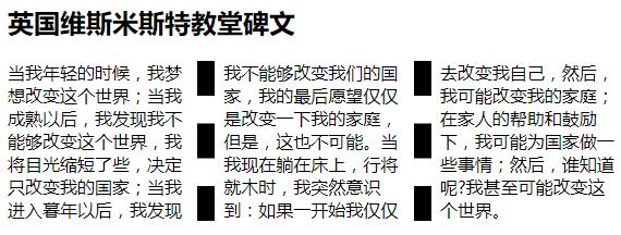
<h2>英国维斯米斯特教堂碑文</h2>
当我年轻的时候,我梦想改变这个世界;当我成熟以后,我发现我不能够改变这个世界,我将目光缩短了些,决定只改变我的国家;当我进入暮年以后,我发现我不能够改变我们的国家,我的最后愿望仅仅是改变一下我的家庭,但是,这也不可能。当我现在躺在床上,行将就木时,我突然意识到:如果一开始我仅仅去改变我自己,然后,我可能改变我的家庭;在家人的帮助和鼓励下,我可能为国家做一些事情;然后,谁知道呢?我甚至可能改变这个世界。
</div>
</body>
</html>
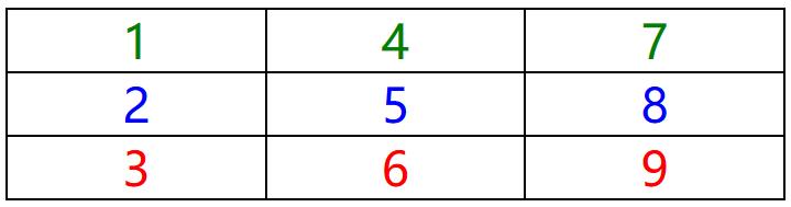
(2)table表格(grid)
<!DOCTYPE html>
<html>
<head>
<style>
.table
	column-count:3;
	column-gap: 0;
	border: 1px solid black;


.table>div
	text-align: center;
	font-size: 300%;
	border: 1px solid black;

/* 注意:nth-child 的起始编号是从 1 开始的 */
.table>div:nth-child(3n)
	color: red;

.table>div:nth-child(3n+1)
	color: green;

.table>div:nth-child(3n+2)
	color: blue;

</style>
</head>
<body>
<div class="table">
<div>1</div><div>2</div><div>3</div>
<div>4</div><div>5</div><div>6</div>
<div>7</div><div>8</div><div>9</div>
</div>
</body>
</html>
(3)瀑布流
从下图可以看出通过 column-count 来实现的瀑布流有一个非常大的弊端,就是它的方向不能调节。一定是从上到下,然后从左到右排列的。这就照成了一个问题——与国人的视图习惯不同。
因此,该实现方案适用性非常狭窄,不适用于竞价式这种与位置强依赖的布局,而只能适用于元素于位置弱依赖的静态布局种。

<!DOCTYPE html>
<html>
<head>
<meta charset="utf8">
<style>
*
	margin: 0;
	padding: 0;

/**
column-width 栏目宽度
column-count 栏目列数
column-gap   栏目距离
column-rule  栏目间隔线
*/
.masonry
	/**
	设置了column的元素会平均的占满每一列(高度保持相当)。但顺序会从第一列开始遍历完才到第二列,以此类推
	*/
	column-count: 1;
	column-gap: 1rem;

	border: 1px solid black;
	/**
	当这里没设置高度的时候,占满后会向下拓展;如果设置了高度,占满后会向右扩展,超出column-count的限制
	height: 100vh;
	*/

.masonry>div
	page-break-inside: avoid;
	column-span: none;

	border: 1px solid #CCC;
	box-shadow:.1rem .1rem .5rem #CCC ;
	transition: box-shadow .1s, transform .1s;
	margin-bottom: 10px;

.masonry>div:hover
	box-shadow:.5rem .5rem .5rem #CCC ;
	transform: translate(-.1em, -.1em);

/* 子元素选择器 */
.masonry>div>div
	/** 使用flex布局使元素居中 */
	display: flex;
	justify-content: center;
	align-items: center;

	box-sizing: border-box;
	min-height: 3rem;
	font-size: 300%;
	/** 如果是img元素,那么就要加一个width:100%来制约它的宽高了 */

/* 一般做布局的时候是从小做到大(即先适配移动端,再适配桌面端),因此media一般放在css的最后,用来覆盖之前的样式 */
/* 如果使用min-width,小的要在上面;如果是max-width,那么就是大的要在上面 */
@media (min-width: 400px)
	.masonry
		column-count: 2;


@media (min-width: 800px)
	.masonry  column-count: 3;

@media (min-width: 1200px)
	.masonry  column-count: 4;

</style>
<script>
//禁止弹出右键菜单栏(在onclick里面prevent右键是没用的,因为onclick包含了down和up,而在它之前它就已经触发了)
document.oncontextmenu = function (event)
	event.preventDefault();
;
document.onclick = (event)=>
	console.log(event.button)
	switch(event.button)
		case 0://鼠标左键
			appendChild();
			break;
		case 2://鼠标右键
			removeChild();
			break;


function appendChild()
	const masonry = document.getElementsByClassName("masonry");
	for(let i=0; i<masonry.length; i++)
		const div = document.createElement("div");
		/*
		注意:这里不能直接限制masonry容器内部元素的高度,因为它会导致"page-break-inside: avoid"失效
		正确的方式是设置masonry容器内部元素的子元素高度,来让浏览器根据column自行调整
		*/
		//div.style = "height: " + 2 + Math.random()*5 + "rem";
		//div.textContent = masonry[i].children.length + "";
		div.innerHTML = "<div style='height:" + (Math.random()*10) + "rem'>" + masonry[i].children.length + "</div>"
		masonry[i].appendChild(div);


function removeChild()
	const masonry = document.getElementsByClassName("masonry");
	for(let i=0; i<masonry.length; i++)
		if(masonry[i].lastElementChild != null)
			masonry[i].removeChild(masonry[i].lastElementChild);


</script>
</head>
<body>
<div class="masonry"></div>
</body>
</html>
2. 用 JavaScript 进行动态测量,并使用 absolute 的 top 和 left 进行绝对定位
在概率论和统计学中,期望值(或数学期望、或均值,亦简称期望,物理学中称为期待值)是指在一个离散性随机变量试验中每次可能结果的概率乘以其结果的总和。
这里可以把随机图片的高度看成这个离散的随机数,那么我们可以得出一个结论就是每列的高度都接近与它们的期望值,因此即使我们不考虑每列的高度,它们也是相差无几的。

<!DOCTYPE html>
<html>
<head>
<meta charset="utf-8">
<style>
body
	margin: 0;
	padding: 0;

#masonry
	width: 100%;
	position: relative;

#masonry>div
	border: 1px solid #CCC;
	box-shadow:.1rem .1rem .1rem #CCC;
	display: inline-block;
	position: absolute;
	transition: all .2s;
	border-radius: .5rem;
	padding: .5rem;
	/** 默认的width只能限制内部宽度,但是边框和边距不在width内	*/
	box-sizing: border-box;

#masonry>div:hover
	box-shadow:.5rem .5rem .2rem #CCC;
	transform: translate(-.1rem, -.1rem);

#masonry>div>img
	width: 100%;
	height: auto;
	display:block;

#masonry>div>div
	/**
	word-wrap: normal|break-word;
	normal 		只在允许的断字点换行(浏览器保持默认处理)
	break-word 	在长单词或 URL 地址内部进行换行
	*/
	word-wrap:break-word;
	margin-top: .5rem;
	font-family: Georgia,"Times New Roman",Times,serif;
	font-weight: bold;

</style>
<script>
let column, margin = 2;

//传统promise处理异步数据
function fetchData1()
	fetch("https://www.apiopen.top/meituApi?page=1", mode: 'no-cors').then(response =>
		console.log(response);
		return response.json();
	).then(data =>
		if(data.code == 200)
			data.data.forEach(elem=>
				//console.log(JSON.stringify(elem));
			);
		 else
			console.log("fail, code is " + data.code);

		return data;
	).catch(e => console.log("error", e));

//ES6的async/await,模仿同步的方式来处理异步函数
//await is only valid in async functions and async generators
async function fetchData2()
	try
		const res = await fetch("https://www.apiopen.top/meituApi?page=1")
		const result = await res.json();
		return result;
	 catch(e)
		console.log(e);

;
let doRecalcPosition = false;
function recalcPosition()
	let oldColumn = column;
	const masonry = document.getElementById("masonry");
	if(masonry.clientWidth < 400)
		column = 1;
	 else if(masonry.clientWidth < 800)
		column = 2;
	 else if(masonry.clientWidth < 1200)
		column = 3;
	 else
		column = 4;

	const perWidth = (100 - column * (margin + 1)) / column / 100 * masonry.clientWidth;
	const marginLeft = margin / 100 * masonry.clientWidth;

	for(let i = 0; i < masonry.children.length; i++)
		const div = masonry.children[i];
		const left = i % column;
		let top = 0;
		for(let j = 0; j < i; j++)
			if(j % column == left)
				top += masonry.children[j].offsetHeight + marginLeft;


		div.style.width = (100 - column * (margin + 1)) / column + "%";
		div.style.top = top + marginLeft + "px";
		div.style.left = (perWidth * left) + (left + 1) * marginLeft + "px";

	//这里发现当列数变化时,高度会计算不正确,导致重合,再次resize则会正常,应该是浏览器的BUG,所以这里需要延迟一段时间后再重新计算
	if(oldColumn != column)
		setTimeout(recalcPosition, 200);


window.onload = async()=>
	let result = await fetchData2();
	console.log(result);
	if(result.code == 200)
		let masonry = document.getElementById("masonry");
		column = masonry.dataset.column;

		result.data.forEach((elem, index)=>
			const div = document.createElement("div");
			const img = document.createElement("img");
			const publishedAt = document.createElement("div");

			img.setAttribute("src", elem.url);
			publishedAt.innerText = index + 1 + ". publish: " + elem.publishedAt;
			div.appendChild(img);
			div.appendChild(publishedAt);
			masonry.appendChild(div);

			//如果这里适用箭头函数,那么内部的this指向的是window
			img.onload = recalcPosition;
		);
		window.onresize = recalcPosition;

;
</script>
</head>
<body>
<div id="masonry" data-column="3"></div>
</body>
</html>
以上是关于CSS3&JavaScript 瀑布流的主要内容,如果未能解决你的问题,请参考以下文章