css常见居中方法总结
Posted Bule Guy
tags:
篇首语:本文由小常识网(cha138.com)小编为大家整理,主要介绍了css常见居中方法总结相关的知识,希望对你有一定的参考价值。
最近跟着网上的教程做了几个网页项目,做的过程中关于居中涉及到了好几种方法,遂想将其总结归纳下来,一是理清自己的思路,二是希望能分享给需要帮助的小伙伴们。
话不多数,直奔主题。
本次涉及到的居中方法有七种,均为平时会常用到的。
目录
4.background-position来设置水平/垂直方向位置
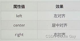
1.text-align:center 用于水平对齐
此方法浮动不可用
所适用的元素:
1.文本
2.span,a标签
3.input,img标签
注意:如果需要让以上元素水平居中,text-align需要给以上元素的父元素设置(行内元素给父元素设置)
text-align属性的其他取值:
2.使用line-height属性来调整文本行高来实现居中
行高示意图:
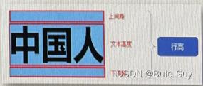
line-height属性取值:
1.数字+px
2.倍数(当前标签font-size的倍数)
具体实现:
1.让单行文本垂直居中时可以设置line-height:文字父元素高度
2.网页精准布局时,会设置line-height:1;来取消上下间距
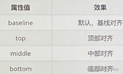
3.vertical-align设置垂直对齐
vertical-align的适用元素和text-align一样
vertical-align的属性取值:
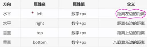
4.background-position来设置水平/垂直方向位置
常用来设置精灵图,背景图以及一些小图标的位置
属性取值:
一.方向名词: 1.水平方向:left,center, right
2.垂直方向:top, center,bottom
二.数字+px(坐标):举例 background-position: 13px -110px;第一个是x坐标,第二个是y坐标.
5 修改Padding值来使Content居中
6.margin :0 auto;
这种方法最常见,常用来使版心居中
第一个属性的值控制上下,第二个属性的值控制左右。auto表示居中
浮动不可用
7.定位之绝对定位position:absloute
margin :0 auto;不可用
绝对定位可以通过设置偏移量属性来实现居中
偏移量属性除了设置 数字+px这种取值外,还可以将属性设置为百分比:
例:div
position:absoluate;
left:40%; /*从左开始,移动到父block宽度的40%的位置,right,top,bottom同理*/
CSS水平垂直居中常见方法总结
行内元素:
父级元素是块级元素:父元素设置text-align:center
1.元素水平居中
margin: 0 auto;谁居中,谁设置
居中不好使的原因:
1、元素没有设置宽度,没有宽度怎么居中嘛!
2、设置了宽度依然不好使,你设置的是行内元素吧
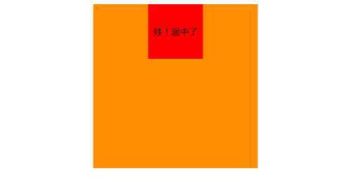
实例1:
<div class="box">
    <div class="content">
        哇!居中了
    </div>
</div>

<style type="text/css">
.box
    background-color: #FF8C00;
    width: 300px;
    height: 300px;
    margin: 0 auto;

.content
    background-color: #F00;
    width: 100px;
    height: 100px;
    line-height: 100px;//文字在块内垂直居中
    text-align: center;//文字居中
    margin: 0 auto;

</style>
2.元素水平垂直居中
方案1:position 元素已知宽度
父元素设置为:position: relative;
子元素设置为:position: absolute;
距上50%,据左50%,然后减去元素自身宽度的距离就可以实现
示例 2:
<div class="box">
    <div class="content">
    </div>
</div>

.box
    background-color: #FF8C00;
    width: 300px;
    height: 300px;
    position: relative;

.content
    background-color: #F00;
    width: 100px;
    height: 100px;
    position: absolute;
    left: 50%;
    top: 50%;
    margin: -50px 0 0 -50px;
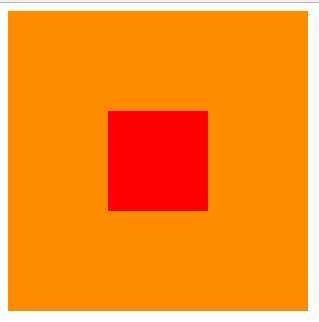
方案2:position transform 元素未知宽度
如果元素未知宽度,只需将上面例子中的margin: -50px 0 0 -50px;替换为:transform: translate(-50%,-50%);
效果如上!
示例 3:
<div class="box">
    <div class="content">
    </div>
</div>

.box
    background-color: #FF8C00;
    width: 300px;
    height: 300px;
    position: relative;

.content
    background-color: #F00;
    width: 100px;
    height: 100px;
    position: absolute;
    left: 50%;
    top: 50%;
    transform: translate(-50%,-50%);

方案3:flex布局
示例 4:
<div class="box">
    <div class="content">
    </div>
</div>

.box
    background-color: #FF8C00;
    width: 300px;
    height: 300px;
    display: flex;//flex布局
    justify-content: center;//使子项目水平居中
    align-items: center;//使子项目垂直居中

.content
    background-color: #F00;
    width: 100px;
    height: 100px;

方案4:table-cell布局
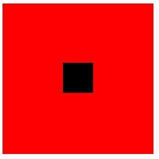
示例 5:
因为table-cell相当与表格的td,td为行内元素,无法设置宽和高,所以嵌套一层,嵌套一层必须设置display: inline-block;td的背景覆盖了橘黄色,不推荐使用
<div class="box">
    <div class="content">
        <div class="inner">
        </div>
    </div>
</div>

.box
    background-color: #FF8C00;//橘黄色
    width: 300px;
    height: 300px;
    display: table;

.content
    background-color: #F00;//红色
    display: table-cell;
    vertical-align: middle;//使子元素垂直居中
    text-align: center;//使子元素水平居中

.inner
    background-color: #000;//黑色
    display: inline-block;
    width: 20%;
    height: 20%;
转:https://blog.csdn.net/qq_27576607/article/details/78697812
https://www.jianshu.com/p/c78fa42e6e78
以上是关于css常见居中方法总结的主要内容,如果未能解决你的问题,请参考以下文章