圆环5种方法。
Posted zhangyufeng0126
tags:
篇首语:本文由小常识网(cha138.com)小编为大家整理,主要介绍了圆环5种方法。相关的知识,希望对你有一定的参考价值。
圆环5种方法。
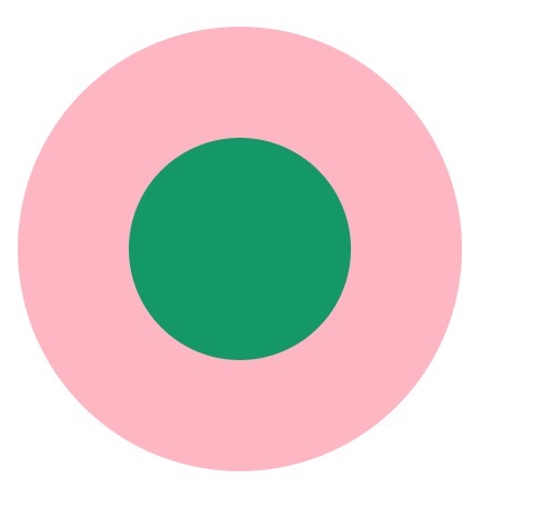
1. 两个标签的嵌套:
-
<div class="element1"> -
<div class="child1"></div> -
</div>
-
.element1 -
width: 200px; -
height: 200px; -
background-color: lightpink; -
border-radius: 50%; -
-
.child1 -
width: 100px; -
height: 100px; -
border-radius: 50%; -
background-color: #009966; -
position: relative; -
top: 50px; -
left: 50px; -
2. 使用伪元素,before/after
<div class="element2"></div>-
.element2 -
width: 200px; -
height: 200px; -
background-color: lightpink; -
border-radius: 50%; -
-
.element2:after -
content: ""; -
display: block; -
width: 100px; -
height: 100px; -
border-radius: 50%; -
background-color: #009966; -
position: relative; -
top: 50px; -
left: 50px; -
3. 使用border:
<div class="element3"></div>
-
.element3 -
width: 100px; -
height: 100px; -
background-color: #009966; -
border-radius: 50%; -
border: 50px solid lightpink ; -
4. 使用border-shadow
<div class="element4"></div>-
.element4 -
width: 100px; -
height: 100px; -
background-color: #009966; -
border-radius: 50%; -
box-shadow: 0 0 0 50px lightpink ; -
margin: auto; -
<div class="element5">-
.element5 -
width: 200px; -
height: 200px; -
background-color: #009966; -
border-radius: 50%; -
box-shadow: 0 0 0 50px lightpink inset; -
margin: auto; -
5. 使用radial-gradient
<div class="element6"></div>
-
.element6 -
width: 200px; -
height: 200px; -
border-radius: 50%; -
background: -webkit-radial-gradient( circle closest-side,#009966 50%,lightpink 50%); -
以上是关于圆环5种方法。的主要内容,如果未能解决你的问题,请参考以下文章