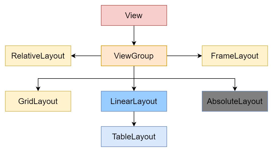
Android 六大布局
Posted 帅次
tags:
篇首语:本文由小常识网(cha138.com)小编为大家整理,主要介绍了Android 六大布局相关的知识,希望对你有一定的参考价值。
布局概述
为了让组件(TextView,Button等)在不同的手机屏幕上都能运行良好(不同手机屏幕分辨率、尺寸并不完全相同),如果让程序手动控制每个组件的大小、位置,则将给编程带来巨大的困难,为了解决这个问题,android提供了布局管理器。布局管理器可以根据运行平台来调整组件的大小,咱们程序员要做的只是为容器选择合适的布局管理器。
每当Acitivity.setContentView(@LayoutRes int layoutResID)方法被调用,或者一个View通过LayoutInflater对象inflater出来,那么相关的布局文件就会被加载并解析出来。XML文件中每个大写的XML节点对应着一个View对象,他们被系统实例化。在Acitviity或者Fragment的整个生命周期中,他们都是UI层级的一部分。这会影响到应用程序使用过程中的分配。
一、线性布局(LinearLayout常用)
LinearLayout是一个视图组,呈线性横向或纵向,依次绘制每个被添加进来的子组件。
LinearLayout的所有子组件依次堆叠,因此无论子视图有多宽,垂直列表每行均只有一个子组件,水平列表将只有一行高(最高子组件的高度加上内边距)。LinearLayout会考虑子组件之间的边距以及每个子组件的对齐方式(右对齐、居中对齐或左对齐)。
布局权重
LinearLayout还支持使用android:layout_weight属性为各个子组件分配权重。此属性会根据视图应在屏幕上占据的空间大小,向视图分配“重要性”值。如果拥有更大的权重值,视图便可展开,填充父视图中的任何剩余空间。子组件可指定权重值,然后系统会按照子组件所声明的权重值比例,为其分配视图组中的任何剩余空间。默认权重为零。
LinearLayout常用XML属性和相关方法说明
| XML属性 | 相关方法 | 说明 |
| android:baselineAligned | setBaselineAligned(boolean) | 设置为 false 时,防止布局对齐其子项的基线。 |
| android:baselineAlignedChildIndex | setBaselineAlignedChildIndex(int) | 当线性布局是另一个基线对齐的布局的一部分时,它可以指定基线对齐到其子项中的哪个子项(即,哪个子项 TextView)。 |
| android:divider | setDividerDrawable(Drawable) | 可绘制用作按钮之间的垂直分隔线。 |
| android:gravity | setGravity(int) | 指定对象应如何在其自身边界内在 X 轴和 Y 轴上定位其内容。 |
| android:measureWithLargestChild | setMeasureWithLargestChildEnabled | 当设置为 true 时,所有有重量的孩子都将被认为是最大孩子的最小尺寸。 |
| android:orientation | setOrientation(int) | 布局应该是一列还是一行?对行使用“horizontal”,对列使用“vertical”。 |
| android:weightSum | setWeightSum(float) | 定义最大权重总和。 |
LinearLayout.LayoutParams
LinearLayout包含的所有子元素都受LinearLayout.LayoutParams控制,因此LinearLayout包含的子元素可以额外指定下列属性。
LinearLayout.LayoutParams常用XML属性和相关方法说明
| XML属性 | 相关方法 | 说明 |
| android:layout_gravity | setGravity(int) | Gravity指定组件应如何放置在其单元组中。 必须是Gravity常量值中的一个或多个(以“|”分隔)。 |
| android:layout_weight | 指示 LinearLayout 中有多少额外空间分配给 与这些 LayoutParams 关联的视图。 |
Gravity常量(必须使用一个或多个以“|”分隔。如:right|top)
| Constant | Value | 描述 |
| center | 11 | 将对象放置在其容器的垂直和水平轴的中心,不改变其大小。 |
| center_horizontal | 1 | 将对象放置在其容器的水平中心,不改变其大小。 |
| center_vertical | 10 | 将对象放在其容器的垂直中心,不改变其大小。 |
| clip_horizontal | 8 | 可以设置为将子项的左边缘和/或右边缘剪裁到其容器边界的附加选项。剪辑将基于水平重力:左重力将剪辑右边缘,右重力将剪辑左边缘,两者都不会剪辑两个边缘。 |
| clip_vertical | 80 | 可以设置为将子项的顶部和/或底部边缘剪裁到其容器边界的附加选项。剪辑将基于垂直重力:顶部重力将剪辑底部边缘,底部重力将剪辑顶部边缘,两者都不会剪辑两个边缘。 |
| fill | 77 | 如果需要,增加对象的水平和垂直大小,使其完全填满其容器。 |
| fill_horizontal | 7 | 如果需要,增加对象的水平尺寸,使其完全填满其容器。 |
| fill_vertical | 70 | 如果需要,增大对象的垂直尺寸,使其完全填满其容器。 |
| left | 3 | 将对象推到其容器的左侧,不改变其大小。 |
| right | 5 | 将对象推到其容器的右侧,不改变其大小。 |
| bottom | 50 | 将对象推到其容器的底部,而不改变其大小。 |
| top | 30 | 将对象推到其容器的顶部,而不改变其大小。 |
| start | 800003 | 将对象推到其容器的开头,不改变其大小。 |
| end | 800005 | 将对象推到其容器的末端,不改变其大小。 |
均等分布
如要创建线性布局,让每个子组件使用大小相同的屏幕空间,请将每个视图的android:layout_height设置为"0dp"(针对垂直布局),或将每个视图的android:layout_width设置为"0dp"(针对水平布局)。然后,请将每个视图的android:layout_weight设置为"1"。例如:

<?xml version="1.0" encoding="utf-8"?>
<LinearLayout xmlns:android="http://schemas.android.com/apk/res/android"
    android:layout_width="match_parent"
    android:layout_height="match_parent"
    android:orientation="vertical">
    <LinearLayout
        android:id="@+id/ll_top"
        android:layout_width="match_parent"
        android:layout_weight="1"
        android:background="@color/color_188FFF"
        android:orientation="horizontal"
        android:layout_height="0dp">
    </LinearLayout>
    <LinearLayout
        android:id="@+id/ll_bottom"
        android:layout_width="match_parent"
        android:layout_weight="1"
        android:orientation="horizontal"
        android:background="@color/color_ff0000"
        android:layout_height="0dp">
    </LinearLayout>
</LinearLayout>
不等分布
你也可创建线性布局,让子元素使用大小不同的屏幕空间:
a、如果有三个文本字段,其中两个声明权重为 1,另一个未赋予权重,那么没有权重的第三个文本字段就不会展开,而仅占据其内容所需的区域。另一方面,另外两个文本字段将以同等幅度展开,填充测量三个字段后仍剩余的空间。
b、如果有三个文本字段,其中两个字段声明权重为 1,而为第三个字段赋予权重 2(而非 0),那么现在相当于声明第三个字段比另外两个字段更为重要,因此,该字段将获得总剩余空间的一半,而其他两个字段均享余下的空间。

<?xml version="1.0" encoding="utf-8"?>
<LinearLayout xmlns:android="http://schemas.android.com/apk/res/android"
    android:layout_width="match_parent"
    android:layout_height="match_parent"
    android:orientation="vertical">
    <LinearLayout
        android:id="@+id/ll_top"
        android:layout_width="match_parent"
        android:layout_weight="1"
        android:background="@color/color_188FFF"
        android:orientation="horizontal"
        android:layout_height="0dp">
        <View
            android:id="@+id/view_top_1"
            android:layout_width="100dp"
            android:layout_height="match_parent"
            android:background="@color/color_ff0000"/>
        <View
            android:id="@+id/view_top_2"
            android:layout_width="0dp"
            android:layout_height="match_parent"
            android:layout_weight="1"
            android:background="@color/purple_500"/>
        <View
            android:id="@+id/view_top_3"
            android:layout_width="100dp"
            android:layout_height="match_parent"
            android:background="@color/color_FF773D"/>
    </LinearLayout>
    <LinearLayout
        android:id="@+id/ll_bottom"
        android:layout_width="match_parent"
        android:layout_weight="1"
        android:orientation="horizontal"
        android:background="@color/color_ff0000"
        android:layout_height="0dp">
        <View
            android:id="@+id/view_bottom_1"
            android:layout_width="0dp"
            android:layout_height="match_parent"
            android:layout_weight="1"
            android:background="@color/color_FF773D"/>
        <View
            android:id="@+id/view_bottom_2"
            android:layout_width="0dp"
            android:layout_height="match_parent"
            android:layout_weight="2"
            android:background="@color/teal_200"/>
        <View
            android:id="@+id/view_bottom_3"
            android:layout_width="0dp"
            android:layout_height="match_parent"
            android:layout_weight="1"
            android:background="@color/color_ff0000"/>
    </LinearLayout>
</LinearLayout>
二、相对布局(RelativeLayout常用)
RelativeLayout是一个视图组,每个子组件位置是相对的,可以相对于同一层级下其他控件,也可以相对于父控件。
RelativeLayout是用于设计用户界面的非常强大的实用程序,因为它可以消除嵌套视图组并保持布局层次结构平坦,从而提高性能。如果你发现自己使用了多个嵌套LinearLayout组,则可以将它们替换为单个RelativeLayout。
定位视图
RelativeLayout让子视图指定它们相对于父视图或彼此的位置(由 ID 指定)。因此,如果A组件的位置是由B组件的位置来决定,Android要求先定义B组件,再定义A组件
RelativeLayout常用XML属性和相关方法说明
| XML属性 | 相关方法 | 说明 |
| android:gravity | setGravity(int) | 指定对象应如何在其自身边界内在X轴和Y轴上定位其内容。 必须是Gravity常量值中的一个或多个(以“|”分隔)。 |
| android:ignoreGravity | setIgnoreGravity(int) | 指示哪个视图不应受重力影响。 |
RelativeLayout.LayoutParams
为了控制RelativeLayout布局容器中各子组件的布局分布,RelativeLayout提供了一个内部类:RelativeLayout.LayoutParams,该类提供了大量的XML属性来控制RelativeLayout布局容器中子组件的布局分布。
RelativeLayout.LayoutParams里设的XML属性及说明
| XML属性 | 说明 |
| android:layout_above | 将此视图的底部边缘定位在给定的锚视图 ID 上方。 |
| android:layout_alignBaseline | 将此视图的基线定位在给定锚视图 ID 的基线上。 |
| android:layout_alignBottom | 使此视图的底部边缘与给定的锚视图 ID 的底部边缘匹配。 |
| android:layout_alignEnd | 使此视图的结束边缘与给定锚视图 ID 的结束边缘匹配。 |
| android:layout_alignLeft | 使此视图的左边缘与给定锚视图 ID 的左边缘匹配。 |
| android:layout_alignParentBottom | 如果为 true,则使此视图的底部边缘与父视图的底部边缘匹配。 |
| android:layout_alignParentEnd | 如果为 true,则使此视图的结束边缘与父视图的结束边缘匹配。 |
| android:layout_alignParentLeft | 如果为 true,则使此视图的左边缘与父视图的左边缘匹配。 |
| android:layout_alignParentRight | 如果为 true,则使此视图的右边缘与父视图的右边缘匹配。 |
| android:layout_alignParentStart | 如果为 true,则使此视图的起始边缘与父视图的起始边缘匹配。 |
| android:layout_alignParentTop | 如果为 true,则使此视图的顶部边缘与父视图的顶部边缘匹配。 |
| android:layout_alignRight | 使此视图的右边缘与给定锚视图 ID 的右边缘匹配。 |
| android:layout_alignStart | 使此视图的起始边缘与给定锚视图 ID 的起始边缘匹配。 |
| android:layout_alignTop | 使此视图的顶部边缘与给定的锚视图 ID 的顶部边缘匹配。 |
| android:layout_alignWithParentIfMissing | 如果设置为 true,则在 layout_toLeftOf、layout_toRightOf 等无法找到锚点时,将使用父级作为锚点。 |
| android:layout_below | 将此视图的顶部边缘定位在给定的锚视图 ID 下方。 |
| android:layout_centerHorizontal | 如果为 true,则此子项在其父项内水平居中。 |
| android:layout_centerInParent | 如果为 true,则此子项在其父项内水平和垂直居中。 |
| android:layout_centerVertical | 如果为 true,则将此子项垂直居中于其父项内。 |
| android:layout_toEndOf | 将此视图的起始边缘定位到给定锚视图 ID 的末尾。 |
| android:layout_toLeftOf | 将此视图的右边缘定位在给定锚视图 ID 的左侧。 |
| android:layout_toRightOf | 将此视图的左边缘定位在给定锚视图 ID 的右侧。 |
| android:layout_toStartOf | 将此视图的结束边缘定位到给定锚视图 ID 的开始处。 |
| android:layout_above | 将此视图的底部边缘定位在给定的锚视图 ID 上方。 |
除此之外,RelativeLayout.LayoutParams还继承了ViewGroup.MarginLayoutParams,因此RelativeLayout布局容器中每个子组件也可以指定ViewGroup.MarginLayoutParams所支持的各XML属性。
不设置相对位置(重叠在一起)

<?xml version="1.0" encoding="utf-8"?>
<RelativeLayout xmlns:android="http://schemas.android.com/apk/res/android"
    android:layout_width="match_parent"
    android:layout_height="match_parent">
    <View
        android:id="@+id/view_top_1"
        android:layout_width="match_parent"
        android:layout_height="100dp"
        android:background="@color/color_666666"/>
    <View
        android:id="@+id/view_top_2"
        android:layout_width="200dp"
        android:layout_height="100dp"
        android:background="@color/teal_200"/>
    <View
        android:id="@+id/view_top_3"
        android:layout_width="100dp"
        android:layout_height="100dp"
        android:background="@color/color_FF773D"/>
</RelativeLayout>
设置相对位置,未出现重叠

<?xml version="1.0" encoding="utf-8"?>
<RelativeLayout xmlns:android="http://schemas.android.com/apk/res/android"
android:layout_width="match_parent"
android:layout_height="match_parent">
<View
android:id="@+id/view_top_1"
android:layout_width="match_parent"
android:layout_height="100dp"
android:background="@color/color_666666"/>
<View
android:id="@+id/view_top_2"
android:layout_width="200dp"
android:layout_below="@id/view_top_1"
android:layout_height="100dp"
android:background="@color/teal_200"/>
<View
android:id="@+id/view_top_3"
android:layout_width="100dp"
android:layout_below="@id/view_top_2"
android:layout_height="100dp"
android:background="@color/color_FF773D"/>
<View
android:id="@+id/view_top_4"
android:layout_width="100dp"
android:layout_below="@id/view_top_2"
android:layout_toRightOf="@id/view_top_3"
android:layout_height="100dp"
android:background="@color/purple_500"/>
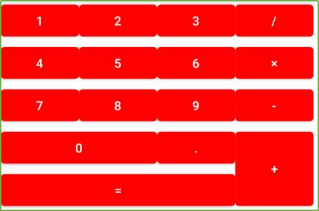
</RelativeLayout>三、网格布局(GridLayout)
GridLayout把这个容器划分成rows×columns个网格,每个网格可以放一个组件。 除此之外,也可以设置一个组件横跨多少列、一个组件纵跨多少行(支持跨行和跨列以及每个单元格组内的任意对齐形式)。
GridLayout提供了setColumnCount(int)和setRowCount(int)方法来控制该网络的列数和行数。
GridLayout的XML属性和相关方法说明
| XML属性 | 相关方法 | 说明 |
| android:alignmentMode | setAlignmentMode(int) | 当设置为 alignMargins 时,会导致在视图的外边界之间进行对齐,由其边距定义。 |
| android:columnCount | setColumnCount(int) | 自动定位子项时要创建的最大列数。 |
| android:columnOrderPreserved | setColumnOrderPreserved (boolean) | 设置为 true 时,强制列边界以与列索引相同的顺序出现。 |
| android:orientation | setOrientation(int) | 布局期间不使用方向属性。 |
| android:rowCount | setRowCount(int) | 自动定位子项时要创建的最大行数。 |
| android:rowOrderPreserved | setRowOrderPreserved(boolean) | 设置为 true 时,强制行边界以与行索引相同的顺序出现。 |
| android:useDefaultMargins | setUseDefaultMargins(boolean) | 当设置为 true 时,告诉 GridLayout 在视图的布局参数中未指定任何边距时使用默认边距。 |
GridLayout.LayoutParams
为了控制GridLayout布局容器中各子组件的布局分布,GridLayout提供了一个内部类:GridLayout.LayoutParams,该类提供了大量的XML属性来控制GridLayout布局容器中子组件的布局分布。
GridLayout.LayoutParams里设的XML属性和相关方法说明
| XML属性 | 相关方法 | 说明 |
| android:layout_column | 界定此视图占用的单元格组左侧的列边界。 | |
| android:layout_columnSpan | 列跨度:界定此视图占用的单元格组的左右边界之间的差异。 | |
| android:layout_columnWeight | 在多余空间分配期间应分配给此视图的水平空间的相对比例。 | |
| android:layout_gravity | setGravity(int) | 重力指定组件应如何放置在其单元组中。 |
| android:layout_row | 界定此视图占据的单元格组顶部的行边界。 | |
| android:layout_rowSpan | 行跨度:界定此视图占据的单元格组的顶部和底部边界之间的差异。 | |
| android:layout_rowWeight | 在多余空间分配期间应分配给此视图的垂直空间的相对比例。 |
<?xml version="1.0" encoding="utf-8"?>
<GridLayout xmlns:android="http://schemas.android.com/apk/res/android"
    android:layout_width="wrap_content"
    android:layout_height="wrap_content"
    android:columnCount="4"
    android:rowCount="5">
    <Button
        android:id="@+id/one"
        android:text="1" />
    <Button
        android:id="@+id/two"
        android:text="2" />
    <Button
        android:id="@+id/three"
        android:text="3" />
    <Button
        android:id="@+id/devide"
        android:text="/" />
    <Button
        android:id="@+id/four"
        android:text="4" />
    <Button
        android:id="@+id/five"
        android:text="5" />
    <Button
        android:id="@+id/six"
        android:text="6" />
    <Button
        android:id="@+id/multiply"
        android:text="×" />
    <Button
        android:id="@+id/seven"
        android:text="7" />
    <Button
        android:id="@+id/eight"
        android:text="8" />
    <Button
        android:id="@+id/nine"
        android:text="9" />
    <Button
        android:id="@+id/minus"
        android:text="-" />
    <Button
        android:id="@+id/zero"
        android:layout_columnSpan="2"
        android:layout_gravity="fill"
        android:text="0" />
    <Button
        android:id="@+id/point"
        android:text="." />
    <Button
        android:id="@+id/plus"
        android:layout_rowSpan="2"
        android:layout_gravity="fill"
        android:text="+" />
    <Button
        android:id="@+id/equal"
        android:layout_columnSpan="3"
        android:layout_gravity="fill"
        android:text="=" />
</GridLayout>这样的布局用LinearLayout也能做,但是相对麻烦一点,所以在适当的时候时候使用GridLayout就非常的有必要了。而且你可能注意到了,子组件中并没有指定android:layout_width和android:layout_height属性。这是因为这两个属性的默认值都是LayoutPrams.WRAP_COUNTENT,而在此,我们希望使用的就是LayoutPrams.WRAP_COUNTENT,所以就没必要指定了。GridLayout和LinaerLayout十分相似,所以将LinaerLayout替换为GridLayout也相当简单。
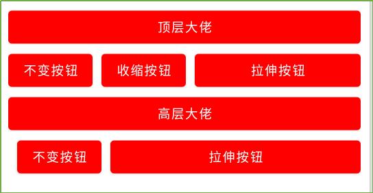
四、表格布局(TableLayout)
TableLayout继承了LinerarLayout,因此它的本质依然是线性布局管理器。表格采用行、列的形式来管理UI组件,TableLayout并不需要明确地声明包含多少行、多少列,而是通过TableRow、其他组件来控制表格的行数和列数。
每次向TableLayout中添加TableRow,该TableRow就是一个表格行,TableRow也是容器,因此它也可以不断的添加其他组件,每添加一个子组件该表格就增加一列。
如果直接向TableLayout添加组件,那么这个组件将直接占一行。
在TableLayout中、列的宽度由该列最宽的那个单元格决定,整个TableLayout的宽度取决于父容器的宽度(默认占满父容器)
在TableLayout中,可以为单元格设置的三种行为方式:
Collapsed:如果某列被设为Collapsed,那么该列所有单元格都会被隐藏。
Shrinkable:如果某列被设为Shrinkable,那么该列所有单元格的宽度可以被收缩,以保证该变革能适应父容器的宽度。
Stretchable:如果某列被设为Stretchable,那么该列所有单元格的宽度可以被拉伸,以保证组件能完全填充满表格空余空间。
TableLayout继承了LinerarLayout,因此它完全可以支持LinerarLayout所支持的XML属性。初次之外还支持下面的XML属性。
TableLayout的常用XML属性和相关方法说明
| XML属性 | 相关方法 | 说明 |
| android:collapseColumns | setColumnCollapsed(int,boolean) | 要折叠的列的从零开始的索引。 |
| android:shrinkColumns | setShrinkAllColumns(boolean) | 要收缩的列的从零开始的索引。 |
| android:stretchColumns | setStretchAllColumns(boolean) | 要拉伸的列的从零开始的索引。 |
<?xml version="1.0" encoding="utf-8"?>
<LinearLayout xmlns:android="http://schemas.android.com/apk/res/android"
android:layout_width="match_parent"
android:layout_height="match_parent"
android:layout_margin="10dp"
android:orientation="vertical">
<TableLayout
android:layout_width="match_parent"
android:layout_height="wrap_content"
android:shrinkColumns="1"
android:stretchColumns="2">
<Button
android:layout_width="match_parent"
android:layout_height="wrap_content"
android:text="顶层大佬" />
<TableRow>
<Button
android:layout_width="match_parent"
android:layout_height="wrap_content"
android:text="不变按钮" />
<Button
android:layout_width="match_parent"
android:layout_height="wrap_content"
android:layout_marginLeft="10dp"
android:text="收缩按钮" />
<Button
android:layout_width="match_parent"
android:layout_height="wrap_content"
android:layout_marginLeft="10dp"
android:text="拉伸按钮" />
</TableRow>
</TableLayout>
<TableLayout
android:layout_width="match_parent"
android:layout_height="wrap_content"
android:collapseColumns="0"
android:stretchColumns="2">
<Button
android:layout_width="match_parent"
android:layout_height="wrap_content"
android:text="高层大佬" />
<TableRow>
<Button
android:layout_width="match_parent"
android:layout_height="wrap_content"
android:text="隐藏按钮" />
<Button
android:layout_width="match_parent"
android:layout_height="wrap_content"
android:layout_marginLeft="10dp"
android:text="不变按钮" />
<Button
android:layout_width="match_parent"
android:layout_height="wrap_content"
android:layout_marginLeft="10dp"
android:text="拉伸按钮" />
</TableRow>
</TableLayout>
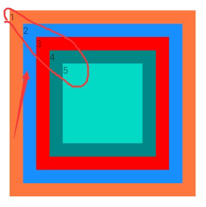
</LinearLayout>五、帧布局(FrameLayout)
FrameLayout将控件以栈的形势堆叠起来,最近添加进去的控件绘制在最顶部。FrameLayout为每个加入其中的组件创建一个空白的区域(称为一帧),每个子组件占据一帧,这些帧都会根据gravity属性执行自动对齐。
FrameLayout常用的XML属性和相关方法说明
| XML属性 | 相关方法 | 说明 |
| android:foregroundGravity | setForegroundGravity(int) | 定义要应用于前景可绘制对象的重力。 |
| android:measureAllChildren | setMeasureAllChildren(boolean) | 确定测量时是测量所有子项还是仅测量处于可见或不可见状态的子项。 |
FrameLayout包含的子元素也受到FrameLayout.LayoutParams的控制,因此它所包含的子元素也可以指定android:layout_gravity。
<?xml version="1.0" encoding="utf-8"?>
<FrameLayout xmlns:android="http://schemas.android.com/apk/res/android"
    android:layout_width="match_parent"
    android:layout_height="match_parent">
    <!--依次定义5个View,先定义的在最下面-->
    <TextView
        android:layout_width="wrap_content"
        android:layout_height="wrap_content"
        android:layout_gravity="center"
        android:width="280dp"
        android:height="280dp"
        android:text="1"
        android:background="@color/color_FF773D"/>
    <TextView
        android:layout_width="wrap_content"
        android:layout_height="wrap_content"
        android:layout_gravity="center"
        android:width="240dp"
        android:text="2"
        android:height="240dp"
        android:background="@color/color_188FFF"/>
    <TextView
        android:layout_width="wrap_content"
        android:layout_height="wrap_content"
        android:layout_gravity="center"
        android:width="200dp"
        android:text="3"
        android:height="200dp"
        android:background="@color/color_ff0000"/>
    <TextView
        android:layout_width="wrap_content"
        android:layout_height="wrap_content"
        android:layout_gravity="center"
        android:width="160dp"
        android:height="160dp"
        android:text="4"
        android:background="@color/teal_700"/>
    <TextView
        android:layout_width="wrap_content"
        android:layout_height="wrap_content"
        android:layout_gravity="center"
        android:width="120dp"
        android:height="120dp"
        android:text="5"
        android:background="@color/teal_200"/>
</FrameLayout>
将xml中的几个android:text=""去掉,通过代码进行颜色变化,可实现霓虹灯效果。
六、绝对布局(AbsoluteLayout)
因为灵活性太差,在API Level 3中被废弃。在实际使用中你需要为所有子组件指定x,y坐标。它的直接子类是WebView。
七、其他(约束布局ConstraintLayout)
将该库作为依赖项添加到app/ build.gradle文件中,
dependencies
    implementation "androidx.constraintlayout:constraintlayout:2.0.4"
    // To use constraintlayout in compose
    implementation "androidx.constraintlayout:constraintlayout-compose:1.0.0-alpha06"
ConstraintLayout允许您以灵活的方式定位和调整子组件的大小。 它与RelativeLayout类似,所有的视图都是根据兄弟视图和父布局之间的关系来布局的,但是它比RelativeLayout更灵活,并且更易于在Android Studio的布局编辑器中使用。
ConstraintLayout的所有功能都可以直接从布局编辑器的可视化工具中使用,因为布局API和布局编辑器是专门为对方构建的。 所以你可以使用ConstraintLayout完全通过拖放操作来构建你的布局,而不是编辑XML。
请注意,约束中不能有循环依赖。
<?xml version="1.0" encoding="utf-8"?>
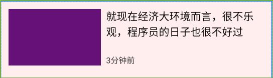
<androidx.constraintlayout.widget.ConstraintLayout xmlns:android="http://schemas.android.com/apk/res/android"
xmlns:app="http://schemas.android.com/apk/res-auto"
android:id="@+id/activity_main"
android:layout_width="match_parent"
android:layout_height="match_parent"
android:background="#11ff0000">
<TextView
android:id="@+id/tv1"
android:layout_width="140dp"
android:layout_height="86dp"
android:layout_marginStart="12dp"
android:layout_marginTop="12dp"
android:background="#617"
app:layout_constraintLeft_toLeftOf="parent"
app:layout_constraintTop_toTopOf="parent" />
<TextView
android:id="@+id/tv2"
android:layout_width="0dp"
android:layout_height="wrap_content"
android:layout_marginStart="8dp"
android:layout_marginEnd="12dp"
android:text="就现在经济大环境而言,很不乐观,程序员的日子也很不好过"
android:textColor="#000000"
android:textSize="16dp"
app:layout_constraintLeft_toRightOf="@id/tv1"
app:layout_constraintRight_toRightOf="parent"
app:layout_constraintTop_toTopOf="@id/tv1" />
<TextView
android:layout_width="wrap_content"
android:layout_height="wrap_content"
android:layout_marginStart="8dp"
android:layout_marginTop="12dp"
android:text="3分钟前"
android:textColor="#333"
android:textSize="12dp"
app:layout_constraintBottom_toBottomOf="@id/tv1"
app:layout_constraintLeft_toRightOf="@id/tv1" />
</androidx.constraintlayout.widget.ConstraintLayout>tv1设置了://父布局的左上角
app:layout_constraintLeft_toLeftOf="parent"
app:layout_constraintTop_toTopOf="parent"
tv2设置了:tv2在tv1的右侧,tv2的右侧和父布局对其,tv2和tv1顶部对齐;
app:layout_constraintLeft_toRightOf="@id/tv1",
app:layout_constraintRight_toRightOf="parent"
app:layout_constraintTop_toTopOf="@id/tv1"
tv3设置了:tv3在tv1的右侧,tv3和tv1底部对其。
app:layout_constraintLeft_toRightOf="@id/tv1"
app:layout_constraintBottom_toBottomOf="@id/tv1"
相对定位
相对定位是在 ConstraintLayout 中创建布局的基本构建块之一。这些约束允许您相对于另一个小部件定位给定的小部件。您可以在水平和垂直轴上约束小部件:
水平轴:左、右、起点和终点
垂直轴:顶边、底边和文本基线
一般概念是将小部件的给定一侧约束到任何其他小部件的另一侧。
以下是可用约束的列表:
layout_constraintLeft_toLeftOf
layout_constraintLeft_toRightOf
layout_constraintRight_toLeftOf
layout_constraintRight_toRightOf
layout_constraintTop_toTopOf
layout_constraintTop_toBottomOf
layout_constraintBottom_toTopOf
layout_constraintBottom_toBottomOf
layout_constraintBaseline_toBaselineOf
layout_constraintStart_toEndOf
layout_constraintStart_toStartOf
layout_constraintEnd_toStartOf
layout_constraintEnd_toEndOf
边距
如果设置了边距,它们将应用于相应的约束(如果存在),将边距强制为目标边和源边之间的空间。通常的布局边距属性可用于此效果:
android:layout_marginStart
android:layout_marginEnd
android:layout_marginLeft
android:layout_marginTop
android:layout_marginRight
android:layout_marginBottom
请注意,边距只能为正数或等于零,并且需要一个Dimension.
连接到 GONE 小部件时的边距
当位置约束目标的可见性为 时View.GONE,您还可以使用以下属性指示要使用的不同边距值:
layout_goneMarginStart
layout_goneMarginEnd
layout_goneMarginLeft
layout_goneMarginTop
layout_goneMarginRight
layout_goneMarginBottom
尺寸限制
您可以为ConstraintLayout自身定义最小和最大尺寸:
android:minWidth 设置布局的最小宽度
android:minHeight 设置布局的最小高度
android:maxWidth 设置布局的最大宽度
android:maxHeight 设置布局的最大高度
以上是关于Android 六大布局的主要内容,如果未能解决你的问题,请参考以下文章