vue2&3自定义svg图标组件
Posted ps酷教程
tags:
篇首语:本文由小常识网(cha138.com)小编为大家整理,主要介绍了vue2&3自定义svg图标组件相关的知识,希望对你有一定的参考价值。
可参考:
未来必热:SVG Sprites技术介绍
懒人神器:svg-sprite-loader实现自己的Icon组件
在Vue3项目中使用svg-sprite-loader
前置知识
在页面中,虽然可以通过如下的方式使用img标签,来引入svg图标。但是,如果这个路径很长,也是比较麻烦的。
<img src="./svg/icon.svg" />
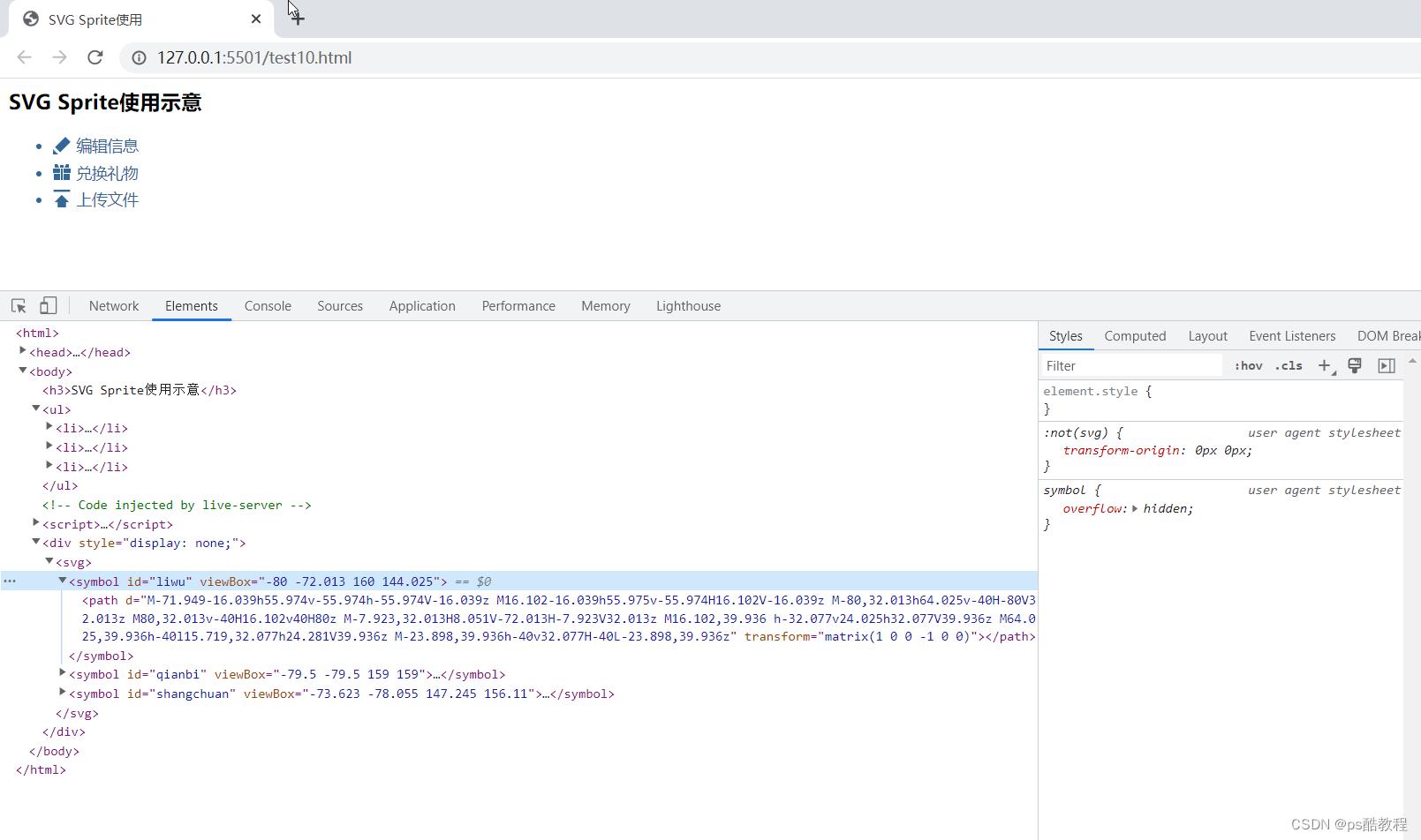
在svg里面,可以在文档中先定义Symbol,然后svg使用的时候,只须通过标识去引用指定的svg即可,Symbol的放置顺序不一定要在最前面,案例如下:
<html>

<head>
  <meta charset="utf-8">
  <title>SVG Sprite使用</title>
  <style>
    li
      font-size: 14px;
      margin-top: 5px;
      color: #369;


    .webicon
      width: 16px;
      height: 16px;
      margin-right: 5px;
      vertical-align: -2px;
      fill: #369;

  </style>
</head>

<body>
  <div style="display: none;"><svg>
      <symbol id="liwu" viewBox="-80 -72.013 160 144.025">
        <path
          d="M-71.949-16.039h55.974v-55.974h-55.974V-16.039z M16.102-16.039h55.975v-55.974H16.102V-16.039z M-80,32.013h64.025v-40H-80V32.013z M80,32.013v-40H16.102v40H80z M-7.923,32.013H8.051V-72.013H-7.923V32.013z M16.102,39.936 h-32.077v24.025h32.077V39.936z M64.025,39.936h-40l15.719,32.077h24.281V39.936z M-23.898,39.936h-40v32.077H-40L-23.898,39.936z"
          transform="matrix(1 0 0 -1 0 0)"></path>
      </symbol>
      <symbol id="qianbi" viewBox="-79.5 -79.5 159 159">
        <path
          d="M79.5,32.802l-93.538-93.538l-46.699,46.699L32.802,79.5L79.5,32.802z M-79.5-32.802L-32.802-79.5H-79.5 V-32.802z"
          transform="matrix(1 0 0 -1 0 0)"></path>
      </symbol>
      <symbol id="shangchuan" viewBox="-73.623 -78.055 147.245 156.11">
        <path
          d="M0.069,32.482L64.48-32.205H36.915v-45.85h-73.83l-0.139,45.85h-27.15L0.069,32.482z M73.623,78.055V59.632 H-73.623v18.423H73.623z"
          transform="matrix(1 0 0 -1 0 0)"></path>
      </symbol>
    </svg></div>
  <h3>SVG Sprite使用示意</h3>
  <ul>
    <li><svg class="webicon">
        <use xlink:href="#qianbi"></use>
      </svg>编辑信息</li>
    <li><svg class="webicon">
        <use xlink:href="#liwu"></use>
      </svg>兑换礼物</li>
    <li><svg class="webicon">
        <use xlink:href="#shangchuan"></use>
      </svg>上传文件</li>
  </ul>
  </div>
</body>

</html>
vue3+vite自定义svg图标组件
1、安装 vite-plugin-svg-icons
npm i fast-glob@3.2.11 -D
npm i vite-plugin-svg-icons@2.0.1 -D
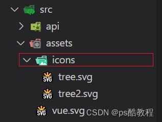
2、创建图标文件夹
在src/assets文件夹下新建icons文件夹,用于存放下载的 SVG 图标
3、vite.config.js 插件配置
import  defineConfig  from 'vite'
import vue from '@vitejs/plugin-vue'
import path from 'path'

import  createSvgIconsPlugin  from 'vite-plugin-svg-icons';

// https://vitejs.dev/config/
export default defineConfig(
  plugins: [
    vue(),
    createSvgIconsPlugin(
      // 指定需要缓存的图标文件夹
      iconDirs: [path.resolve(process.cwd(), 'src/assets/icons')],
      // 指定symbolId格式
      symbolId: 'icon-[dir]-[name]',
    )
  ],
  resolve:
    alias:
      '@': path.resolve(__dirname, './src')


)
4、SvgIcon组件封装
<!--src/components/SvgIcon/index.vue-->
<template>
  <svg
      aria-hidden="true"
      class="svg-icon"
      :style="'width:' + size + ';height:' + size"
  >
    <use :xlink:href="symbolId" :fill="color"/>
  </svg>
</template>

<script setup lang="ts">
import computed from 'vue';

const props = defineProps(
  prefix:
    type: String,
    default: 'icon'
  ,
  iconClass:
    type: String,
    required: false
  ,
  color:
    type: String
  ,
  size:
    type: String,
    default: '1em'

);

const symbolId = computed(() => `#$props.prefix-$props.iconClass`);
</script>

<style scoped>
.svg-icon
  overflow: hidden;
  fill: currentColor;

</style>
5、main.js 引入注册脚本
import  createApp  from 'vue'
import './style.css'
import App from './App.vue'

import router from '@/router'
import store from '@/store'

// 不知道这个东西是哪来的,但是没它的话,html下面就没有那个Symbol的定义了
import 'virtual:svg-icons-register';

import SvgIcon from '@/components/SvgIcon/index.vue'


const app = createApp(App)
app.use(router)
app.use(store)

// 注册全局组件
app.component('SvgIcon',SvgIcon)

app.mount('#app')
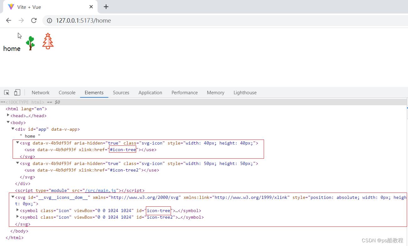
6、Home.vue中使用SvgIcon组件
<template>
    home
    <svg-icon icon-class="tree" size="40px"/>
    <svg-icon icon-class="tree2" size="50px"/>
</template>

<script setup>

</script>

<style lang="scss">

</style>
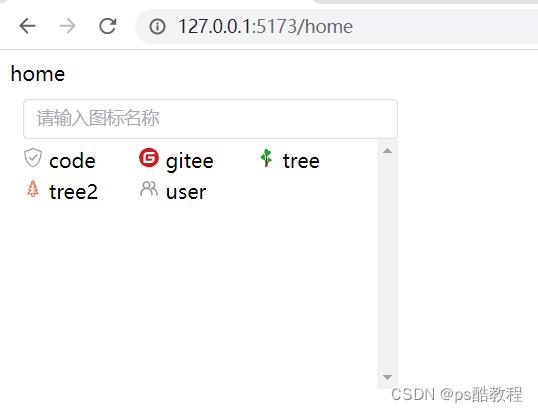
7、图标选择器
IconSelect.vue
在src/components文件夹下新建IconSelect文件夹,并在IconSelect文件夹下新建index.vue
<template>
    <div class="icon-select">
      <el-input
        v-model="iconName"
        clearable
        placeholder="请输入图标名称"
        @clear="filterIcons"
        @input="filterIcons"
      >
        <template #suffix><i class="el-icon-search el-input__icon" /></template>
      </el-input>
      <div class="icon-select__list">
        <div
          v-for="(item, index) in iconList"
          :key="index"
          @click="selectedIcon(item)"
        >
          <svg-icon
            color="#999"
            :icon-class="item"
            style="height: 30px; width: 16px; margin-right: 5px"
          />
          <span> item </span>
        </div>
      </div>
    </div>
  </template>

  <script setup>
  import  ref  from 'vue';
  import SvgIcon from '@/components/SvgIcon/index.vue';

  const icons = [] ;
  const modules = import.meta.glob('../../assets/icons/*.svg');
  for (const path in modules)
    const p = path.split('assets/icons/')[1].split('.svg')[0];
    icons.push(p);

  const iconList = ref(icons);

  const iconName = ref('');

  const emit = defineEmits(['selected']);

  function filterIcons()
    iconList.value = icons;
    if (iconName.value)
      iconList.value = icons.filter(item => item.indexOf(iconName.value) !== -1);


  function selectedIcon(name)
    emit('selected', name);
    document.body.click();


  function reset()
    iconName.value = '';
    iconList.value = icons;


  defineExpose(
    reset
  );
  </script>

  <style lang="scss" scoped>
  .icon-select
    width: 100%;
    padding: 10px;

    &__list
      height: 200px;
      overflow-y: scroll;

      div
        height: 30px;
        line-height: 30px;
        margin-bottom: -5px;
        cursor: pointer;
        width: 33%;
        float: left;


      span
        display: inline-block;
        vertical-align: -0.15em;
        fill: currentColor;
        overflow: hidden;


  </style>
Home.vue中使用IconSelect
<template>
    home
    <!-- <svg-icon icon-class="tree" size="40px"/>
    <svg-icon icon-class="tree2" size="50px"/> -->

    <div style="width:300px">
        <icon-select @selected="selected"></icon-select>
    </div>
</template>

<script setup>
import IconSelect from '@/components/IconSelect/index.vue'
import  reactive, ref  from "vue";

const state = reactive(
    icon: '',
)

function selected(name)
    console.log(state.icon)
    state.icon = name;


</script>

<style lang="scss"></style>
vue2自定义svg图标组件
1. 安装svg-sprite-loader
npm install svg-sprite-loader -D
2. 创建图标所在文件夹
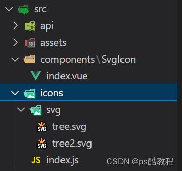
在项目 src 目录下新建 src/icons/svg 目录(存放 svg 图标文件)。
3. 配置vue.config.js
const  defineConfig  = require('@vue/cli-service')

const path = require('path')
const resolve = dir => path.join(__dirname, dir)

module.exports = defineConfig(
  transpileDependencies: true,
  chainWebpack(config)
    // 配置 svg-sprite-loader
    config.module
      .rule('svg')
      .exclude.add(resolve('src/icons'))
      .end()
    config.module
      .rule('icons')
      .test(/\\.svg$/)
      .include.add(resolve('src/icons'))
      .end()
      .use('svg-sprite-loader')
      .loader('svg-sprite-loader')
      .options(
        symbolId: 'icon-[name]'
      )
      .end()

)
4. SvgIcon.vue图标组件封装
在src/components下创建SvgIcon.vue
(或者:在src/components下创建SvgIcon文件夹,在里边创建index.vue)
<template>
  <svg className="svg-icon" aria-hidden="true">
    <use :xlink:href="iconName"/>
  </svg>
</template>
<style>
.svg-icon
  width: 1.5em;
  height: 1.5em;

</style>
<script>
export default
  props:
    iconClass:
      type: String,
      required: true

  ,
  computed:
    iconName ()
      return `#icon-$this.iconClass`


</script>
5.创建svg文件的入口文件icon.js
在 src/icons 下创建 icons 目录的入口文件 index.js ,负责svg文件的加载
import Vue from 'vue'
import SvgIcon from '@/components/SvgIcon'在Vue中使用svg图标即封装自定义svg-icon标签
参考 Vue项目中使用svg图标 这篇软文质量不错, 依葫芦画瓢,也跑通了
1.慢慢在理解其中包含的知识
2. 把自己理解换一种方式表达一下
我们想在vue页面使用svg图标,例如
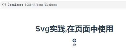
<template>
<div>
<h1>Svg实践,在页面中使用</h1>
<svg-icon icon-class="add"></svg-icon>
<svg-icon icon-class="auto"></svg-icon>
</div>
</template>
<script>
export default {
props: {},
components: {},
data() {
return {};
},
computed: {},
created() {},
mounted() {},
watch: {},
methods: {}
};
</script>
参考上面的文章
以上代码是svg的原生用法(正确性未验证)
1. src/icons 目录, 导入 svg 资源文件
2. npm install svg-sprite-loader --save-dev =>package.json
3. 配置webpack.base.conf.js(build文件夹中)
//设置Webpack 用 svg-sprite-loader 加载, src/icons 目录的内容,
换一种方式:
1). 在 rules 下增加
{
test: /.svg$/,
loader: "svg-sprite-loader",
include: [resolve("src/icons")],
options: {
symbolId: "icon-[name]"
}
},
//实际效果是,上面配置后webpack会加载src/icons下的index.js
2). webpack.base.conf.js 原生的 loader: ‘url-loader‘,中去掉svg,就不再额外添加
指令: exclude:[resolve(‘src/icons‘)] ,
如下:
{
test: /.(png|jpe?g|gif)(?.*)?$/,
loader: ‘url-loader‘,
options: {
limit: 10000,
name: utils.assetsPath(‘img/[name].[hash:7].[ext]‘)
}
},
4. 自定义svg组件封装svg功能
基础核心知识
srciconsindex.js 中
import SvgIcon from ‘@/components/SvgIcon‘ 的加载行为
加载 srccomponentsSvgIconindex.vue
<svg :class="svgClass" aria-hidden="true" v-on="$listeners">
在Vue中使用svg图标即封装自定义svg-icon标签
如在 SvgDemo.vue 使用如下标签
<template>
<div>
<h1>Svg实践,在页面中使用</h1>
<svg-icon icon-class="add"></svg-icon>
<svg-icon icon-class="auto"></svg-icon>
</div>
</template>
以上是关于vue2&3自定义svg图标组件的主要内容,如果未能解决你的问题,请参考以下文章