pyecharts折线图进阶篇
Posted
tags:
篇首语:本文由小常识网(cha138.com)小编为大家整理,主要介绍了pyecharts折线图进阶篇相关的知识,希望对你有一定的参考价值。
参考技术A import pyecharts.options as optsfrom pyecharts.charts import Line
x=['星期一','星期二','星期三','星期四','星期五','星期七','星期日']
y=[100,200,300,400,500,400,300]
line=(
Line()
.set_global_opts(
tooltip_opts=opts.TooltipOpts(is_show=False),
xaxis_opts=opts.AxisOpts(type_="category"),
yaxis_opts=opts.AxisOpts(
type_="value",
axistick_opts=opts.AxisTickOpts(is_show=True),
splitline_opts=opts.SplitLineOpts(is_show=True),
),
)
.add_xaxis(xaxis_data=x)
.add_yaxis(
series_name="基本折线图",
y_axis=y,
symbol="emptyCircle",
is_symbol_show=True,
label_opts=opts.LabelOpts(is_show=False),
)
)
line.render_notebook()
series_name:图形名称
y_axis:数据
symbol:标记的图形,
pyecharts提供的类型包括'circle','rect','roundRect','triangle','diamond','pin','arrow','none',也可以通过'image://url'设置为图片,其中 URL 为图片的链接。is_symbol_show:是否显示 symbol
有时候我们要分析的数据存在空缺值,需要进行处理才能画出折线图
import pyecharts.options as opts
from pyecharts.charts import Line
x=['星期一','星期二','星期三','星期四','星期五','星期七','星期日']
y=[100,200,300,400,None,400,300]
line=(
Line()
.add_xaxis(xaxis_data=x)
.add_yaxis(
series_name="连接空数据(折线图)",
y_axis=y,
)
.set_global_opts(title_opts=opts.TitleOpts(title="Line-连接空数据"))
)
line.render_notebook()
import pyecharts.options as opts
from pyecharts.charts import Line
x=['星期一','星期二','星期三','星期四','星期五','星期七','星期日']
y1=[100,200,300,400,100,400,300]
y2=[200,300,200,100,200,300,400]
line=(
Line()
.add_xaxis(xaxis_data=x)
.add_yaxis(series_name="y1线",y_axis=y1,symbol="arrow",is_symbol_show=True)
.add_yaxis(series_name="y2线",y_axis=y2)
.set_global_opts(title_opts=opts.TitleOpts(title="Line-多折线重叠"))
)
line.render_notebook()
import pyecharts.options as opts
from pyecharts.charts import Line
x=['星期一','星期二','星期三','星期四','星期五','星期七','星期日']
y1=[100,200,300,400,100,400,300]
y2=[200,300,200,100,200,300,400]
line=(
Line()
.add_xaxis(xaxis_data=x)
.add_yaxis(series_name="y1线",y_axis=y1, is_smooth=True)
.add_yaxis(series_name="y2线",y_axis=y2, is_smooth=True)
.set_global_opts(title_opts=opts.TitleOpts(title="Line-多折线重叠"))
)
line.render_notebook()
import pyecharts.options as opts
from pyecharts.charts import Line
x=['星期一','星期二','星期三','星期四','星期五','星期七','星期日']
y1=[100,200,300,400,100,400,300]
line=(
Line()
.add_xaxis(xaxis_data=x)
.add_yaxis(series_name="y1线",y_axis=y1, is_step=True)
.set_global_opts(title_opts=opts.TitleOpts(title="Line-阶梯图"))
)
line.render_notebook()
is_step:阶梯图参数
import pyecharts.options as opts
from pyecharts.charts import Line
from pyecharts.faker import Faker
x=['星期一','星期二','星期三','星期四','星期五','星期七','星期日']
y1=[100,200,300,400,100,400,300]
line = (
Line()
.add_xaxis(xaxis_data=x)
.add_yaxis(
"y1",
y1,
symbol="triangle",
symbol_size=30,
linestyle_opts=opts.LineStyleOpts(color="red", width=4, type_="dashed"),
itemstyle_opts=opts.ItemStyleOpts(
border_width=3, border_color="yellow", color="blue"
),
)
.set_global_opts(title_opts=opts.TitleOpts(title="Line-ItemStyle"))
)
line.render_notebook()
linestyle_opts:折线样式配置color设置颜色,width设置宽度type设置类型,有'solid','dashed','dotted'三种类型 itemstyle_opts:图元样式配置,border_width设置描边宽度,border_color设置描边颜色,color设置纹理填充颜色
import pyecharts.options as opts
from pyecharts.charts import Line
x=['星期一','星期二','星期三','星期四','星期五','星期七','星期日']
y1=[100,200,300,400,100,400,300]
y2=[200,300,200,100,200,300,400]
line=(
Line()
.add_xaxis(xaxis_data=x)
.add_yaxis(series_name="y1线",y_axis=y1,areastyle_opts=opts.AreaStyleOpts(opacity=0.5))
.add_yaxis(series_name="y2线",y_axis=y2,areastyle_opts=opts.AreaStyleOpts(opacity=0.5))
.set_global_opts(title_opts=opts.TitleOpts(title="Line-多折线重叠"))
)
line.render_notebook()
import pyecharts.options as opts
from pyecharts.charts import Line
from pyecharts.commons.utils import JsCode
js_formatter ="""function (params)
console.log(params);
return '降水量 ' + params.value + (params.seriesData.length ? ':' + params.seriesData[0].data : '');
"""
line=(
Line()
.add_xaxis(
xaxis_data=[
"2016-1",
"2016-2",
"2016-3",
"2016-4",
"2016-5",
"2016-6",
"2016-7",
"2016-8",
"2016-9",
"2016-10",
"2016-11",
"2016-12",
]
)
.extend_axis(
xaxis_data=[
"2015-1",
"2015-2",
"2015-3",
"2015-4",
"2015-5",
"2015-6",
"2015-7",
"2015-8",
"2015-9",
"2015-10",
"2015-11",
"2015-12",
],
xaxis=opts.AxisOpts(
type_="category",
axistick_opts=opts.AxisTickOpts(is_align_with_label=True),
axisline_opts=opts.AxisLineOpts(
is_on_zero=False, linestyle_opts=opts.LineStyleOpts(color="#6e9ef1")
),
axispointer_opts=opts.AxisPointerOpts(
is_show=True, label=opts.LabelOpts(formatter=JsCode(js_formatter))
),
),
)
.add_yaxis(
series_name="2015 降水量",
is_smooth=True,
symbol="emptyCircle",
is_symbol_show=False,
color="#d14a61",
y_axis=[2.6,5.9,9.0,26.4,28.7,70.7,175.6,182.2,48.7,18.8,6.0,2.3],
label_opts=opts.LabelOpts(is_show=False),
linestyle_opts=opts.LineStyleOpts(width=2),
)
.add_yaxis(
series_name="2016 降水量",
is_smooth=True,
symbol="emptyCircle",
is_symbol_show=False,
color="#6e9ef1",
y_axis=[3.9,5.9,11.1,18.7,48.3,69.2,231.6,46.6,55.4,18.4,10.3,0.7],
label_opts=opts.LabelOpts(is_show=False),
linestyle_opts=opts.LineStyleOpts(width=2),
)
.set_global_opts(
legend_opts=opts.LegendOpts(),
tooltip_opts=opts.TooltipOpts(trigger="none", axis_pointer_type="cross"),
xaxis_opts=opts.AxisOpts(
type_="category",
axistick_opts=opts.AxisTickOpts(is_align_with_label=True),
axisline_opts=opts.AxisLineOpts(
is_on_zero=False, linestyle_opts=opts.LineStyleOpts(color="#d14a61")
),
axispointer_opts=opts.AxisPointerOpts(
is_show=True, label=opts.LabelOpts(formatter=JsCode(js_formatter))
),
),
yaxis_opts=opts.AxisOpts(
type_="value",
splitline_opts=opts.SplitLineOpts(
is_show=True, linestyle_opts=opts.LineStyleOpts(opacity=1)
),
),
)
)
line.render_notebook()
import pyecharts.options as opts
from pyecharts.charts import Line
x_data = ["00:00","01:15","02:30","03:45","05:00","06:15","07:30","08:45","10:00","11:15","12:30","13:45","15:00","16:15","17:30","18:45","20:00","21:15","22:30","23:45",]
y_data = [300,280,250,260,270,300,550,500,400,390,380,390,400,500,600,750,800,700,600,400,]
line=(
Line()
.add_xaxis(xaxis_data=x_data)
.add_yaxis(
series_name="用电量",
y_axis=y_data,
is_smooth=True,
label_opts=opts.LabelOpts(is_show=False),
linestyle_opts=opts.LineStyleOpts(width=2),
)
.set_global_opts(
title_opts=opts.TitleOpts(title="一天用电量分布", subtitle="纯属虚构"),
tooltip_opts=opts.TooltipOpts(trigger="axis", axis_pointer_type="cross"),
xaxis_opts=opts.AxisOpts(boundary_gap=False),
yaxis_opts=opts.AxisOpts(
axislabel_opts=opts.LabelOpts(formatter="value W"),
splitline_opts=opts.SplitLineOpts(is_show=True),
),
visualmap_opts=opts.VisualMapOpts(
is_piecewise=True,
dimension=0,
pieces=[
"lte":6,"color":"green",
"gt":6,"lte":8,"color":"red",
"gt":8,"lte":14,"color":"yellow",
"gt":14,"lte":17,"color":"red",
"gt":17,"color":"green",
],
pos_right=0,
pos_bottom=100
),
)
.set_series_opts(
markarea_opts=opts.MarkAreaOpts(
data=[
opts.MarkAreaItem(name="早高峰", x=("07:30","10:00")),
opts.MarkAreaItem(name="晚高峰", x=("17:30","21:15")),
]
)
)
)
line.render_notebook()
这里给大家介绍几个关键参数:
①visualmap_opts:视觉映射配置项,可以将折线分段并设置标签(is_piecewise),将不同段设置颜色(pieces);
②markarea_opts:标记区域配置项,data参数可以设置标记区域名称和位置。
matplotlib进阶教程:如何逐步美化一个折线图
大家好,今天分享一个非常有趣的 Python 教程,如何美化一个 matplotlib 折线图,喜欢记得收藏、关注、点赞。
注:数据、完整代码、技术交流文末获取
1. 导入包
import pandas as pd
import matplotlib.pyplot as plt
import matplotlib.ticker as ticker
import matplotlib.gridspec as gridspec
2. 获得数据
file_id = '1yM_F93NY4QkxjlKL3GzdcCQEnBiA2ltB'
url = f'https://drive.google.com/uc?id=file_id'
df = pd.read_csv(url, index_col=0)
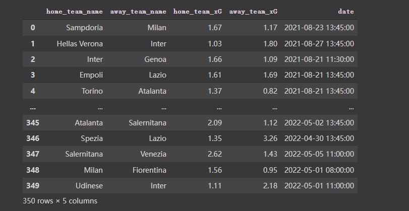
df
数据长得是这样的:
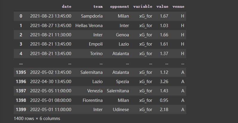
3. 对数据做一些预处理
按照需要,对数据再做一些预处理,代码及效果如下:
home_df = df.copy()
home_df = home_df.melt(id_vars = ["date", "home_team_name", "away_team_name"])
home_df["venue"] = "H"
home_df.rename(columns = "home_team_name":"team", "away_team_name":"opponent", inplace = True)
home_df.replace("variable":"home_team_xG":"xG_for", "away_team_xG":"xG_ag", inplace = True)
away_df = df.copy()
away_df = away_df.melt(id_vars = ["date", "away_team_name", "home_team_name"])
away_df["venue"] = "A"
away_df.rename(columns = "away_team_name":"team", "home_team_name":"opponent", inplace = True)
away_df.replace("variable":"away_team_xG":"xG_for", "home_team_xG":"xG_ag", inplace = True)
df = pd.concat([home_df, away_df]).reset_index(drop = True)
df
4. 画图
# ---- Filter the data

Y_for = df[(df["team"] == "Lazio") & (df["variable"] == "xG_for")]["value"].reset_index(drop = True)
Y_ag = df[(df["team"] == "Lazio") & (df["variable"] == "xG_ag")]["value"].reset_index(drop = True)
X_ = pd.Series(range(len(Y_for)))

# ---- Compute rolling average

Y_for = Y_for.rolling(window = 5, min_periods = 0).mean() # min_periods is for partial avg.
Y_ag = Y_ag.rolling(window = 5, min_periods = 0).mean()
fig, ax = plt.subplots(figsize = (7,3), dpi = 200)

ax.plot(X_, Y_for)
ax.plot(X_, Y_ag)
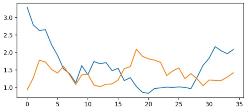
使用matplotlib倒是可以快速把图画好了,但是太丑了。接下来进行优化。
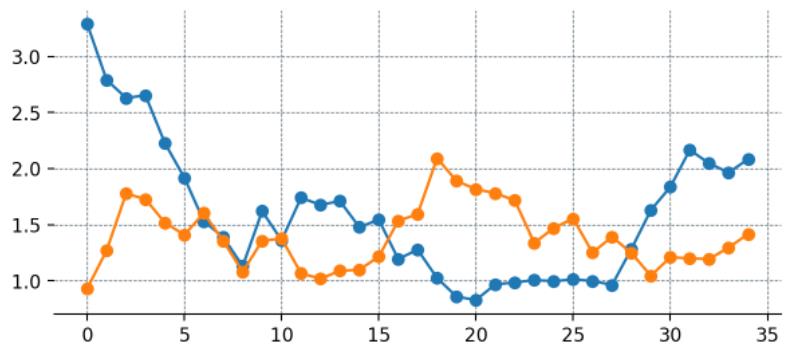
4.1 优化:添加点
这里为每一个数据添加点
fig, ax = plt.subplots(figsize = (7,3), dpi = 200)

# --- Remove spines and add gridlines

ax.spines["left"].set_visible(False)
ax.spines["top"].set_visible(False)
ax.spines["right"].set_visible(False)

ax.grid(ls = "--", lw = 0.5, color = "#4E616C")

# --- The data

ax.plot(X_, Y_for, marker = "o")
ax.plot(X_, Y_ag, marker = "o")
4.2 优化:设置刻度
fig, ax = plt.subplots(figsize = (7,3), dpi = 200)

# --- Remove spines and add gridlines

ax.spines["left"].set_visible(False)
ax.spines["top"].set_visible(False)
ax.spines["right"].set_visible(False)

ax.grid(ls = "--", lw = 0.25, color = "#4E616C")

# --- The data

ax.plot(X_, Y_for, marker = "o", mfc = "white", ms = 5)
ax.plot(X_, Y_ag, marker = "o", mfc = "white", ms = 5)

# --- Adjust tickers and spine to match the style of our grid

ax.xaxis.set_major_locator(ticker.MultipleLocator(2)) # ticker every 2 matchdays
xticks_ = ax.xaxis.set_ticklabels([x - 1 for x in range(0, len(X_) + 3, 2)])
# This last line outputs
# [-1, 1, 3, 5, 7, 9, 11, 13, 15, 17, 19, 21, 23, 25, 27, 29, 31, 33, 35]
# and we mark the tickers every two positions.

ax.xaxis.set_tick_params(length = 2, color = "#4E616C", labelcolor = "#4E616C", labelsize = 6)
ax.yaxis.set_tick_params(length = 2, color = "#4E616C", labelcolor = "#4E616C", labelsize = 6)

ax.spines["bottom"].set_edgecolor("#4E616C")
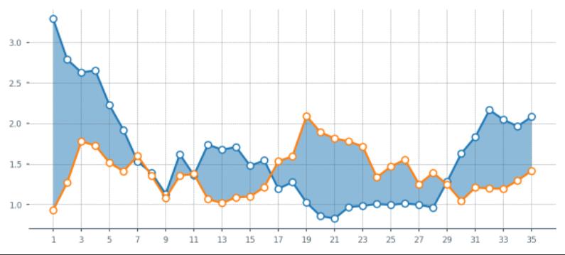
4.3 优化:设置填充
fig, ax = plt.subplots(figsize = (7,3), dpi = 200)

# --- Remove spines and add gridlines

ax.spines["left"].set_visible(False)
ax.spines["top"].set_visible(False)
ax.spines["right"].set_visible(False)

ax.grid(ls = "--", lw = 0.25, color = "#4E616C")

# --- The data

ax.plot(X_, Y_for, marker = "o", mfc = "white", ms = 5)
ax.plot(X_, Y_ag, marker = "o", mfc = "white", ms = 5)

# --- Fill between

ax.fill_between(x = X_, y1 = Y_for, y2 = Y_ag, alpha = 0.5)

# --- Adjust tickers and spine to match the style of our grid

ax.xaxis.set_major_locator(ticker.MultipleLocator(2)) # ticker every 2 matchdays
xticks_ = ax.xaxis.set_ticklabels([x - 1 for x in range(0, len(X_) + 3, 2)])

ax.xaxis.set_tick_params(length = 2, color = "#4E616C", labelcolor = "#4E616C", labelsize = 6)
ax.yaxis.set_tick_params(length = 2, color = "#4E616C", labelcolor = "#4E616C", labelsize = 6)

ax.spines["bottom"].set_edgecolor("#4E616C")
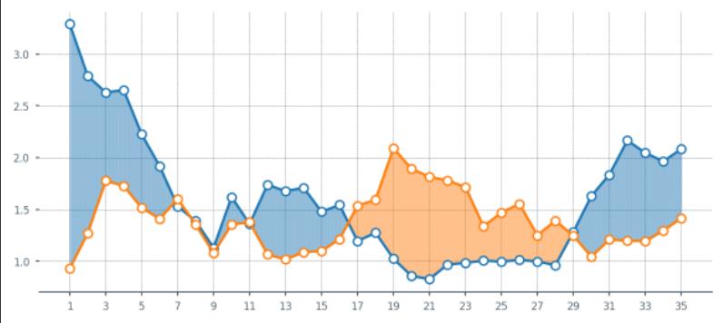
4.4 优化:设置填充颜色
- 当橙色线更高时,希望填充为橙色。但是上面的还无法满足,这里再优化一下.
fig, ax = plt.subplots(figsize = (7,3), dpi = 200)

# --- Remove spines and add gridlines

ax.spines["left"].set_visible(False)
ax.spines["top"].set_visible(False)
ax.spines["right"].set_visible(False)

ax.grid(ls = "--", lw = 0.25, color = "#4E616C")

# --- The data

ax.plot(X_, Y_for, marker = "o", mfc = "white", ms = 5)
ax.plot(X_, Y_ag, marker = "o", mfc = "white", ms = 5)

# --- Fill between

# Identify points where Y_for > Y_ag

pos_for = (Y_for > Y_ag)
ax.fill_between(x = X_[pos_for], y1 = Y_for[pos_for], y2 = Y_ag[pos_for], alpha = 0.5)

pos_ag = (Y_for <= Y_ag)
ax.fill_between(x = X_[pos_ag], y1 = Y_for[pos_ag], y2 = Y_ag[pos_ag], alpha = 0.5)

# --- Adjust tickers and spine to match the style of our grid

ax.xaxis.set_major_locator(ticker.MultipleLocator(2)) # ticker every 2 matchdays
xticks_ = ax.xaxis.set_ticklabels([x - 1 for x in range(0, len(X_) + 3, 2)])

ax.xaxis.set_tick_params(length = 2, color = "#4E616C", labelcolor = "#4E616C", labelsize = 6)
ax.yaxis.set_tick_params(length = 2, color = "#4E616C", labelcolor = "#4E616C", labelsize = 6)

ax.spines["bottom"].set_edgecolor("#4E616C")

上面的图出现异常,再修改一下:
X_aux = X_.copy()
X_aux.index = X_aux.index * 10 # 9 aux points in between each match
last_idx = X_aux.index[-1] + 1
X_aux = X_aux.reindex(range(last_idx))
X_aux = X_aux.interpolate()


# --- Aux series for the xG created (Y_for)
Y_for_aux = Y_for.copy()
Y_for_aux.index = Y_for_aux.index * 10
last_idx = Y_for_aux.index[-1] + 1
Y_for_aux = Y_for_aux.reindex(range(last_idx))
Y_for_aux = Y_for_aux.interpolate()

# --- Aux series for the xG conceded (Y_ag)
Y_ag_aux = Y_ag.copy()
Y_ag_aux.index = Y_ag_aux.index * 10
last_idx = Y_ag_aux.index[-1] + 1
Y_ag_aux = Y_ag_aux.reindex(range(last_idx))
Y_ag_aux = Y_ag_aux.interpolate()


fig, ax = plt.subplots(figsize = (7,3), dpi = 200)

# --- Remove spines and add gridlines

ax.spines["left"].set_visible(False)
ax.spines["top"].set_visible(False)
ax.spines["right"].set_visible(False)

ax.grid(ls = "--", lw = 0.25, color = "#4E616C")

# --- The data

for_ = ax.plot(X_, Y_for, marker = "o", mfc = "white", ms = 5)
ag_ = ax.plot(X_, Y_ag, marker = "o", mfc = "white", ms = 5)

# --- Fill between

for index in range(len(X_aux) - 1):
    # Choose color based on which line's on top
    if Y_for_aux.iloc[index + 1] > Y_ag_aux.iloc[index + 1]:
        color = for_[0].get_color()
    else:
        color = ag_[0].get_color()

    # Fill between the current point and the next point in pur extended series.
    ax.fill_between([X_aux[index], X_aux[index+1]],
                    [Y_for_aux.iloc[index], Y_for_aux.iloc[index+1]],
                    [Y_ag_aux.iloc[index], Y_ag_aux.iloc[index+1]],
                    color=color, zorder = 2, alpha = 0.2, ec = None)

# --- Adjust tickers and spine to match the style of our grid

ax.xaxis.set_major_locator(ticker.MultipleLocator(2)) # ticker every 2 matchdays
xticks_ = ax.xaxis.set_ticklabels([x - 1 for x in range(0, len(X_) + 3, 2)])

ax.xaxis.set_tick_params(length = 2, color = "#4E616C", labelcolor = "#4E616C", labelsize = 6)
ax.yaxis.set_tick_params(length = 2, color = "#4E616C", labelcolor = "#4E616C", labelsize = 6)

ax.spines["bottom"].set_edgecolor("#4E616C")
5. 把功能打包成函数
- 上面的样子都还不错啦,接下来把这些东西都打包成一个函数。方便后面直接出图。
def plot_xG_rolling(team, ax, window = 5, color_for = "blue", color_ag = "orange", data = df):
  '''
  This function creates a rolling average xG plot for a given team and rolling
  window.

  team (str): The team's name
  ax (obj): a Matplotlib axes.
  window (int): The number of periods for our rolling average.
  color_for (str): A hex color code for xG created.
  color_af (str): A hex color code for xG conceded.
  data (DataFrame): our df with the xG data.
  '''

  # -- Prepping the data
  home_df = data.copy()
  home_df = home_df.melt(id_vars = ["date", "home_team_name", "away_team_name"])
  home_df["venue"] = "H"
  home_df.rename(columns = "home_team_name":"team", "away_team_name":"opponent", inplace = True)
  home_df.replace("variable":"home_team_xG":"xG_for", "away_team_xG":"xG_ag", inplace = True)

  away_df = data.copy()
  away_df = away_df.melt(id_vars = ["date", "away_team_name", "home_team_name"])
  away_df["venue"] = "A"
  away_df.rename(columns = "away_team_name":"team", "home_team_name":"opponent", inplace = True)
  away_df.replace("variable":"away_team_xG":"xG_for", "home_team_xG":"xG_ag", inplace = True)

  df = pd.concat([home_df, away_df]).reset_index(drop = True)

  # ---- Filter the data

  Y_for = df[(df["team"] == team) & (df["variable"] == "xG_for")]["value"].reset_index(drop = True)
  Y_ag = df[(df["team"] == team) & (df["variable"] == "xG_ag")]["value"].reset_index(drop = True)
  X_ = pd.Series(range(len(Y_for)))

  if Y_for.shape[0] == 0:
    raise ValueError(f"Team team is not present in the DataFrame")

  # ---- Compute rolling average

  Y_for = Y_for.rolling(window = 5, min_periods = 以上是关于pyecharts折线图进阶篇的主要内容,如果未能解决你的问题,请参考以下文章