Python之电子游戏销售数据Seaborn可视化笔记
Posted 白又白学Python
tags:
篇首语:本文由小常识网(cha138.com)小编为大家整理,主要介绍了Python之电子游戏销售数据Seaborn可视化笔记相关的知识,希望对你有一定的参考价值。
这个笔记是R:https://www.kaggle.com/umeshnarayanappa/explore-video-games-sales
中的作品启发的。
笔记的目标是尽可能简单地实现在上面的R笔记本中创建的可视化,使用Python以及一些附加的情节,并添加了一些评论和解释,以帮助Seborn/Python初学者他们的数据可视化/自定义。我们通过玩不同的颜色来保持事物的趣味性。
import numpy as np
import pandas as pd
import matplotlib.pyplot as plt
import seaborn as sns
Matplotlib is building the font cache using fc-list. This may take a moment.
使用熊猫在数据集中阅读。我们看到每一行条目对应于特定的游戏,数据包含游戏的名称、发布的年份以及一些分类特征,如平台、类型和发行者。最后,我们看到,游戏(行)条目还包括累计销售所取得的,按区域,按该特定的游戏。
df = pd.read_csv("/home/kesci/input/Datasets6073/vgsales.csv")
df.head()
| Rank | Name | Platform | Year | Genre | Publisher | NA_Sales | EU_Sales | JP_Sales | Other_Sales | Global_Sales | |
|---|---|---|---|---|---|---|---|---|---|---|---|
| 0 | 1 | Wii Sports | Wii | 2006.0 | Sports | Nintendo | 41.49 | 29.02 | 3.77 | 8.46 | 82.74 |
| 1 | 2 | Super Mario Bros. | NES | 1985.0 | Platform | Nintendo | 29.08 | 3.58 | 6.81 | 0.77 | 40.24 |
| 2 | 3 | Mario Kart Wii | Wii | 2008.0 | Racing | Nintendo | 15.85 | 12.88 | 3.79 | 3.31 | 35.82 |
| 3 | 4 | Wii Sports Resort | Wii | 2009.0 | Sports | Nintendo | 15.75 | 11.01 | 3.28 | 2.96 | 33.00 |
| 4 | 5 | Pokemon Red/Pokemon Blue | GB | 1996.0 | Role-Playing | Nintendo | 11.27 | 8.89 | 10.22 | 1.00 | 31.37 |
检查最大年值,我们看到它是2020年,这是一个不可能的发布日期。
year_data = df[\'Year\']
print("Max Year Value: ", year_data.max())
Max Year Value:  2020.0
通过错误年份查看条目的名称,我们可以在网上搜索游戏的发布日期,并将当前值替换为正确的发布日期。
max_entry = year_data.idxmax()
print(max_entry)
max_entry = df.iloc[max_entry]
pd.DataFrame(max_entry).T
5957
| Rank | Name | Platform | Year | Genre | Publisher | NA_Sales | EU_Sales | JP_Sales | Other_Sales | Global_Sales | |
|---|---|---|---|---|---|---|---|---|---|---|---|
| 5957 | 5959 | Imagine: Makeup Artist | DS | 2020 | Simulation | Ubisoft | 0.27 | 0 | 0 | 0.02 | 0.29 |
df[\'Year\'] = df[\'Year\'].replace(2020.0, 2009.0)
print("Max Year Value: ", year_data.max())
Max Year Value:  2017.0
下面我们检查游戏(行)的数量和独特的发行者、平台和类型的数量,以了解我们在数据集中的游戏是如何被明确地分布的。
print("Number of games: ", len(df))
publishers = df[\'Publisher\'].unique()
print("Number of publishers: ", len(publishers))
platforms = df[\'Platform\'].unique()
print("Number of platforms: ", len(platforms))
genres = df[\'Genre\'].unique()
print("Number of genres: ", len(genres))
Number of games:  16598
Number of publishers:  579
Number of platforms:  31
Number of genres:  12
我们做一个简单的空值检查。我们可能会在网上搜索所有缺少的出版年份和出版商,但现在我们只需删除那些没有所有数据的游戏的条目。
print(df.isnull().sum())
df = df.dropna()
Rank              0
Name              0
Platform          0
Year            271
Genre             0
Publisher        58
NA_Sales          0
EU_Sales          0
JP_Sales          0
Other_Sales       0
Global_Sales      0
dtype: int64
下面我们创建一个简单的列图表来表示视频游戏每年的“全球销售”总量。我们通过数据获取我们的数据–我们所有的电子游戏销售数据,按“年份”分组,然后调用.sum()来获得每年的总数。这将创建一个以我们的年份作为索引或行名的数据RAME,以及该年总销售额的条目。
在数据集中,表示年份的索引是浮点数,例如“2006.0”而不是“2006年”。我们通过把这些值作为整数来得到我们的x项。一旦数据准备就绪,我们就简单地将x和y变量传递给我们的SebornBarart函数。我们还设置了我们的x标签名称,标题,我们还旋转我们的xtickLabel和更改它们的fontSize。
y = df.groupby([\'Year\']).sum()
y = y[\'Global_Sales\']
x = y.index.astype(int)

plt.figure(figsize=(12,8))
ax = sns.barplot(y = y, x = x)
ax.set_xlabel(xlabel=\'$ Millions\', fontsize=16)
ax.set_xticklabels(labels = x, fontsize=12, rotation=50)
ax.set_ylabel(ylabel=\'Year\', fontsize=16)
ax.set_title(label=\'Game Sales in $ Millions Per Year\', fontsize=20)
plt.show();

下面我们创建了一个简单的列图来表示每年发布的电子游戏的总数量,但是有一点扭曲,它是横向的,这意味着我们的年份条目,通常是我们的X轴,现在在Y轴上,而“Global_Sales”条目的计数通常在Y轴上,现在在X轴上。
x = df.groupby([\'Year\']).count()
x = x[\'Global_Sales\']
y = x.index.astype(int)

plt.figure(figsize=(12,8))
colors = sns.color_palette("muted")
ax = sns.barplot(y = y, x = x, orient=\'h\', palette=colors)
ax.set_xlabel(xlabel=\'Number of releases\', fontsize=16)
ax.set_ylabel(ylabel=\'Year\', fontsize=16)
ax.set_title(label=\'Game Releases Per Year\', fontsize=20)
Text(0.5, 1.0, \'Game Releases Per Year\')

下面我们创建了一个要点图,每个出版商每年的销售额都是最高的。全球销售额在Y轴上,年份在X轴上,我们使用切入点图的参数“hue”来代表最高的发行者。
我们使用一个支点表,它使计算“出版商”很容易,出版商的名字按年销售额计算,以及“销售额”,即该出版商每年产生的全球销售额。
注意,Pivot表接受一个函数要应用的参数,该参数具有其他选项,如均值、中值和模式。这个切入点需要一个dataframe,然后您可以简单地将列名添加到x、y和hue。我们还通过旋转和改变它们的大小来定制我们的xtick标签。
table = df.pivot_table(\'Global_Sales\', index=\'Publisher\', columns=\'Year\', aggfunc=\'sum\')
publishers = table.idxmax()
sales = table.max()
years = table.columns.astype(int)
data = pd.concat([publishers, sales], axis=1)
data.columns = [\'Publisher\', \'Global Sales\']

plt.figure(figsize=(12,8))
ax = sns.pointplot(y = \'Global Sales\', x = years, hue=\'Publisher\', data=data, size=15)
ax.set_xlabel(xlabel=\'Year\', fontsize=16)
ax.set_ylabel(ylabel=\'Global Sales Per Year\', fontsize=16)
ax.set_title(label=\'Highest Publisher Revenue in $ Millions Per Year\', fontsize=20)
ax.set_xticklabels(labels = years, fontsize=12, rotation=50)
plt.show();

下面,我们创建了一个游戏产生的全球销售,它每年赚的钱最多。我们还返回了下面的数据,以供参考。你可以为每个游戏映射不同的颜色,但是在一个有这么多条目的情节中添加一个传奇会让一个情节看起来很混乱。
此图的数据创建与上面类似,不包括使用色调来表示数据中的类别。相反,我们使用调色板,将我们想要的特定调色板中的颜色数传递给它。
table = df.pivot_table(\'Global_Sales\', index=\'Name\', columns=\'Year\')
table.columns = table.columns.astype(int)
games = table.idxmax()
sales = table.max()
years = table.columns
data = pd.concat([games, sales], axis=1)
data.columns = [\'Game\', \'Global Sales\']

colors = sns.color_palette("GnBu_d", len(years))
plt.figure(figsize=(12,8))
ax = sns.barplot(y = years , x = \'Global Sales\', data=data, orient=\'h\', palette=colors)
ax.set_xlabel(xlabel=\'Global Sales Per Year\', fontsize=16)
ax.set_ylabel(ylabel=\'Year\', fontsize=16)
ax.set_title(label=\'Highest Revenue Per Game in $ Millions Per Year\', fontsize=20)
plt.show();
data
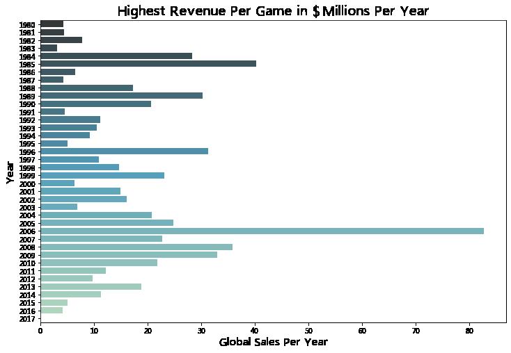
| Game | Global Sales | |
|---|---|---|
| Year | ||
| 1980 | Asteroids | 4.310 |
| 1981 | Pitfall! | 4.500 |
| 1982 | Pac-Man | 7.810 |
| 1983 | Baseball | 3.200 |
| 1984 | Duck Hunt | 28.310 |
| 1985 | Super Mario Bros. | 40.240 |
| 1986 | The Legend of Zelda | 6.510 |
| 1987 | Zelda II: The Adventure of Link | 4.380 |
| 1988 | Super Mario Bros. 3 | 17.280 |
| 1989 | Tetris | 30.260 |
| 1990 | Super Mario World | 20.610 |
| 1991 | The Legend of Zelda: A Link to the Past | 4.610 |
| 1992 | Super Mario Land 2: 6 Golden Coins | 11.180 |
| 1993 | Super Mario All-Stars | 10.550 |
| 1994 | Donkey Kong Country | 9.300 |
| 1995 | Donkey Kong Country 2: Diddy’s Kong Quest | 5.150 |
| 1996 | Pokemon Red/Pokemon Blue | 31.370 |
| 1997 | Gran Turismo | 10.950 |
| 1998 | Pokémon Yellow: Special Pikachu Edition | 14.640 |
| 1999 | Pokemon Gold/Pokemon Silver | 23.100 |
| 2000 | Pokémon Crystal Version | 6.390 |
| 2001 | Gran Turismo 3: A-Spec | 14.980 |
| 2002 | Grand Theft Auto: Vice City | 16.150 |
| 2003 | Mario Kart: Double Dash!! | 6.950 |
| 2004 | Grand Theft Auto: San Andreas | 20.810 |
| 2005 | Nintendogs | 24.760 |
| 2006 | Wii Sports | 82.740 |
| 2007 | Wii Fit | 22.720 |
| 2008 | Mario Kart Wii | 35.820 |
| 2009 | Wii Sports Resort | 33.000 |
| 2010 | Kinect Adventures! | 21.820 |
| 2011 | Mario Kart 7 | 12.210 |
| 2012 | New Super Mario Bros. 2 | 9.820 |
| 2013 | Grand Theft Auto V | 18.890 |
| 2014 | Pokemon Omega Ruby/Pokemon Alpha Sapphire | 11.330 |
| 2015 | Call of Duty: Black Ops 3 | 5.064 |
| 2016 | Uncharted 4: A Thief’s End | 4.200 |
| 2017 | Phantasy Star Online 2 Episode 4: Deluxe Package | 0.020 |
data = df.groupby([\'Publisher\']).count().iloc[:,0]
data = pd.DataFrame(data.sort_values(ascending=False))[0:10]
publishers = data.index
data.columns = [\'Releases\']

colors = sns.color_palette("spring", len(data))
plt.figure(figsize=(12,8))
ax = sns.barplot(y = publishers , x = \'Releases\', data=data, orient=\'h\', palette=colors)
ax.set_xlabel(xlabel=\'Number of Releases\', fontsize=16)
ax.set_ylabel(ylabel=\'Publisher\', fontsize=16)
ax.set_title(label=\'Top 10 Total Publisher Games Released\', fontsize=20)
ax.set_yticklabels(labels = publishers, fontsize=14)
plt.show();

data = df.groupby([\'Publisher\']).sum()[\'Global_Sales\']
data = pd.DataFrame(data.sort_values(ascending=False))[0:10]
publishers = data.index
data.columns = [\'Global Sales\']

colors = sns.color_palette("cool", len(data))
plt.figure(figsize=(12,8))
ax = sns.barplot(y = publishers , x = \'Global Sales\', data=data, orient=\'h\', palette=colors)
ax.set_xlabel(xlabel=\'Revenue in $ Millions\', fontsize=16)
ax.set_ylabel(ylabel=\'Publisher\', fontsize=16)
ax.set_title(label=\'Top 10 Total Publisher Game Revenue\', fontsize=20)
ax.set_yticklabels(labels = publishers, fontsize=14)
plt.show();

rel = df.groupby([\'Genre\']).count().iloc[:,0]
rel = pd.DataFrame(rel.sort_values(ascending=False))
genres = rel.index
rel.columns = [\'Releases\']
colors = sns.color_palette("summer", len(rel))
plt.figure(figsize=(12,8))
ax = sns.barplot(y = genres , x = \'Releases\', data=rel, orient=\'h\', palette=colors)
ax.set_xlabel(xlabel=\'Number of Releases\', fontsize=16)
ax.set_ylabel(ylabel=\'Genre\', fontsize=16)
ax.set_title(label=\'Genres by Total Number of Games Released\', fontsize=20)
ax.set_yticklabels(labels = genres, fontsize=14)
plt.show();

rev = df.groupby([\'Genre\']).sum()[\'Global_Sales\']
rev = pd.DataFrame(rev.sort_values(ascending=False))
genres = rev.index
rev.columns = [\'Revenue\']

colors = sns.color_palette(\'Set3\', len(rev))
plt.figure(figsize=(12,8))
ax = sns.barplot(y = genres , x = \'Revenue\', data=rev, orient=\'h\', palette=colors)
ax.set_xlabel(xlabel=\'Revenue in $ Millions\', fontsize=16)
ax.set_ylabel(ylabel=\'Genre\', fontsize=16)
ax.set_title(label=\'Genres by Total Revenue Generated in $ Millions\', fontsize=20)
ax.set_yticklabels(labels = genres, fontsize=14)
plt.show();


我是白又白i,一名喜欢分享知识的程序媛❤️
如果没有接触过编程这块的朋友看到这篇博客,发现不会编程或者想要学习的,可以直接留言+私我呀【非常感谢你的点赞、收藏、关注、评论,一键四连支持】
以上是关于Python之电子游戏销售数据Seaborn可视化笔记的主要内容,如果未能解决你的问题,请参考以下文章