纯css实现元素融合效果
Posted 水星记_
tags:
篇首语:本文由小常识网(cha138.com)小编为大家整理,主要介绍了纯css实现元素融合效果相关的知识,希望对你有一定的参考价值。
前言
现如今网页越来越趋近于动画,相信大家平时浏览网页或多或少都能看到一些动画效果,今天我们来做一个有意思的动画效果,通过 css3 实现元素融合效果,下面一起看看吧。
实现效果

完整源码
<template>
  <div class="parentBox">
    <div class="contantBox"></div>
  </div>
</template>
<style lang="less" scoped>
.parentBox
  height: 100%;
  background: rgb(31, 31, 31);
  padding: 100px;
  @keyframes filterBallMove
    50%
      left: 140px;


  @keyframes filterBallMove2
    50%
      right: 140px;


  .contantBox
    position: absolute;
    top: 50%;
    left: 50%;
    transform: translate(-50%, -50%);
    width: 300px;
    height: 200px;
    filter: contrast(20);

  .contantBox::before
    content: "";
    position: absolute;
    width: 120px;
    height: 120px;
    border-radius: 50%;
    background: olive;
    top: 40px;
    left: 80px;
    z-index: 2;
    filter: blur(6px);
    box-sizing: border-box;
    animation: filterBallMove 4s ease-out infinite;

  .contantBox::after
    content: "";
    position: absolute;
    width: 80px;
    height: 80px;
    border-radius: 50%;
    background: green;
    top: 60px;
    right: 40px;
    z-index: 2;
    filter: blur(6px);
    animation: filterBallMove2 4s ease-out infinite;


</style>
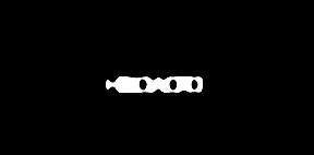
文字融合
实现效果
完整源码
<template>
  <div class="parentBox">
    <div class="contantBox">
      <h1>hello Word!</h1>
    </div>
  </div>
</template>
<style lang="less" scoped>
.parentBox
  height: 100%;
  background: rgb(31, 31, 31);
  padding: 100px;
  .contantBox
    width: 100%;
    height: 100%;
    position: relative;
    padding: 4em;
    filter: contrast(20);
    overflow: hidden;
    background: rgb(0, 0, 0);
    h1
      font-family: Righteous;
      color: white;
      font-size: 4rem;
      text-transform: uppercase;
      line-height: 1;
      animation: letterspacing 3s infinite alternate ease-in-out;
      display: block;
      position: absolute;
      left: 50%;
      top: 50%;
      transform: translate3d(-50%, -50%, 0);
      letter-spacing: -2.2rem;


  @keyframes letterspacing
    0%
      letter-spacing: -2.4rem;
      filter: blur(0.3rem);

    50%
      filter: blur(0.5rem);

    100%
      letter-spacing: 0.5rem;
      filter: blur(0rem);
      color: #fff;


</style>
以上是关于纯css实现元素融合效果的主要内容,如果未能解决你的问题,请参考以下文章